

Qlik Dashboard Examples
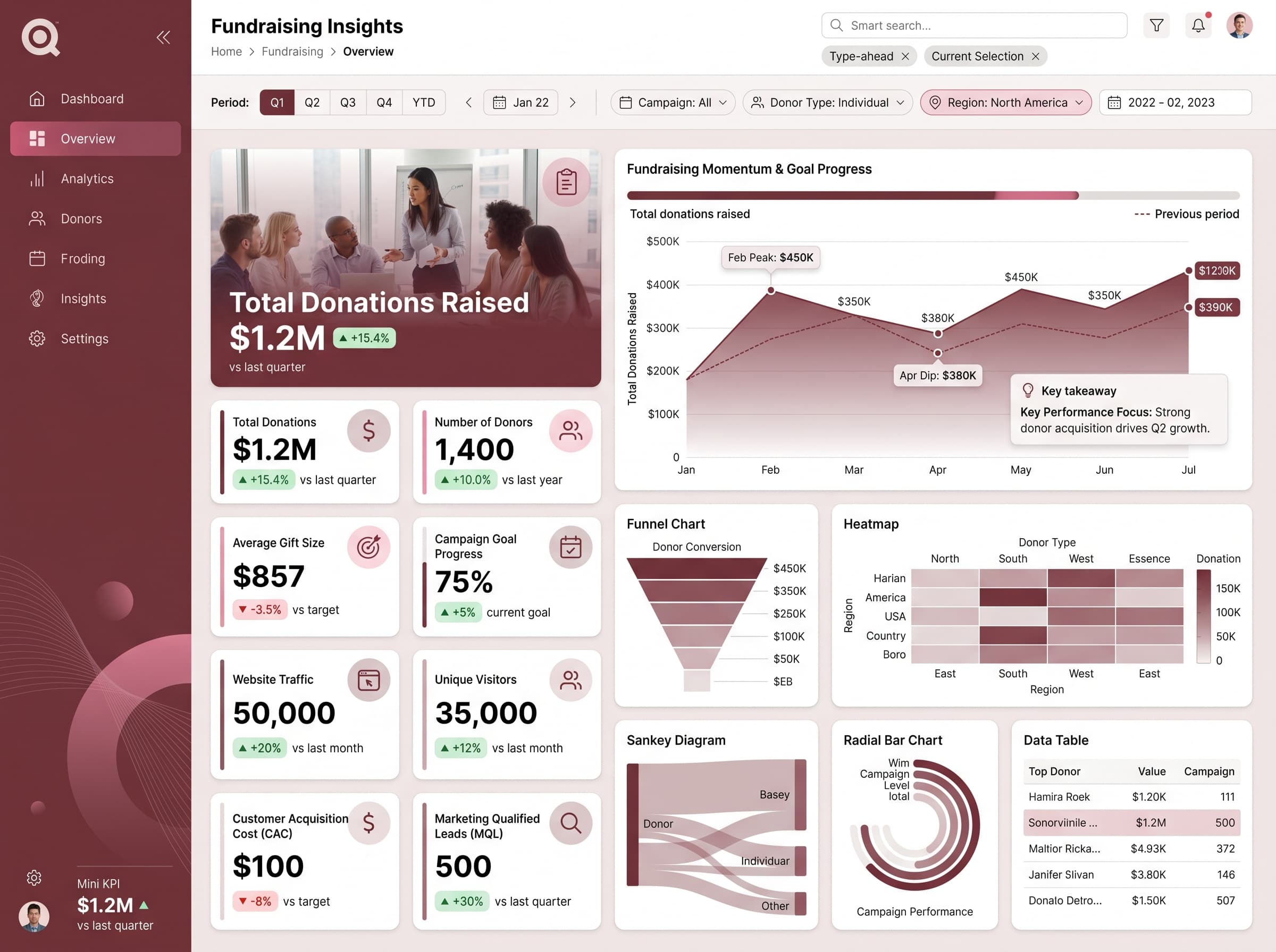
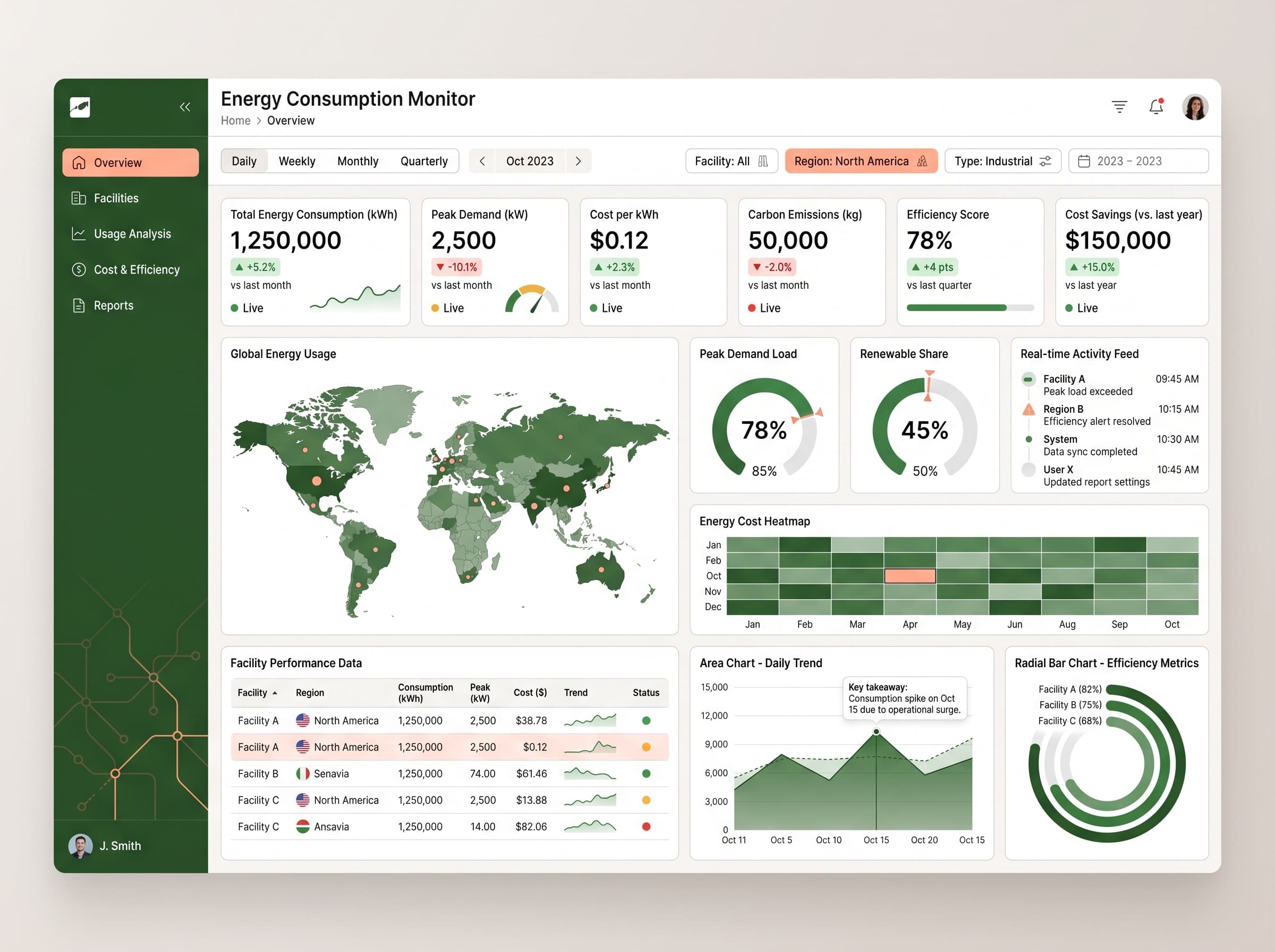
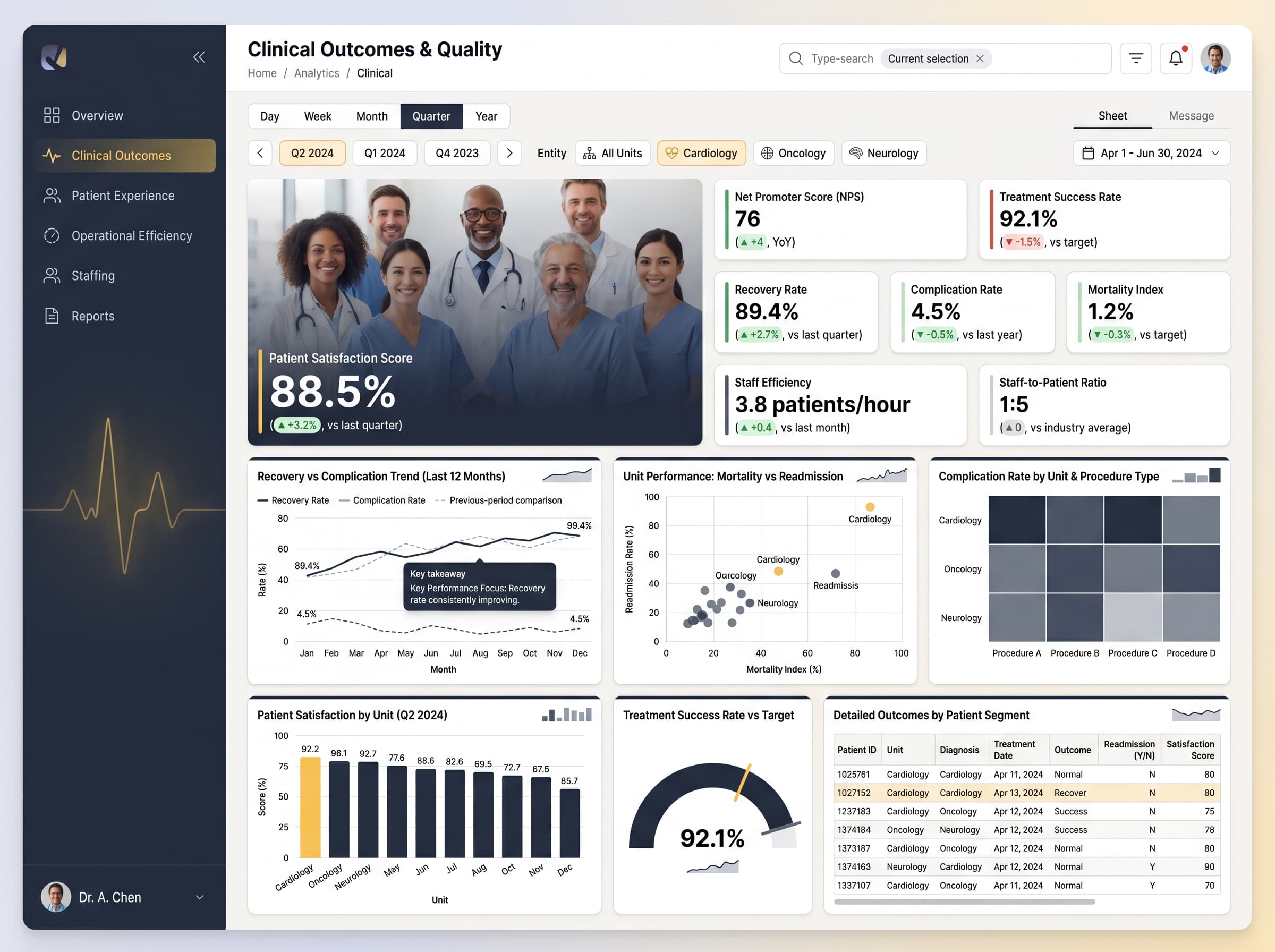
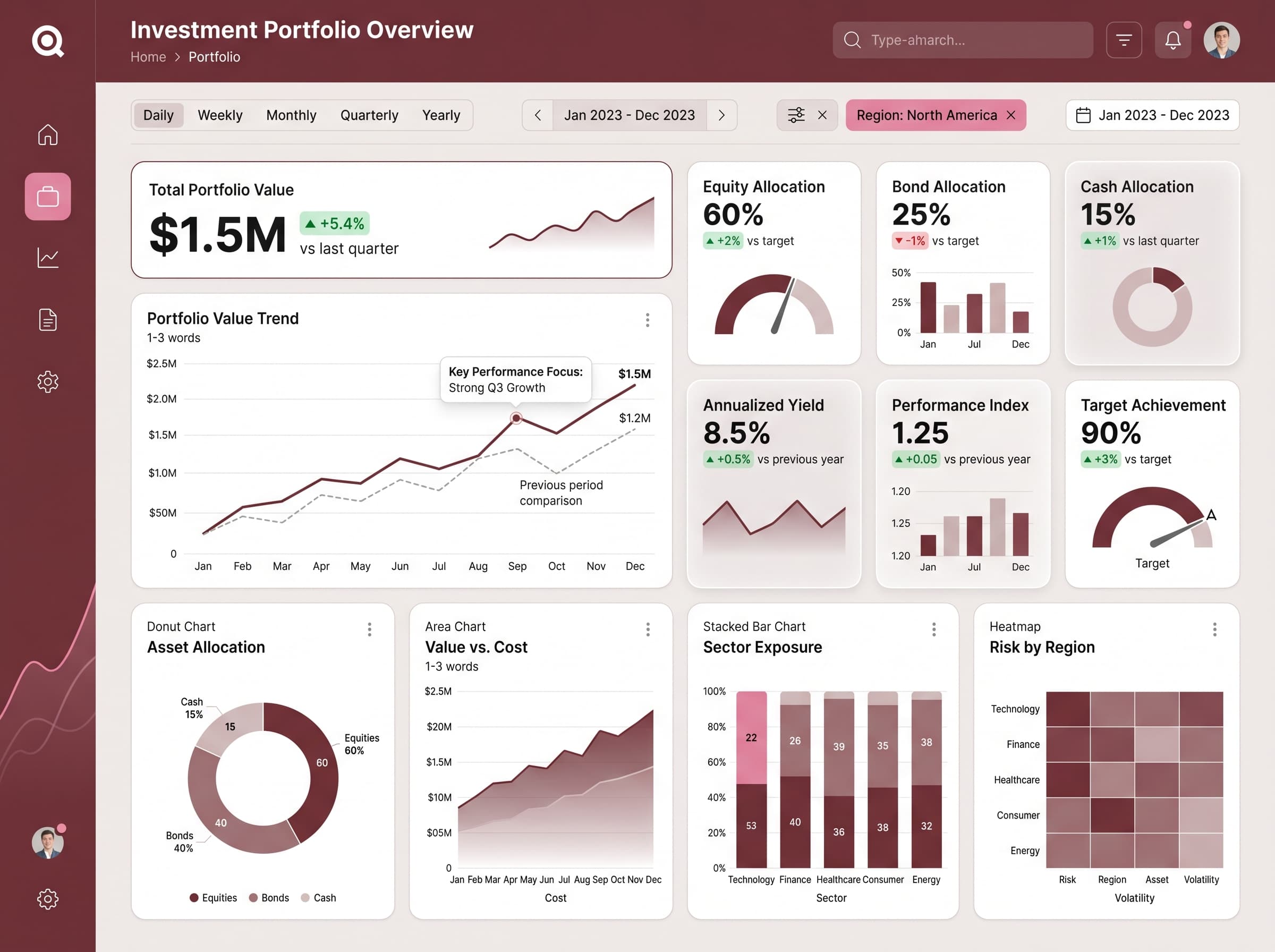
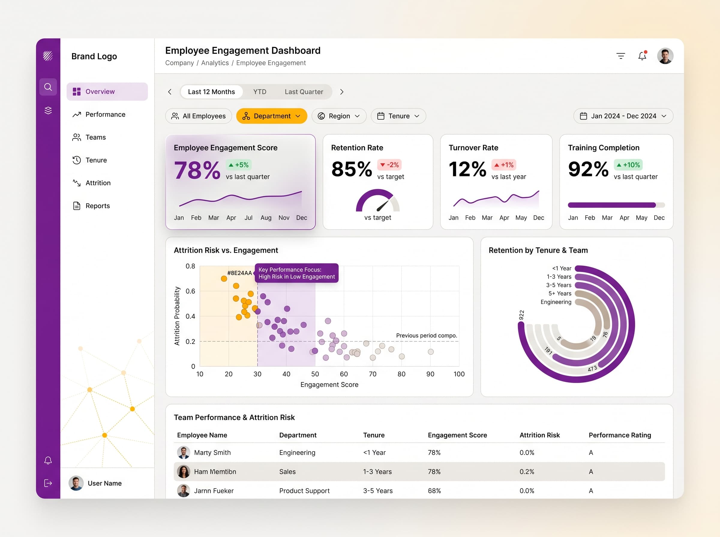
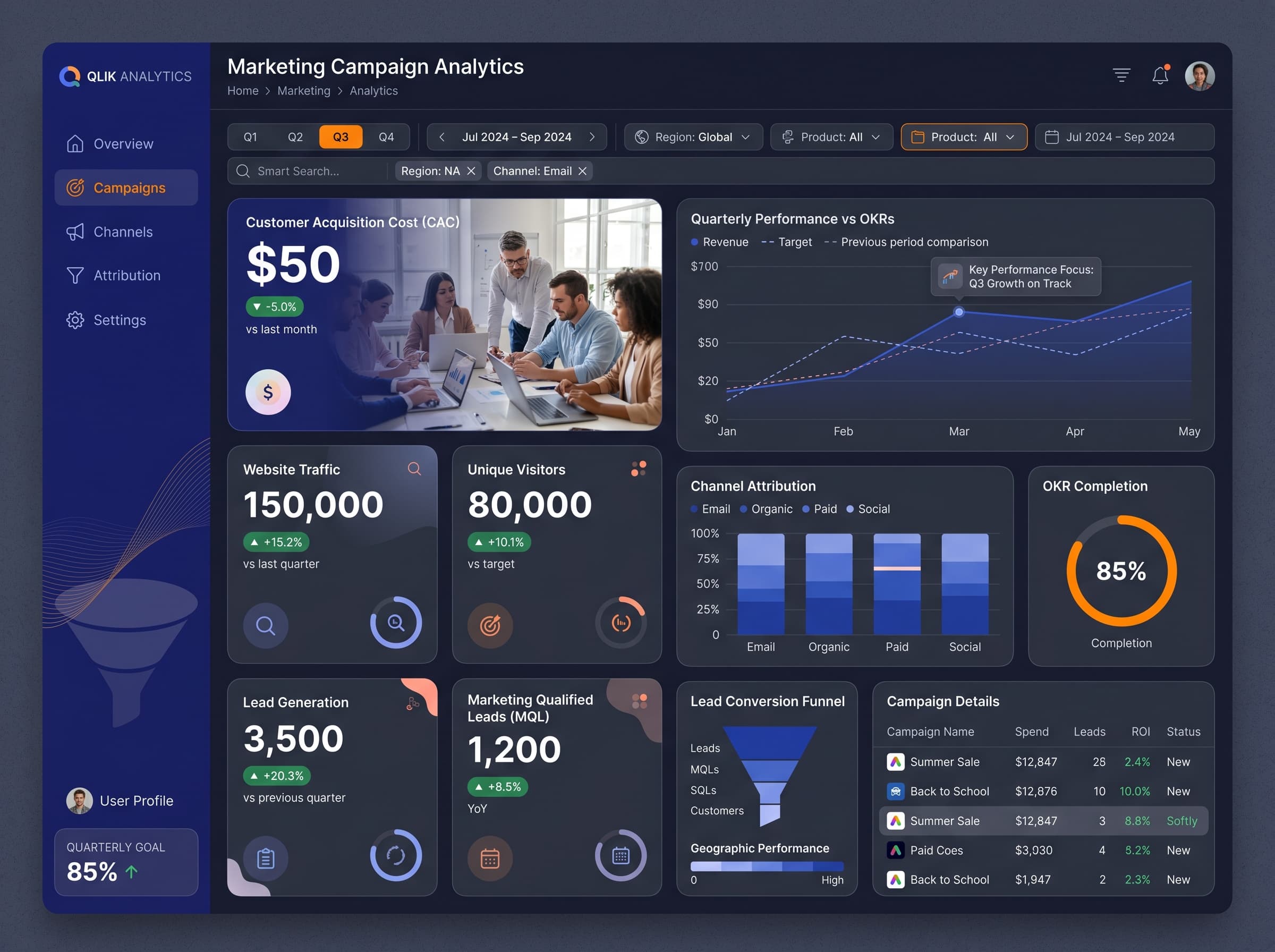
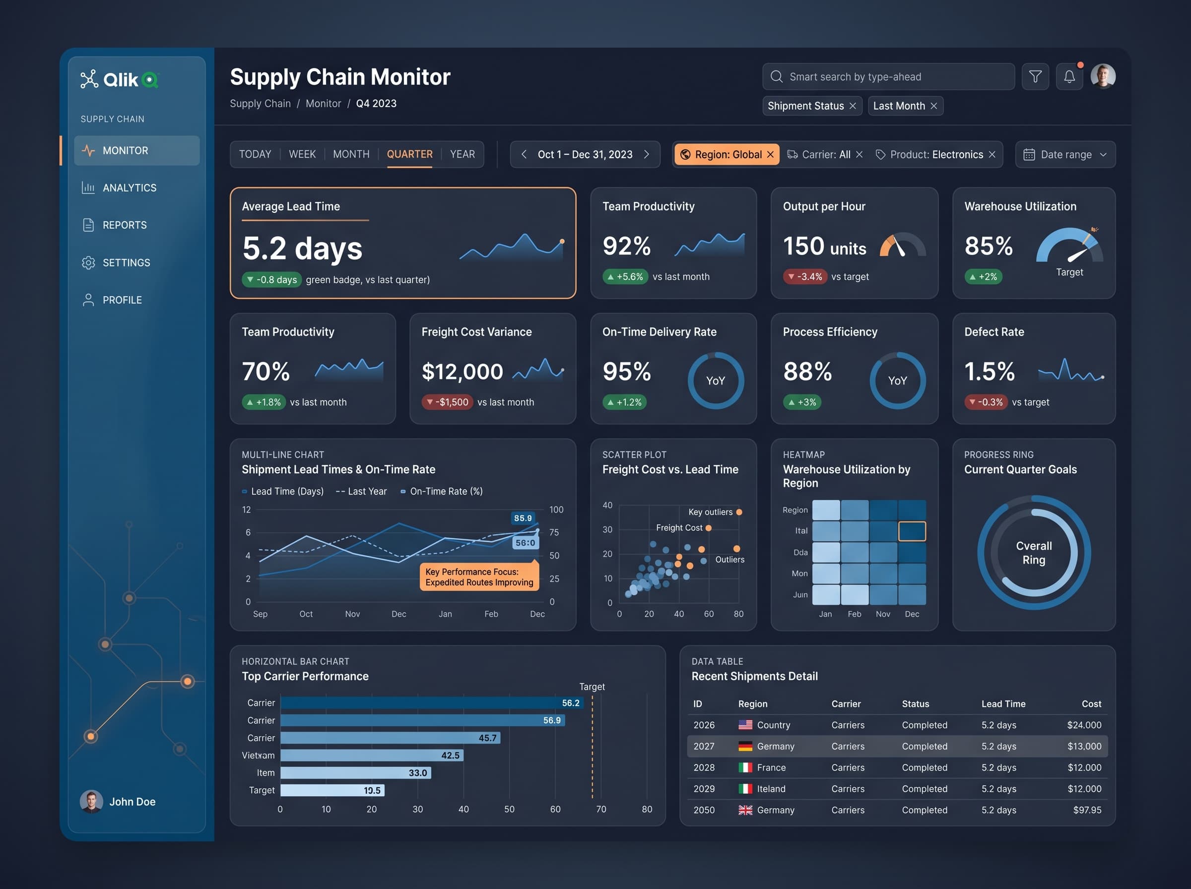
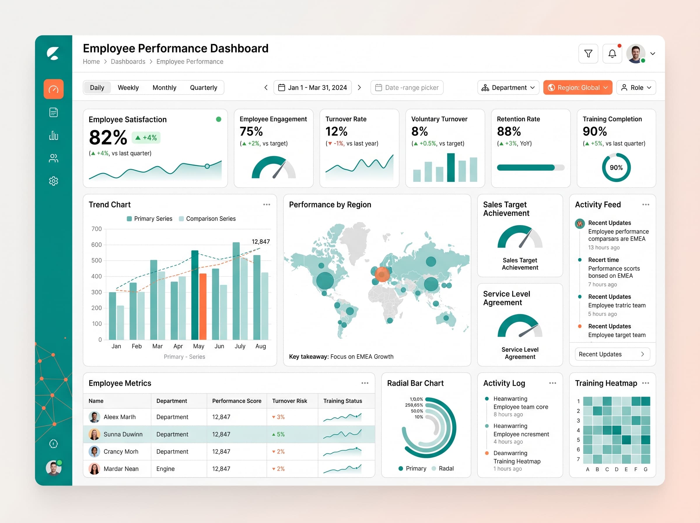
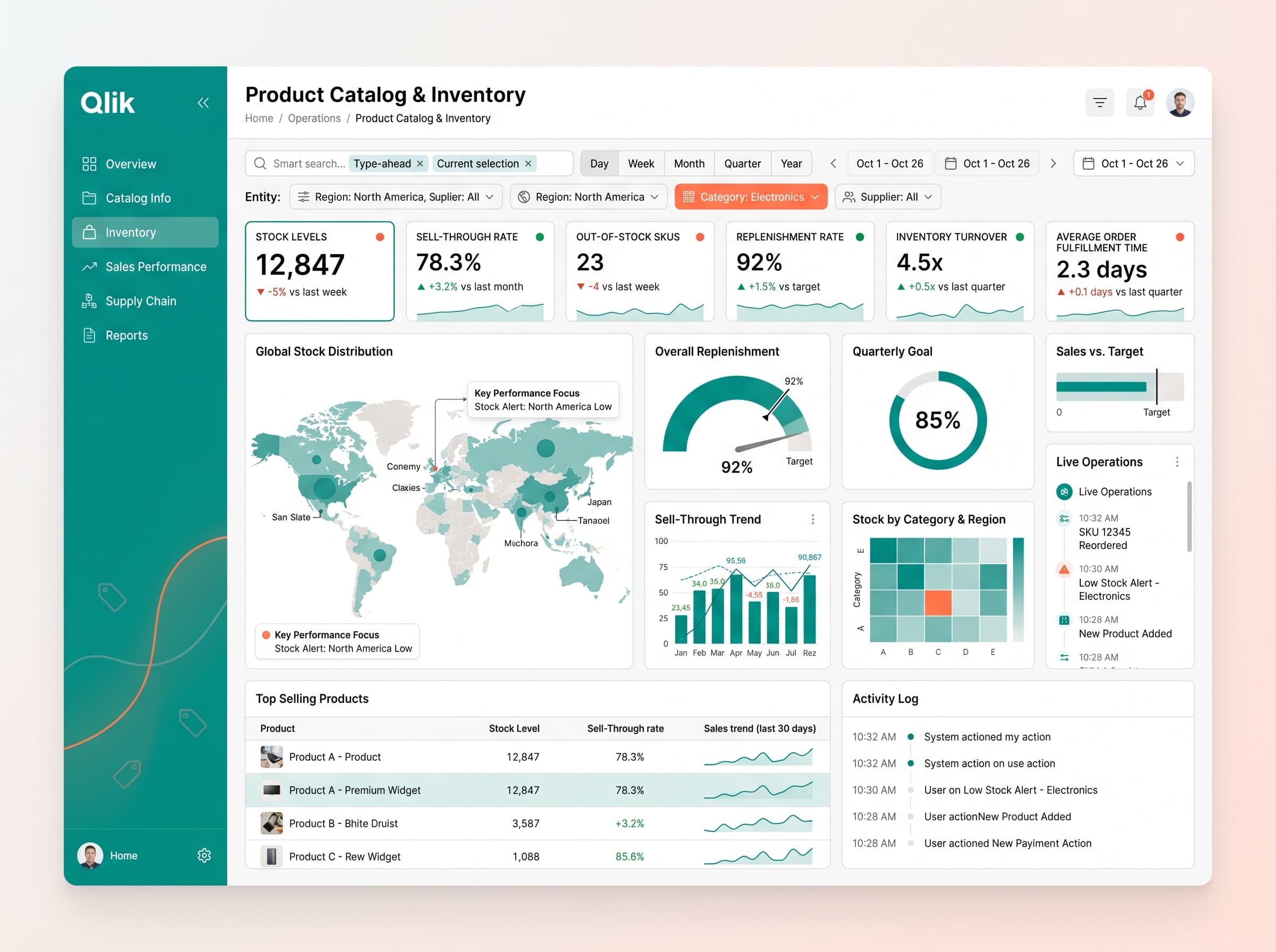
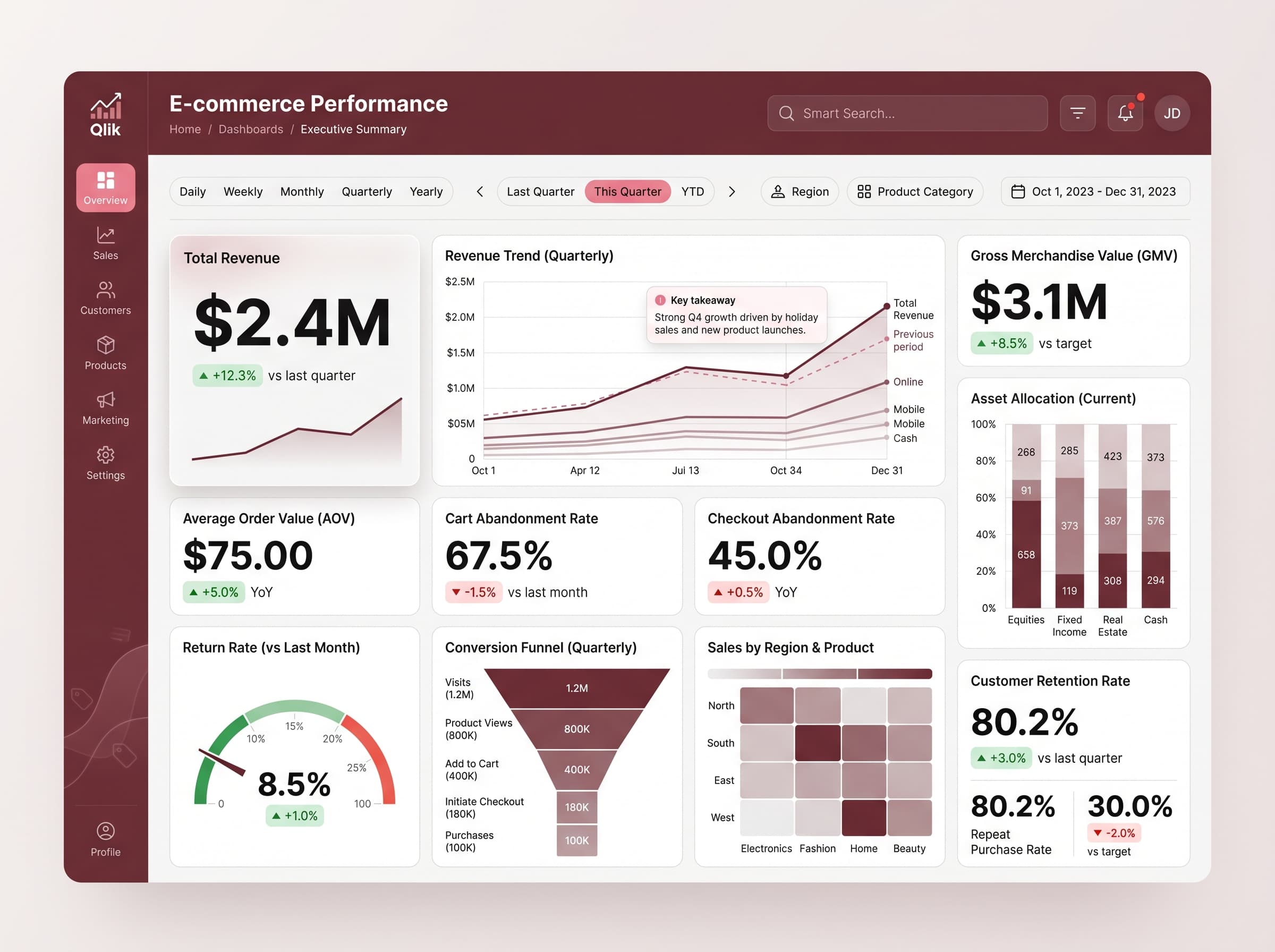
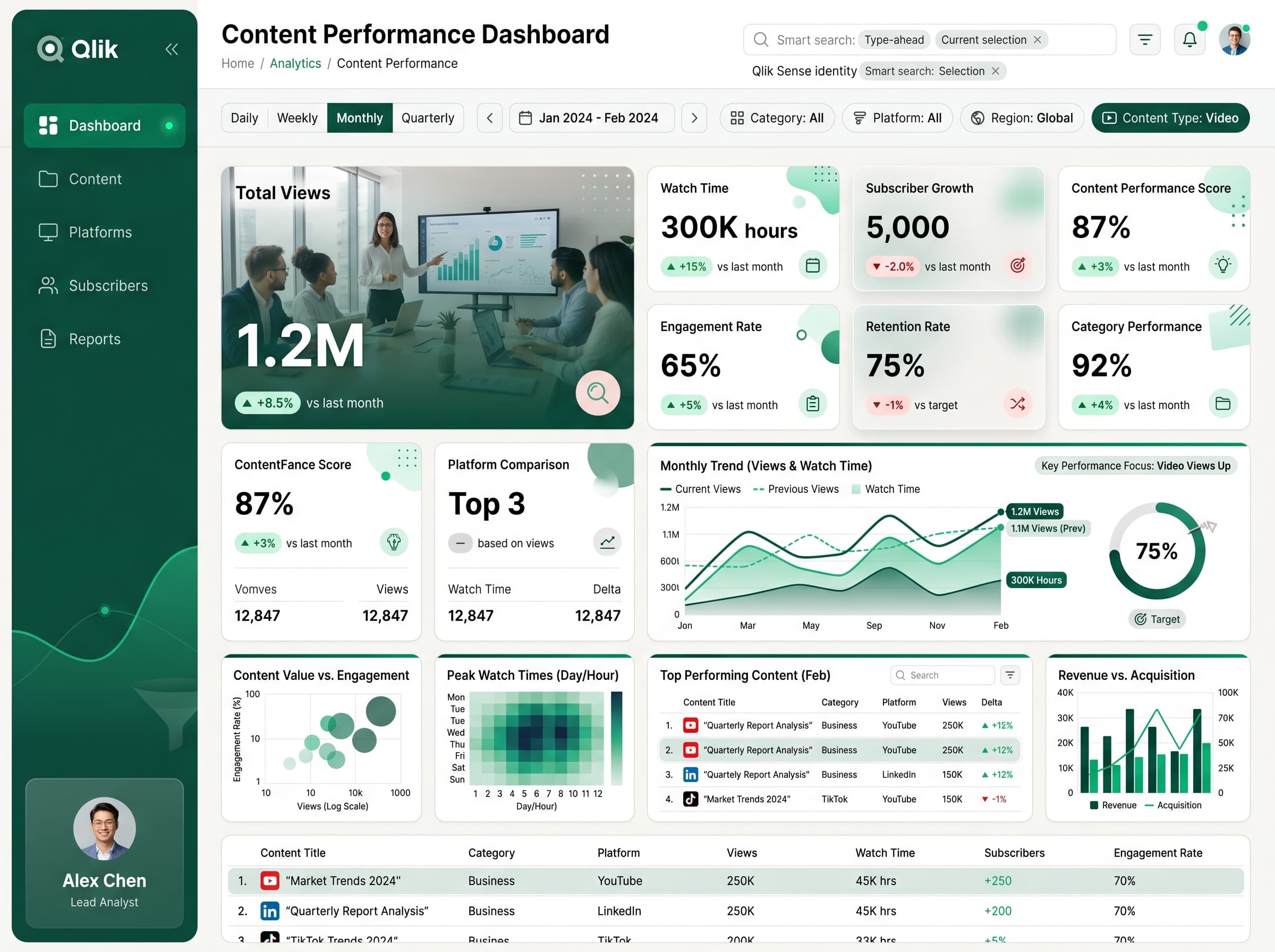
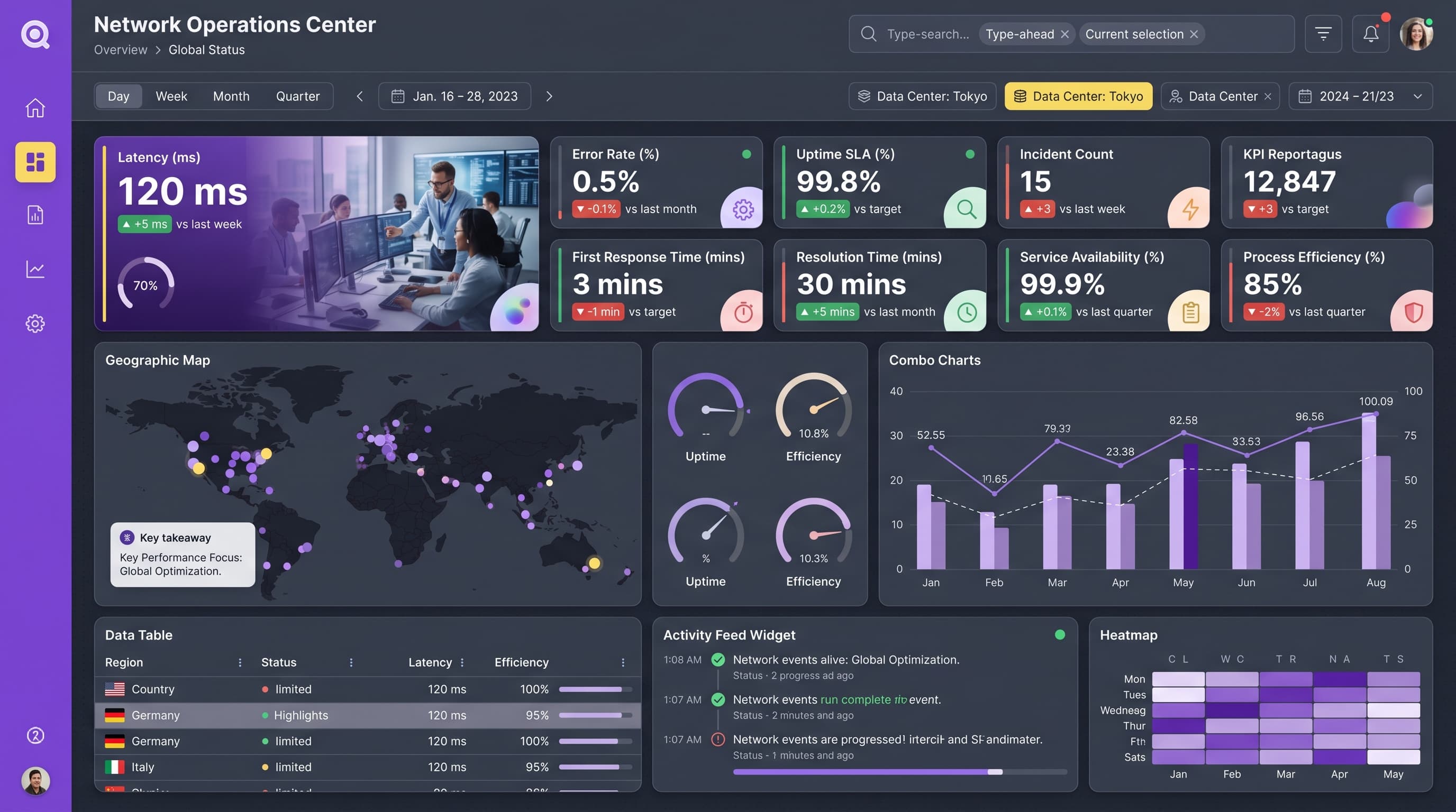
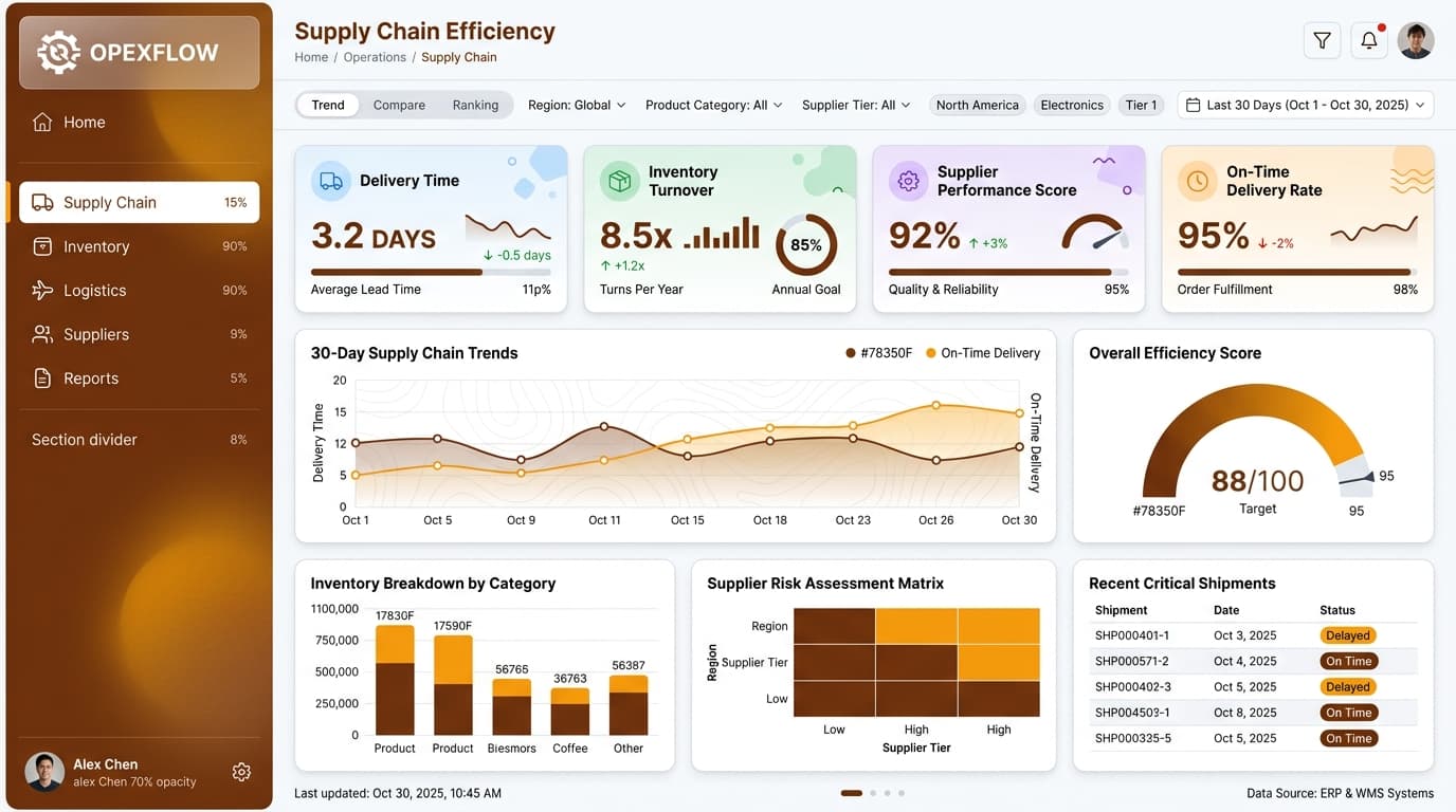
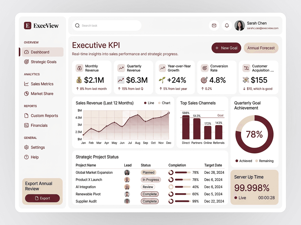
Qlik Sense dashboards shine when the layout supports associative exploration instead of fighting it. Browse these gallery examples for sheet structures, KPI objects and chart pairings that hold up as users select their way through the data.
14 examples in the gallery
Designing for Qlik Sense
Design sheets around selection: every chart should stay legible when the user filters to a sliver of the data. A KPI row that reacts to selections, one master visualization per sheet, and consistent dimensions across charts make the associative model feel coherent rather than chaotic.
What to steal from these examples
Watch how these layouts keep comparative charts (bars, lines) dominant and reserve gauges and donuts for single-number context. That balance keeps Qlik sheets readable both at the 'all data' view and deep into a selection.
Create your own qlik dashboard
Describe it in a sentence — ChartCraft designs the layout, KPIs and charts for you.