

Blog
Designed Power BI reports, with and without agents
Techniques proven in Power BI Desktop, notes on PBIR and AI agents, and free reports to take apart.
 Design techniques8 min read
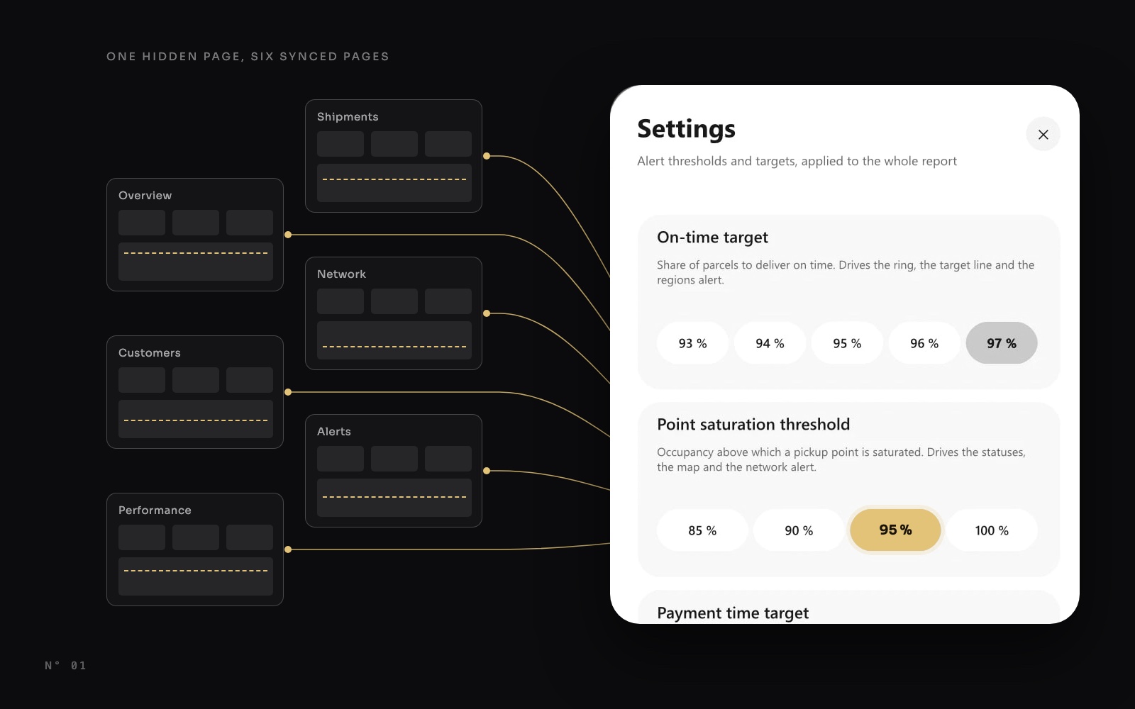
Let users set the thresholds: a settings panel in Power BI
Move thresholds out of DAX and into a settings panel: a parameter table, one measure with a default, a synced slicer and a hidden page. The whole report follows.
 PBIR & agents9 min read
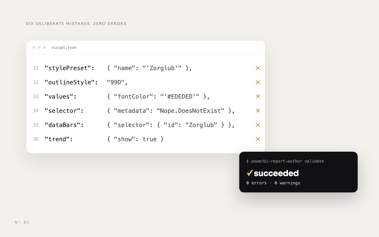
The PBIR validator passes, Desktop disagrees: 7 traps
Microsoft's PBIR validator checks names and the schema, never the render. Seven things it lets through that Power BI Desktop draws differently, each proven by a render.
 Design techniques9 min read
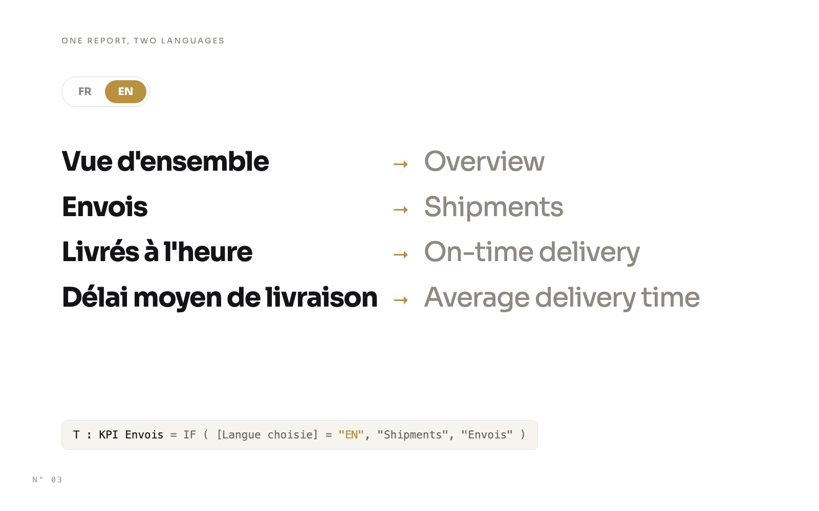
A bilingual Power BI report with one slicer
Switch a whole Power BI report between French and English with one slicer: a language table, one measure per text, FORMAT with a culture, and one row per language for chart categories.
 Design techniques7 min read
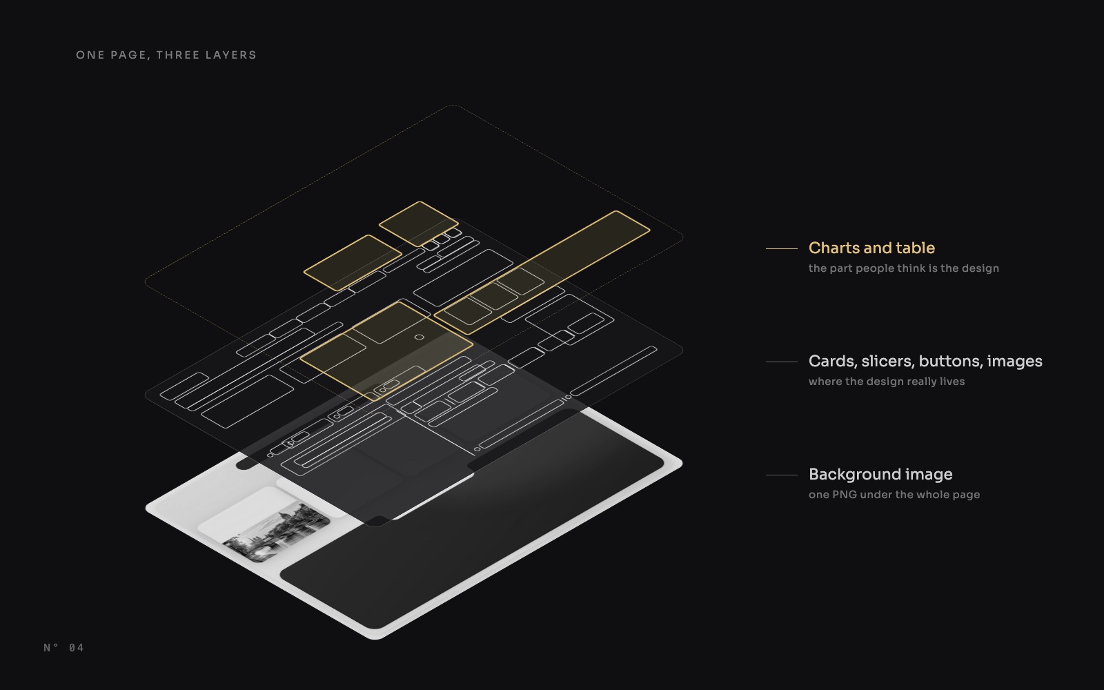
347 visuals, only 9 charts: anatomy of a designed Power BI report
An X-ray of a designed Power BI report: 347 visuals, 167 of them cards and only 9 charts. Where the design of a Power BI report really lives, region by region.
 Design techniques9 min read
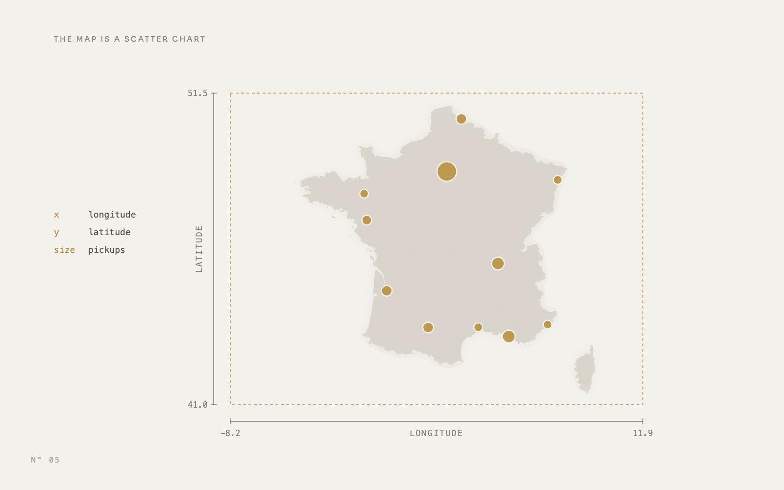
A Power BI map without Azure Maps: a scatter chart over an image
Replace Azure Maps with a native scatter chart: longitude on X, latitude on Y, axes bounded to a map image set as the plot area background.
 Design techniques9 min read
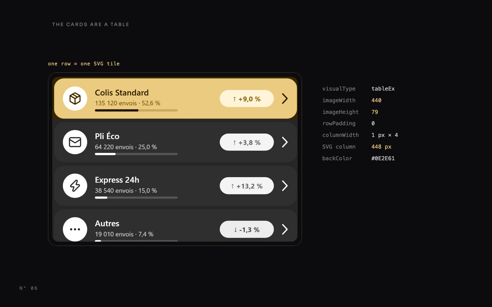
Power BI table rows as cards: one SVG measure per row
A native table row can't have rounded corners or a highlight. One DAX measure draws an SVG tile per row, and the table shows only that image column.
 Design techniques9 min read
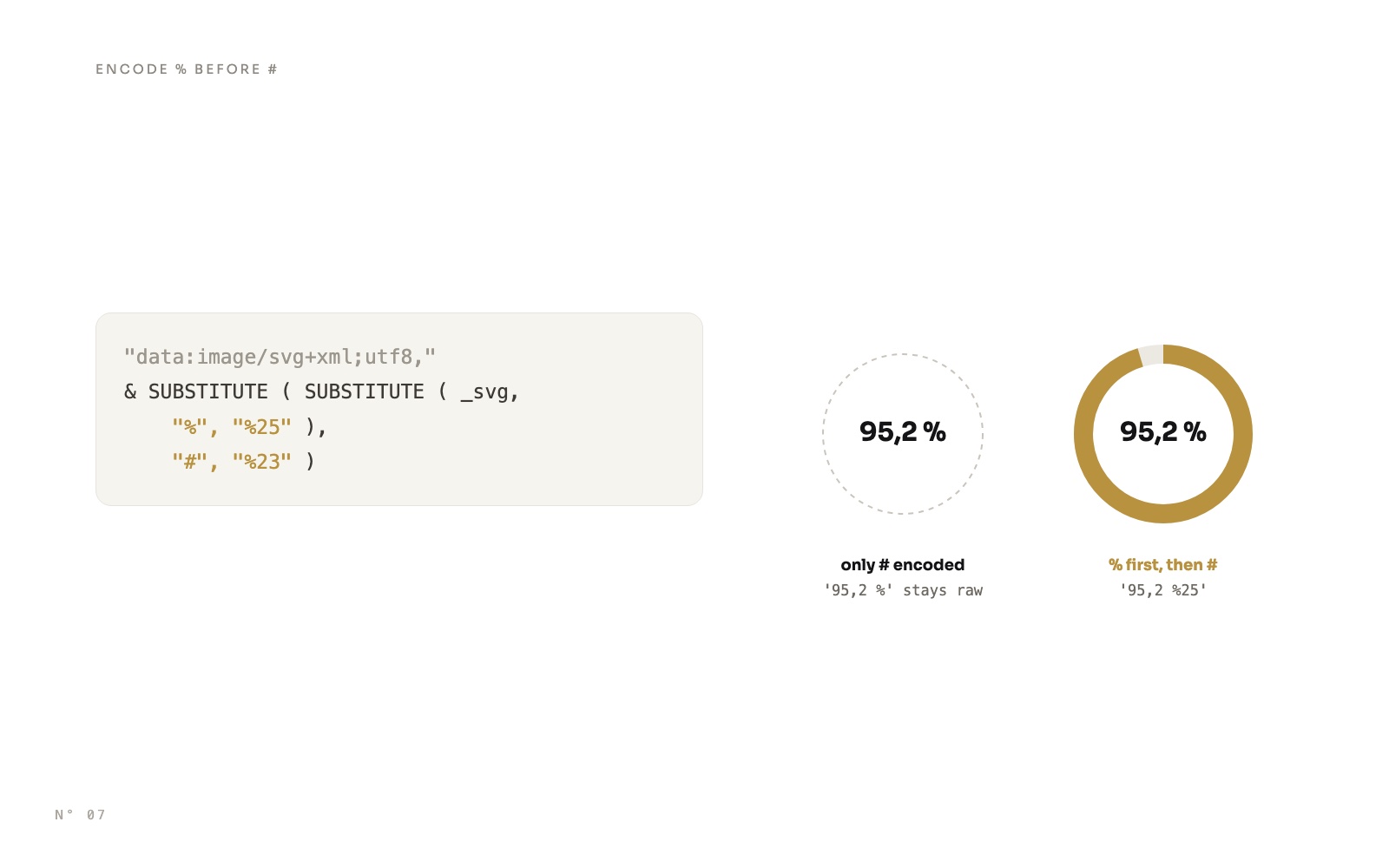
SVG measures in Power BI cards: rings, pills and a timeline
Draw rings, status pills, gauges and a shipment timeline with DAX, as SVG in a card's image, and avoid the encoding trap that wipes out every colour.
 Design techniques9 min read
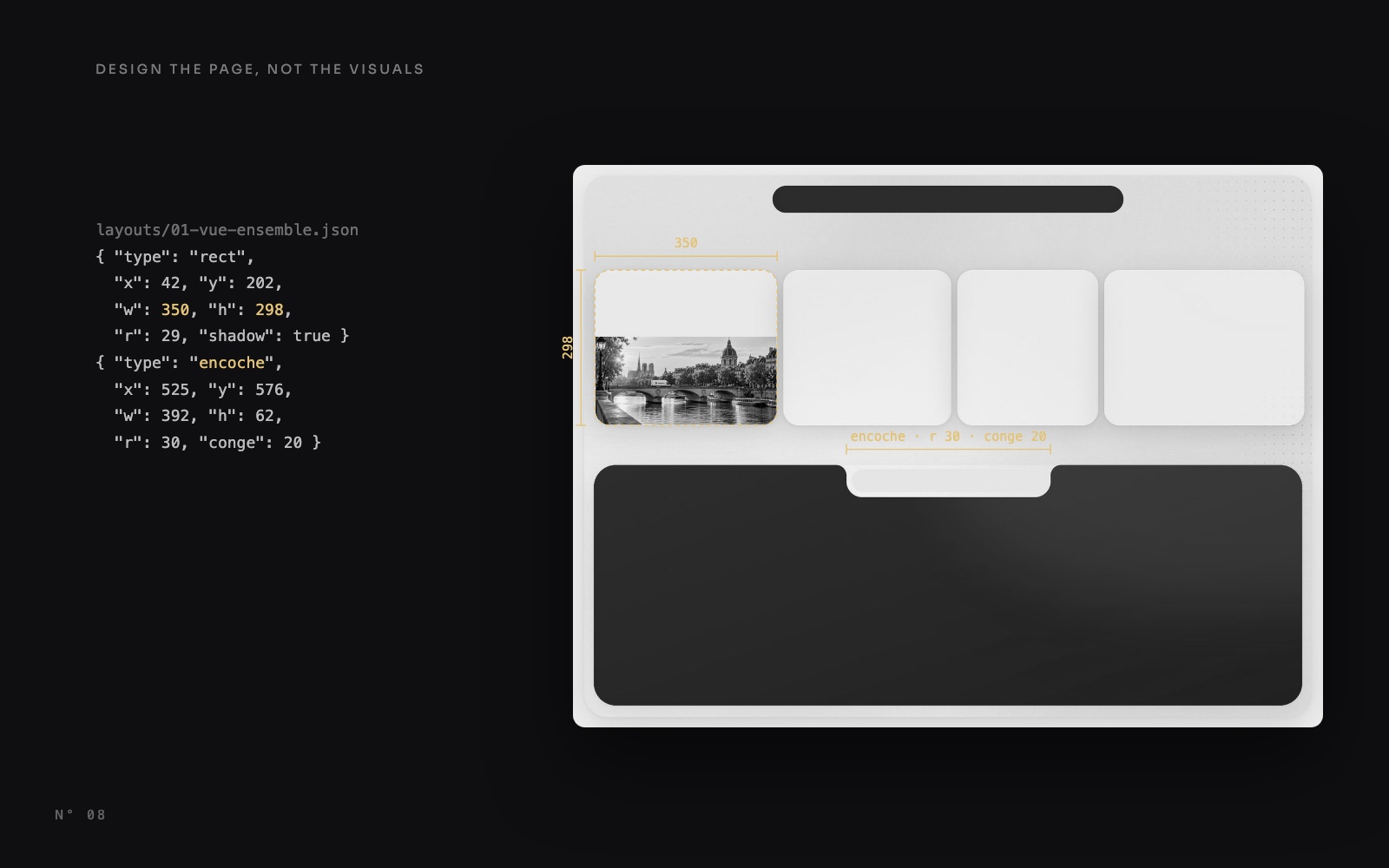
Design the page, not the visuals: Power BI page backgrounds
Shadows, gradients, a notch and photos drawn into one 2x image under transparent visuals: how Colis Pro designs each Power BI page, with or without code.
 PBIR & agents9 min read
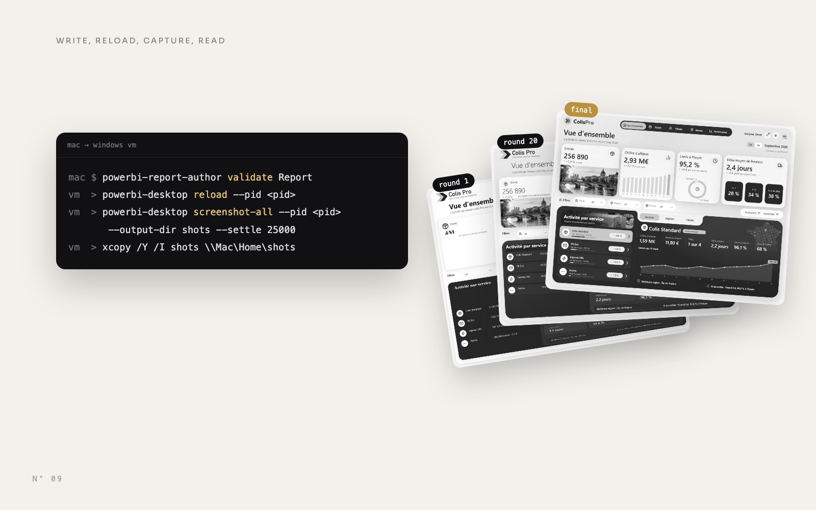
Give your AI agent eyes: the Power BI Desktop Bridge from a Mac
An AI agent on a Mac drives Power BI Desktop in a Windows VM with the Desktop Bridge: write, validate, reload, capture every page, read the PNGs, fix.
 Field notes9 min read
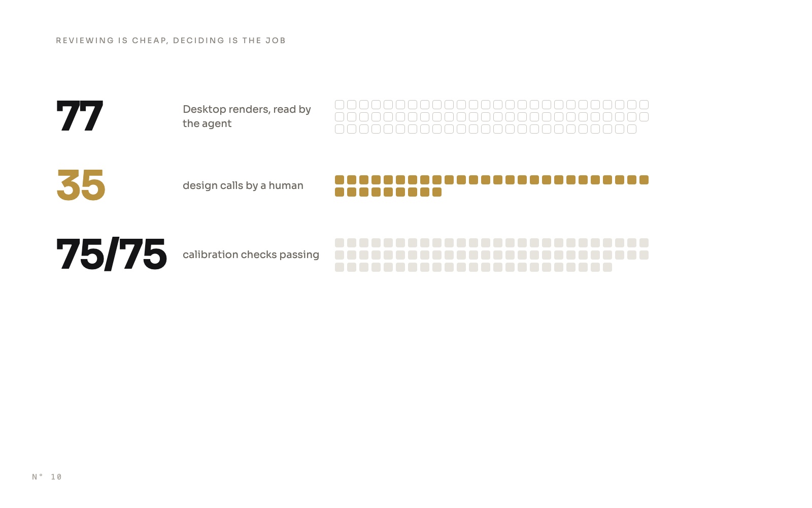
Reviewing is cheap, deciding is the job: how an AI agent built a Power BI report
An AI agent built Colis Pro, a full Power BI report, in 77 rounds. Where the human time went: the brief, calibrated data, contradictions and choices.
 Field notes8 min read
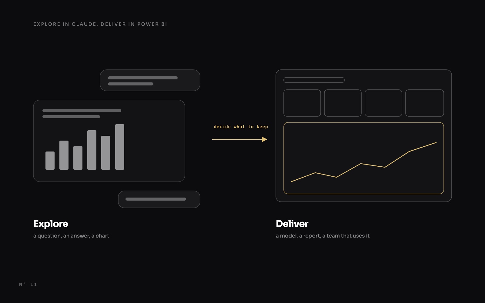
Claude Dashboards and Power BI: explore in Claude, deliver in Power BI
Claude Dashboards answers data questions in a chat. Power BI runs governed reports. What each one does, how they fit, and how an agent bridges the two.
 PBIR & agents9 min read
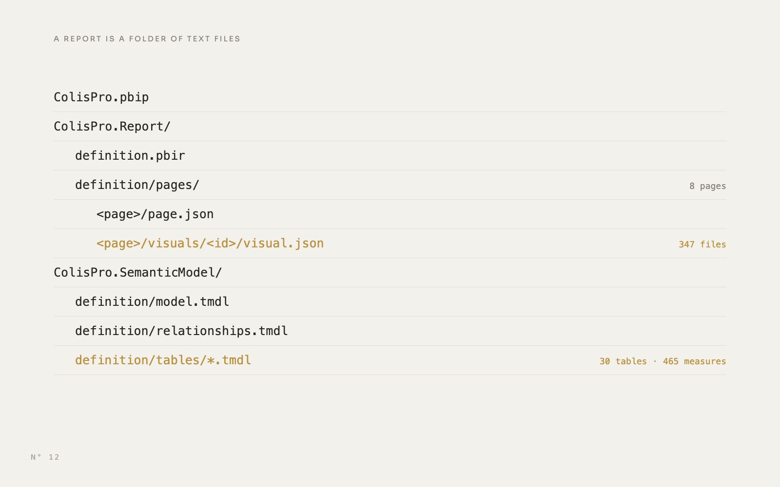
PBIP, PBIR and TMDL explained: inside a Power BI project
What is inside a Power BI project folder, file by file, from a real 347-visual report: PBIR for the report, TMDL for the model, and why Git and agents care.
 Free reports8 min read
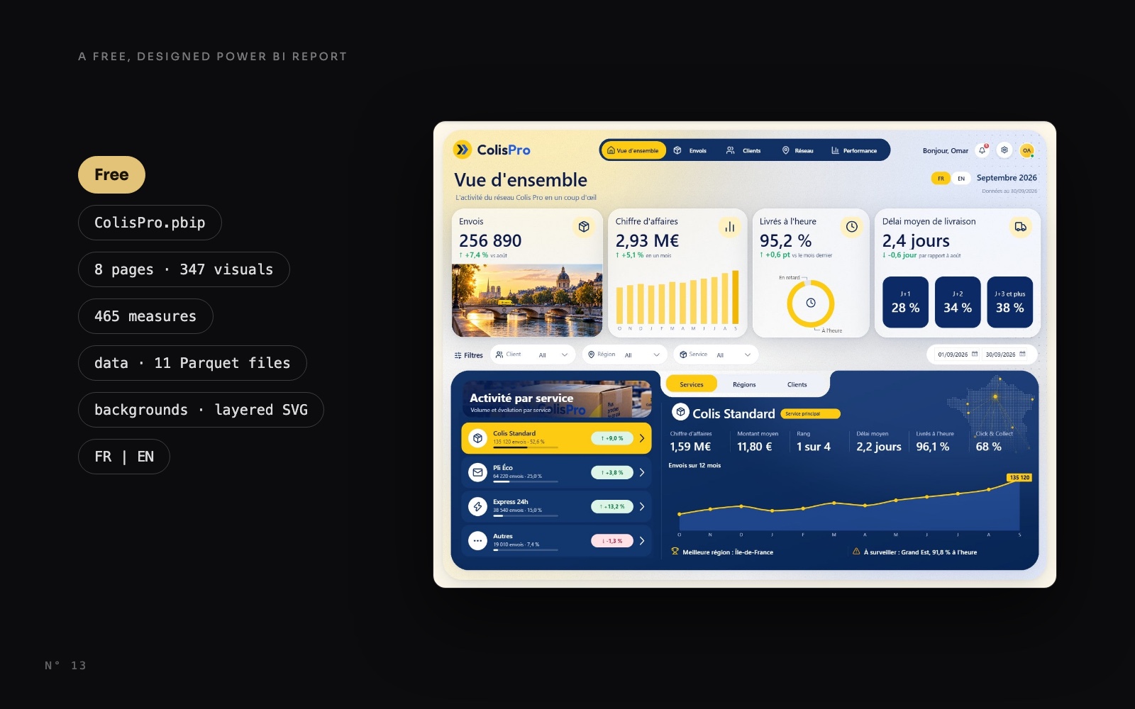
Colis Pro: a free designed Power BI report you can download
Download Colis Pro, a free designed Power BI report built with an AI agent: 5 pages, 2 panels, 347 visuals, French and English. What's inside, how to open it.