About this dashboard
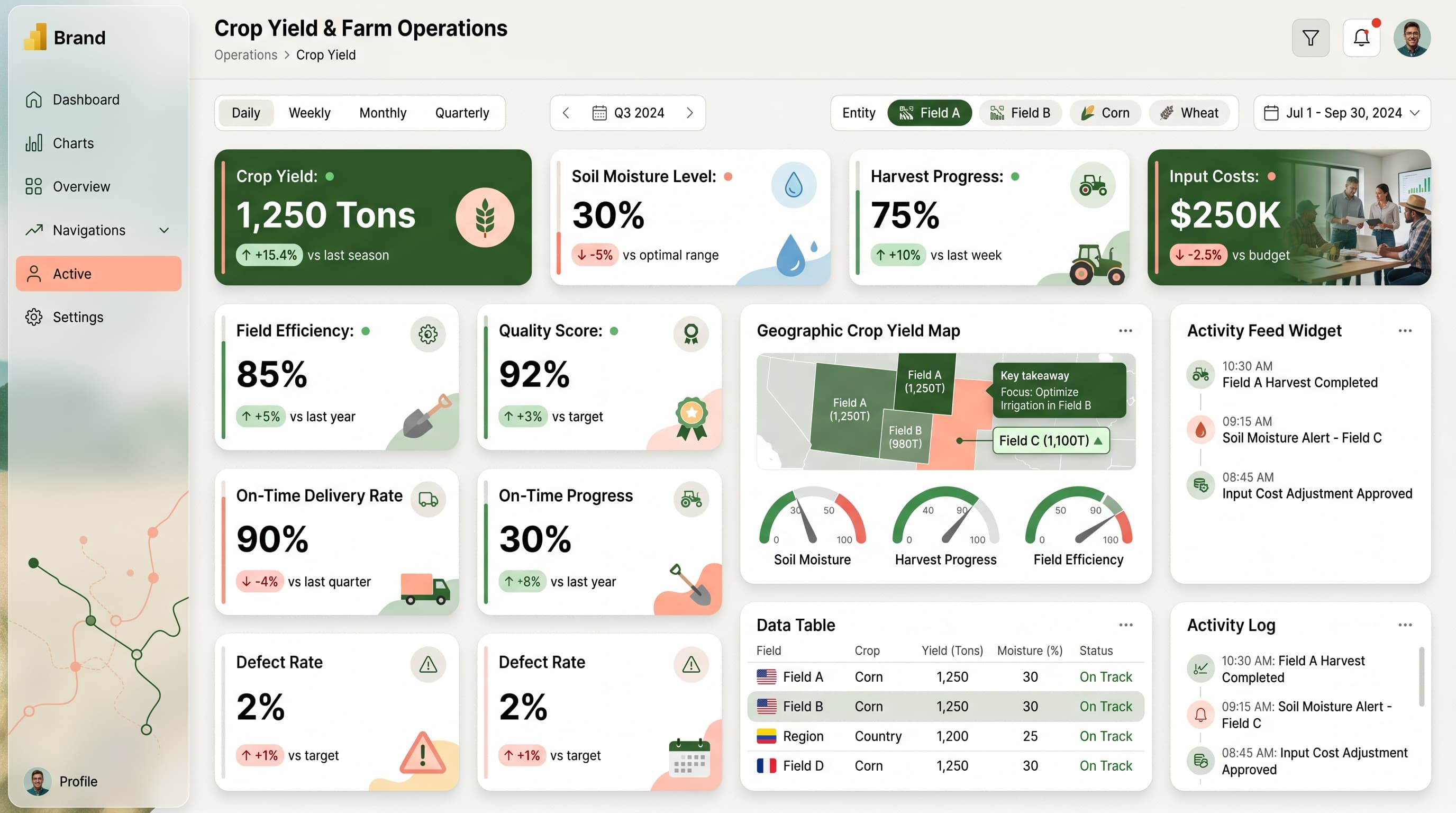
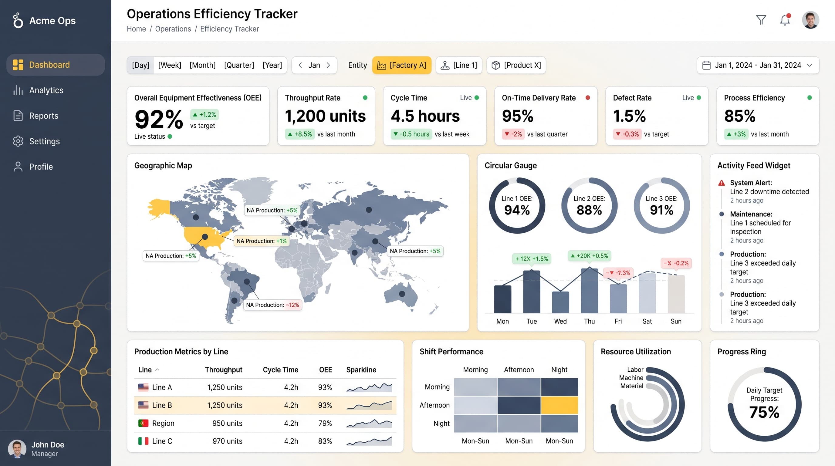
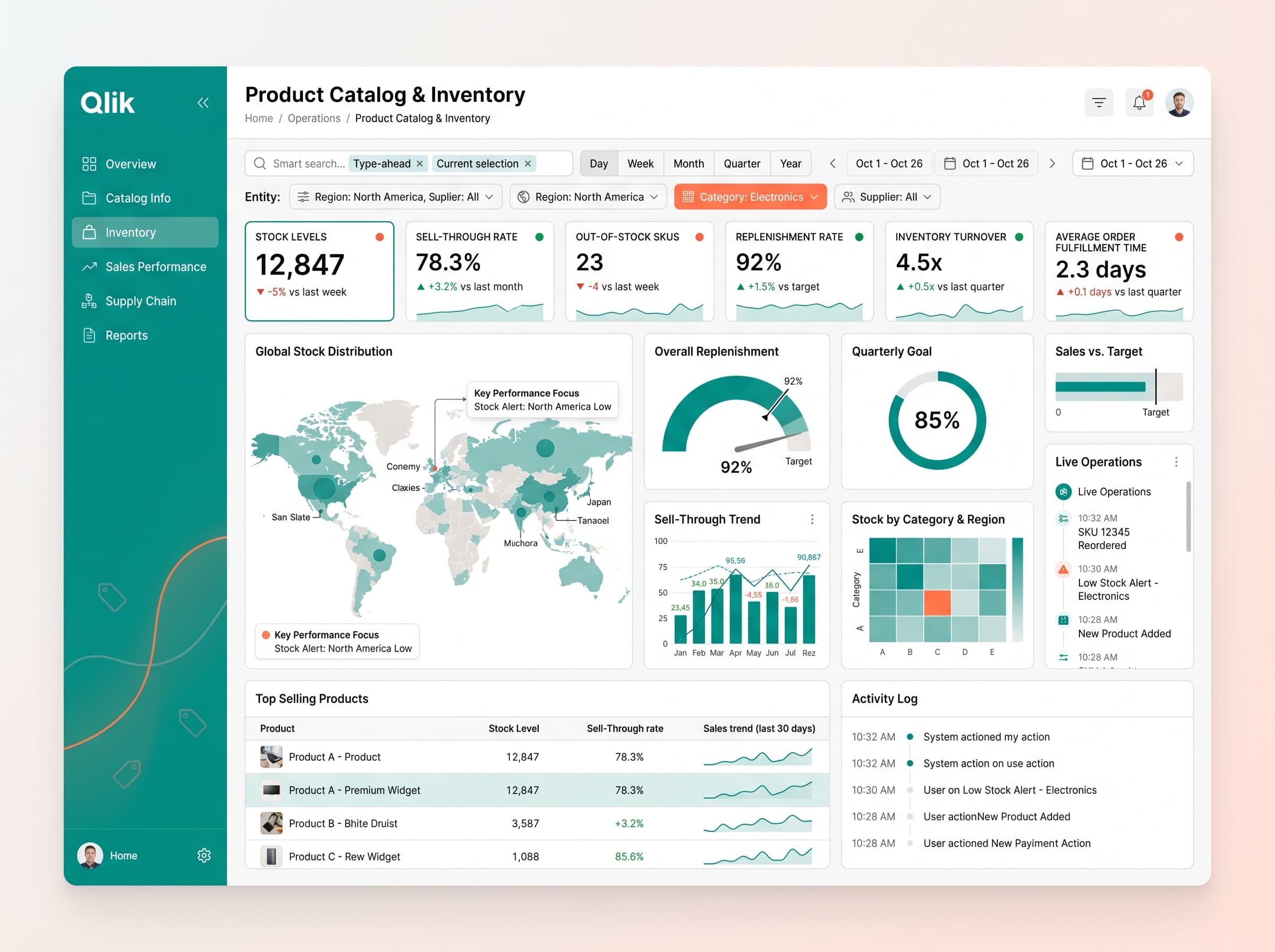
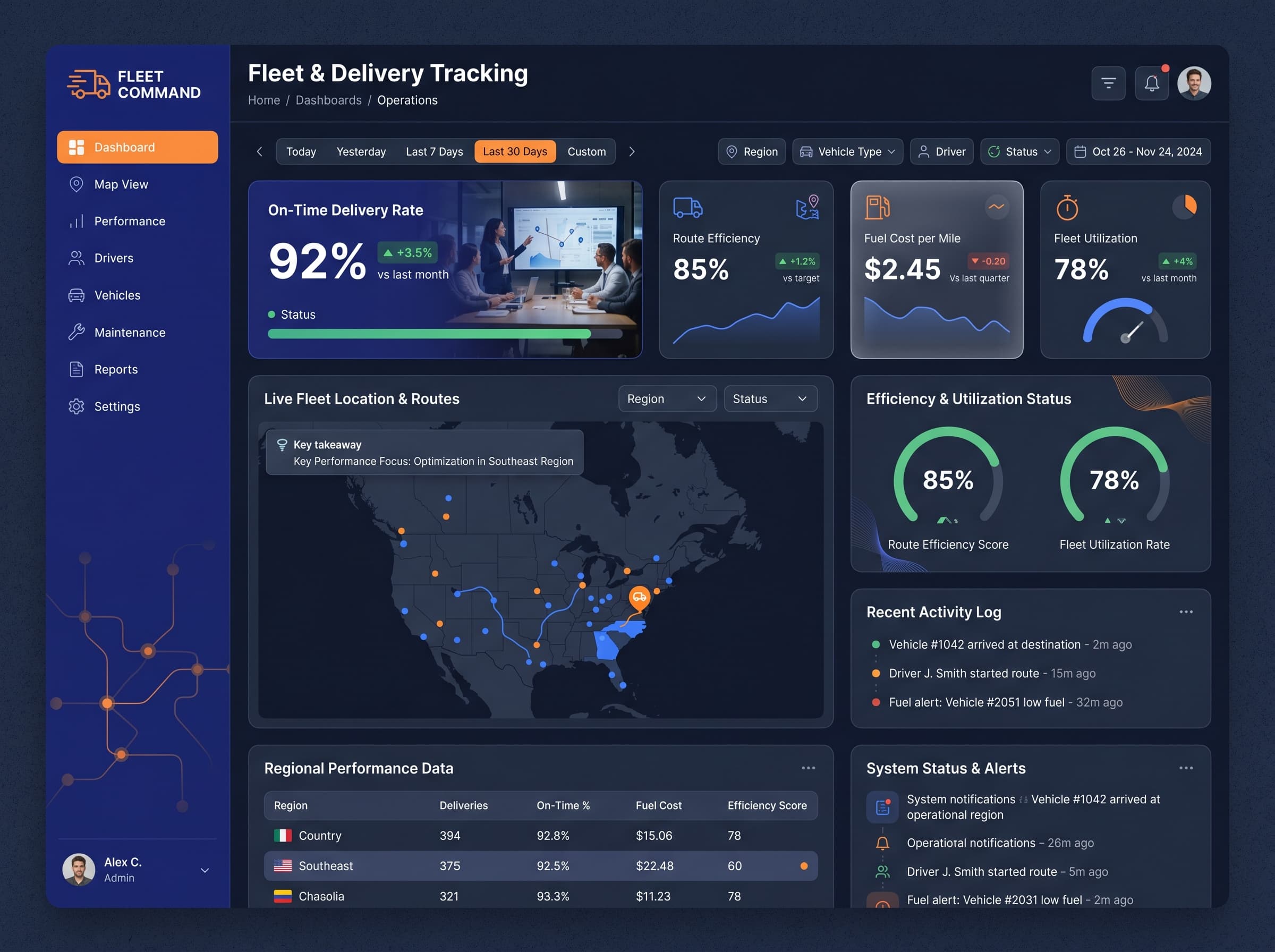
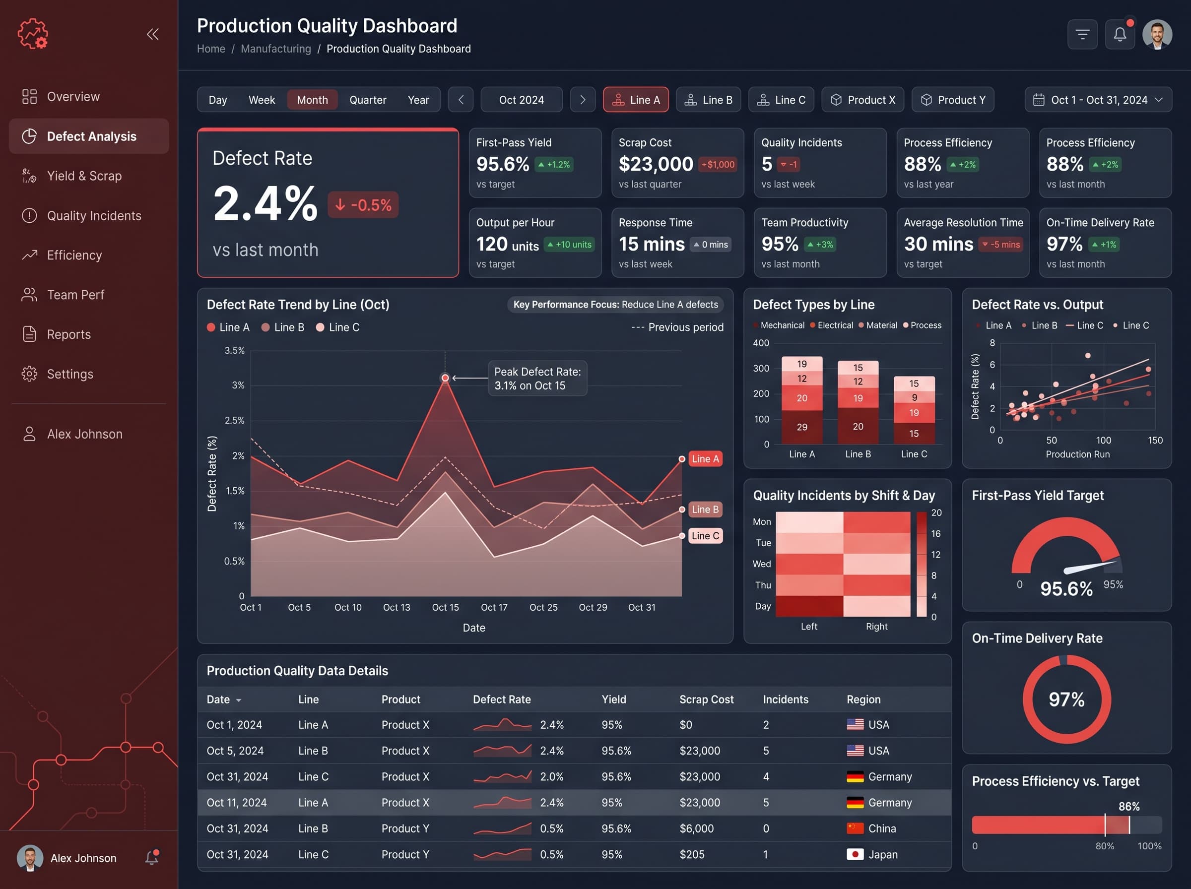
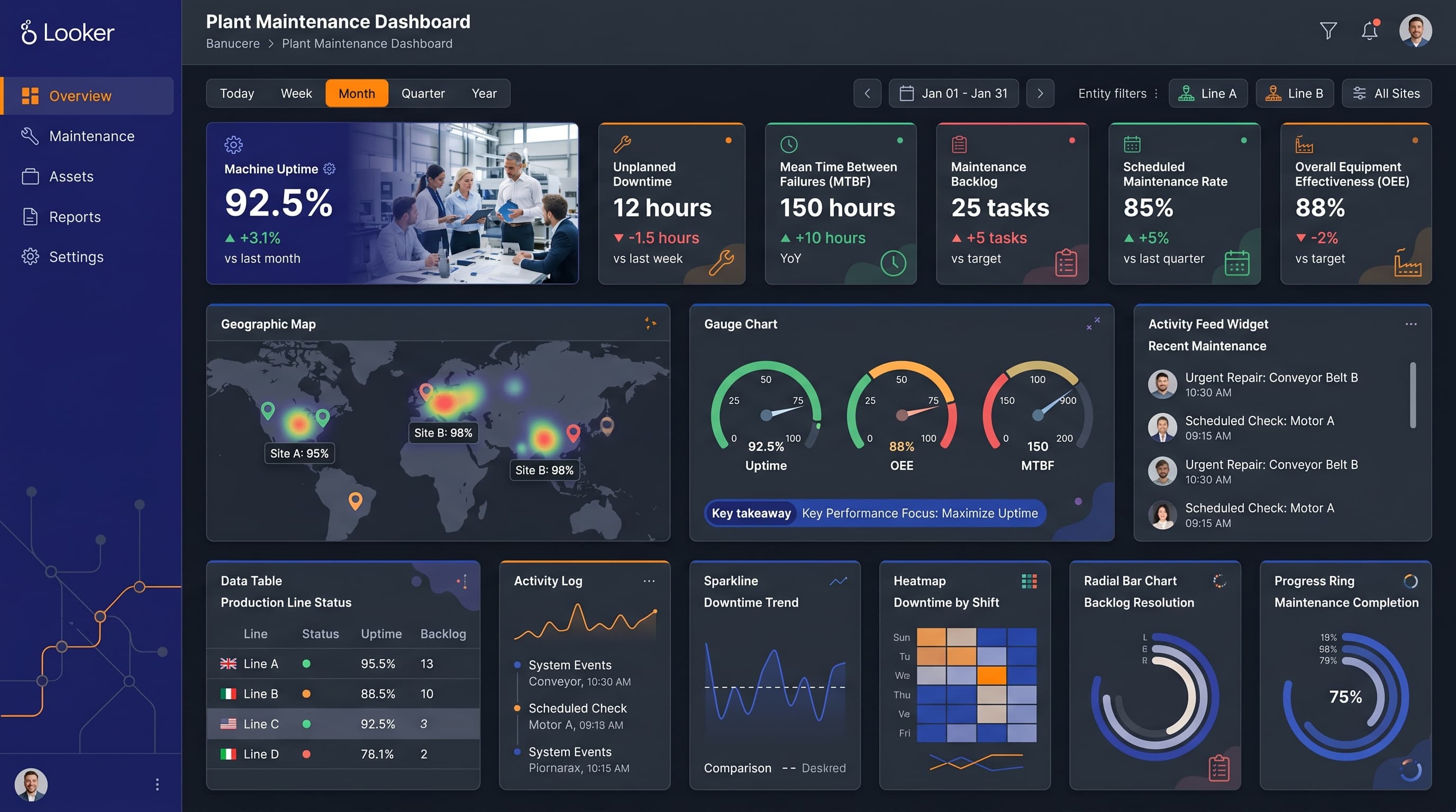
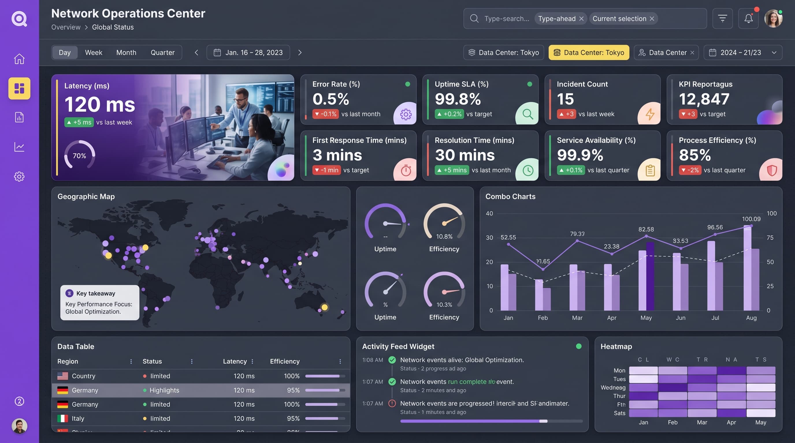
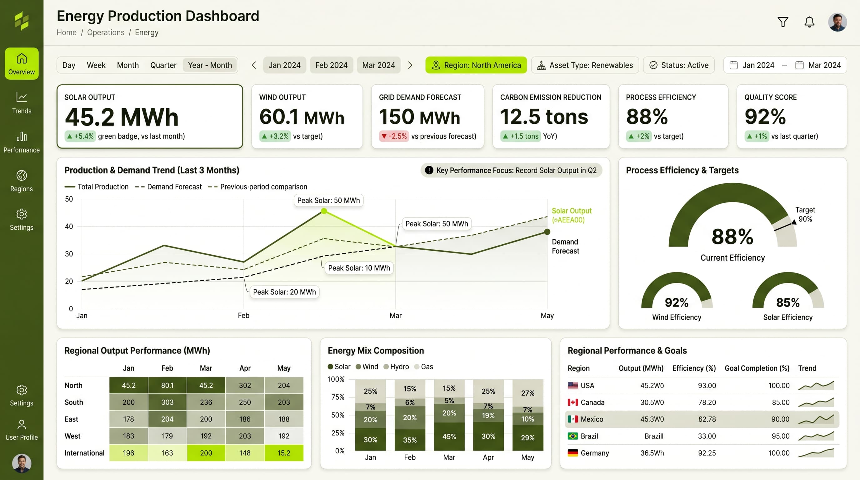
An analytical dashboard designed to track key metrics in supply chain and logistics, focusing on shipment status, warehouse utilization, lead times, and freight cost variance.
KPIs tracked
Charts
Strategic insights
Design recommendations
Color Palette Strategy
HighThe ocean-sand palette will be utilized effectively with a dark theme to ensure high contrast and readability. Primary colors should be used for headers, while secondary colors highlight key performance metrics, ensuring accessibility with a 4.5:1 contrast ratio.
Layout & Grid System
HighUtilize a 12-column grid system to maintain a 4:3 aspect ratio. Place KPIs in the top row for quick visibility, with charts in the center for deeper analysis and filters or navigation elements at the bottom for accessibility.
Typography Hierarchy
MediumEstablish a clear typography hierarchy: Dashboard title should be 24-28px bold, section headers at 18-20px semibold, card titles at 14-16px medium, and body text at 12-14px regular, using a single font family like Inter for consistency.
Data Visualization UX
HighSelect chart types that match the data semantics: multi-line charts for trends, scatter plots for correlation, and heatmaps for density. Limit colors per chart to 5-7, use tooltips for additional context, and ensure axes are clearly labeled.
Visual Hierarchy & Focus
MediumCreate a clear visual hierarchy by making the most important metrics the largest and boldest elements. Utilize whitespace effectively to separate sections, and highlight anomalies with conditional formatting to draw attention.
Interaction & Feedback
LowIncorporate hover states for interactive elements, using opacity changes to signify interaction. Implement loading skeletons during data refresh and provide visual feedback on filter selections, ensuring users can navigate seamlessly.