
About this dashboard
Real-time monitoring of latency, error rates, uptime SLA, and incidents across 40 services.
KPIs tracked
Charts
Strategic insights
Design recommendations
Color Palette Strategy
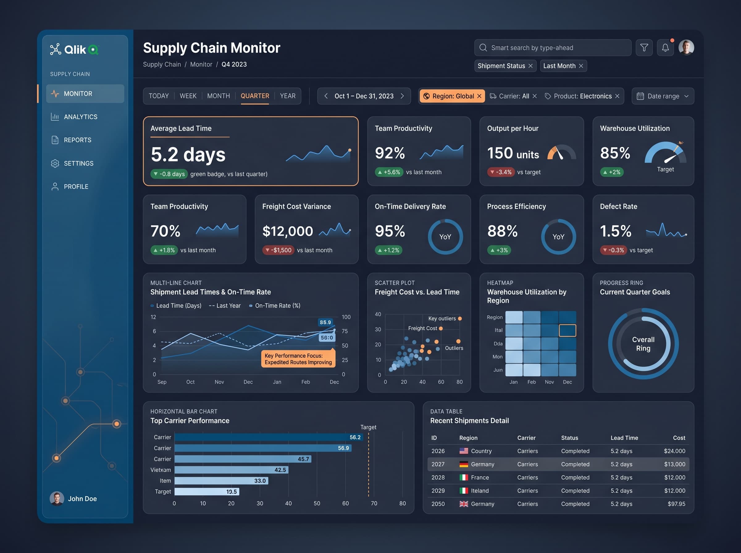
HighUtilize the dark theme with the custom colors (#7f40dd for headers and #f5db5b for key metrics) to create a visually striking contrast. Ensure a 4.5:1 ratio for accessibility on all text elements.
Layout & Grid System
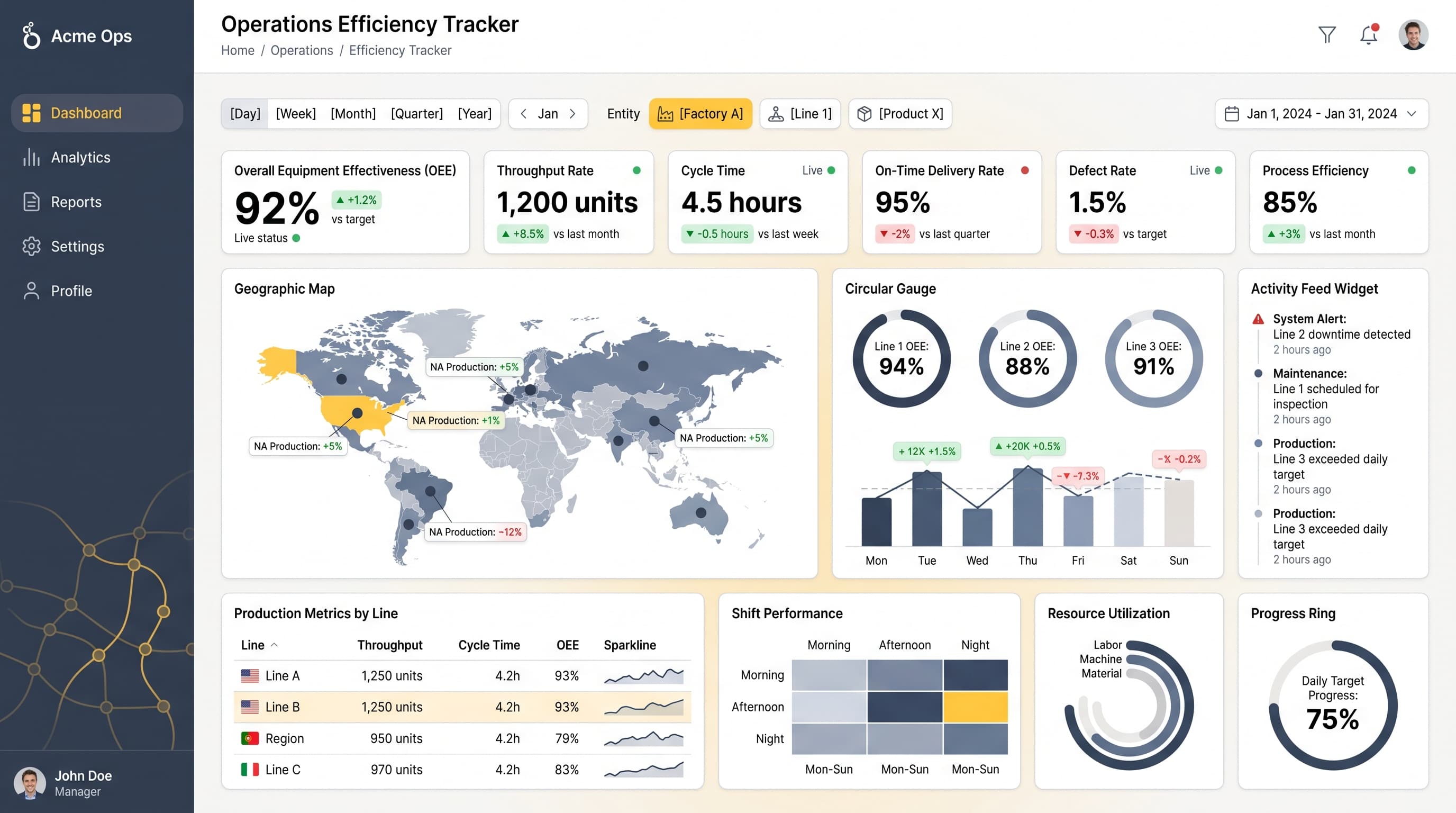
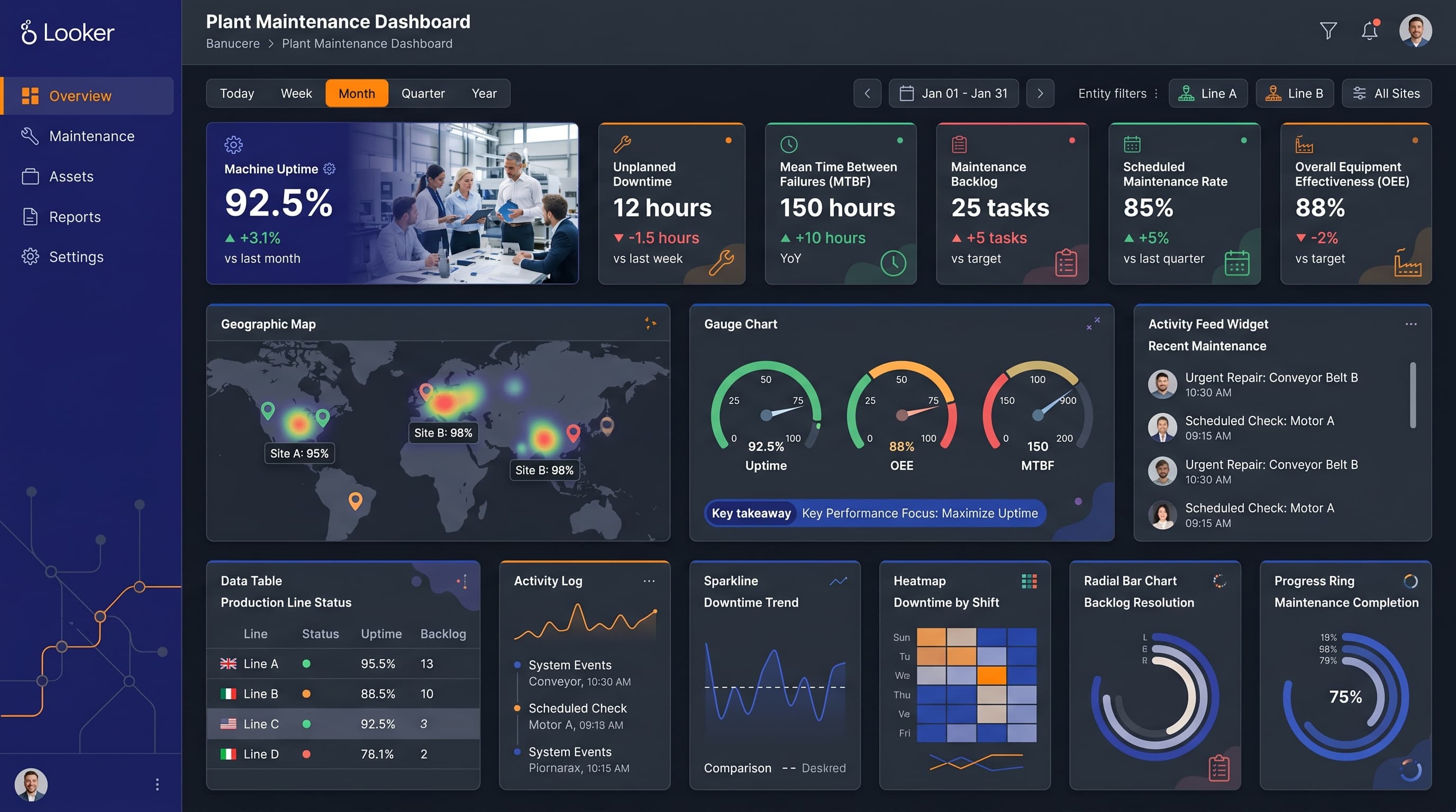
HighImplement a 12-column grid layout for a 16:9 ratio, positioning KPIs at the top row for immediate visibility. Place the geographic map in the first column, the gauge in the second column, and use remaining space for charts and tables.
Typography Hierarchy
MediumUse a single font family, such as Inter or Segoe UI, with a size hierarchy: Dashboard title at 28px bold, section headers at 20px semibold, KPI labels at 16px medium, and body text at 14px regular for clarity.
Data Visualization UX
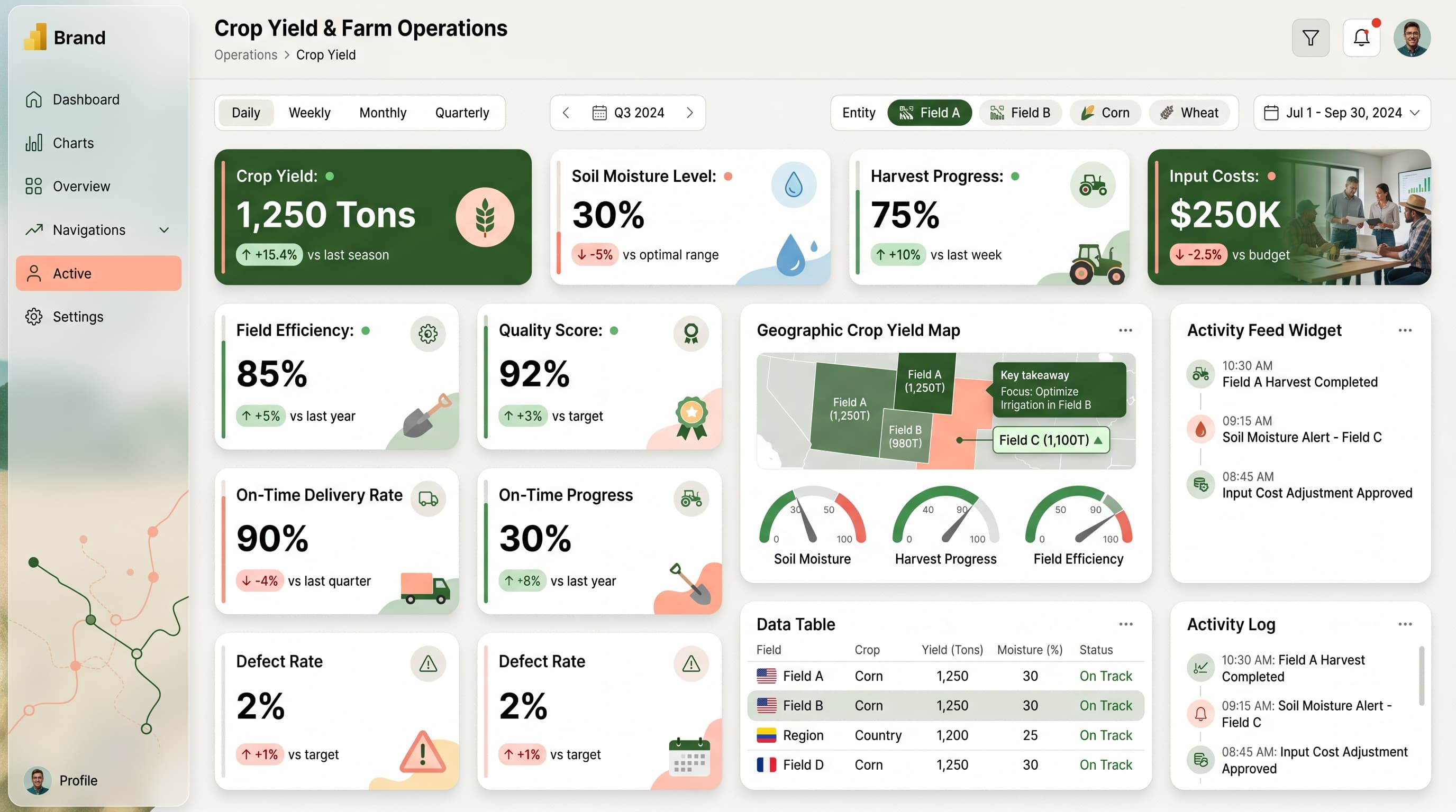
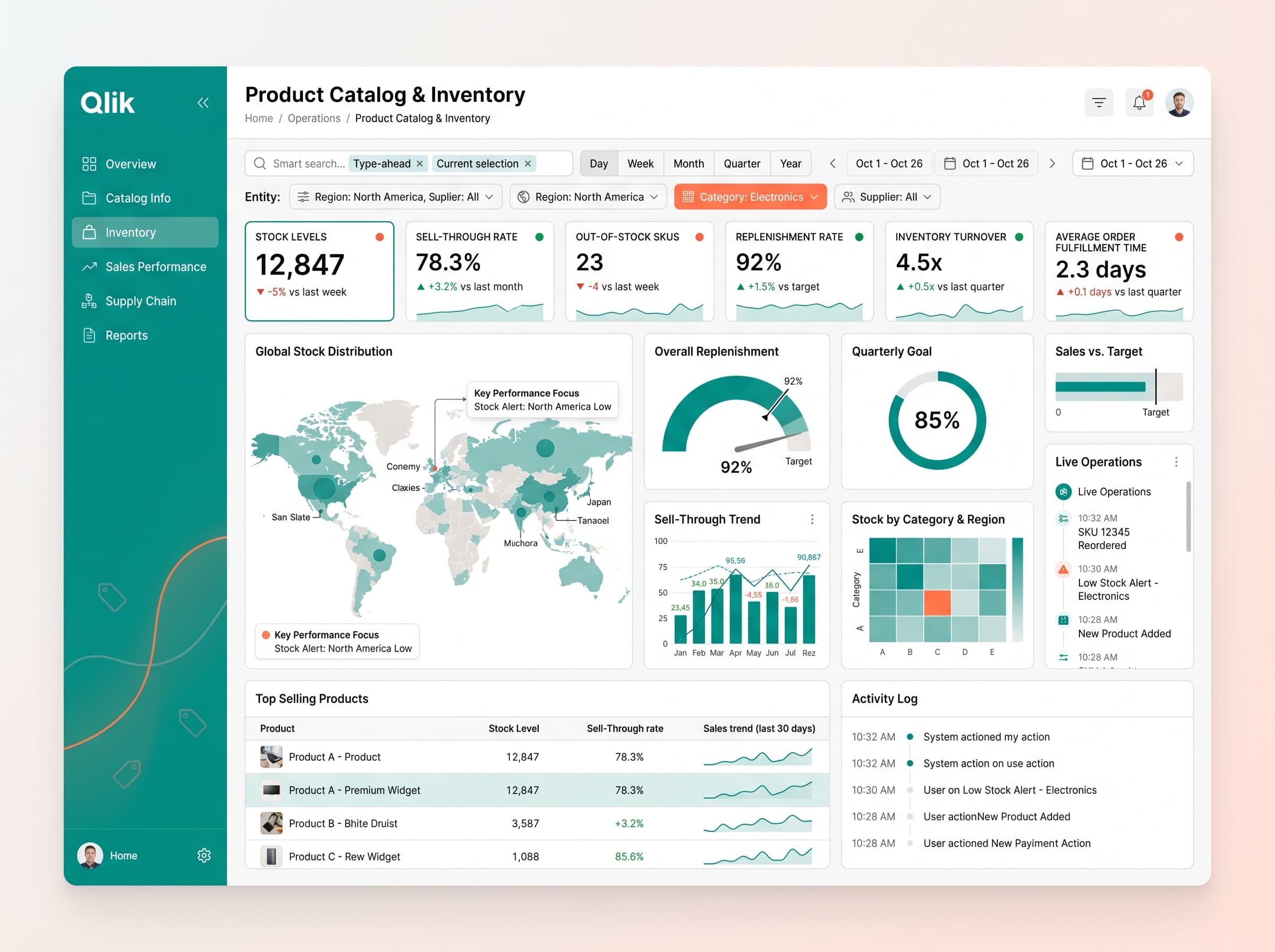
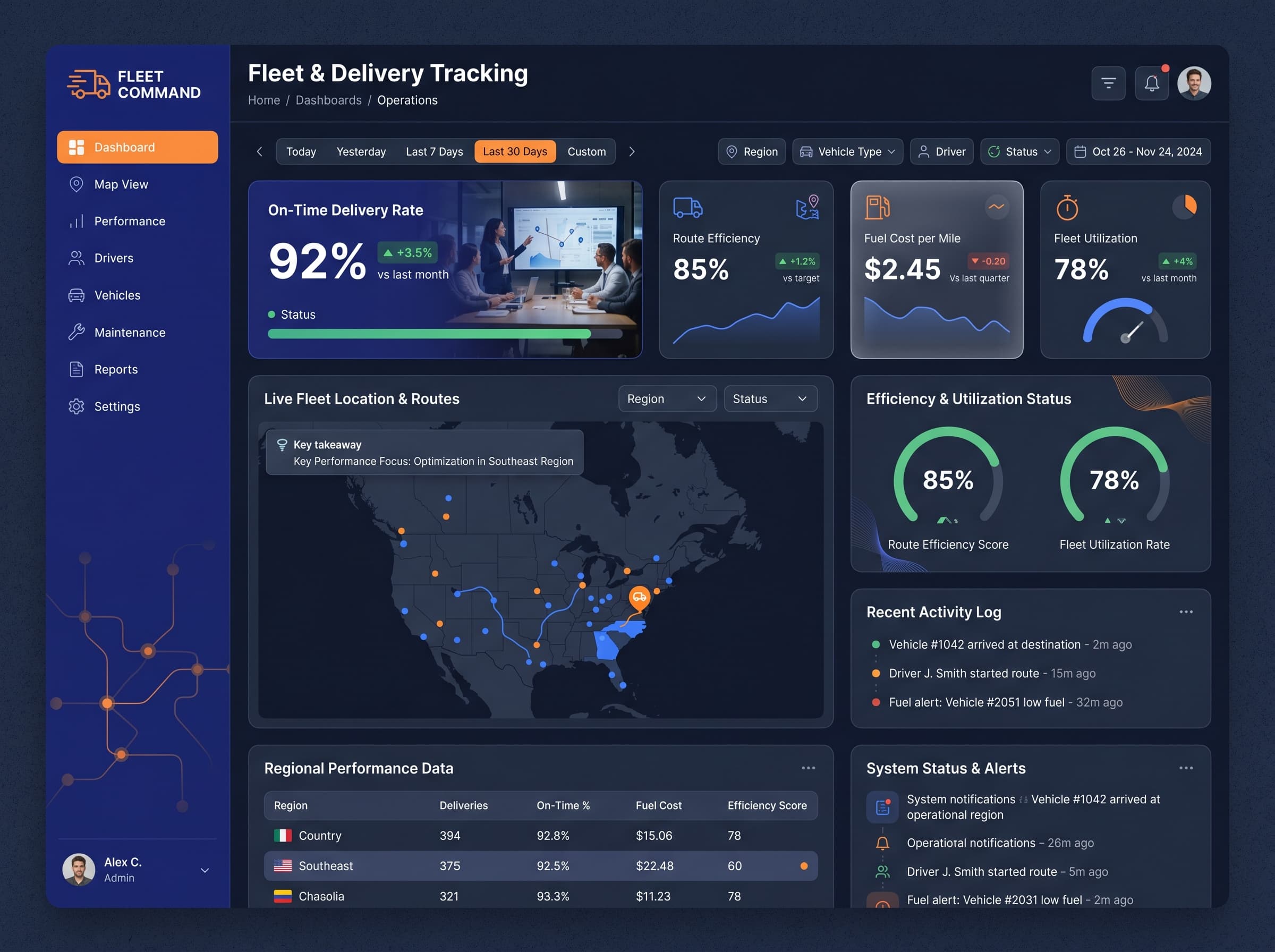
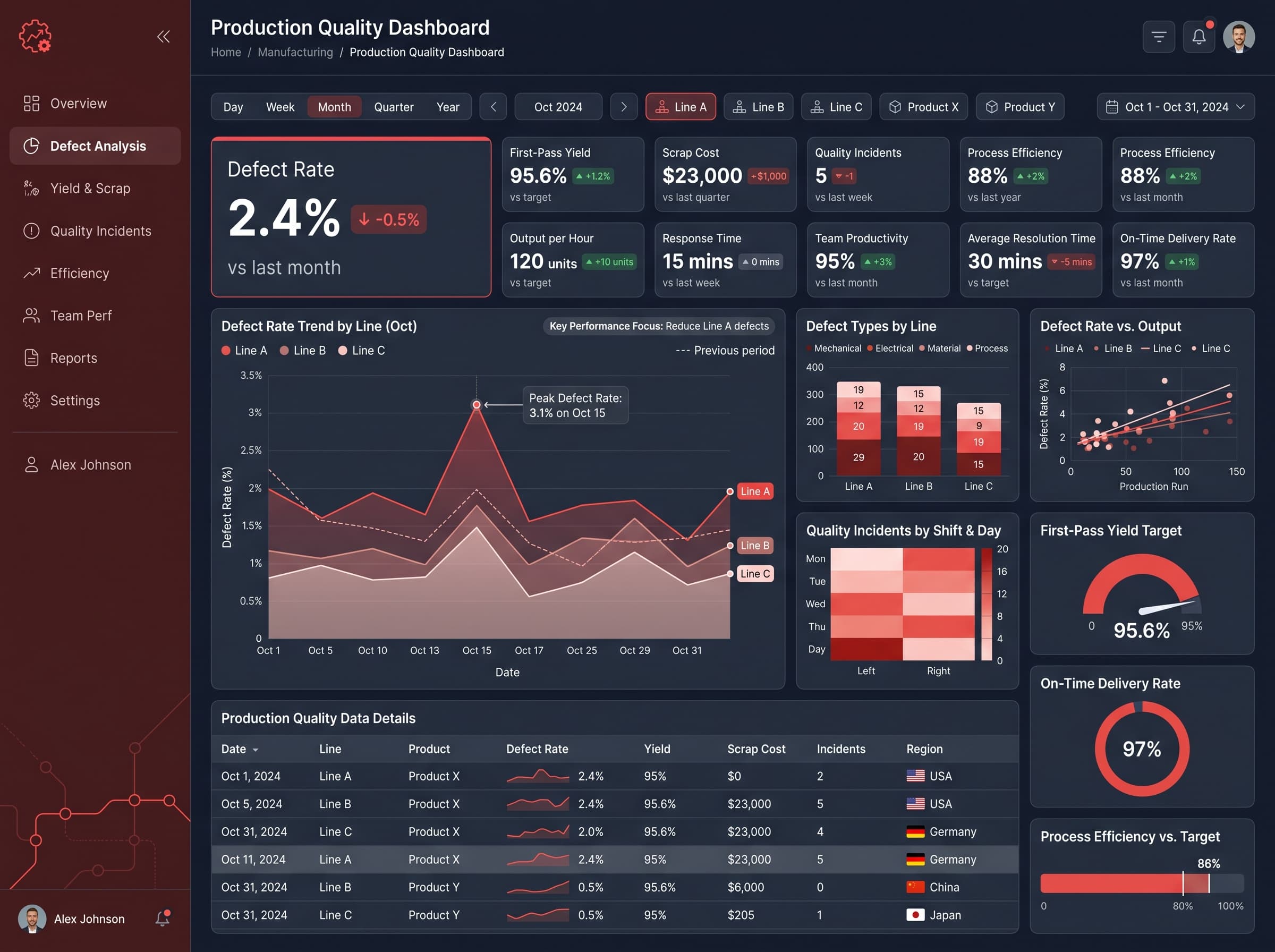
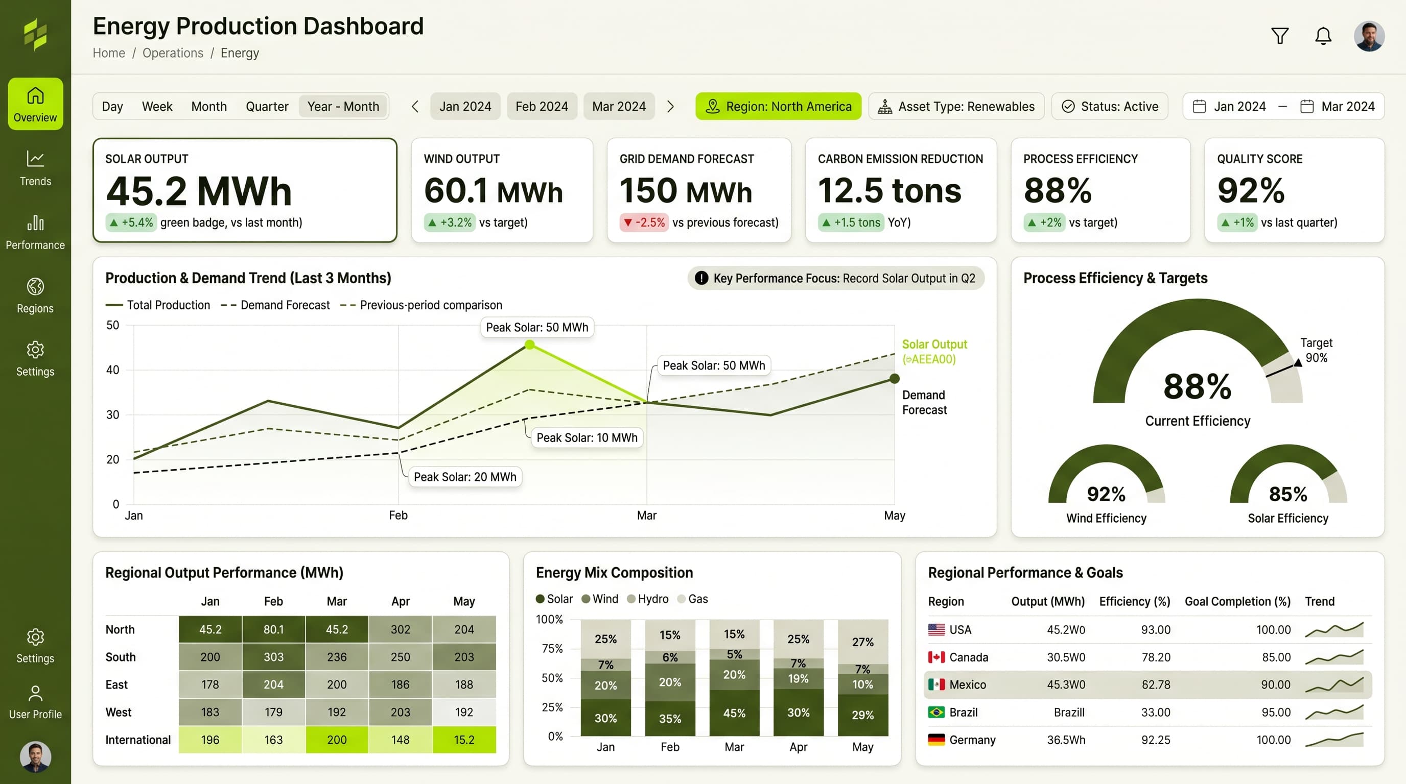
HighSelect chart types that best represent data context: use a geographic map for incident locations, gauge charts for latency targets, and heatmaps for error distribution. Limit colors per chart to ensure clarity and add tooltips for data context.
Visual Hierarchy & Focus
MediumCreate a clear visual hierarchy with the most critical metrics in larger, bolder fonts. Use whitespace effectively to separate sections and apply conditional formatting to highlight areas of concern, e.g., red for increasing latency.
Interaction & Feedback
LowImplement hover states for interactive elements to enhance user experience. Use loading skeletons during data refresh and provide visual feedback on filter selections to keep users informed.