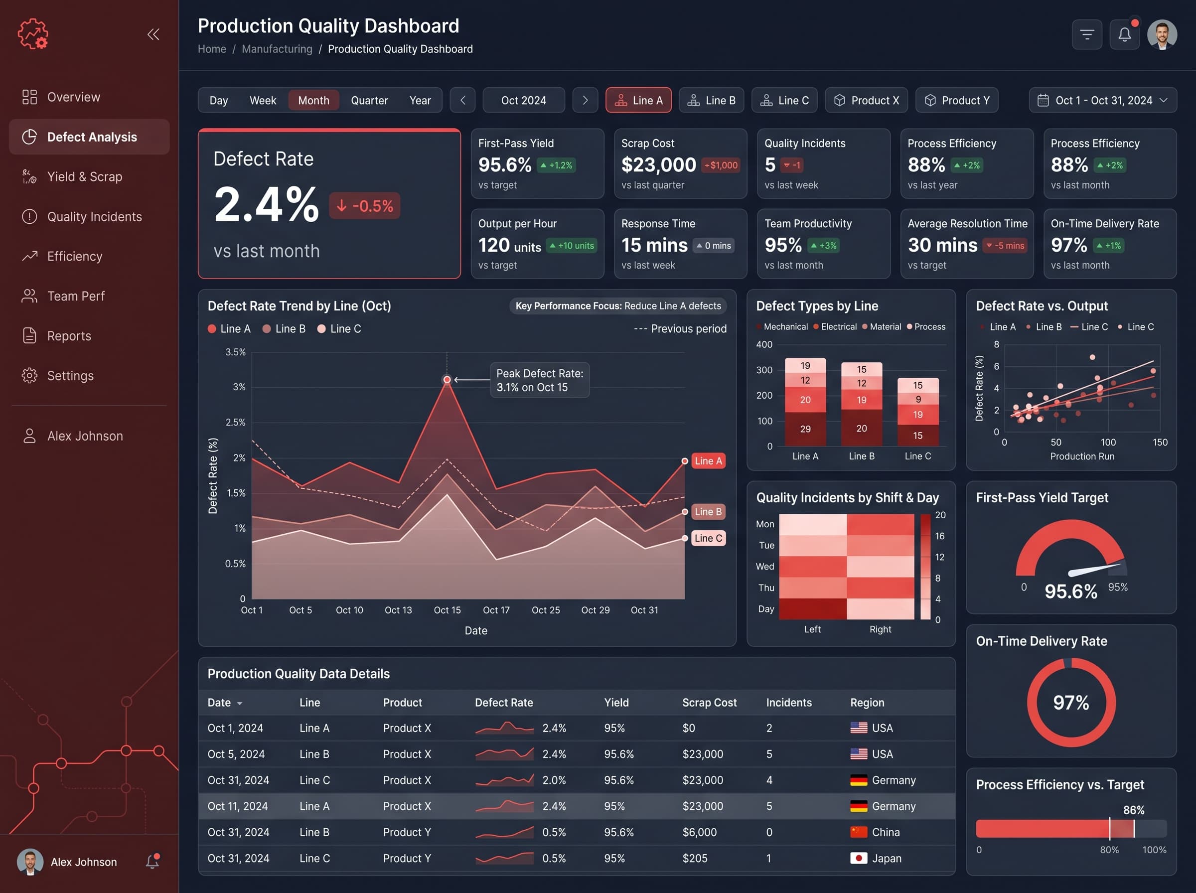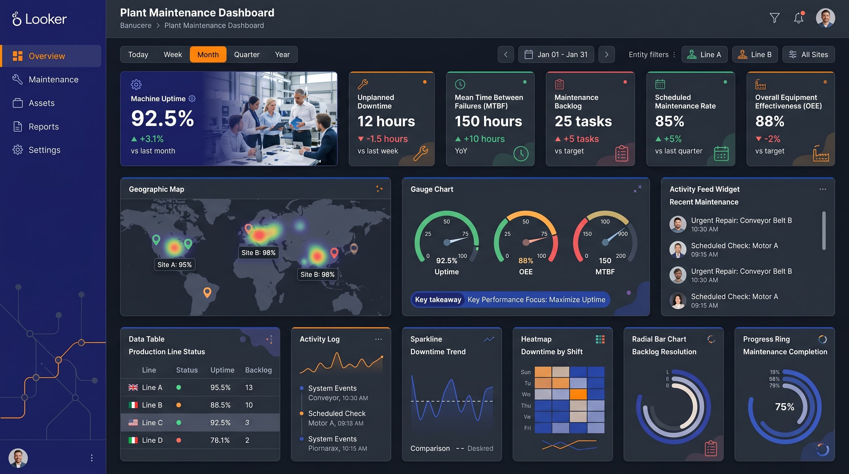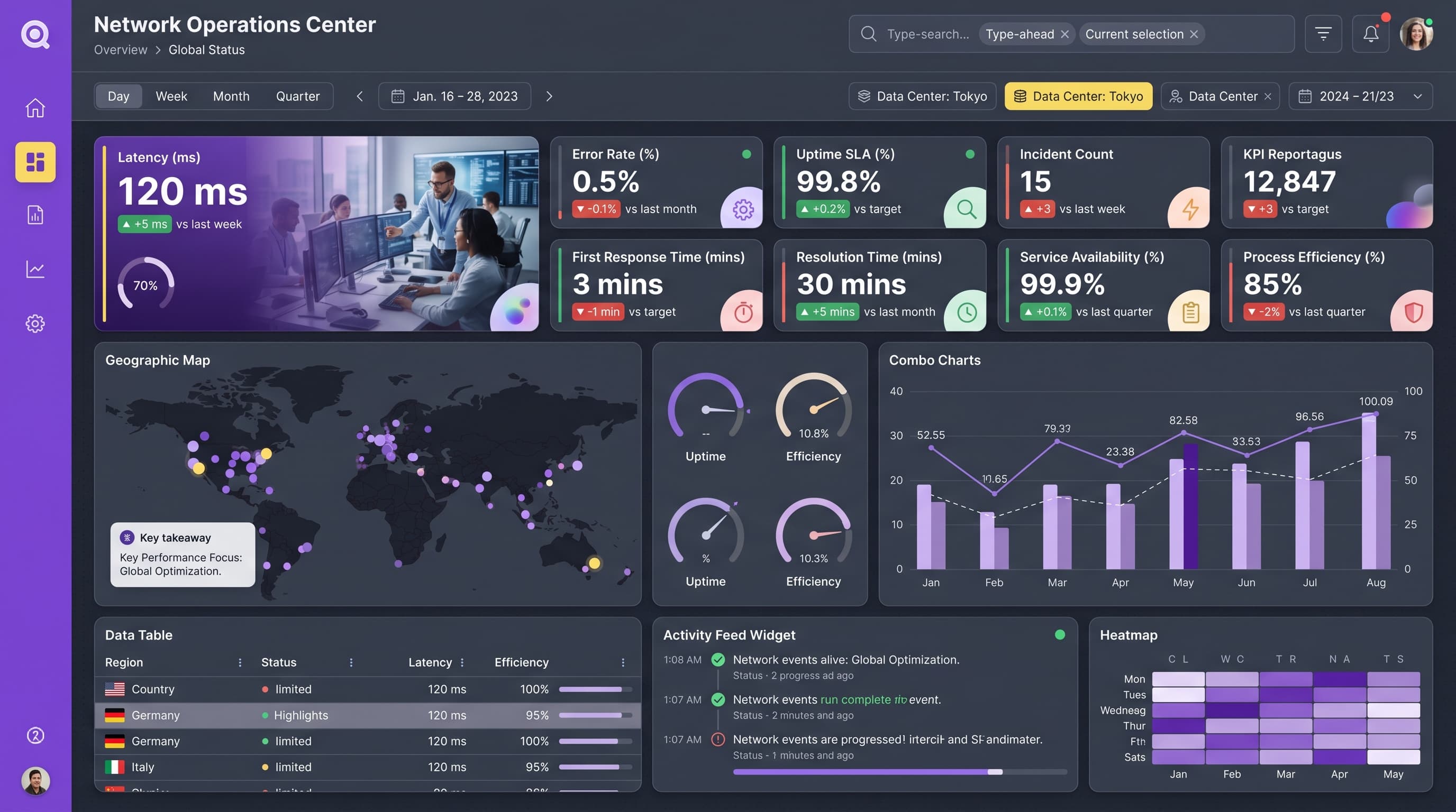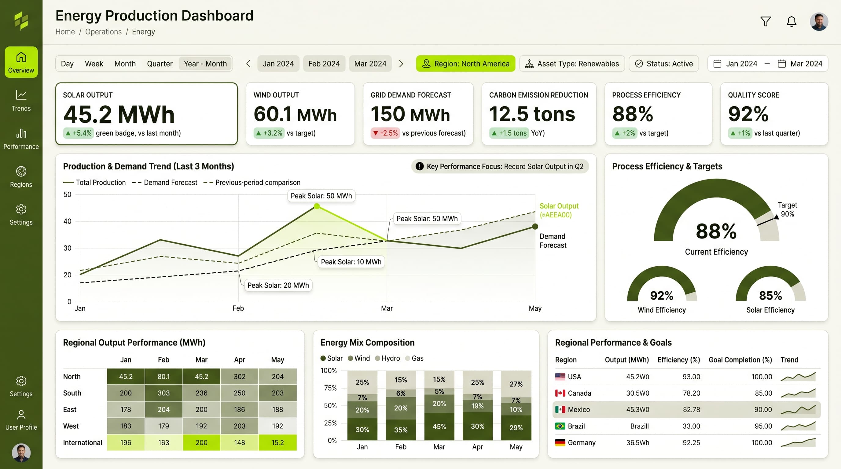

About this dashboard
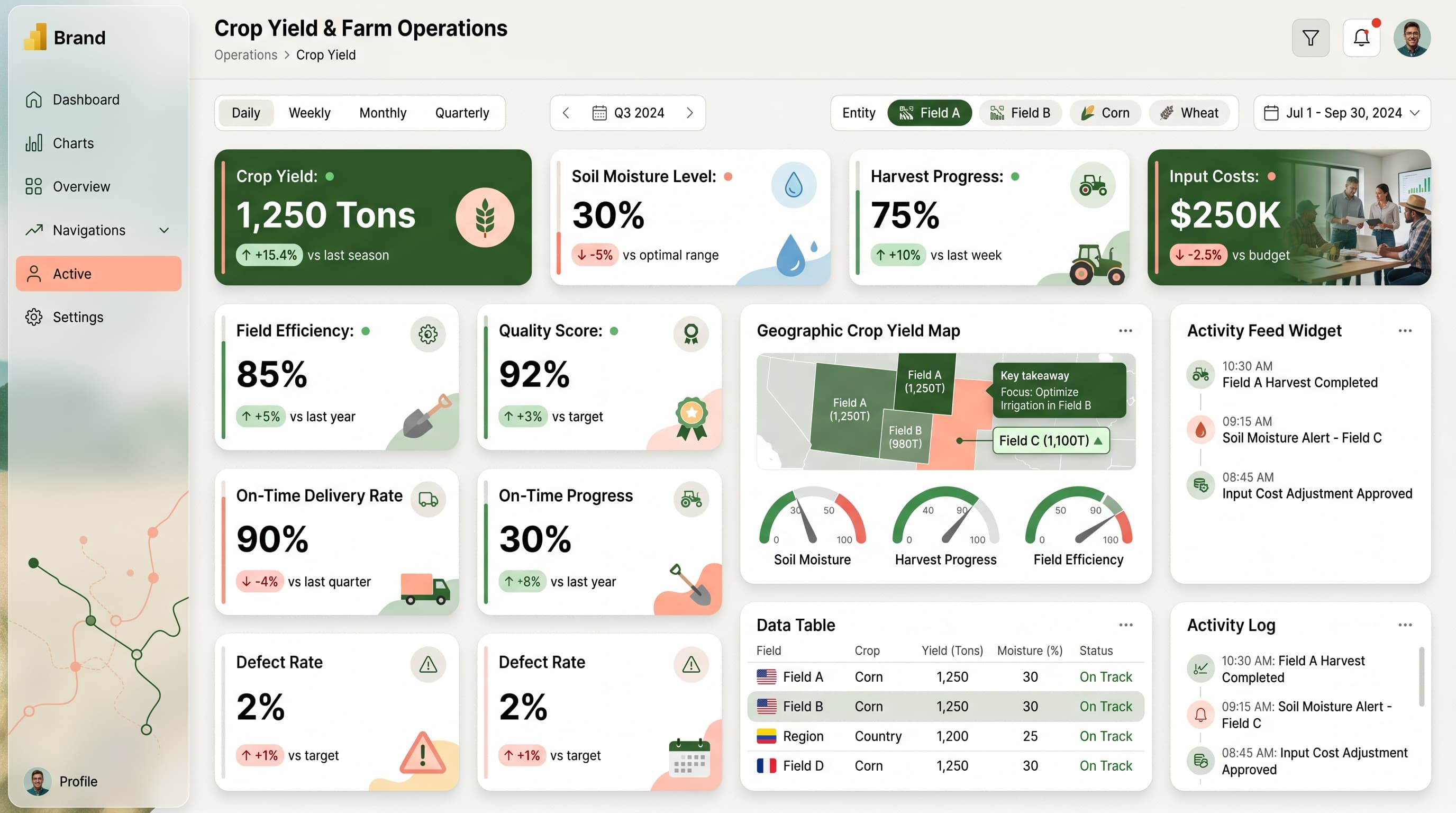
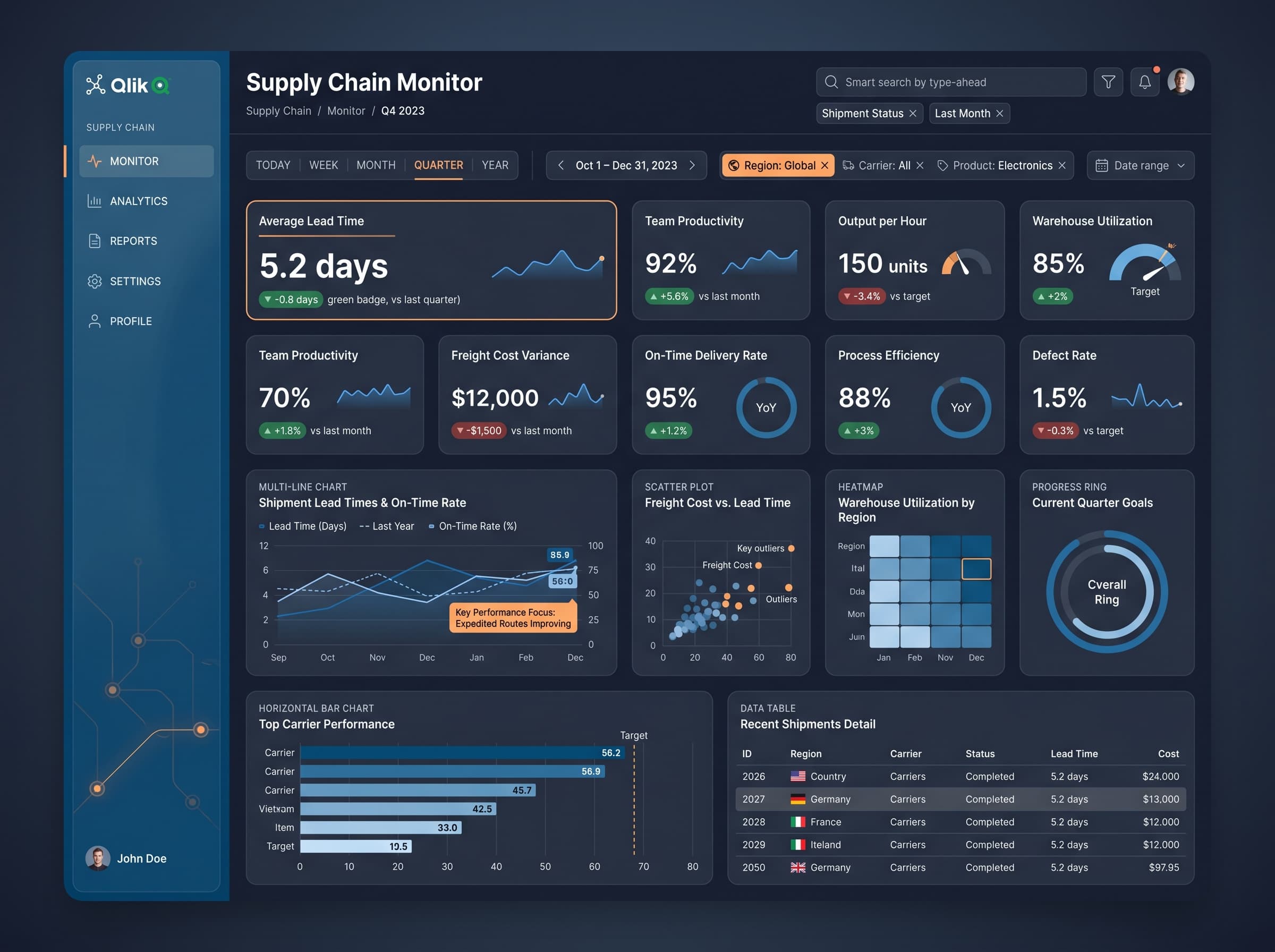
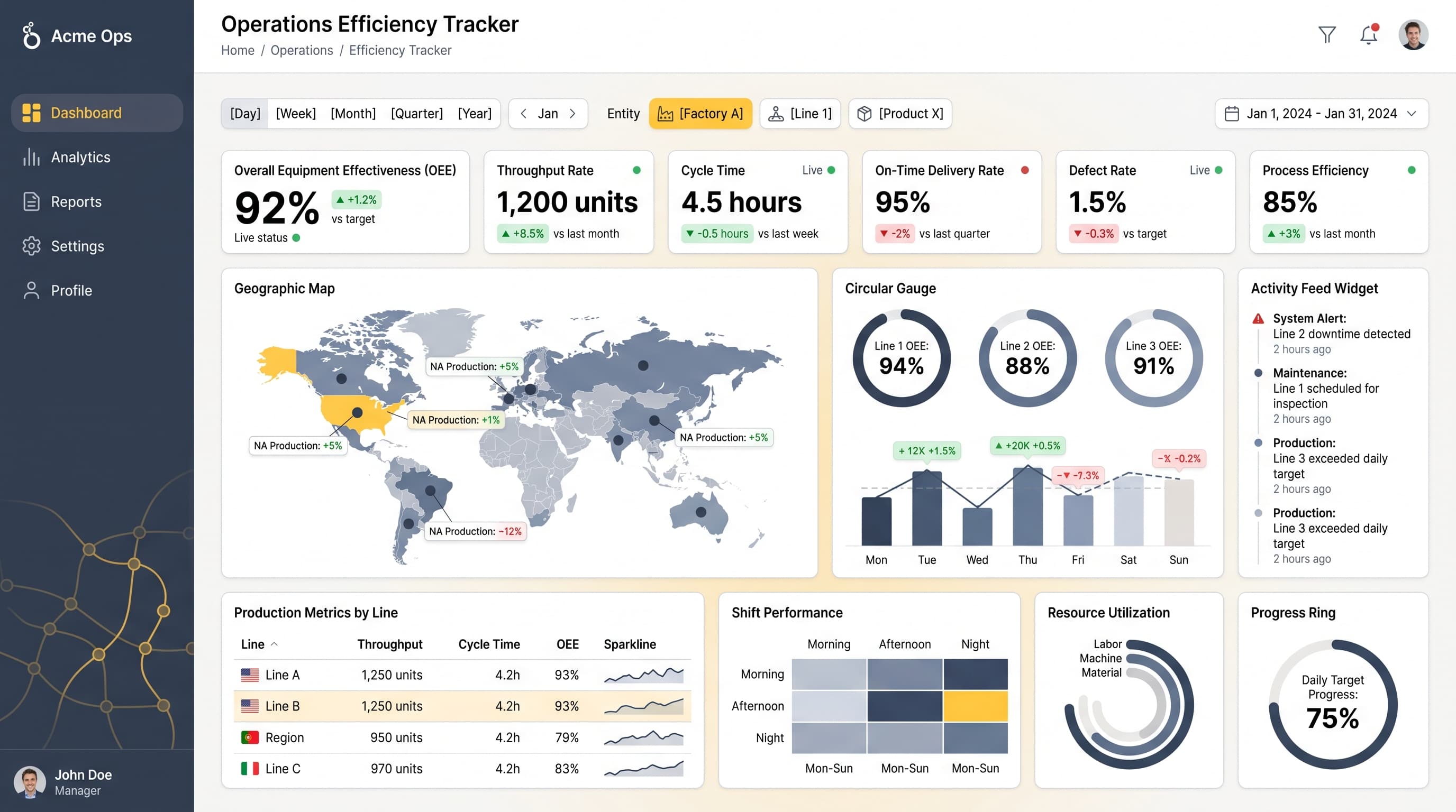
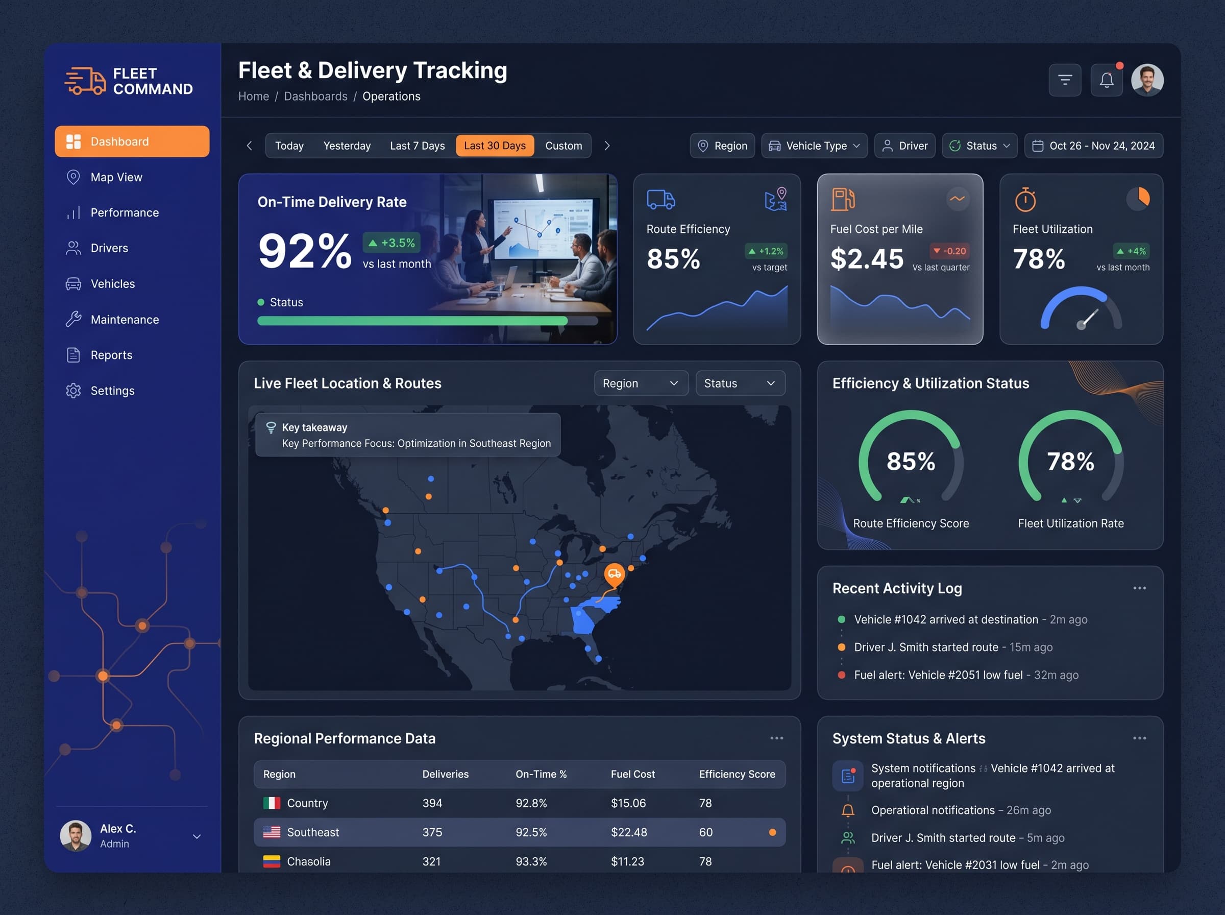
Monitor stock levels, sell-through rates, and out-of-stock SKUs across product categories.
KPIs tracked
Charts
Strategic insights
Design recommendations
Color Palette Strategy
HighUtilize the teal-coral palette effectively, ensuring a 4.5:1 contrast ratio for accessibility. Use teal for primary components and coral for highlights/alerts, maintaining consistency throughout the dashboard.
Layout & Grid System
HighImplement a 12-column grid for a 4:3 ratio. Place KPIs across the top for visibility, with detailed charts and tables in the middle. Maintain 16-24px padding and 16-20px gaps between elements to enhance readability.
Typography Hierarchy
MediumUse a typography hierarchy of 24-28px bold for the dashboard title, 18-20px semibold for section headers, 14-16px medium for card titles, and 12-14px regular for body text. Ensure consistent use of a single font family for clarity.
Data Visualization UX
HighSelect chart types that best represent data: use geographic maps for regional stock levels, gauges for KPI targets, and sparklines for trend visualization. Limit color usage to 5-7 per chart and include tooltips for additional context.
Visual Hierarchy & Focus
MediumEstablish a clear visual hierarchy by emphasizing the most critical metrics with larger, bolder elements. Use whitespace effectively to separate sections and apply conditional formatting to highlight anomalies.
Interaction & Feedback
LowImplement hover states with subtle opacity changes for interactive elements and loading skeletons during data refresh. Provide visual feedback on filter selections to enhance user experience.