About this dashboard
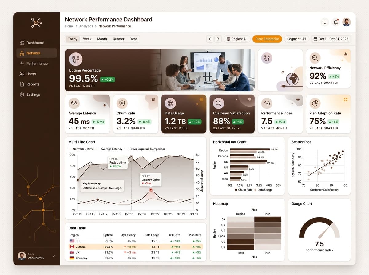
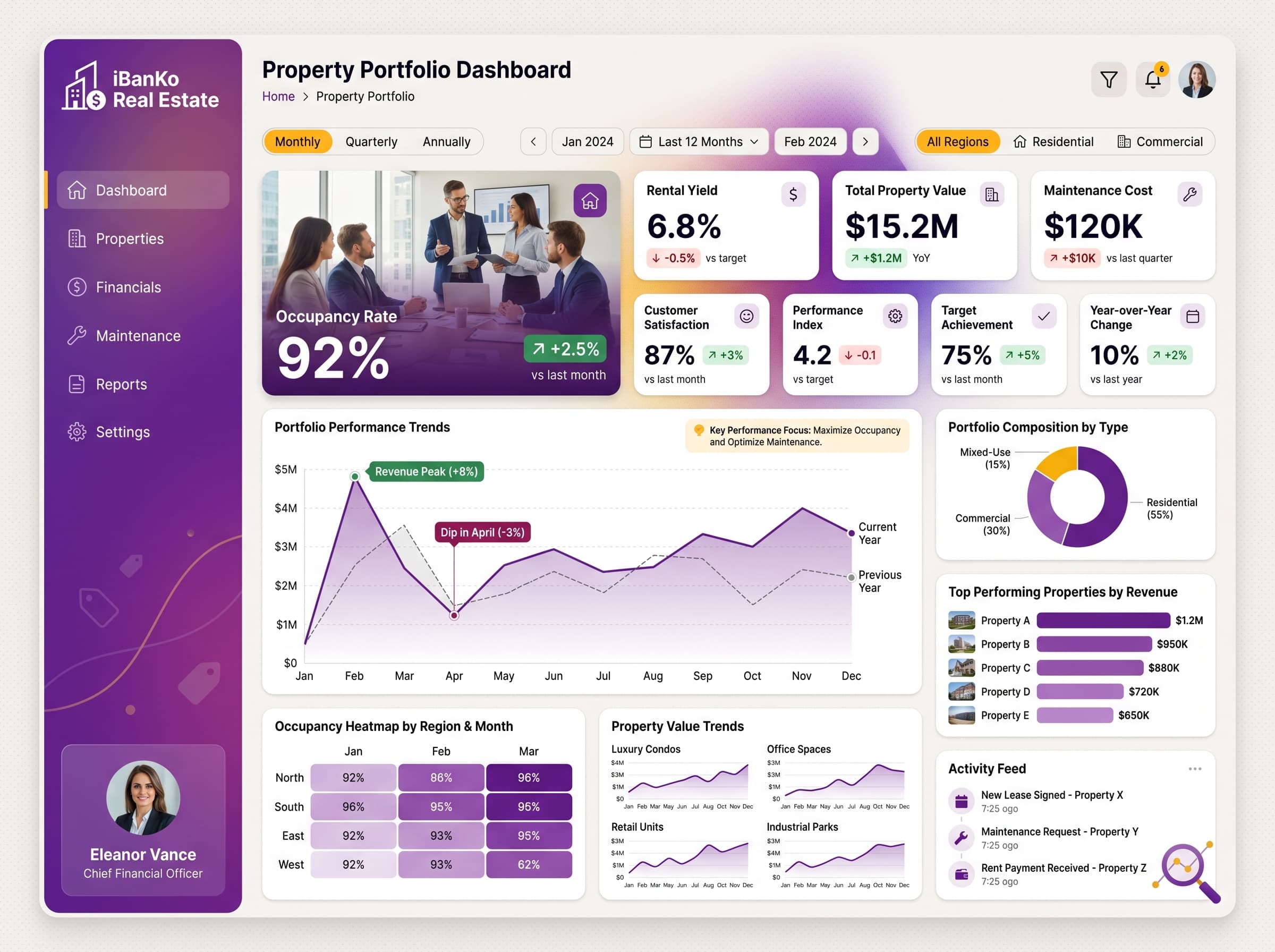
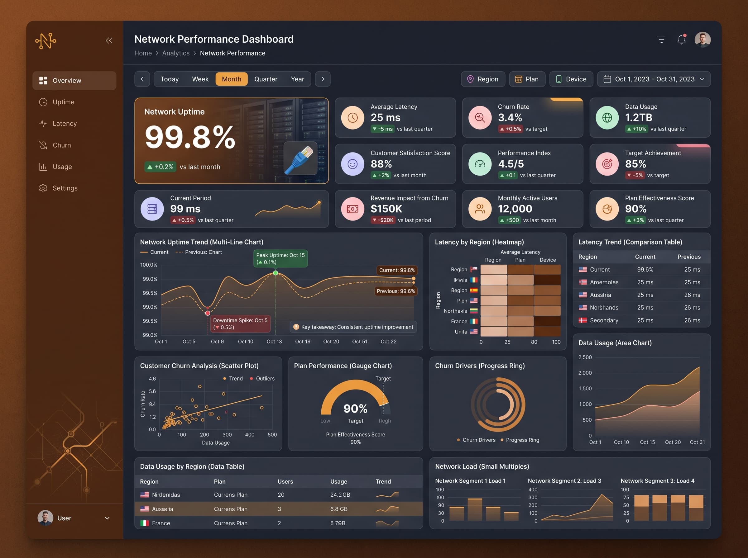
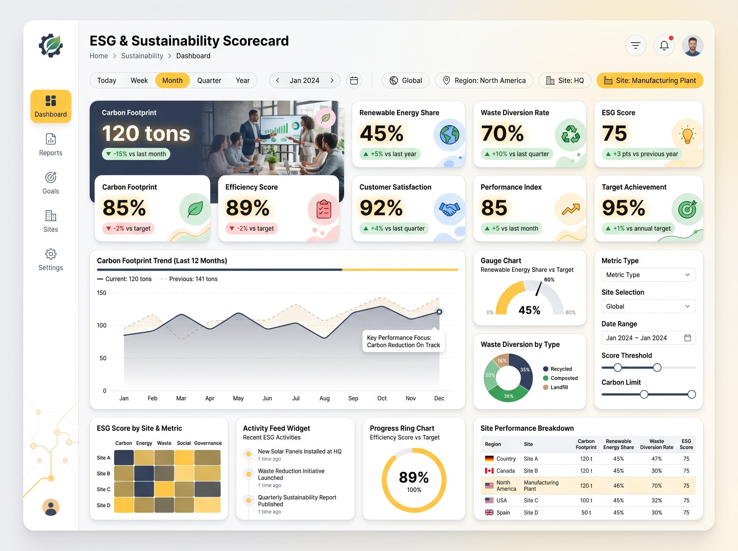
Real-time tracking of energy usage, peak demand, cost per kWh, and carbon emissions by facility.
KPIs tracked
Charts
Strategic insights
Design recommendations
Color Palette Strategy
HighUtilize a forest-peach color palette to enhance readability, ensuring a contrast ratio of at least 4.5:1 for text against backgrounds. Use primary colors for headers and critical metrics, while secondary colors can highlight alerts.
Layout & Grid System
HighEmploy a 12-column grid for a 4:3 layout. Position KPIs at the top for immediate visibility, with charts and feeds in the middle sections. Maintain 16px padding and 16-20px gaps between cards for clarity.
Typography Hierarchy
MediumSet the dashboard title at 24-28px bold. Use 18-20px semibold for section headers, and 12-14px regular for body text. Ensure consistency by using a single font family, such as Inter or Segoe UI.
Data Visualization UX
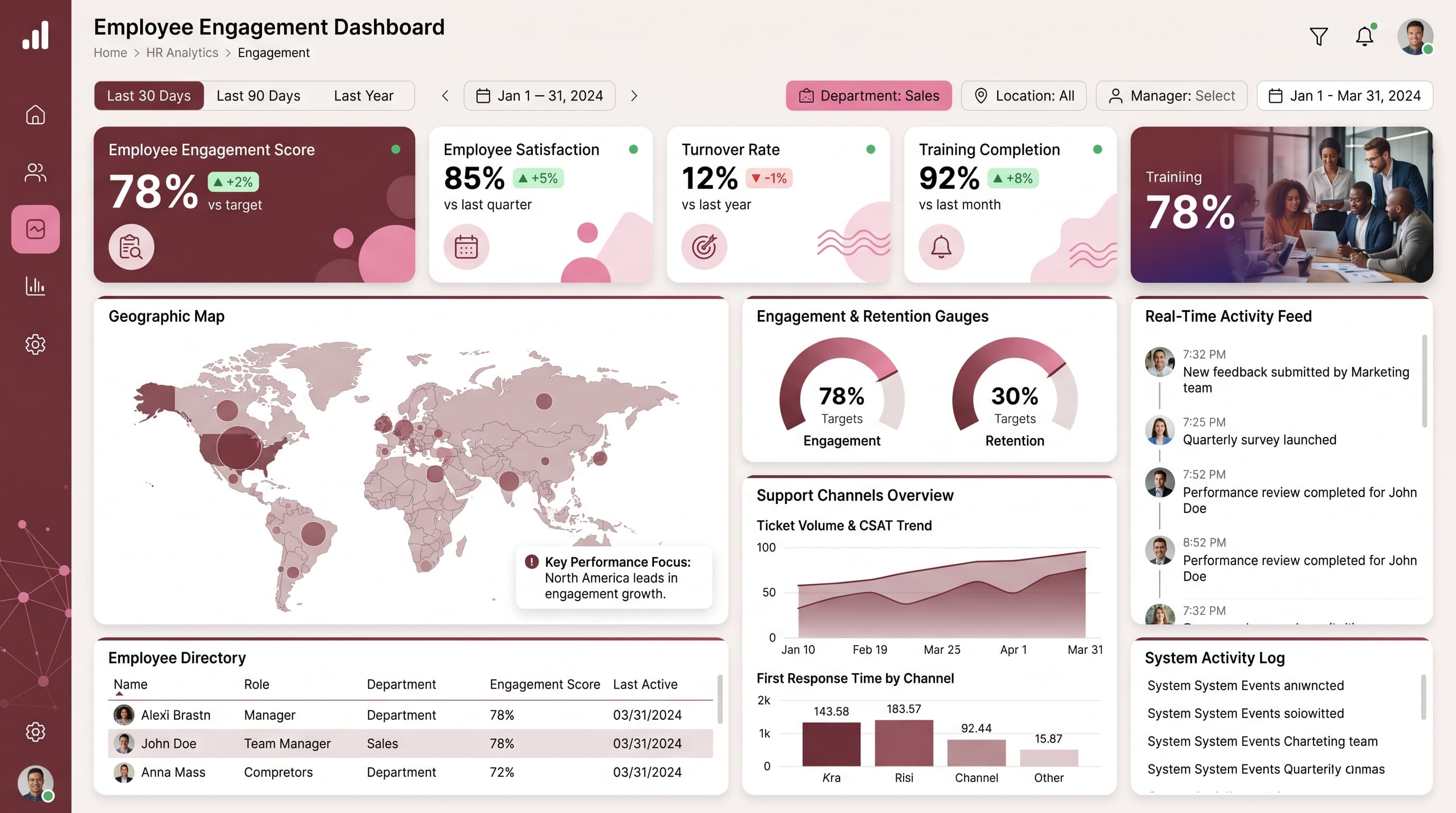
HighSelect chart types that match data semantics: use a Geographic Map for facility locations, Gauge Chart for peak demand, and Heatmap for consumption patterns. Ensure tooltips provide context and legends are clear.
Visual Hierarchy & Focus
MediumCreate a clear visual hierarchy where the most important metrics are the most prominent. Use whitespace effectively to separate sections and highlight anomalies with conditional formatting (green for positive, red for negative).
Interaction & Feedback
LowImplement hover states on interactive elements to enhance user experience (e.g., slightly darker opacity). Use loading indicators for data refresh and provide visual feedback when filters are applied.