

Power BI Dashboard Examples
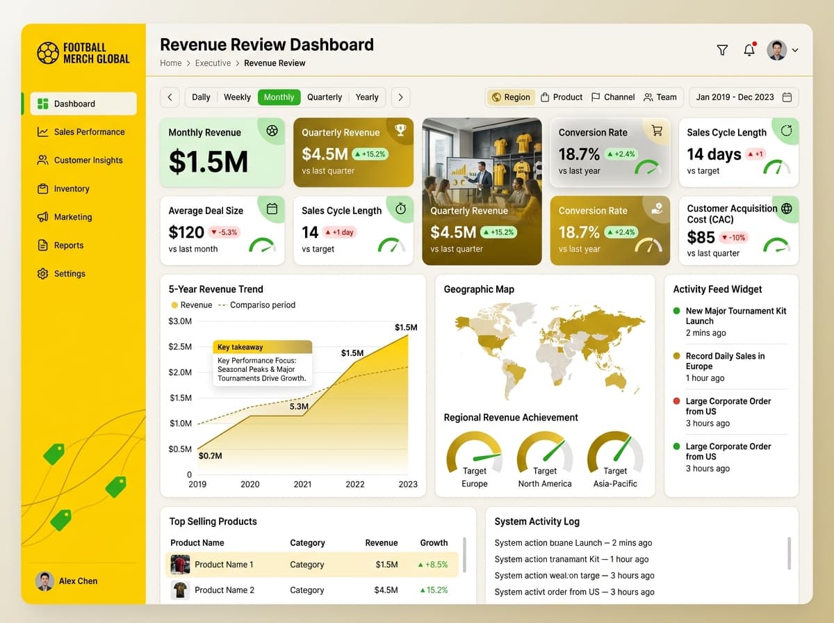
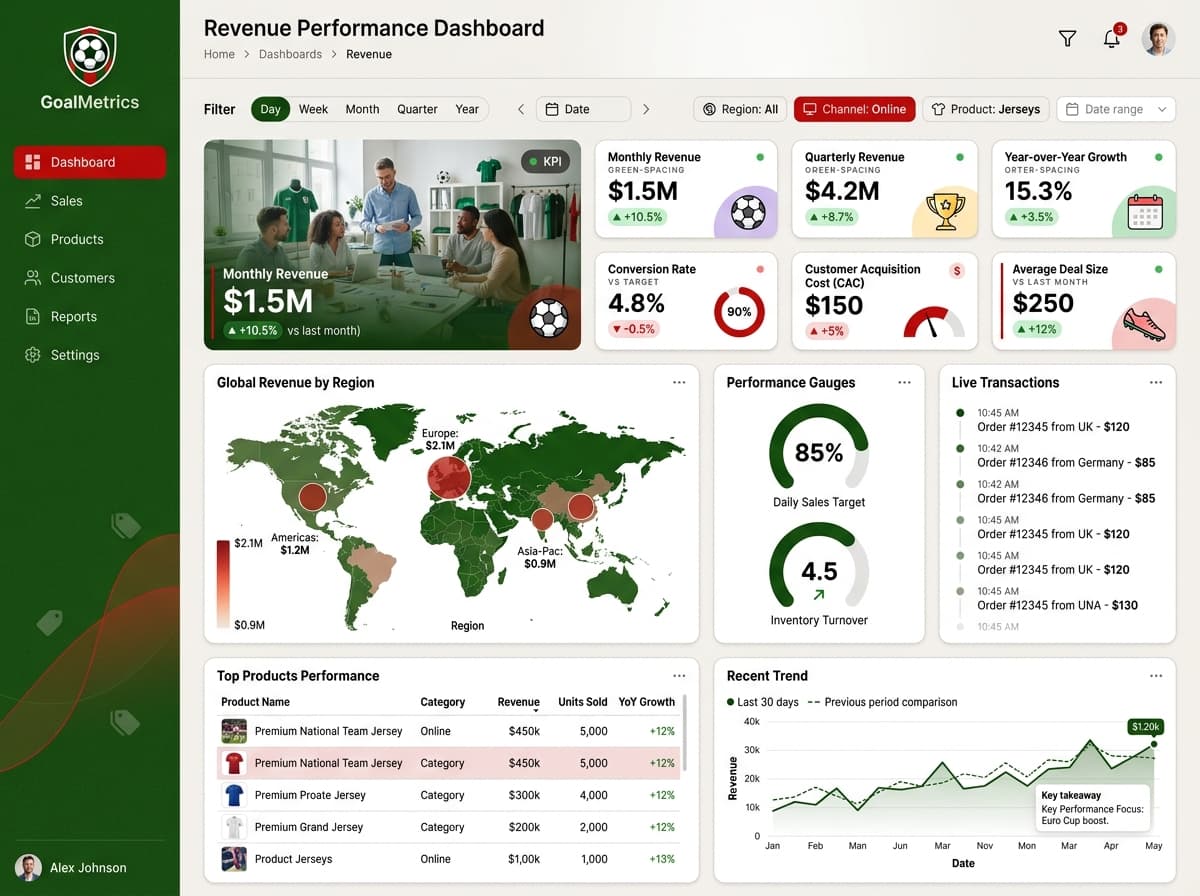
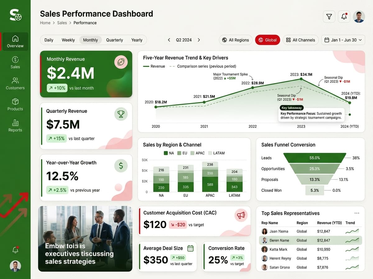
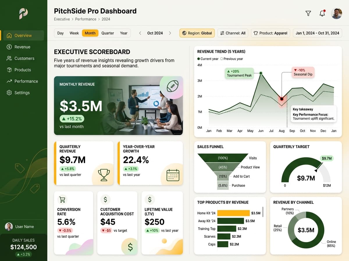
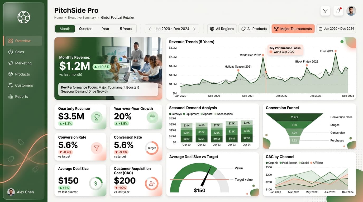
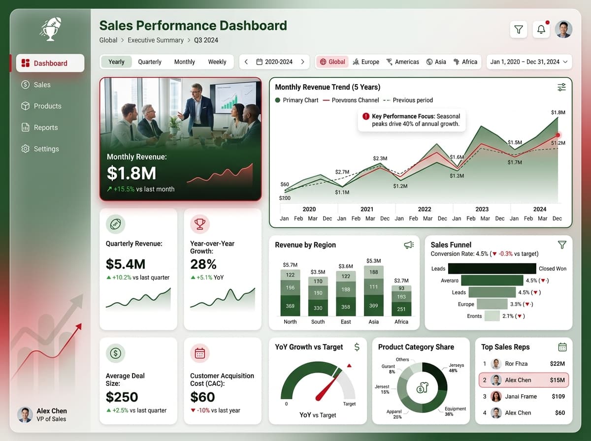
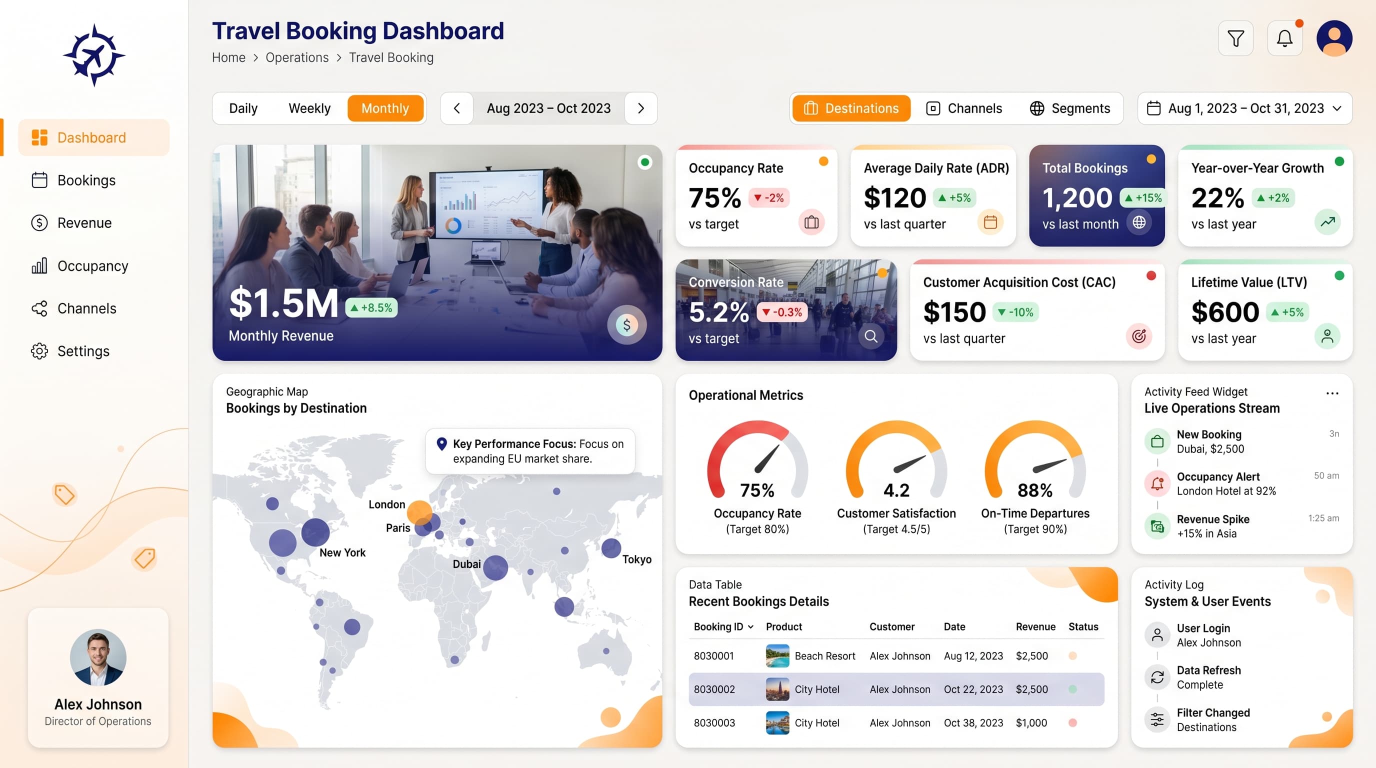
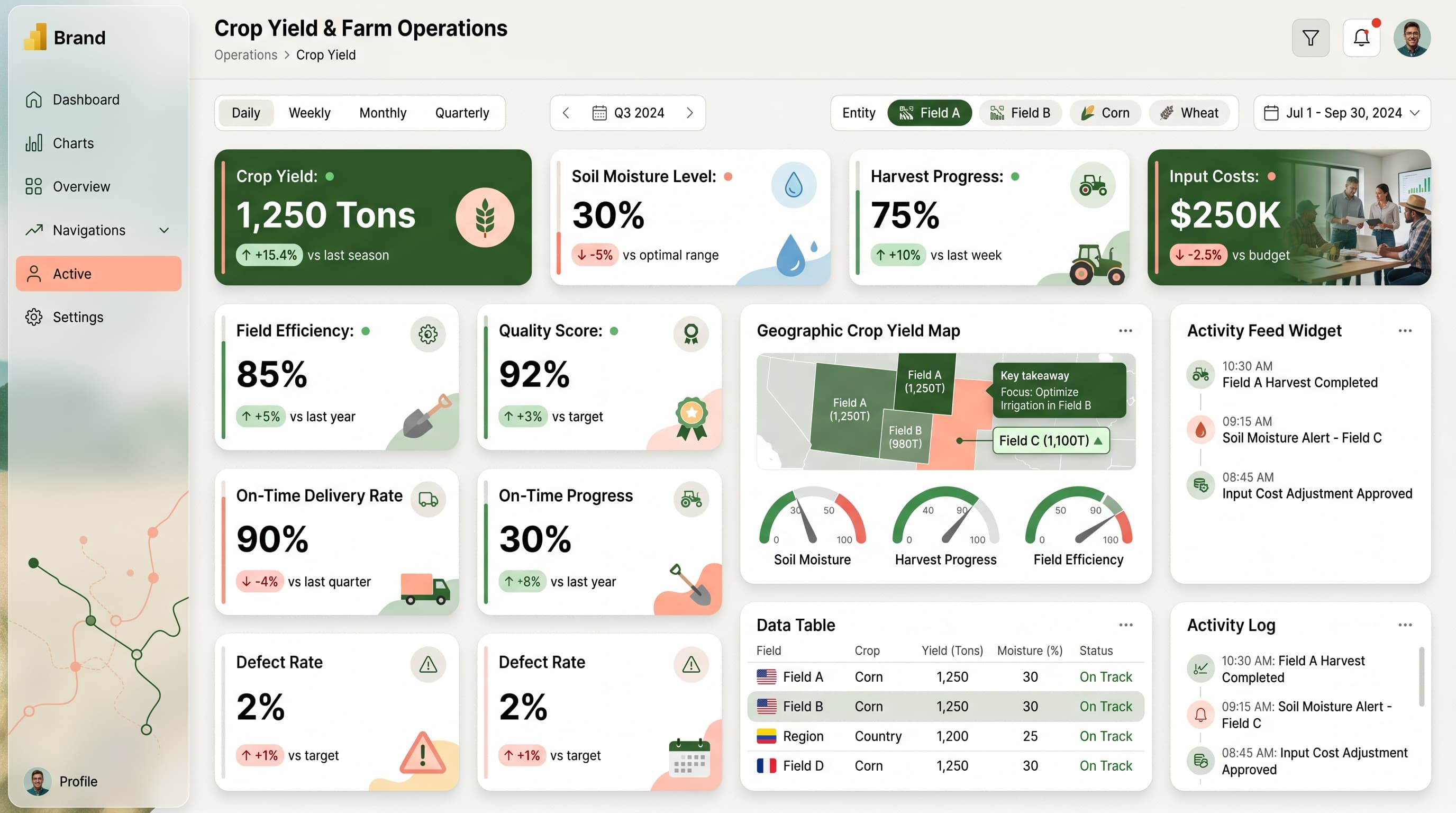
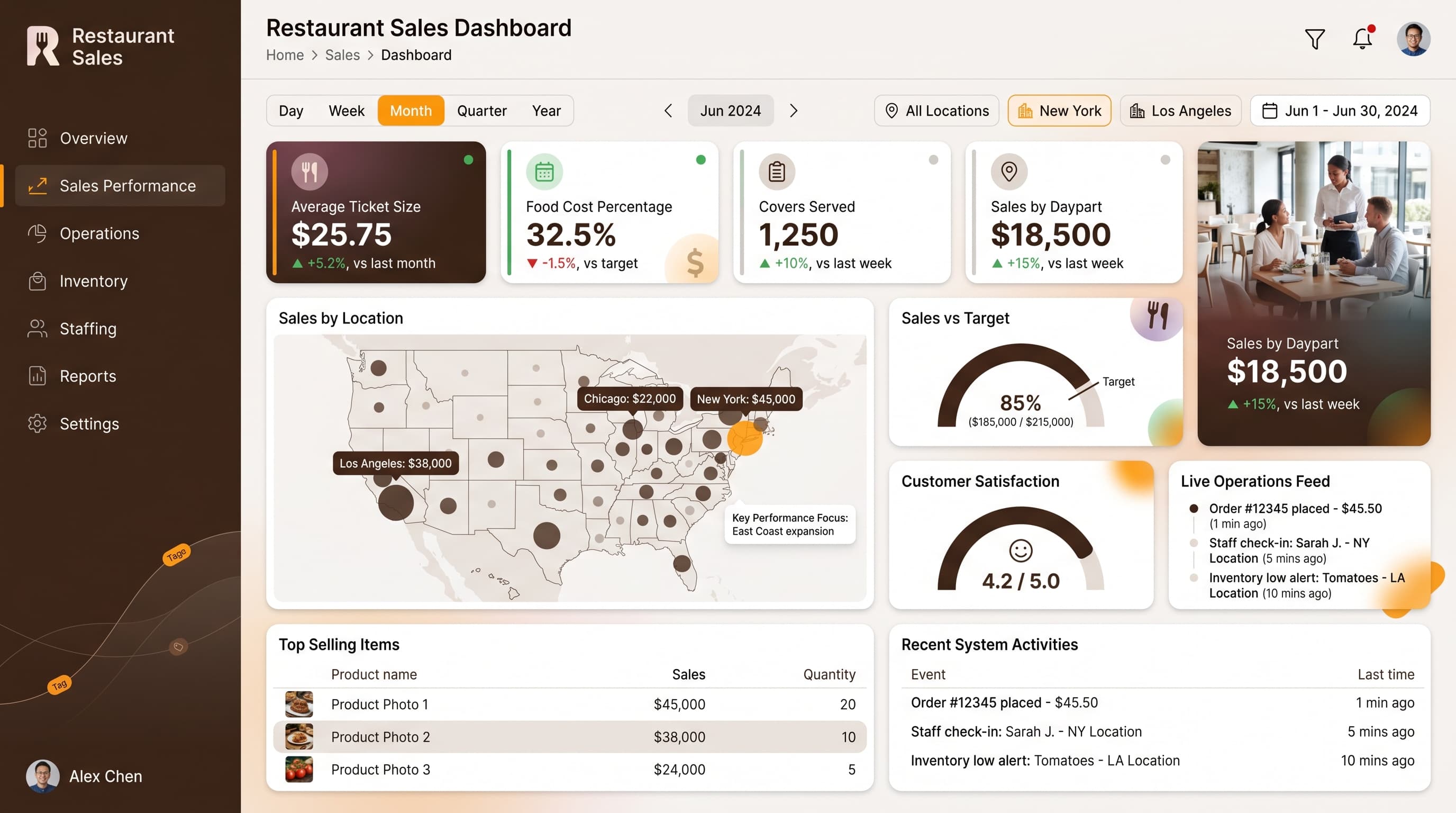
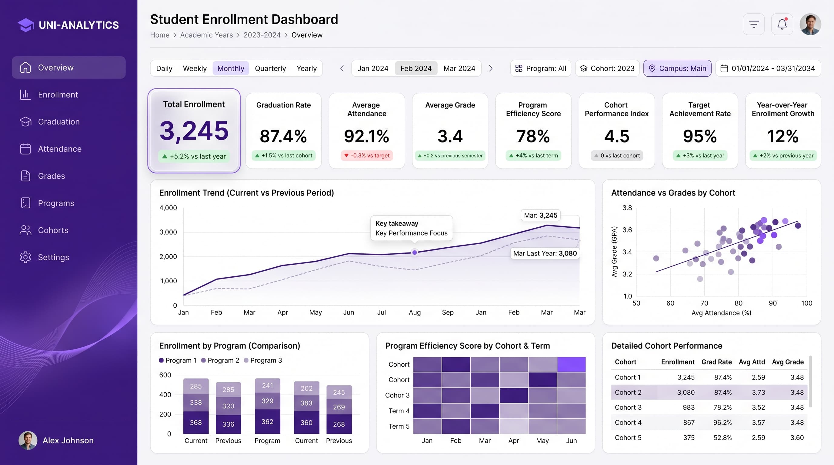
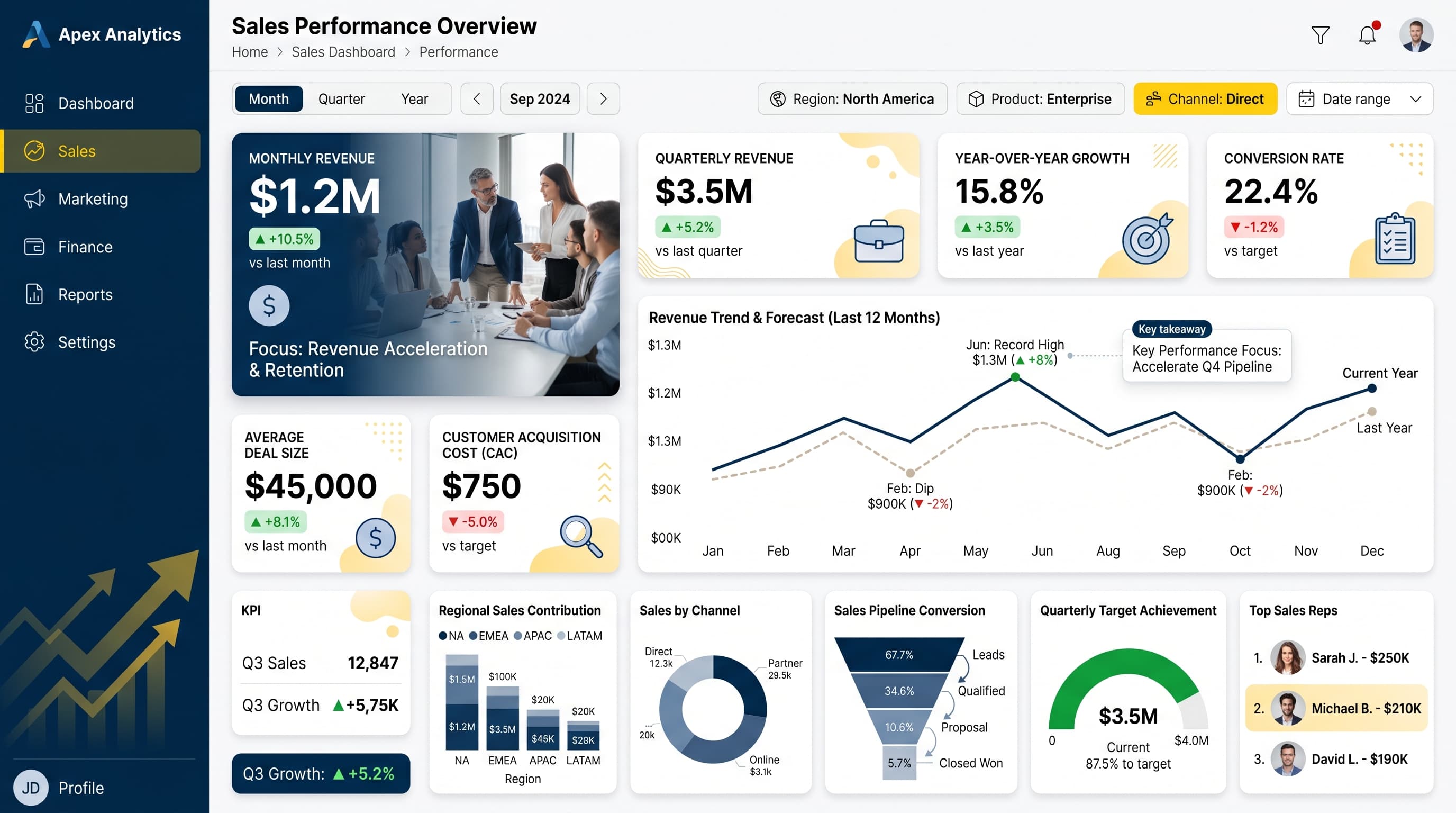
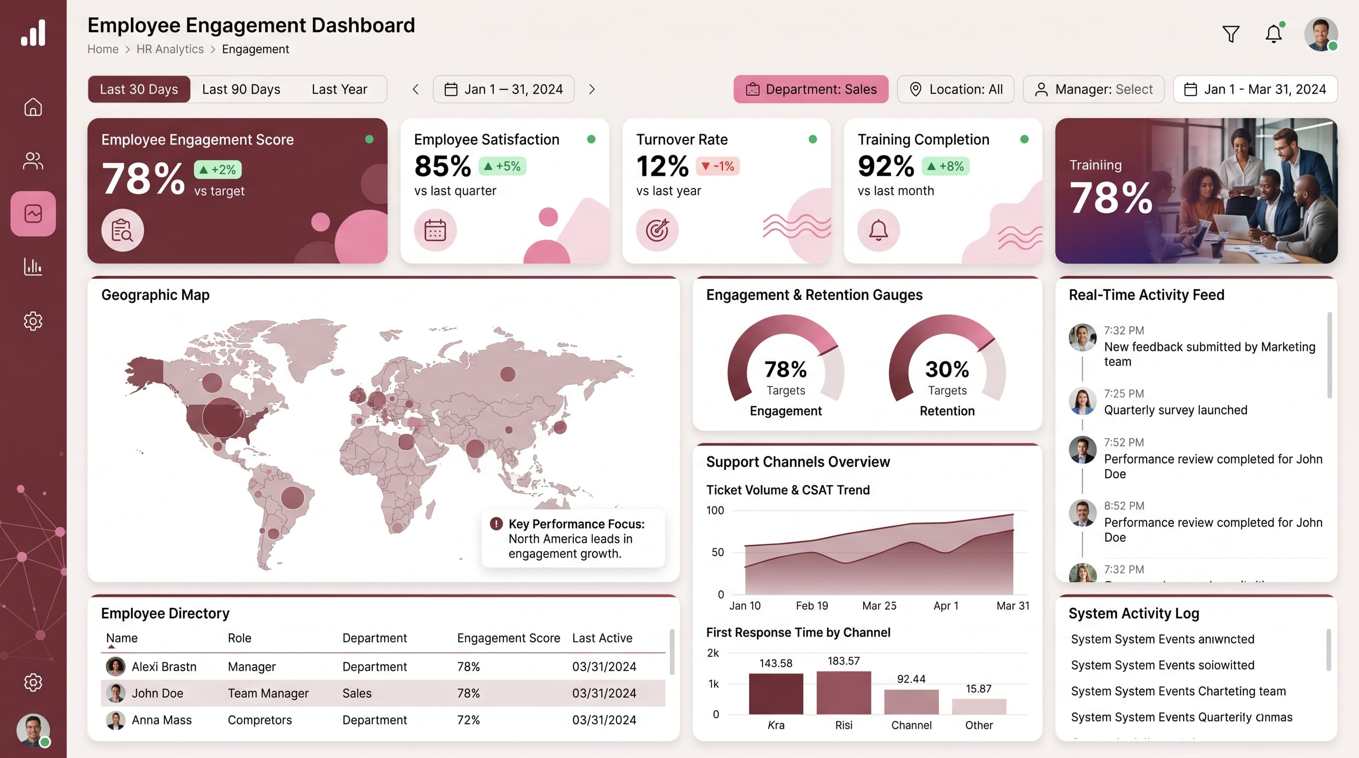
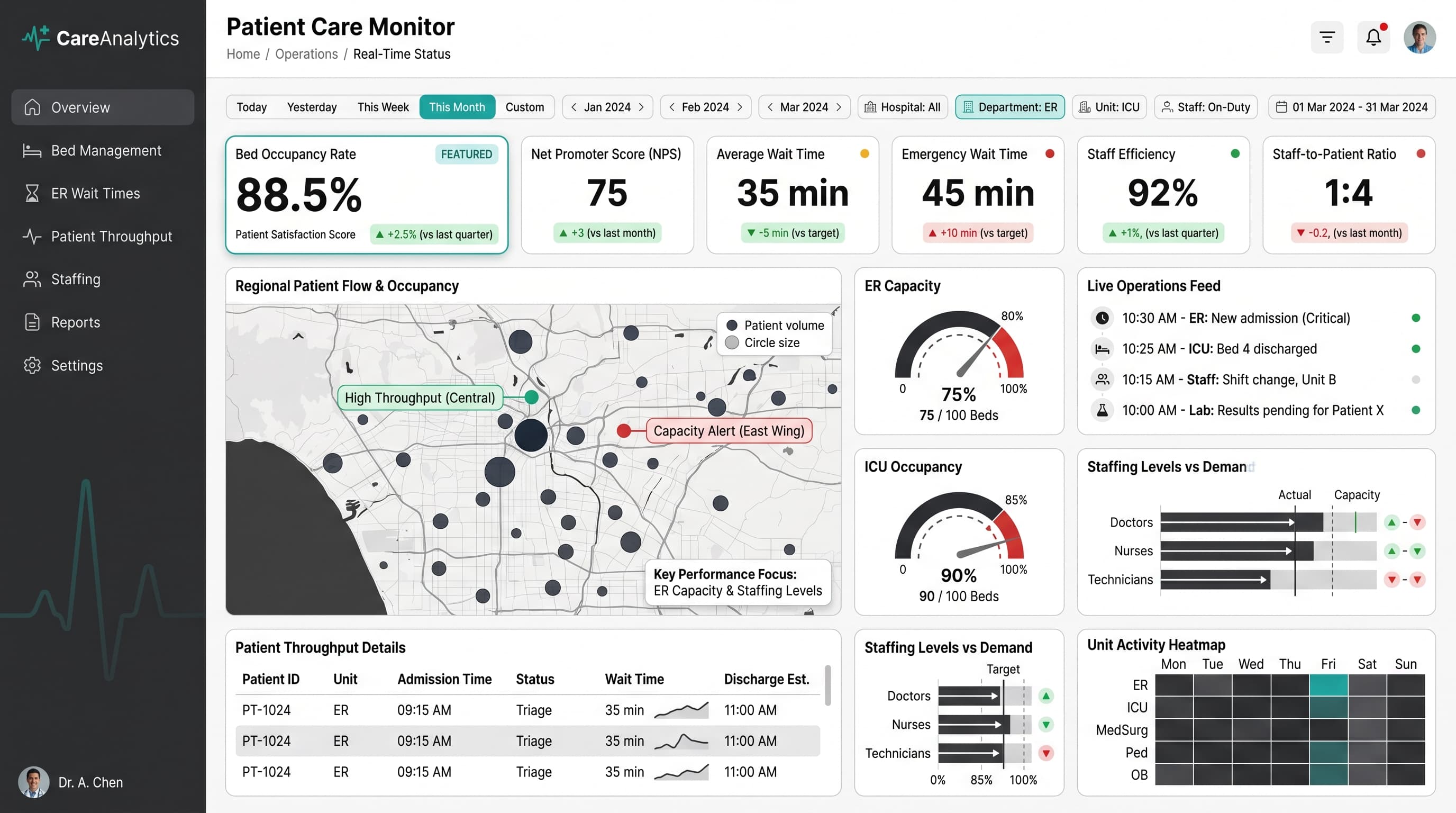
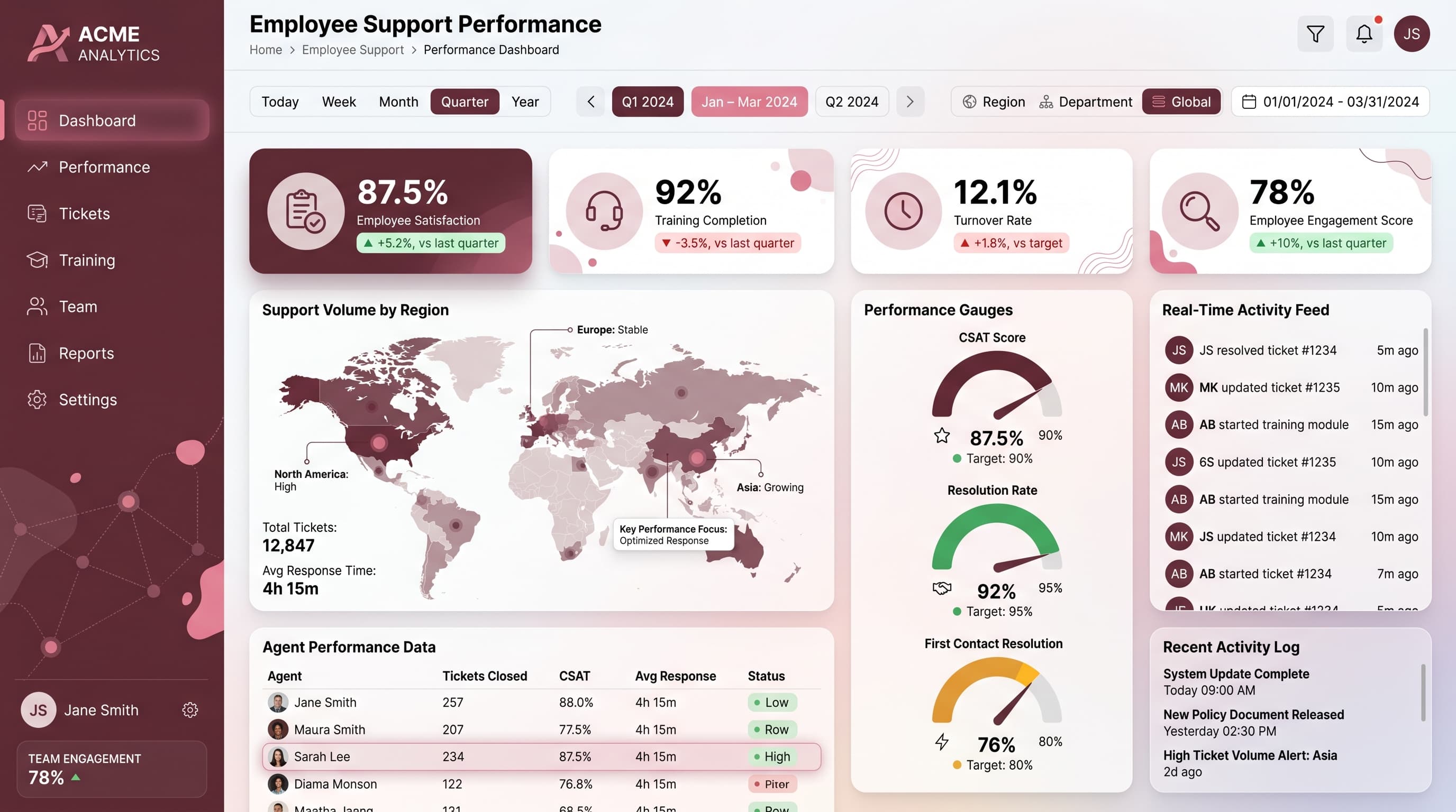
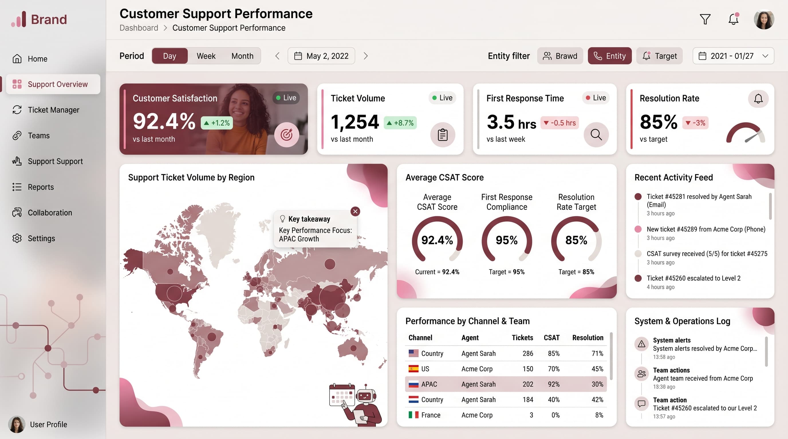
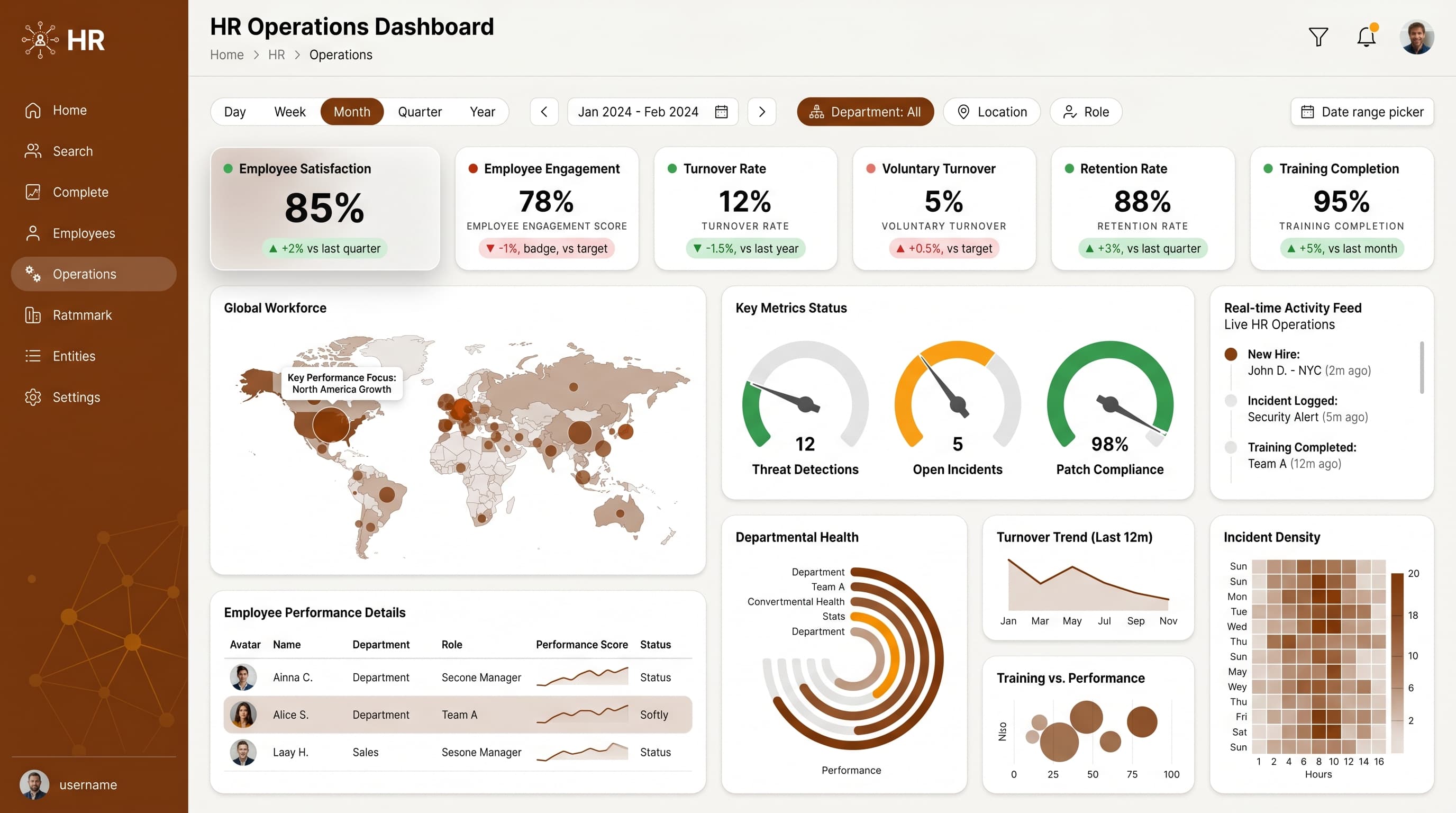
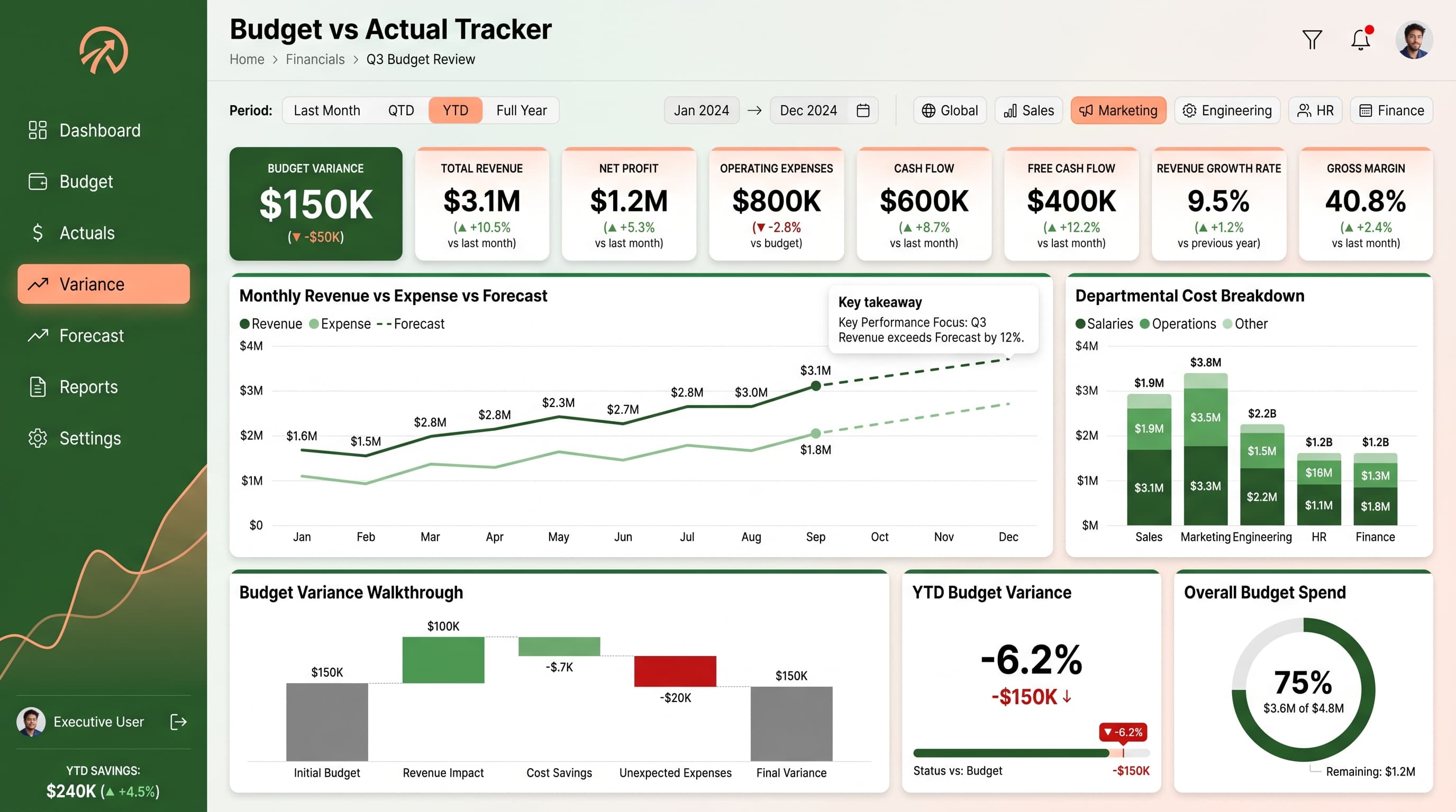
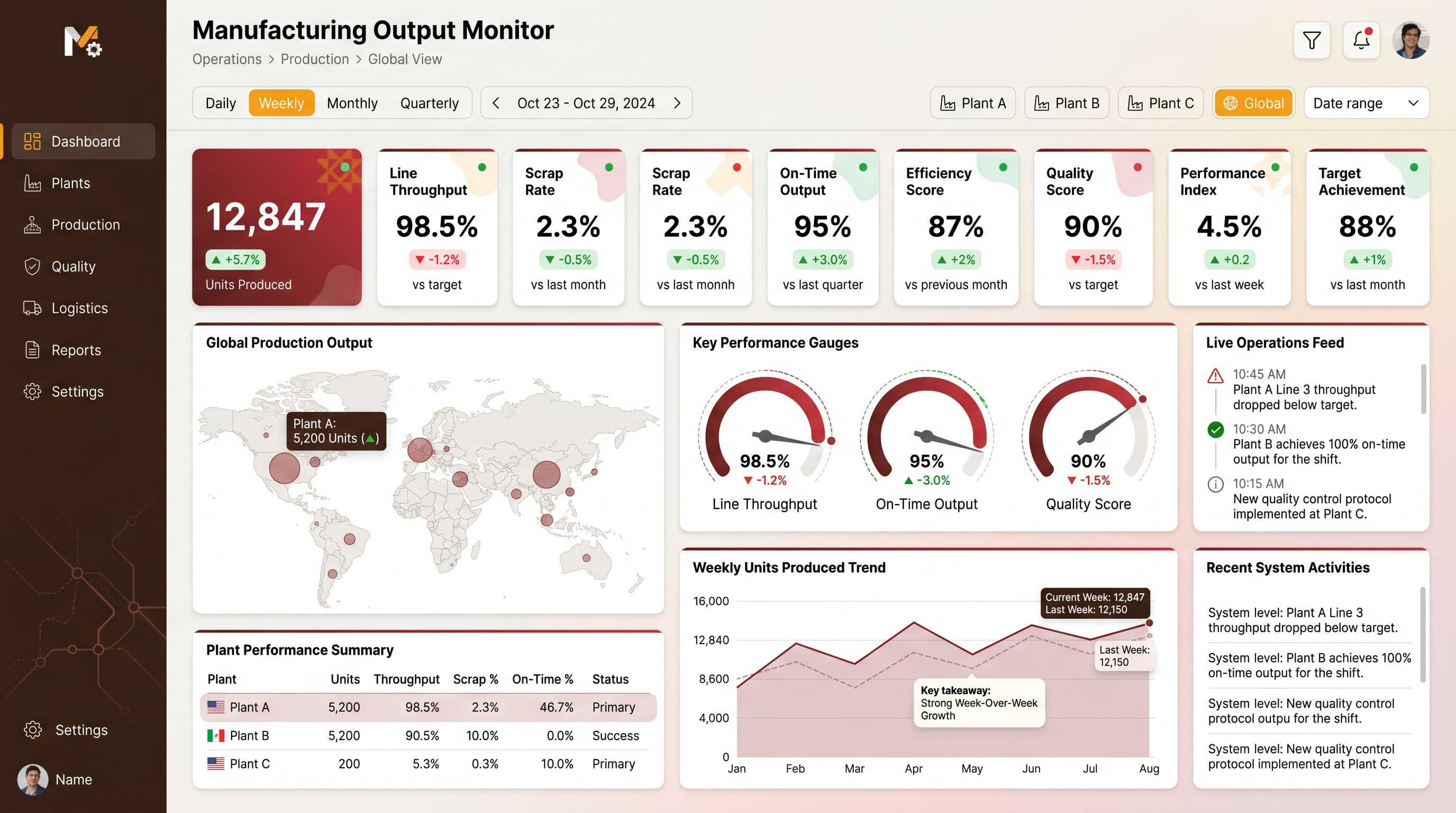
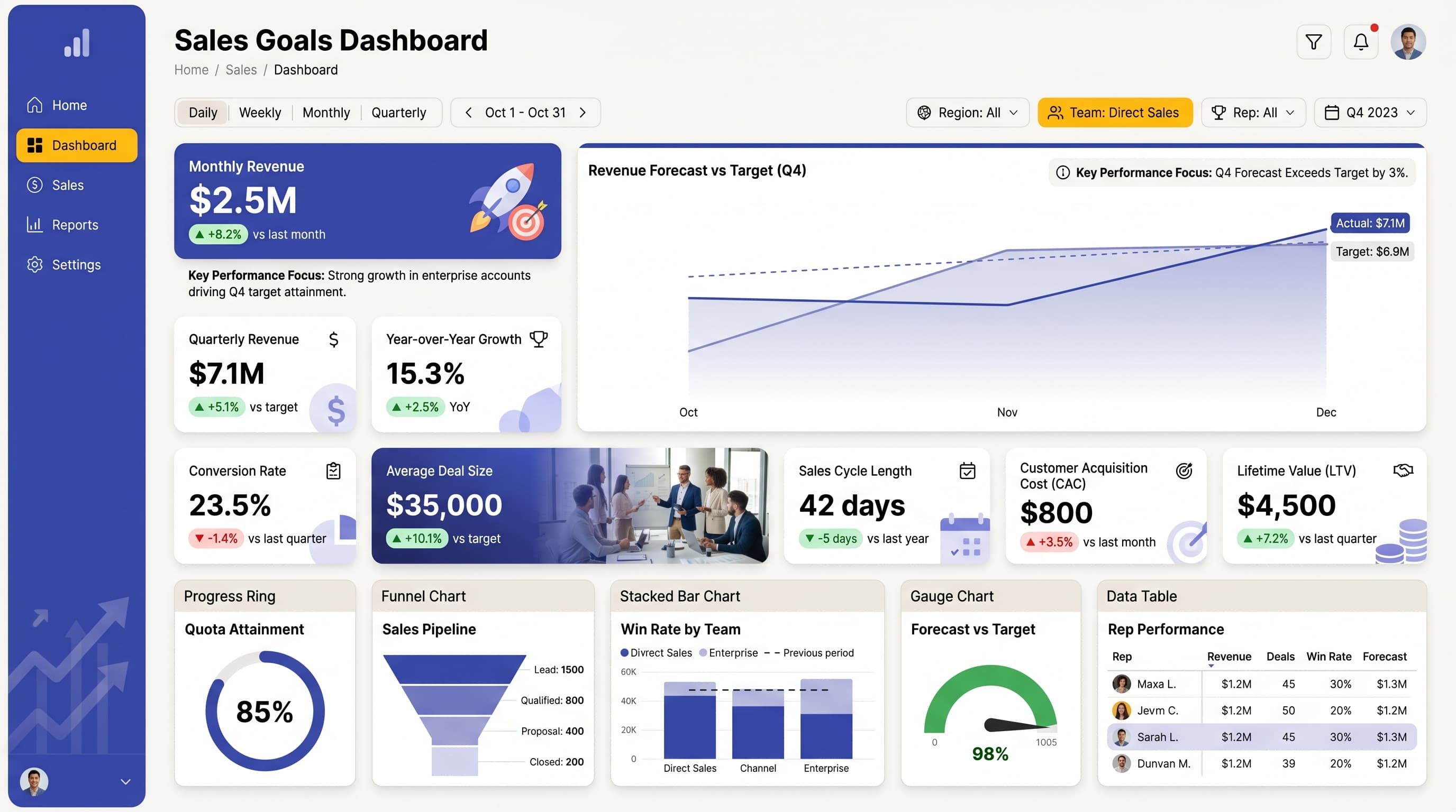
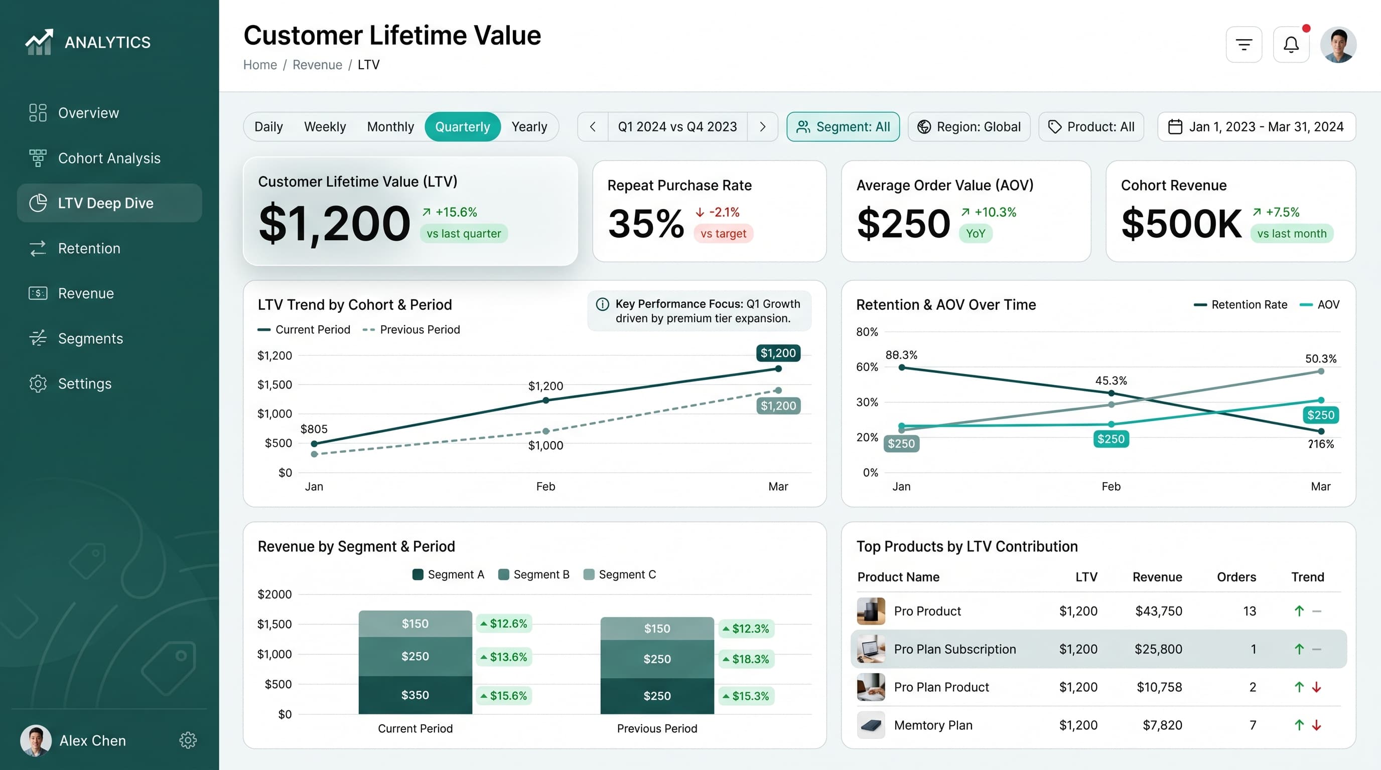
Power BI rewards disciplined layout: a strong KPI band, a clear visual hierarchy and restrained use of slicers beat a wall of visuals every time. Browse dashboard designs from the ChartCraft gallery built to translate cleanly into Power BI report pages.
67 examples in the gallery
Designing for Power BI
Power BI report pages work best on a fixed 16:9 canvas with an explicit grid. Anchor the top row with 4-6 KPI cards, keep one dominant visual per page, and use bookmarks or drill-through instead of cramming every breakdown onto one screen. A consistent theme JSON keeps colors and typography aligned across pages.
What to steal from these examples
Look at how these layouts group related visuals, reserve accent color for the primary metric, and keep axis labels readable at dashboard scale. Most of them can be rebuilt with core Power BI visuals — cards, bar and line charts, matrices — without custom visuals.
Create your own power bi dashboard
Describe it in a sentence — ChartCraft designs the layout, KPIs and charts for you.