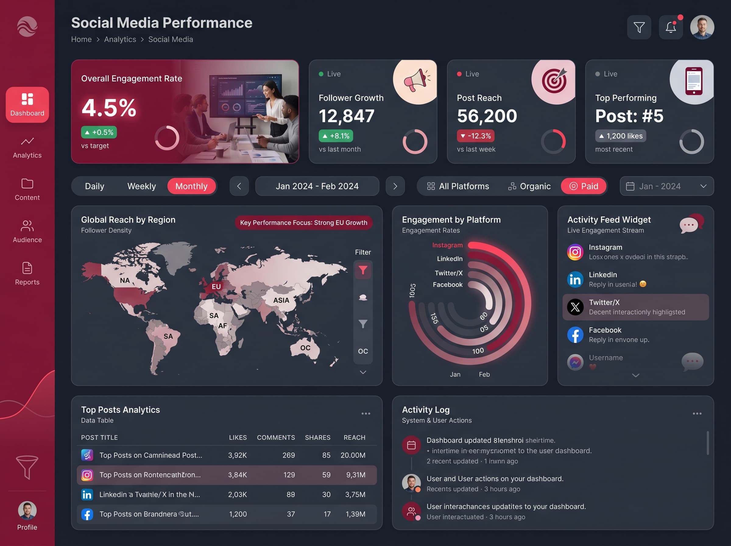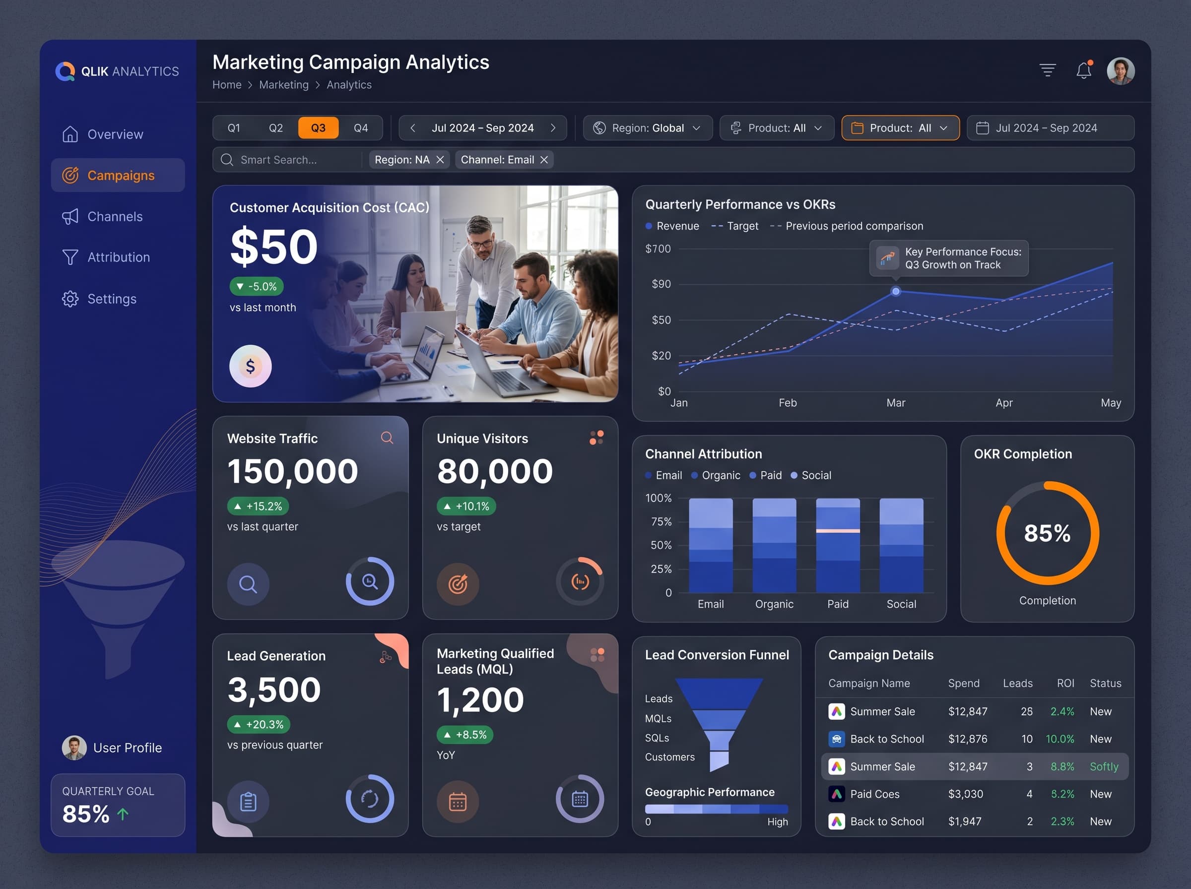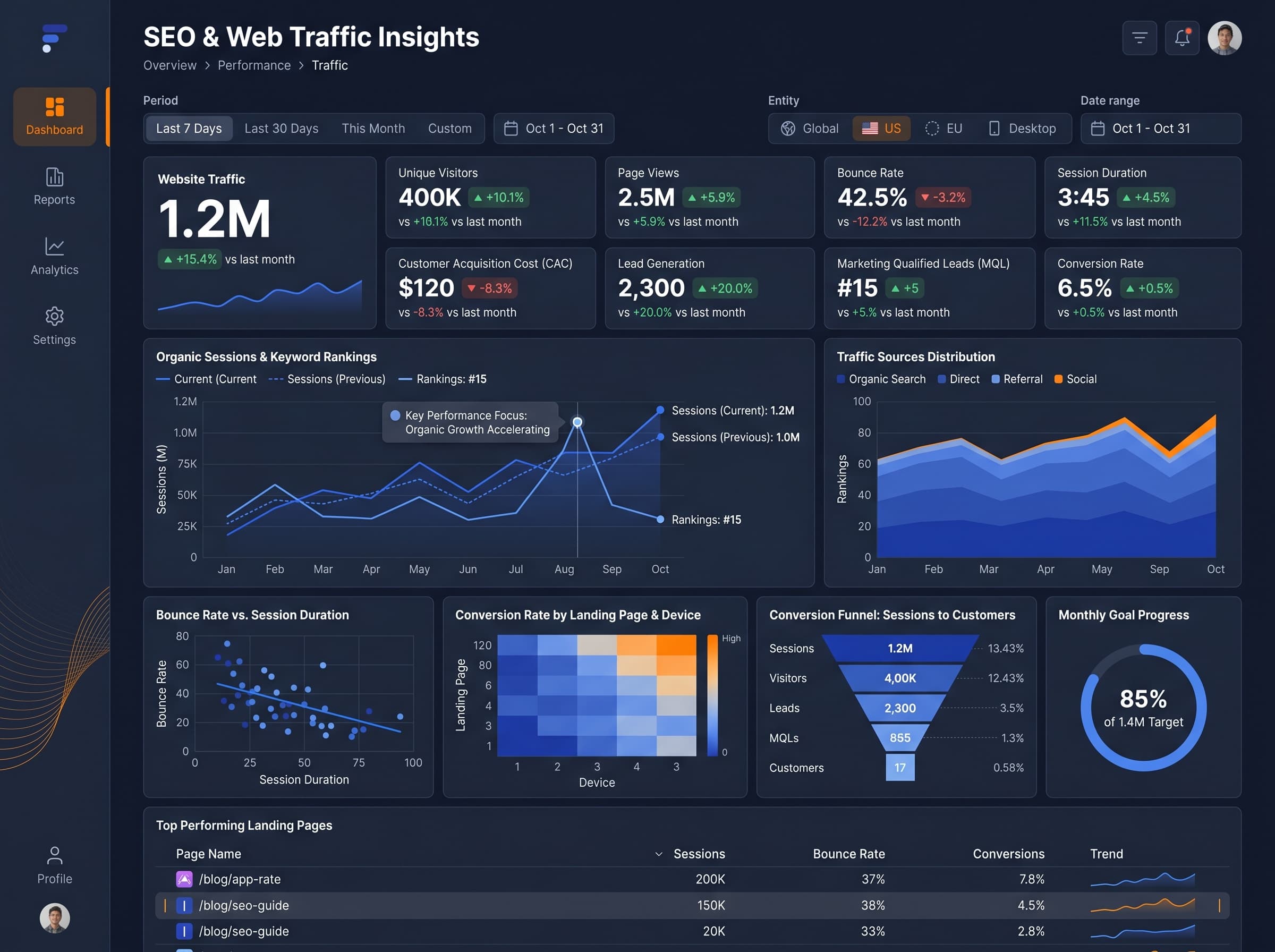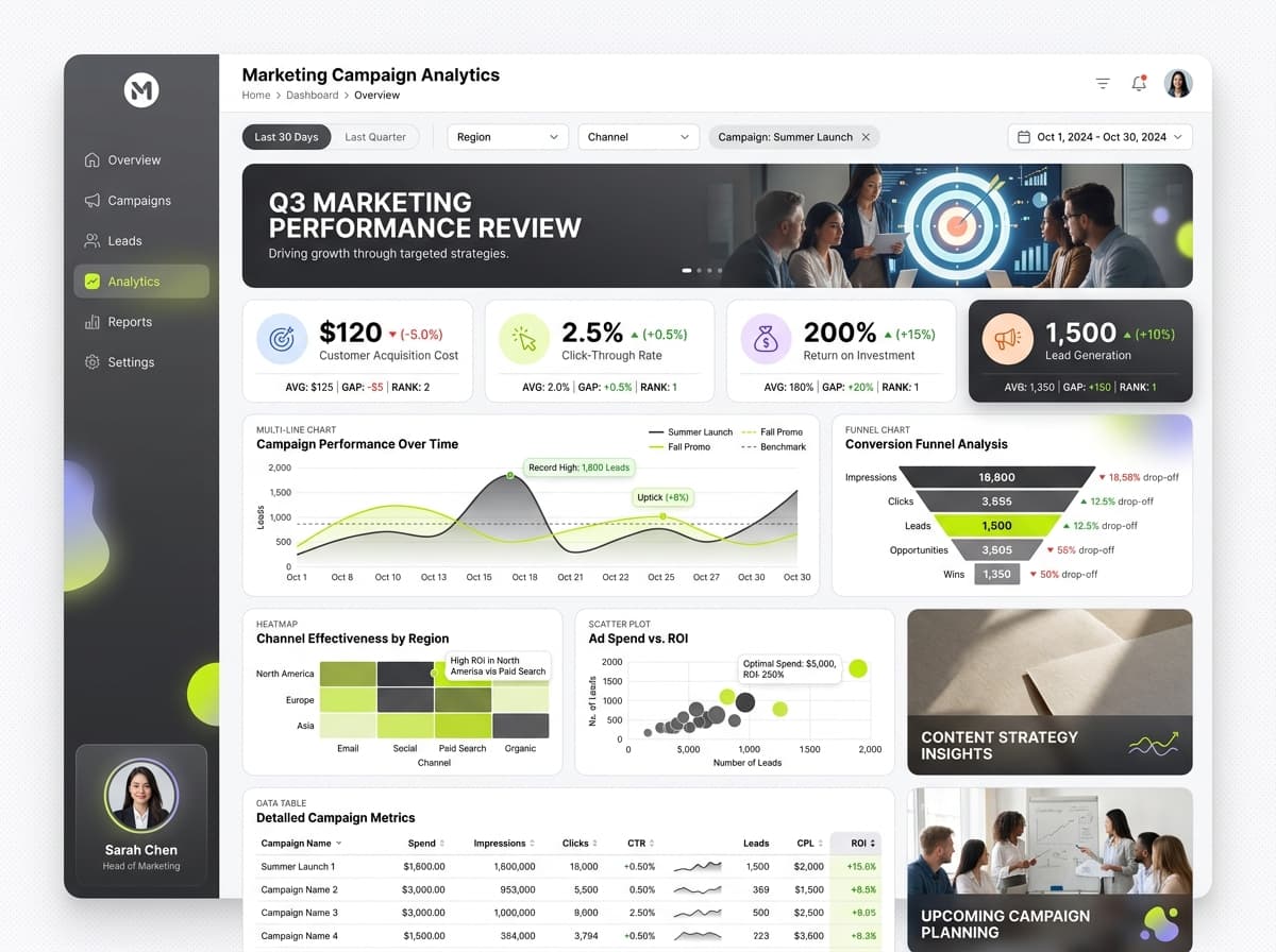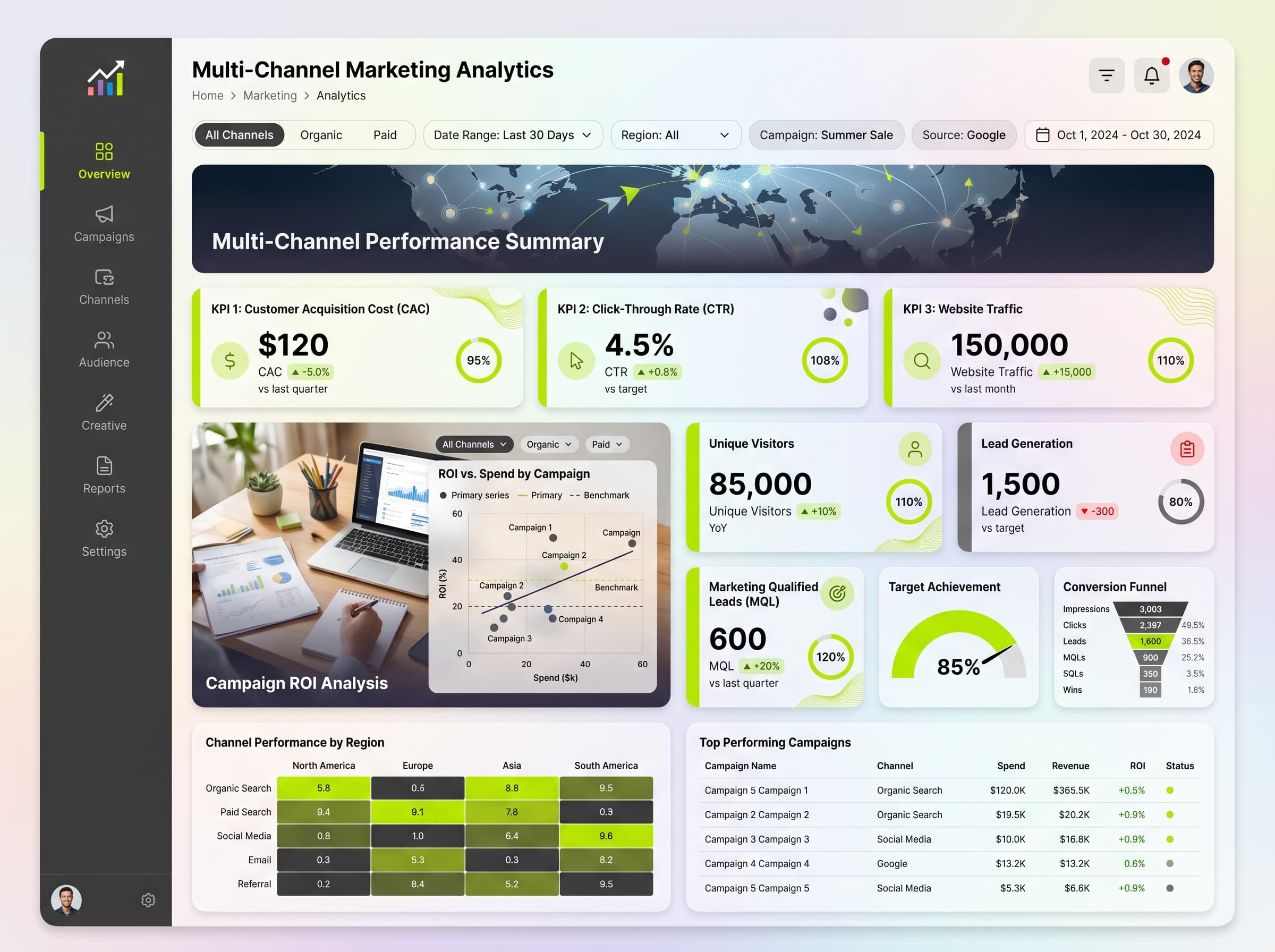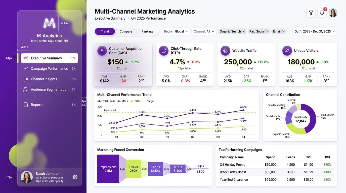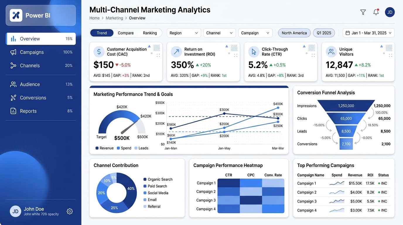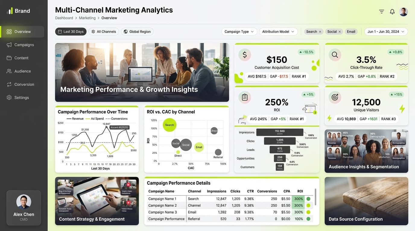

About this dashboard
Comprehensive analysis of fundraising performance, donor engagement, and campaign effectiveness.
KPIs tracked
Charts
Strategic insights
Design recommendations
Color Palette Strategy
HighUtilize the wine-blush color palette to create a vibrant and inviting dashboard. Use the primary color (#722F37) for headers and backgrounds, the secondary color (#E988AC) for key metrics, and maintain a 4.5:1 contrast ratio for text to ensure accessibility.
Layout & Grid System
HighImplement a 12-column grid system with a 4:3 aspect ratio. Place KPIs prominently at the top row for immediate visibility, use the middle row for analytical visualizations, and the bottom row for detailed data tables and insights.
Typography Hierarchy
MediumEstablish a clear typography hierarchy: Dashboard title at 24-28px bold, section headers at 18-20px semibold, and body text at 12-14px. This will ensure readability and a professional appearance.
Data Visualization UX
HighSelect chart types that best represent the data: use the funnel chart for donor acquisition, heatmap for engagement metrics, and area chart for trends over time. Limit color palettes to 5-7 distinct colors for clarity.
Visual Hierarchy & Focus
MediumCreate a visual hierarchy by emphasizing the most important metrics in larger font sizes and bolder colors. Use ample whitespace to separate sections and add visual depth through shadows on cards.
Interaction & Feedback
LowIncorporate hover states for interactive elements with slight opacity changes. Provide loading animations for data refreshes and ensure visual feedback on filter selections to enhance user experience.