About this dashboard
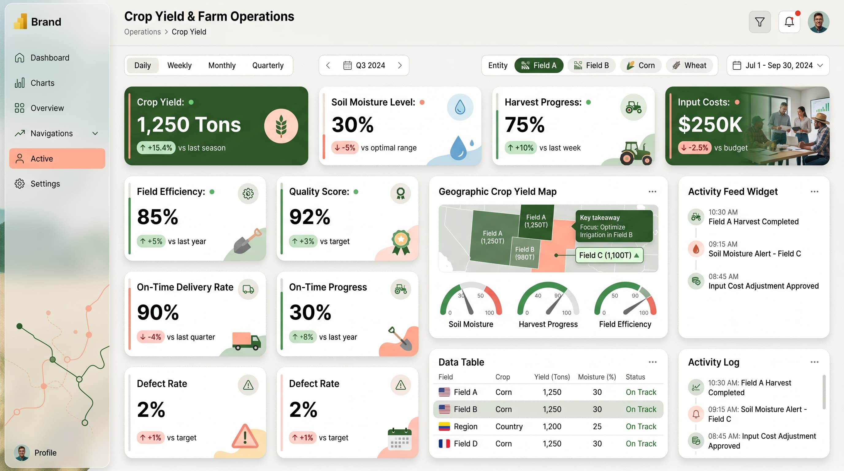
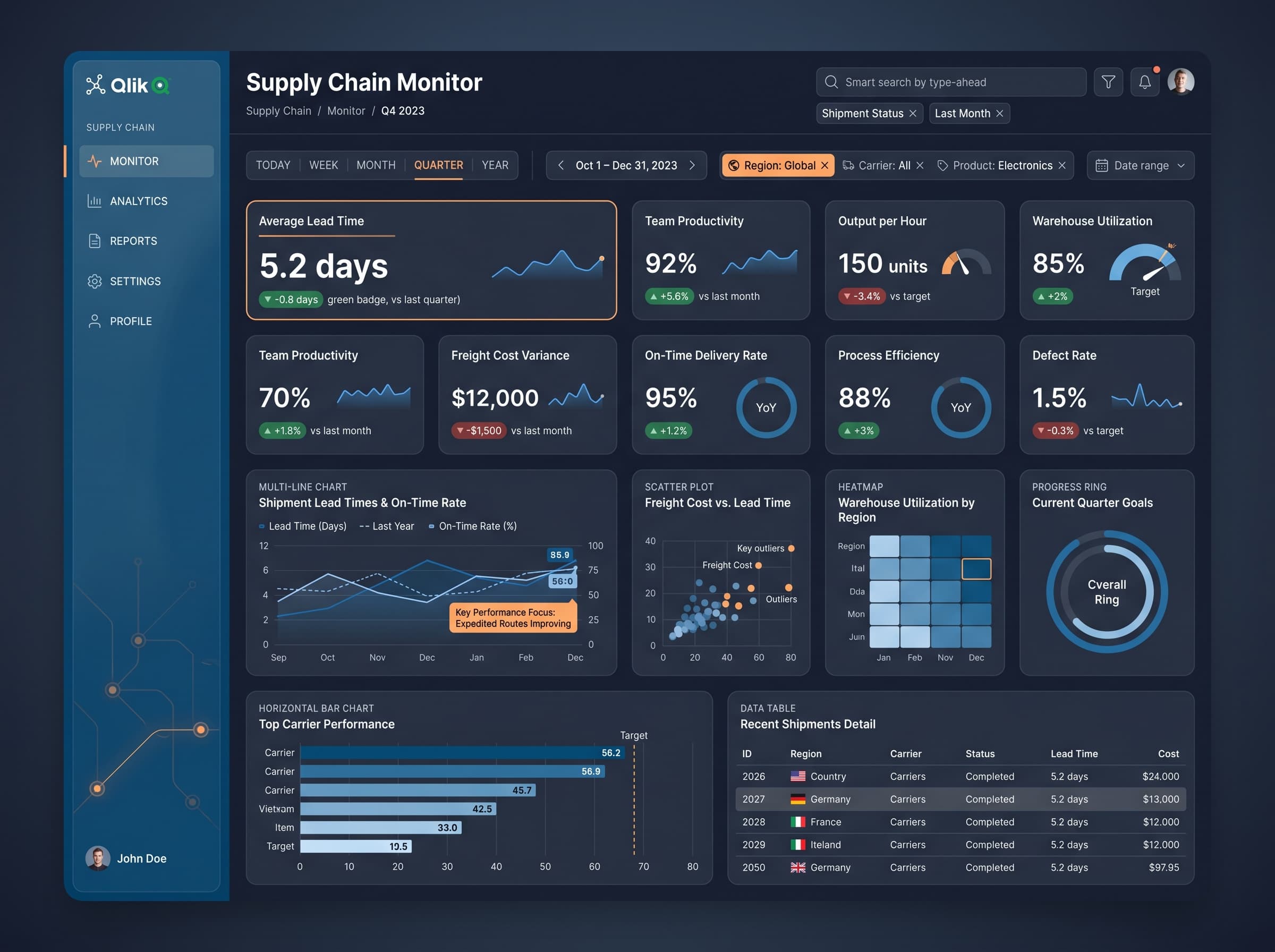
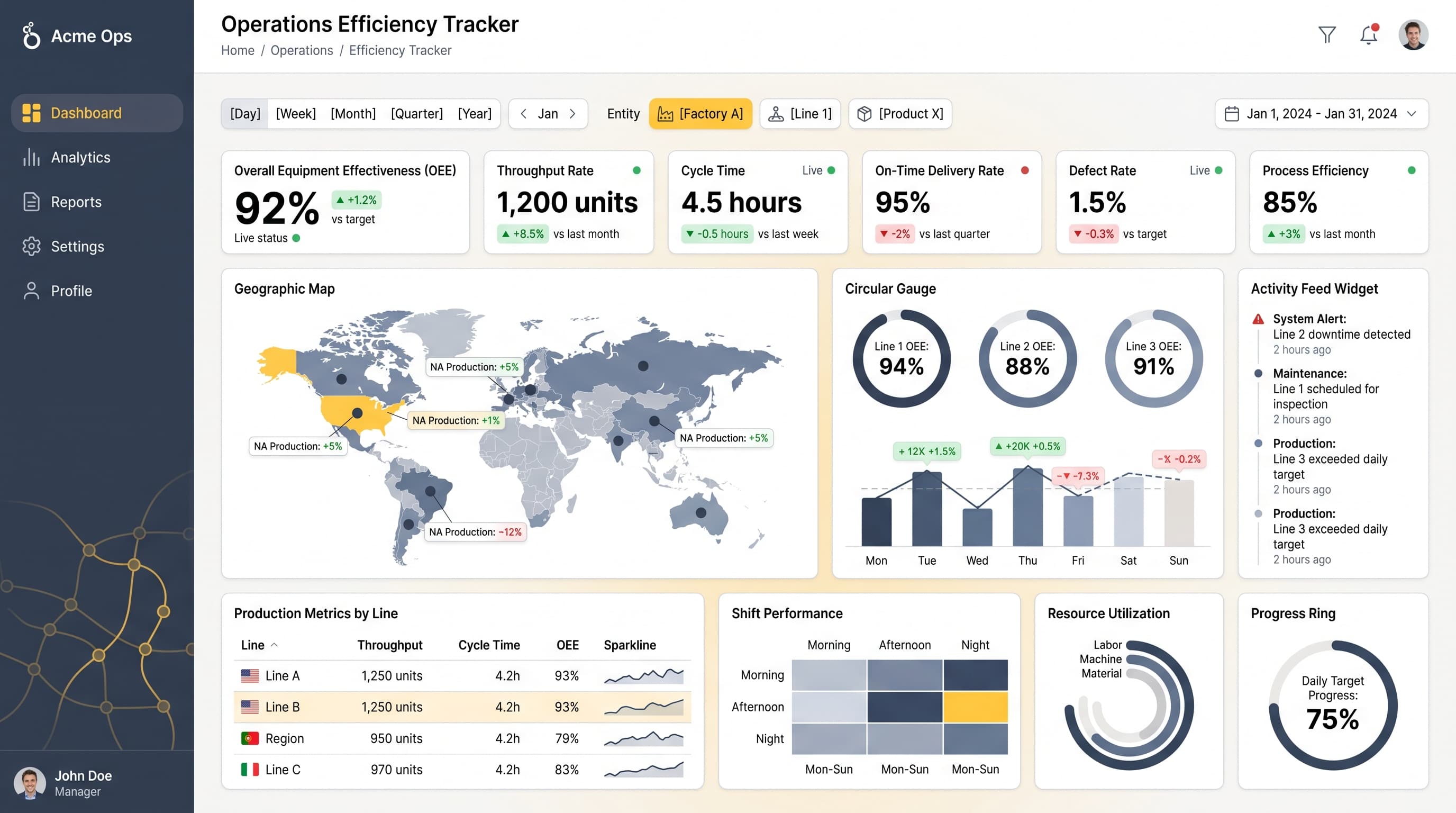
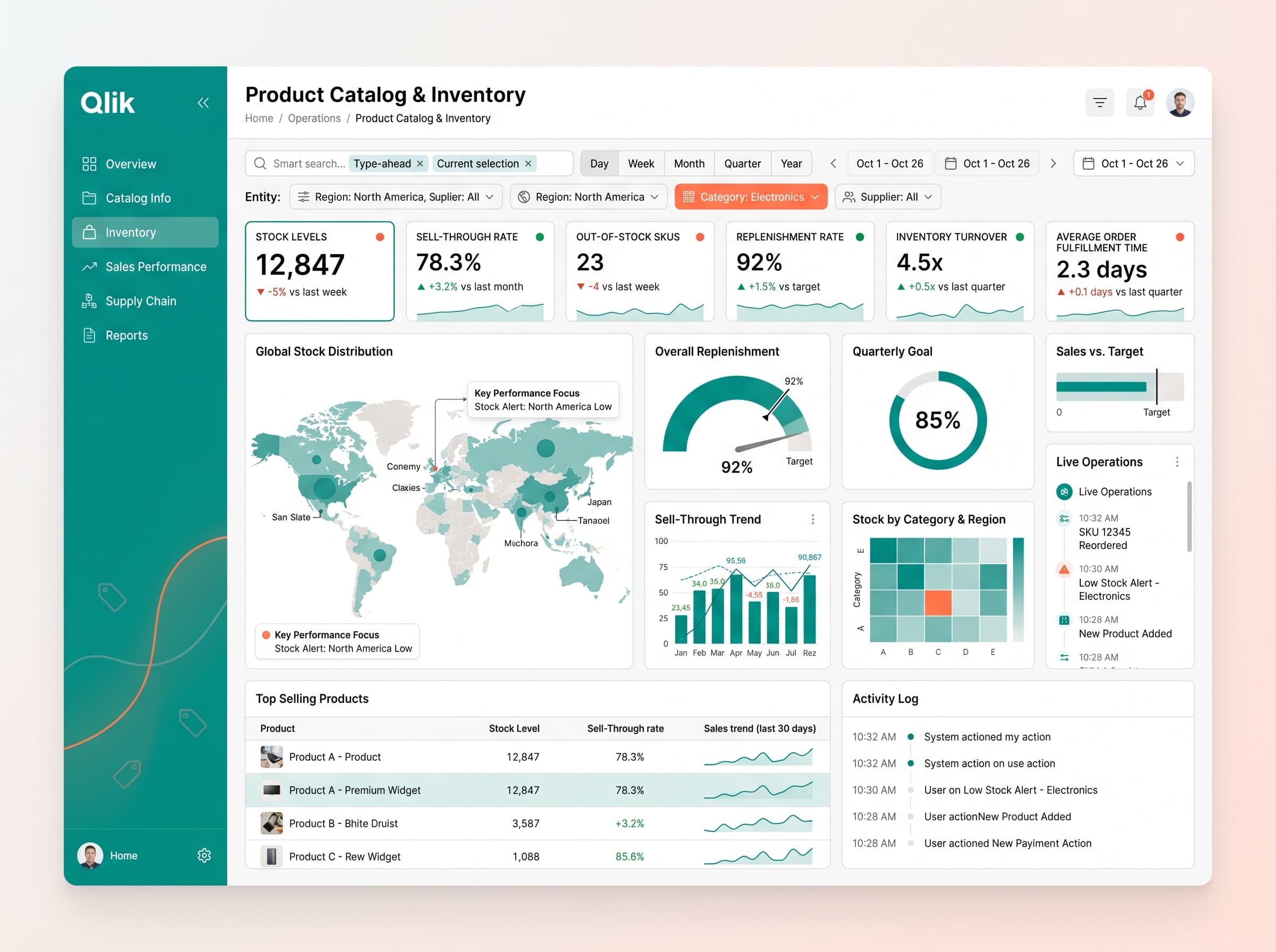
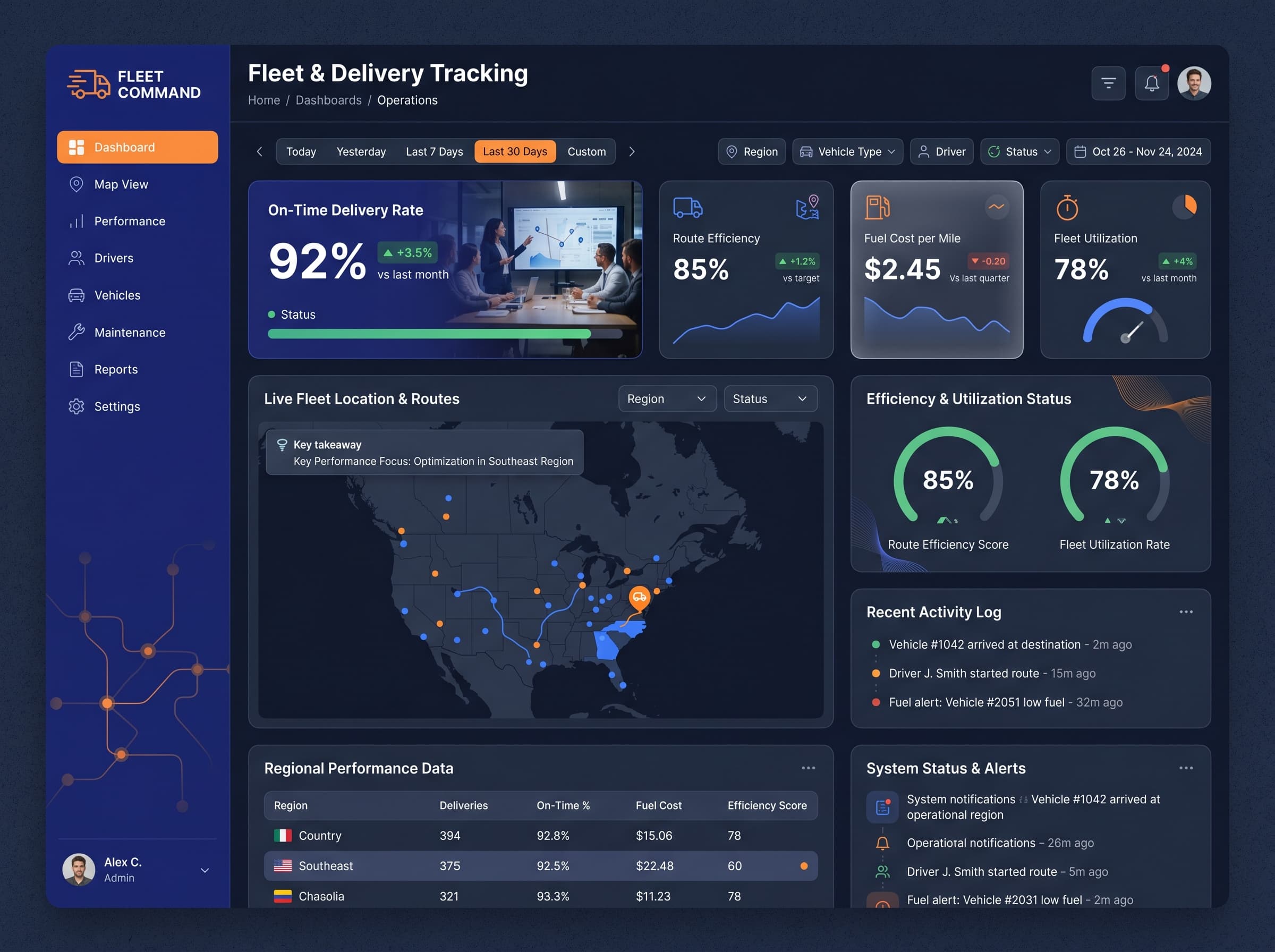
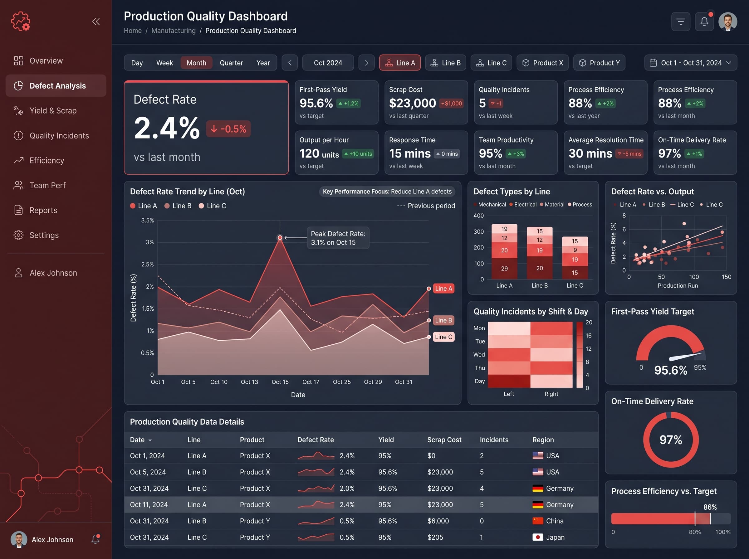
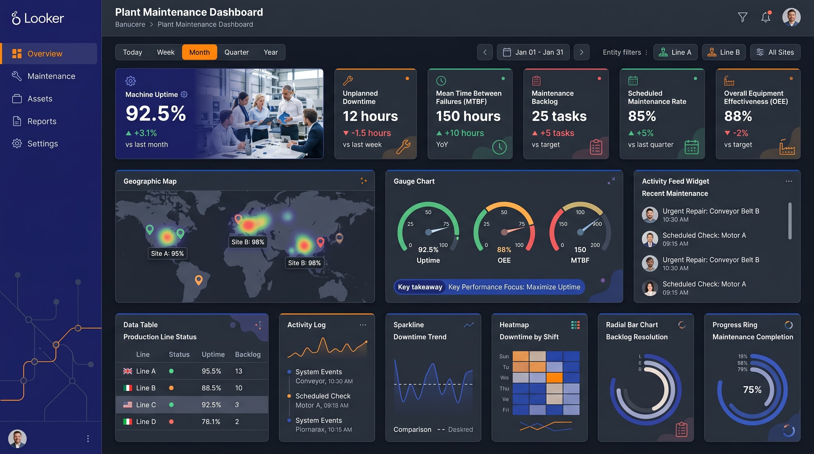
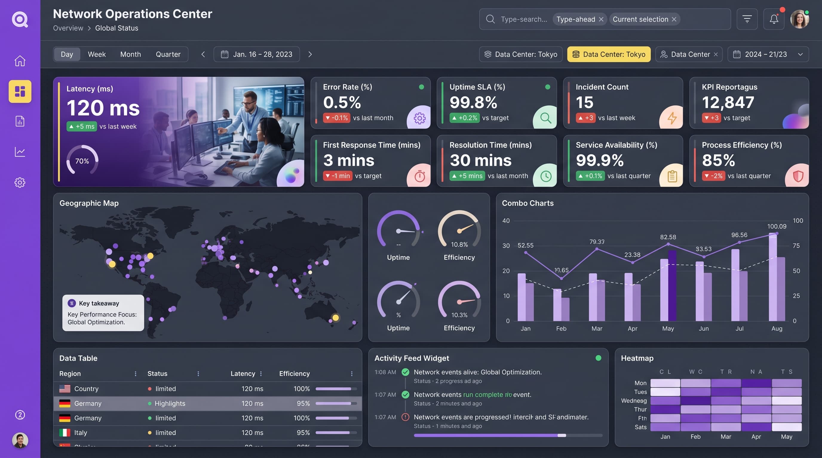
Track delivery times, inventory turnover, and supplier performance to reduce lead times and minimize stockouts across warehouses.
KPIs tracked
Charts
Strategic insights
Design recommendations
Color Palette Strategy
HighUtilize a light theme with a mono-amber color palette, ensuring that the primary color is used for headers and key metrics, with 4.5:1 contrast for accessibility. Consistent color usage will create visual patterns that users can quickly recognize.
Layout & Grid System
HighUse a 12-column grid for a 16:9 ratio. Place KPI cards at the top for immediate visibility, charts in the middle for strategic analysis, and detailed data tables at the bottom. Maintain 16-24px padding and group related metrics visually.
Typography Hierarchy
MediumAdopt a clear typography hierarchy: Dashboard title at 28px bold, section headers at 20px semibold, card titles at 16px medium, and body text at 14px regular. Use a single font family (e.g., Inter) for consistency across all text.
Data Visualization UX
HighSelect chart types that best represent the data: use multi-line charts for performance trends, gauge charts for target achievements, and heatmaps for process efficiency. Tooltips should add context to data points, and legends should be clear and concise.
Visual Hierarchy & Focus
MediumEstablish a clear visual hierarchy with the most important metrics being the largest and boldest on the dashboard. Use ample whitespace to separate sections and highlight anomalies in metrics using conditional formatting.
Interaction & Feedback
LowIncorporate hover states for interactive elements to enhance user experience. Utilize loading animations during data refreshes and provide clear feedback on filter selections to aid user navigation.