

Looker Dashboard Examples
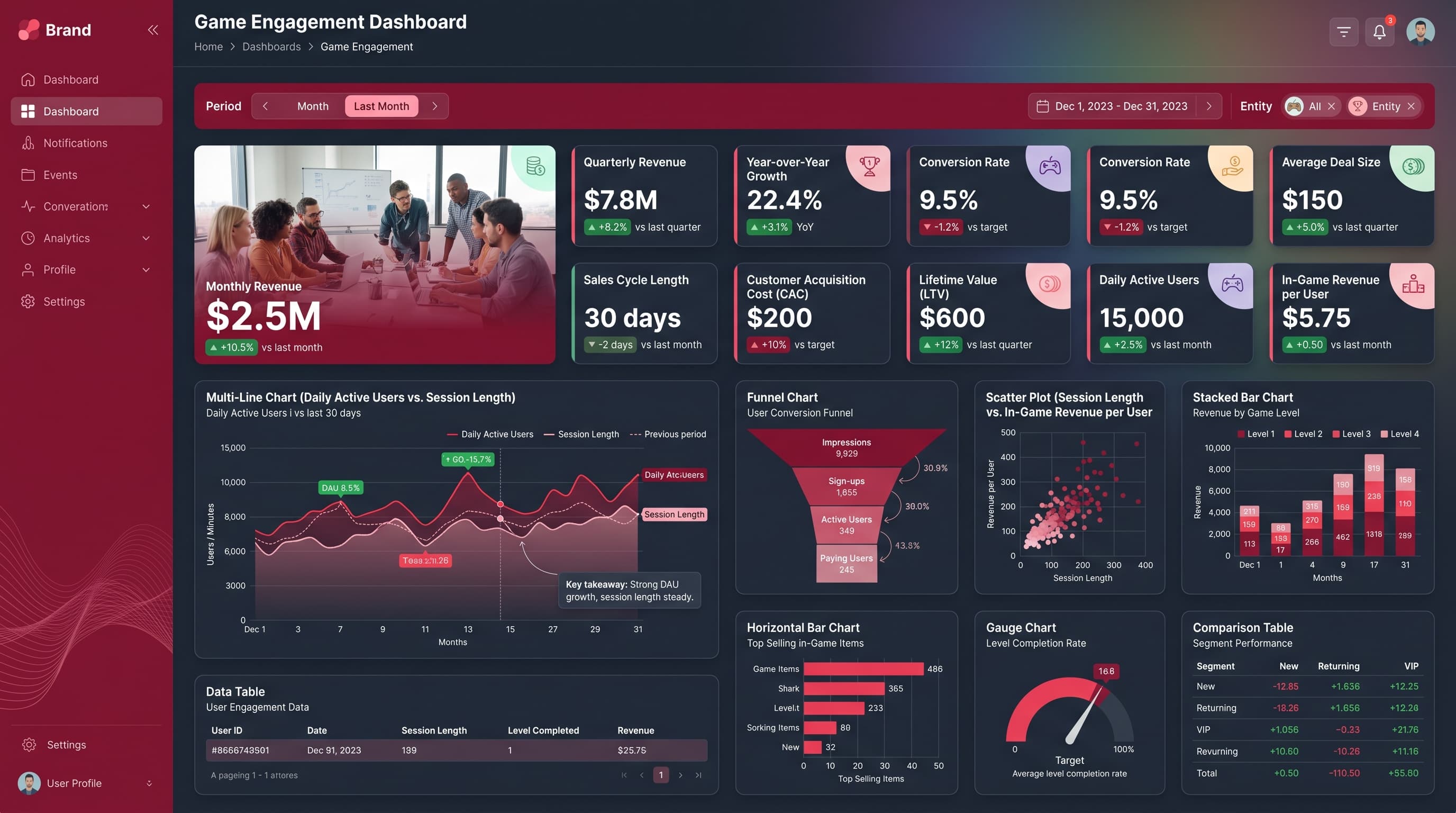
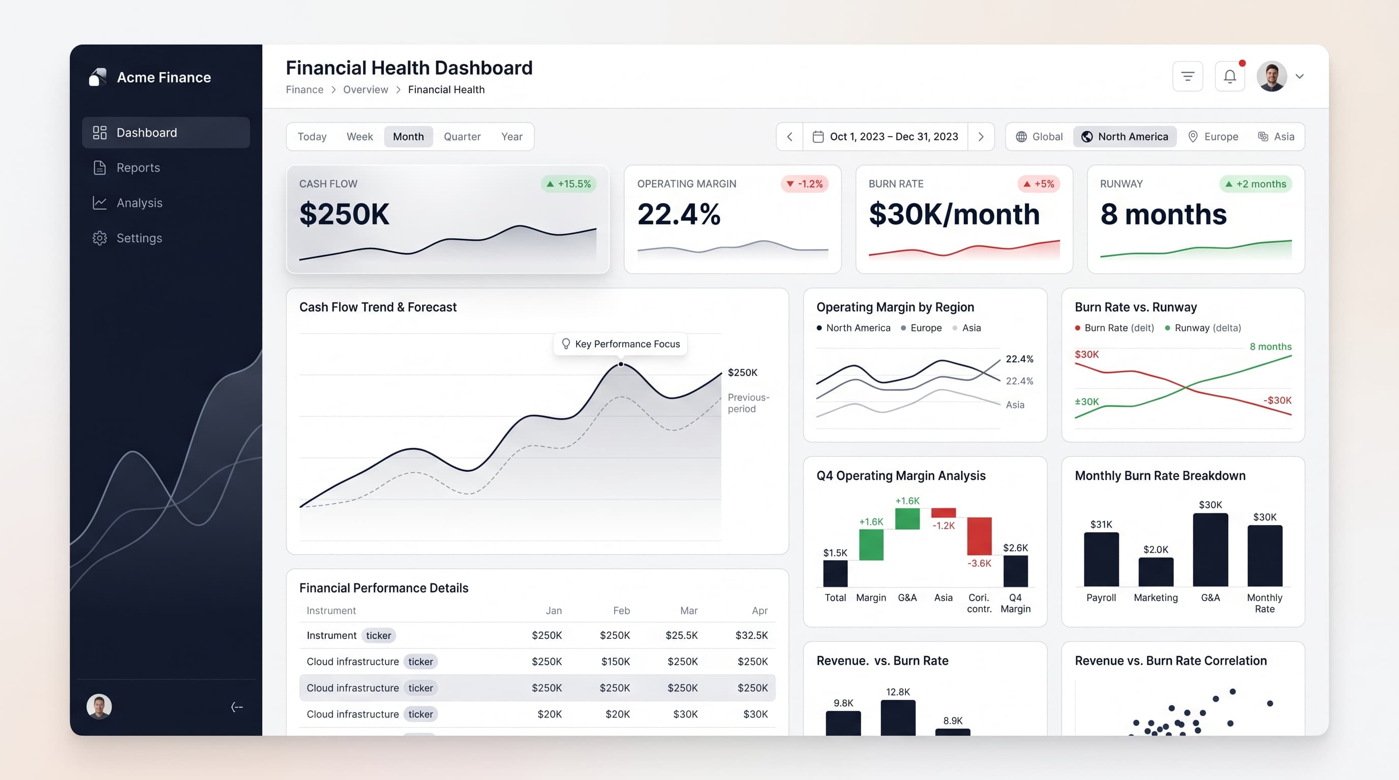
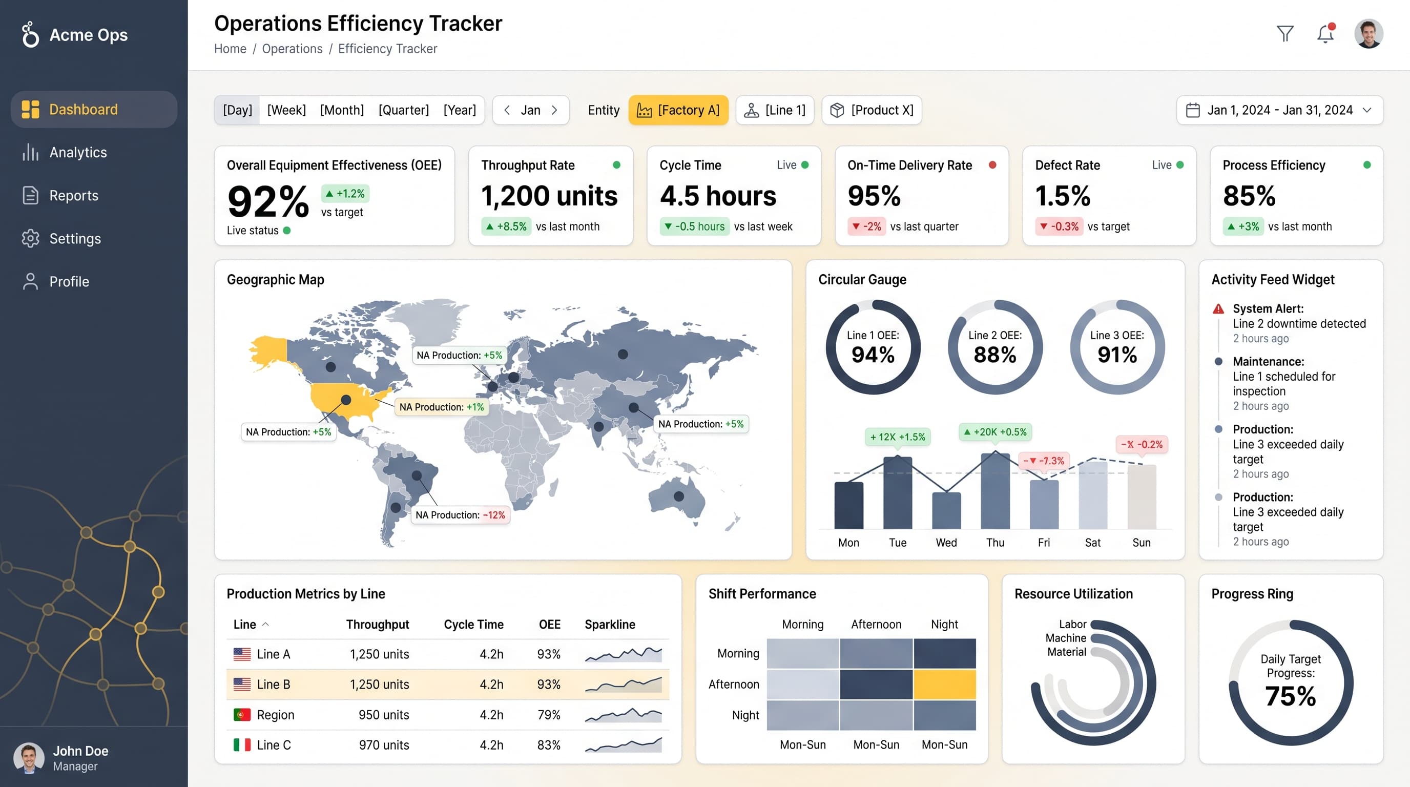
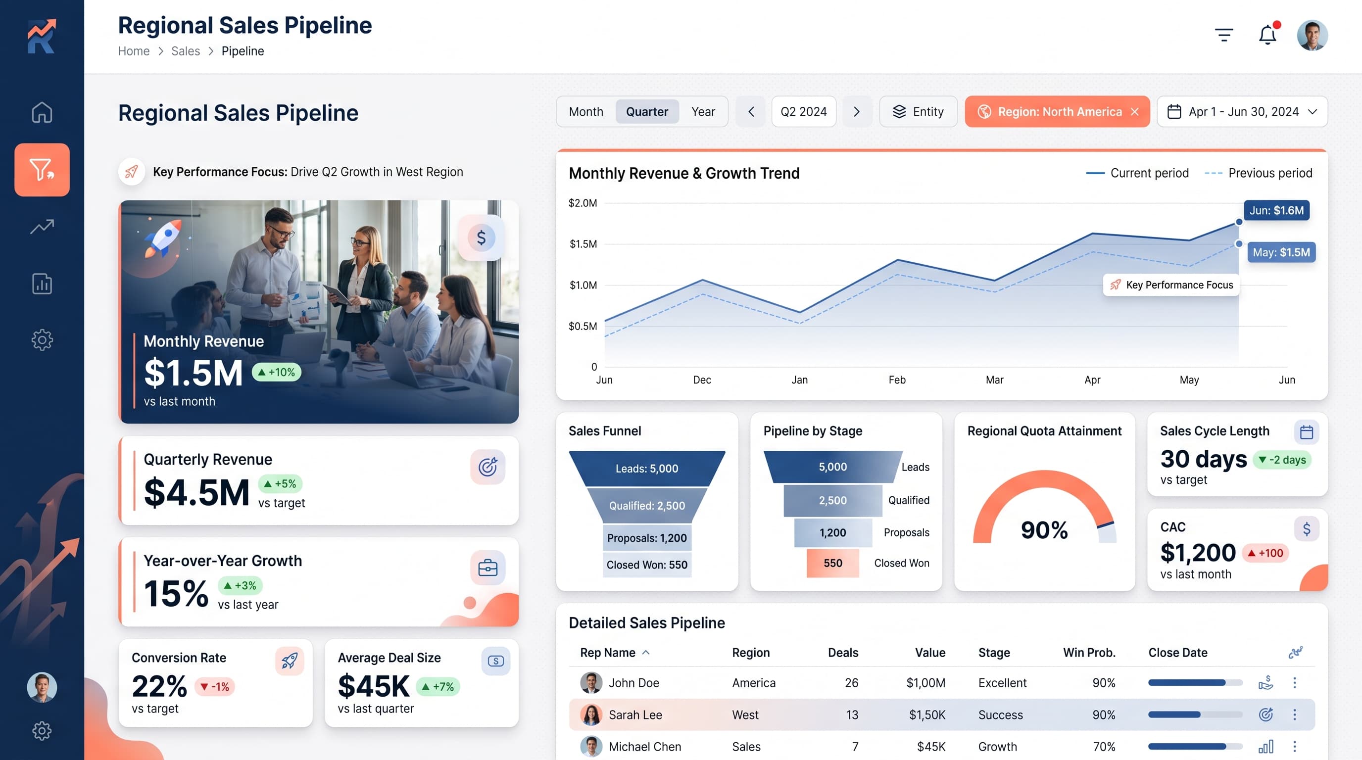
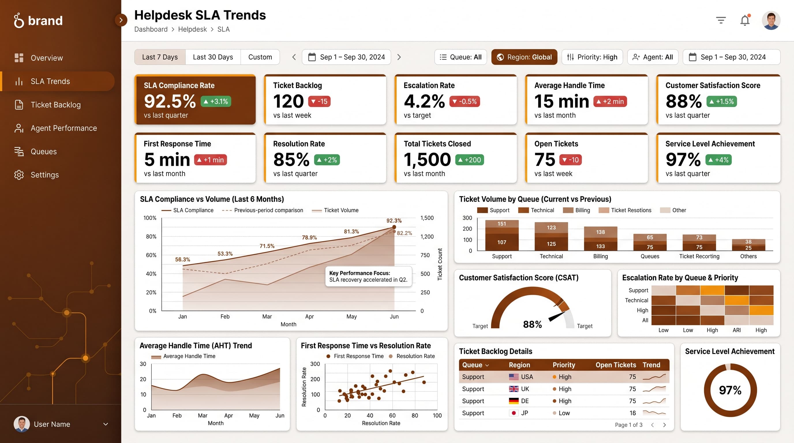
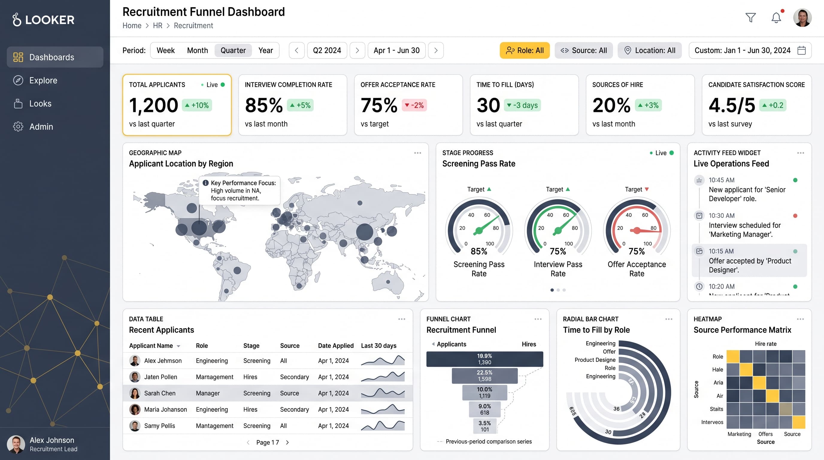
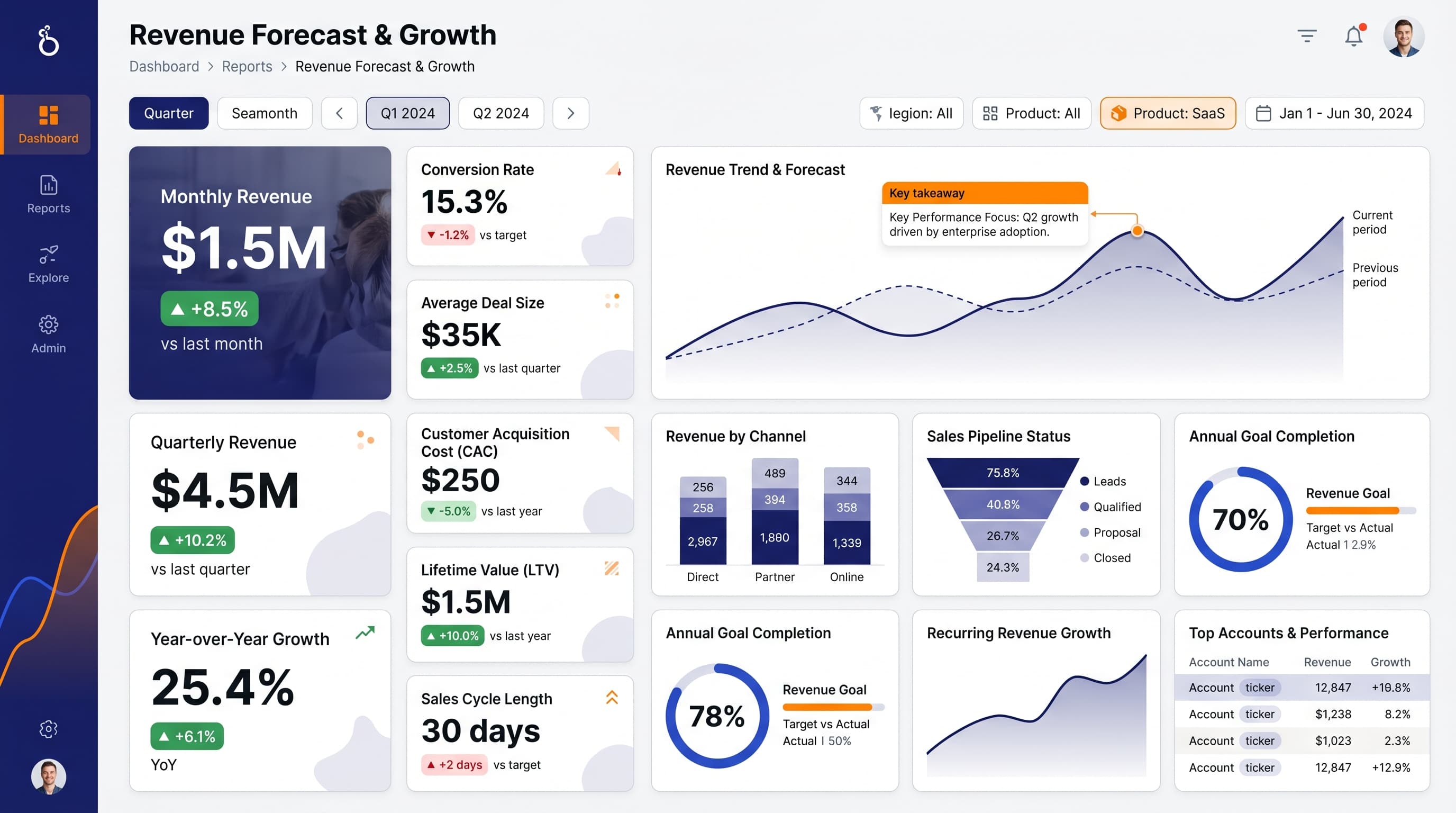
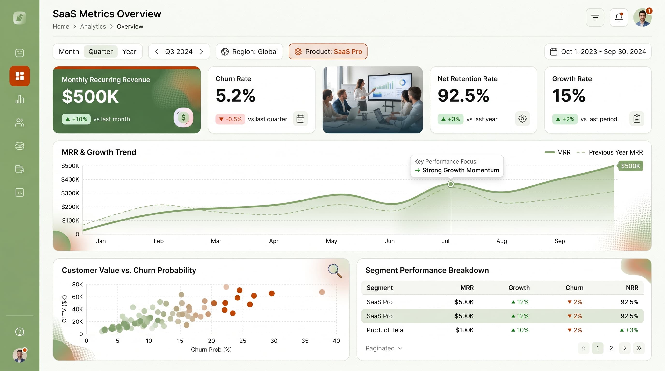
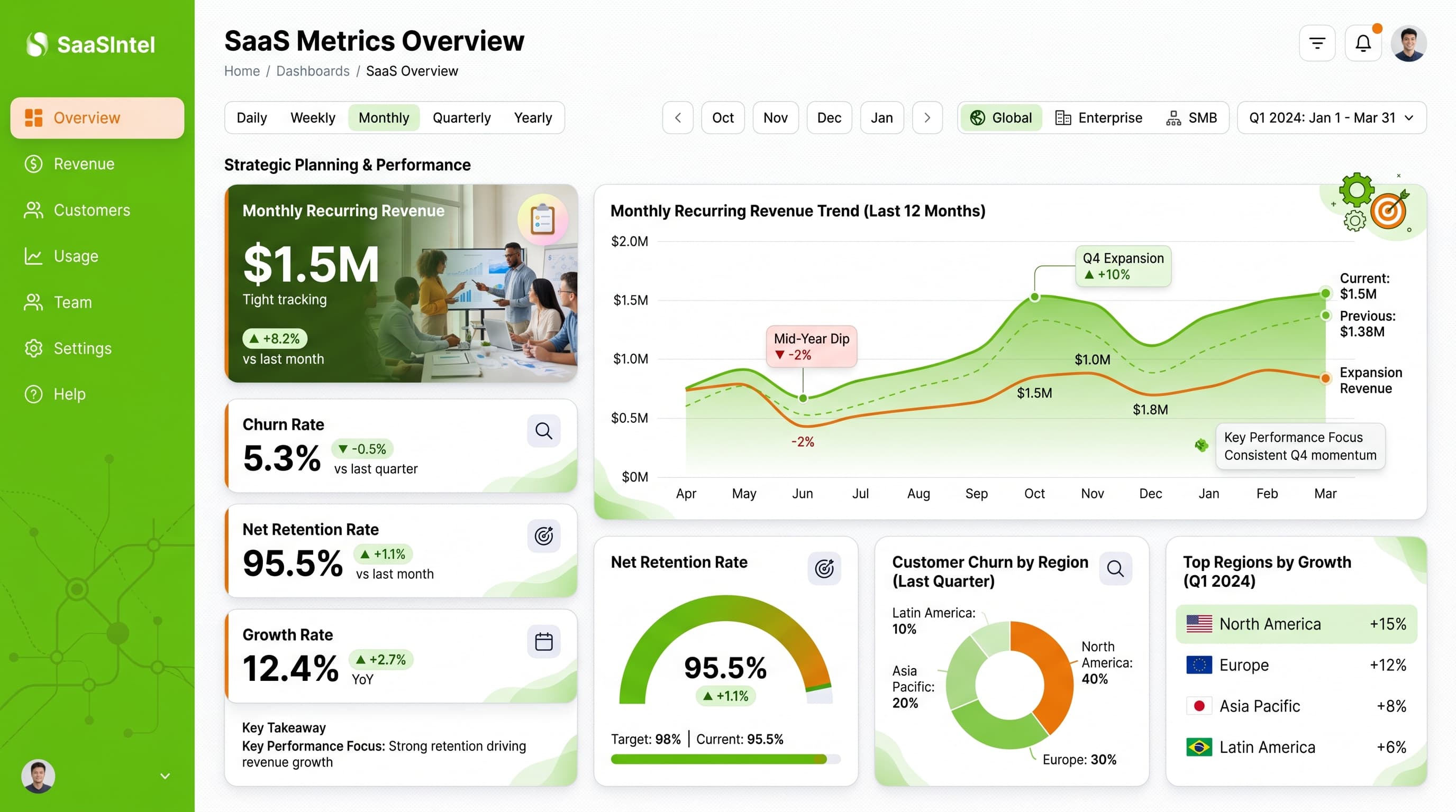
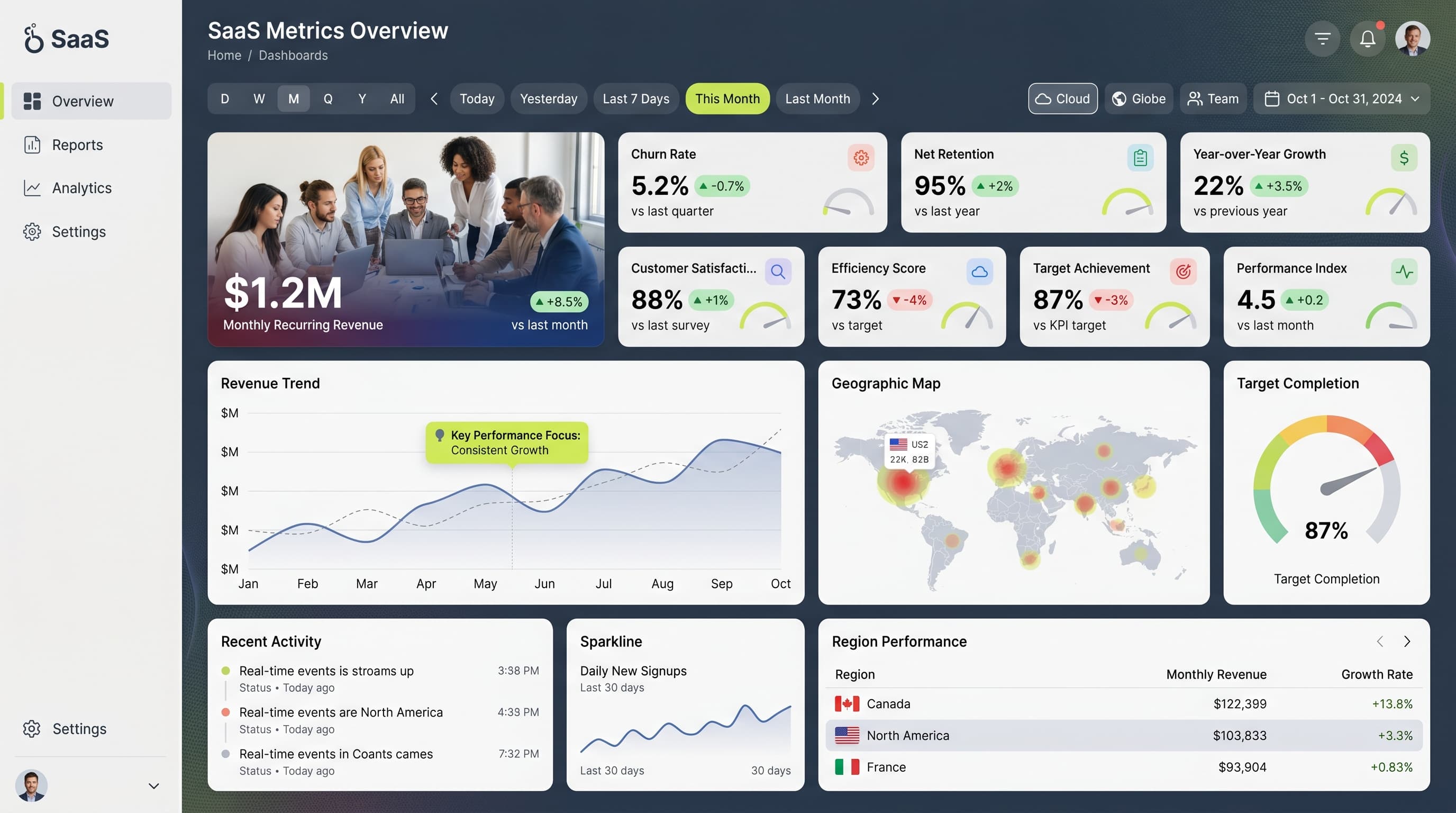
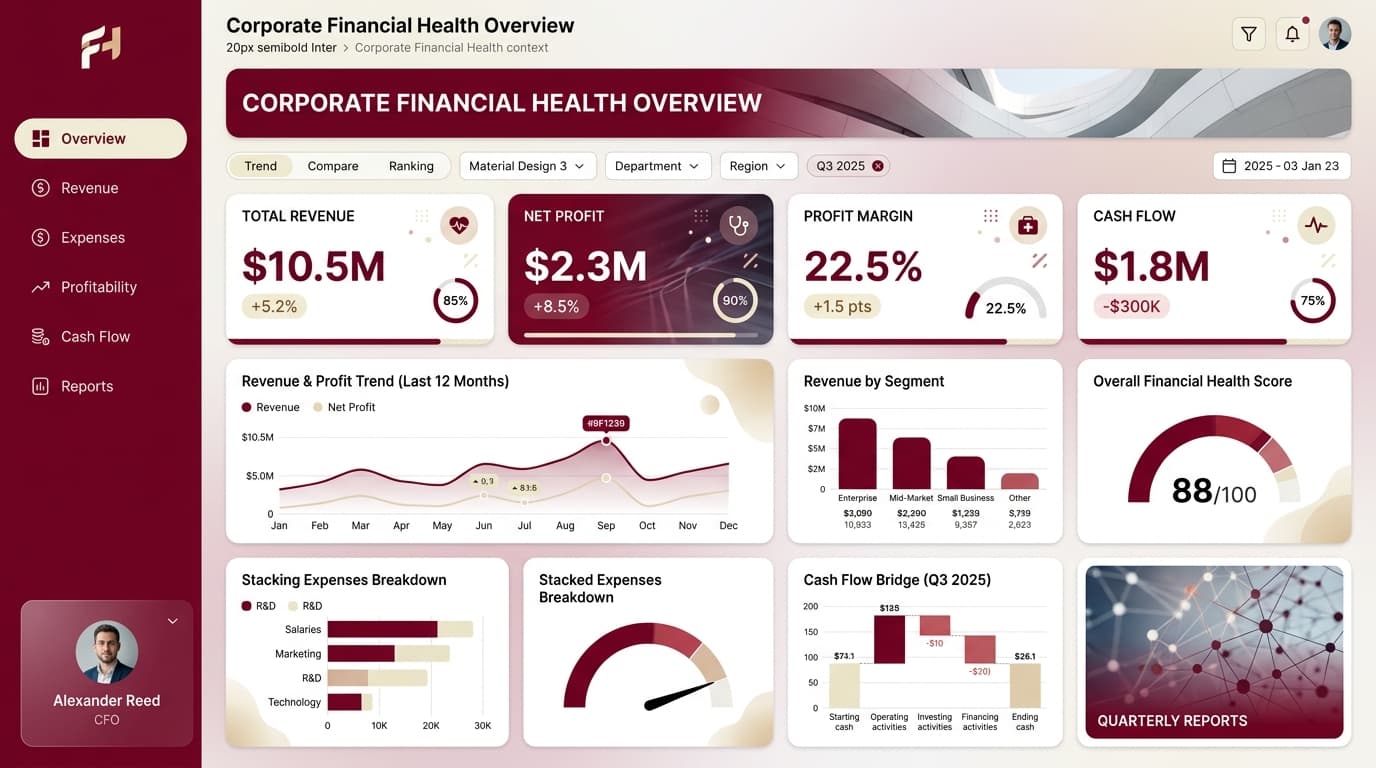
Looker's tile grid makes alignment easy and clutter easier. These examples show how to use that grid deliberately — scorecards first, one chart per question, filters kept global. Each layout maps naturally onto Looker or Looker Studio tiles.
14 examples in the gallery



Designing for Looker
Lead with a scorecard row sized consistently across the top, then give each subsequent tile a single question to answer. Keep filters at dashboard level rather than per tile, and use text tiles sparingly to introduce sections instead of explaining individual charts.
What to steal from these examples
These layouts show disciplined tile sizing — equal heights within a row, one double-width hero chart — and a single accent color reserved for the metric that matters. Both habits transfer directly to Looker's grid.
Create your own looker dashboard
Describe it in a sentence — ChartCraft designs the layout, KPIs and charts for you.