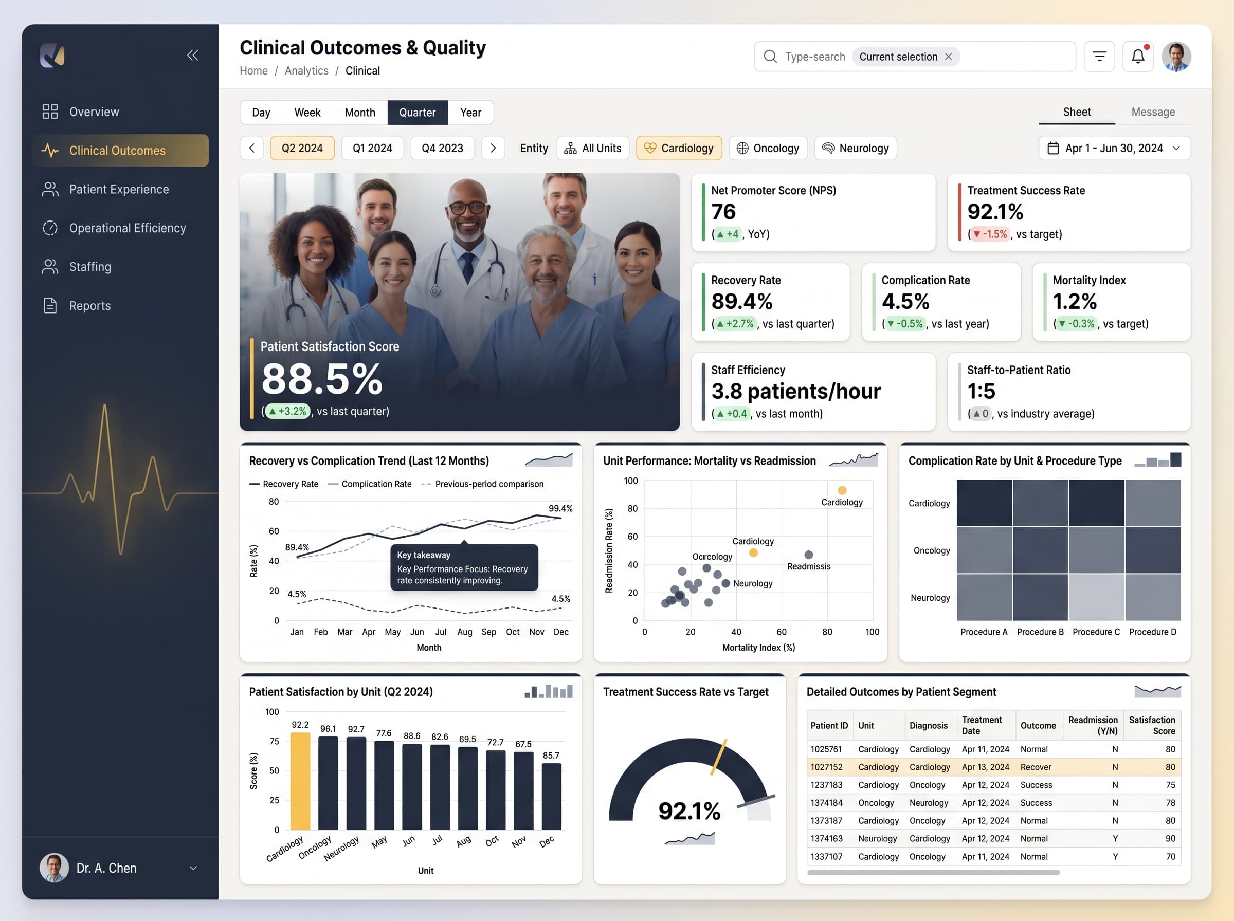
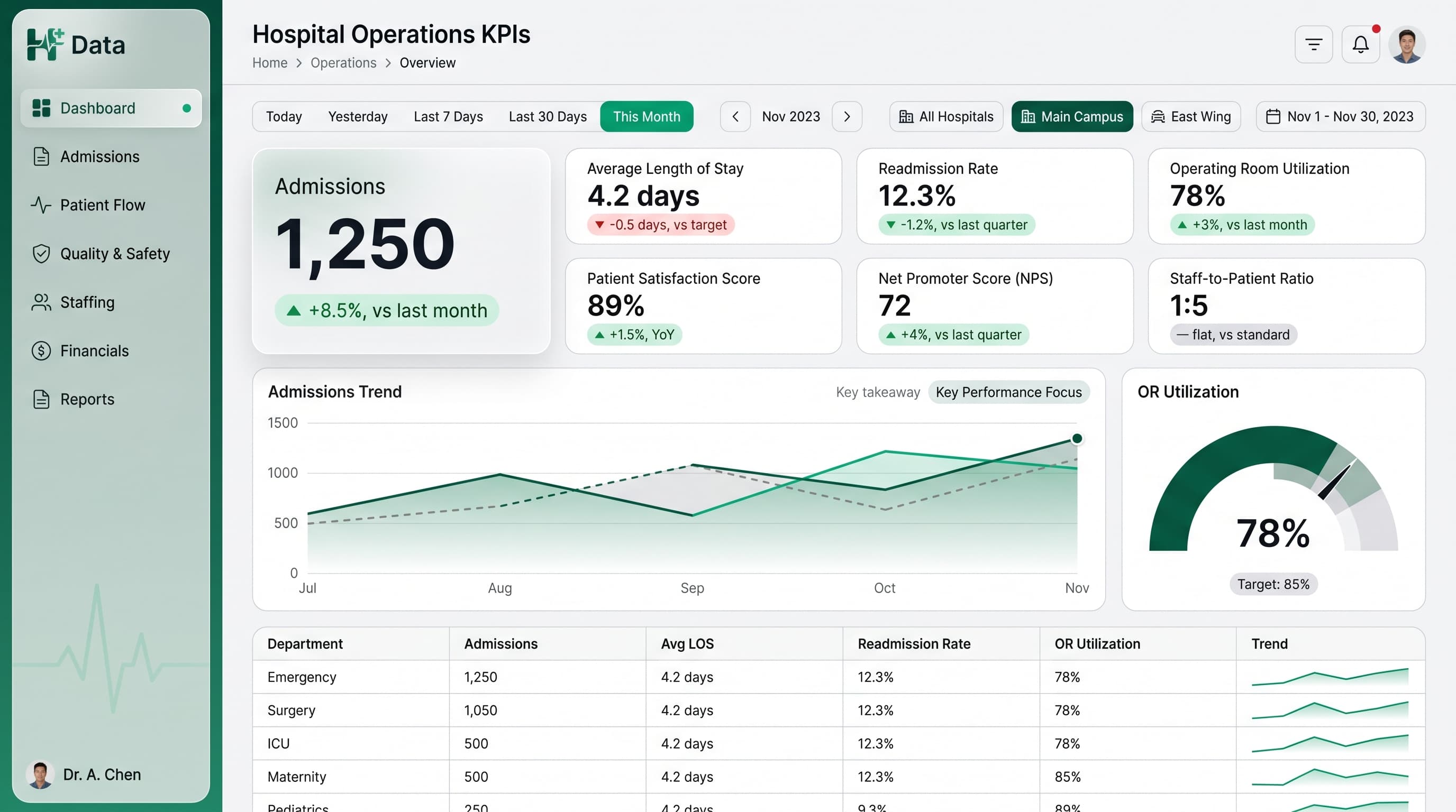
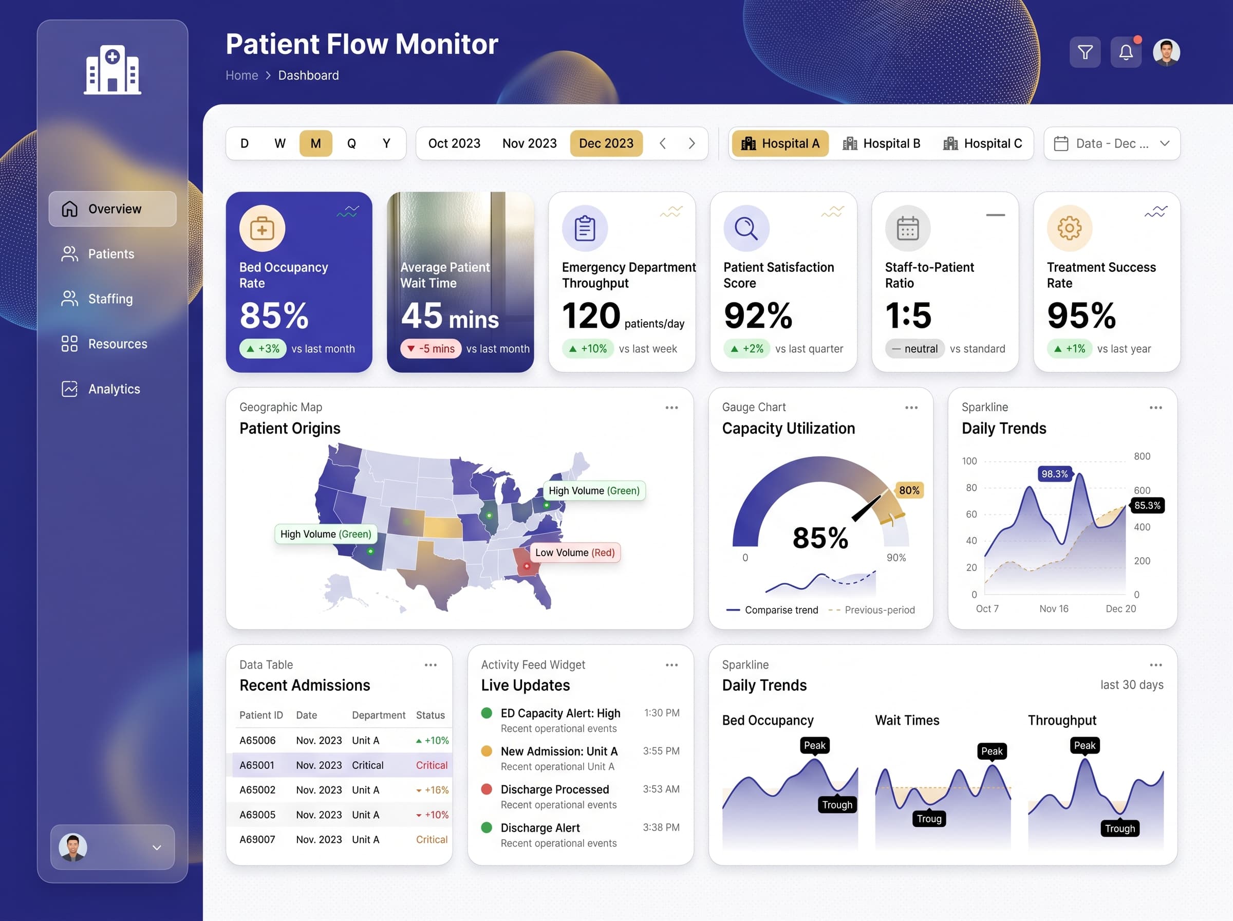
About this dashboard
Real-time tracking of bed occupancy, ER wait times, patient throughput, and staffing levels.
KPIs tracked
Charts
Strategic insights
Design recommendations
Color Palette Strategy
HighUtilize a charcoal-teal palette effectively by using charcoal for background elements and teal for high-contrast metrics. Ensure at least a 4.5:1 contrast ratio for accessibility on text.
Layout & Grid System
HighImplement a 12-column grid with a 16:9 ratio. Place KPIs at the top for visibility, charts in the middle for analysis, and filters on the side. Maintain 16-24px padding and 16-20px gaps between cards.
Typography Hierarchy
MediumUse a clear typography hierarchy: Dashboard title at 24-28px bold, section headers at 18-20px semi-bold, card titles at 14-16px medium, and body text at 12-14px regular.
Data Visualization UX
HighSelect chart types that effectively convey data insights: Gauge for targets, Geographic Map for location-based data, and Sparklines for trends. Limit colors per chart to 5-7 for clarity.
Visual Hierarchy & Focus
MediumCreate distinct visual hierarchies with the most important metrics in larger fonts. Use whitespace to separate sections and highlight anomalies with conditional formatting.
Interaction & Feedback
LowIncorporate hover states for interactive elements and loading skeletons during data refresh. Provide clear visual feedback on filter selections and consider drill-through navigation for detailed insights.