About this dashboard
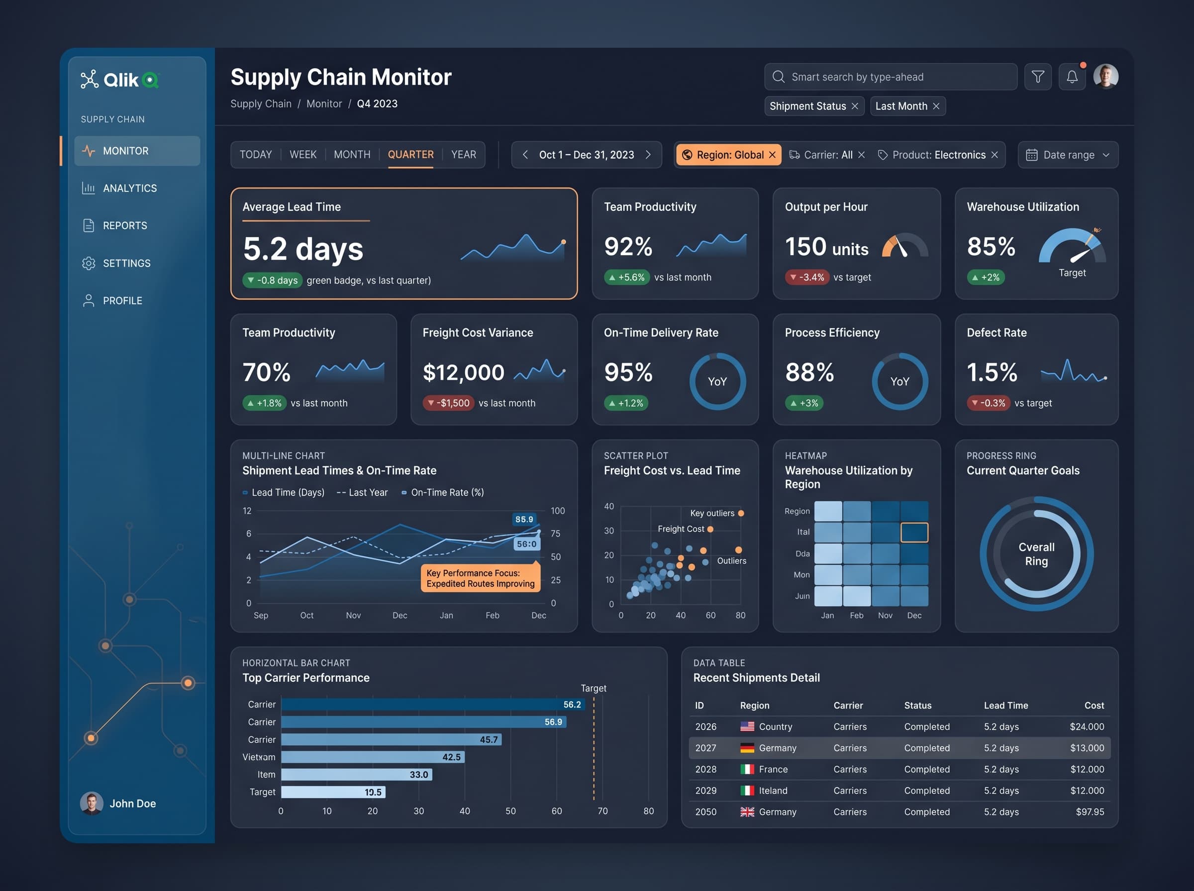
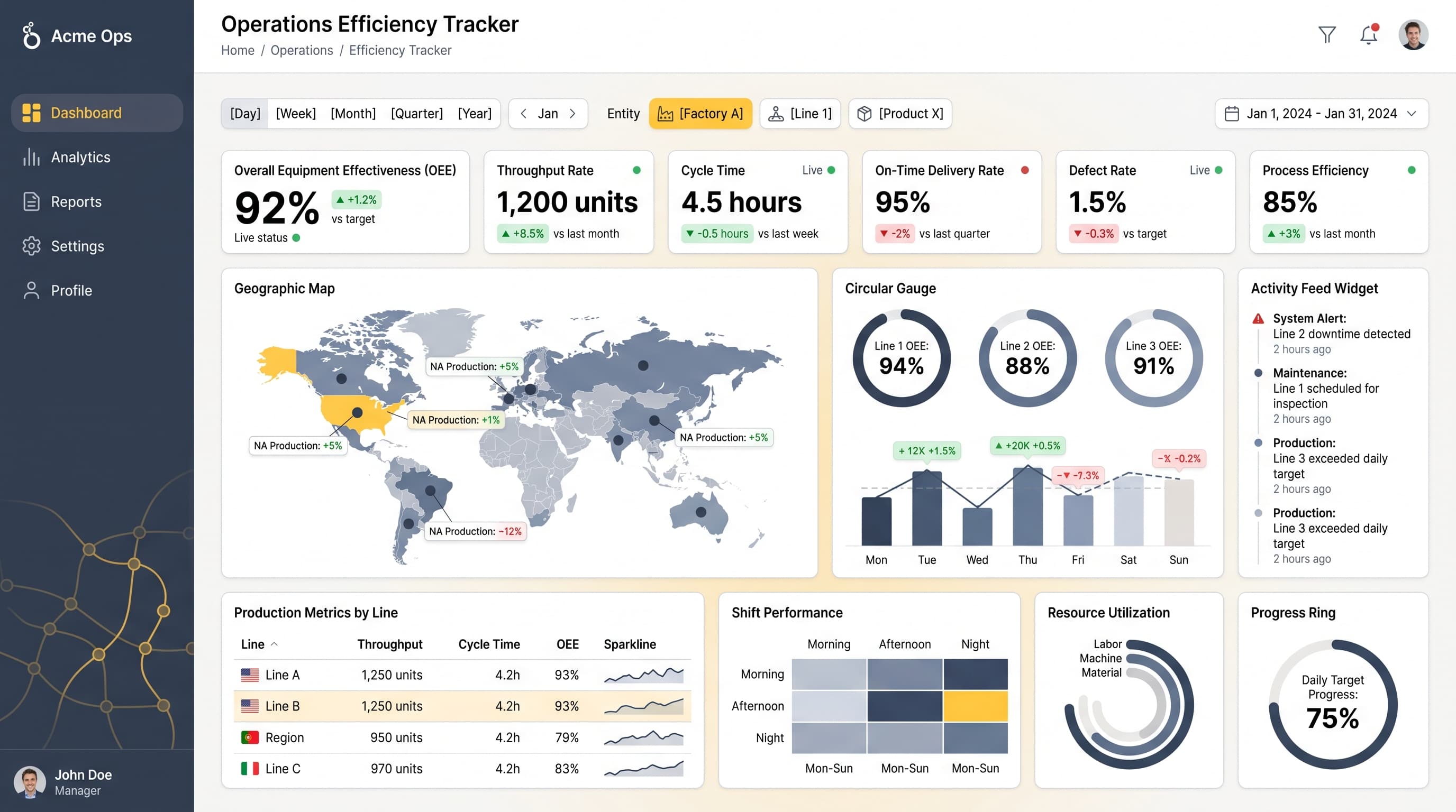
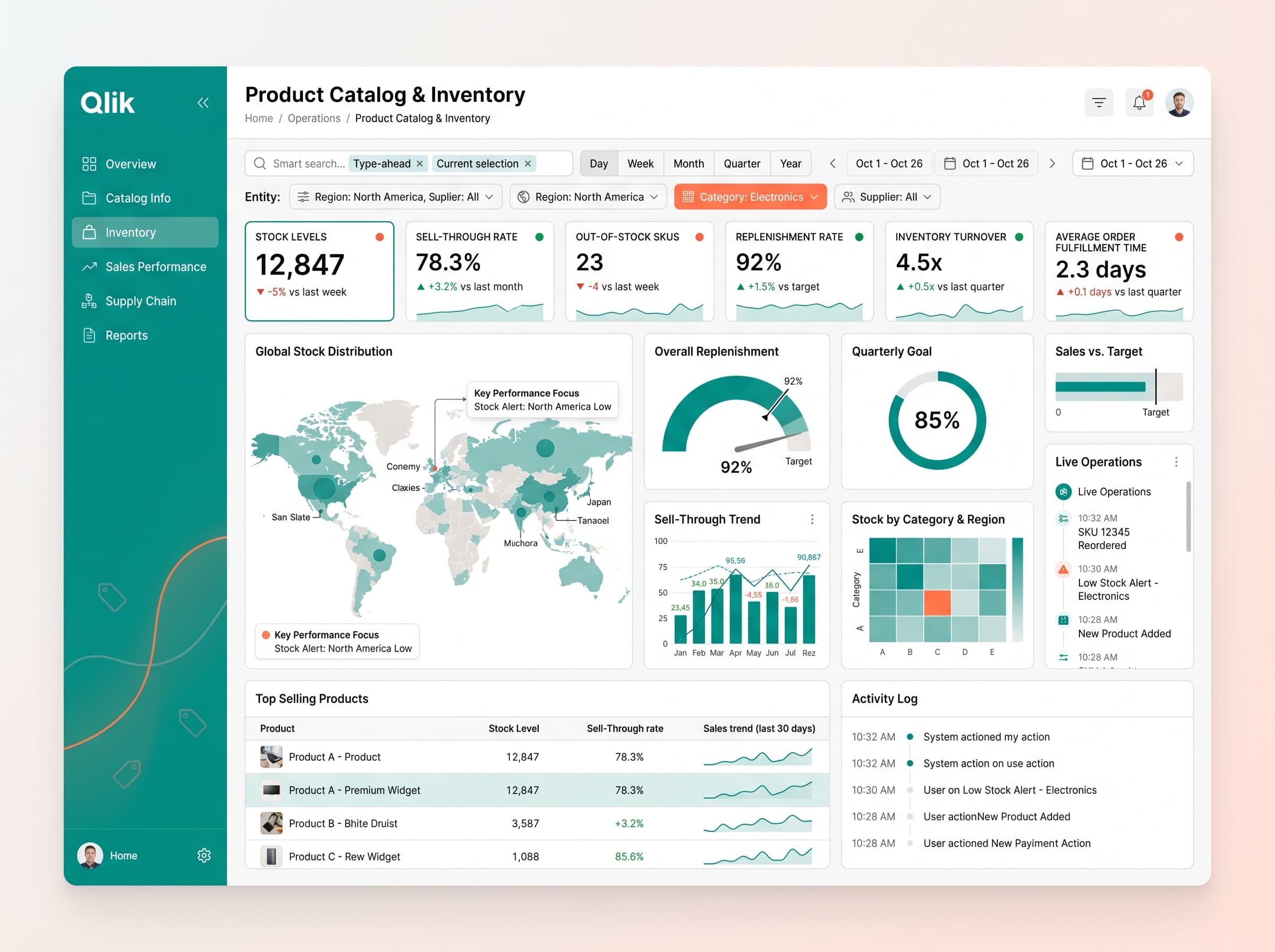
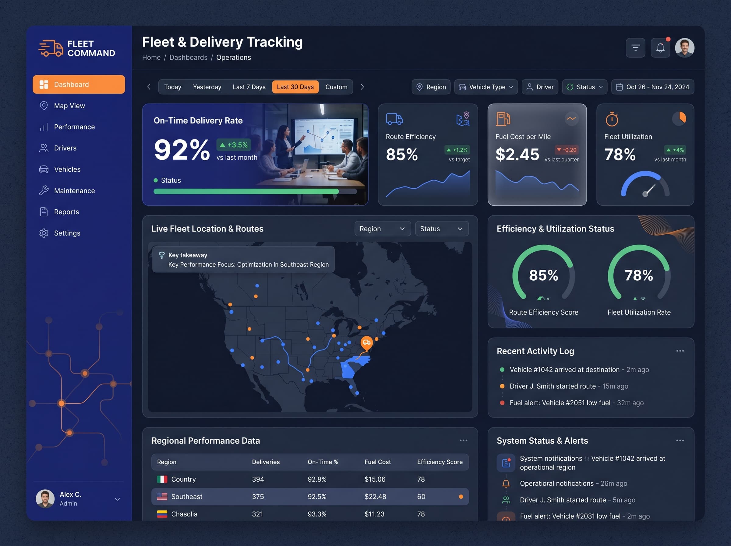
Monitor crop yields, soil moisture, and harvest progress across fields for enhanced operational efficiency.
KPIs tracked
Charts
Strategic insights
Design recommendations
Color Palette Strategy
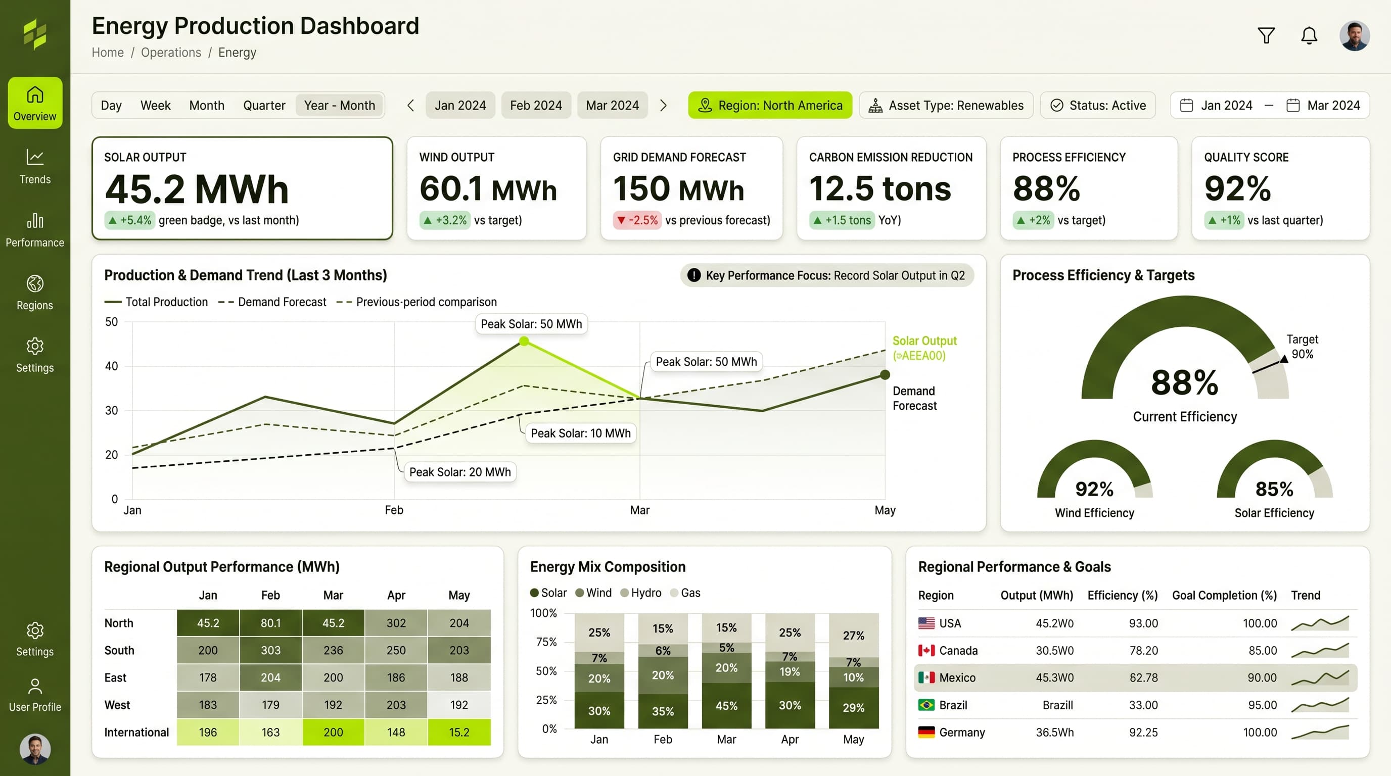
HighUse the forest-peach palette to create a visually appealing yet professional interface. Ensure a 4.5:1 contrast ratio for text and background elements, emphasizing key metrics with the peach accent for alerts.
Layout & Grid System
HighImplement a 12-column grid layout in a 16:9 ratio. Place KPIs at the top row for immediate visibility, with charts distributed in the middle section and detailed insights in the lower section. Maintain 16px padding and 20px gaps between sections.
Typography Hierarchy
MediumEstablish a clear typographic hierarchy: Dashboard title at 28px bold, section headers at 20px semi-bold, and body text at 14px regular. Use a single font family such as Inter for consistency across the dashboard.
Data Visualization UX
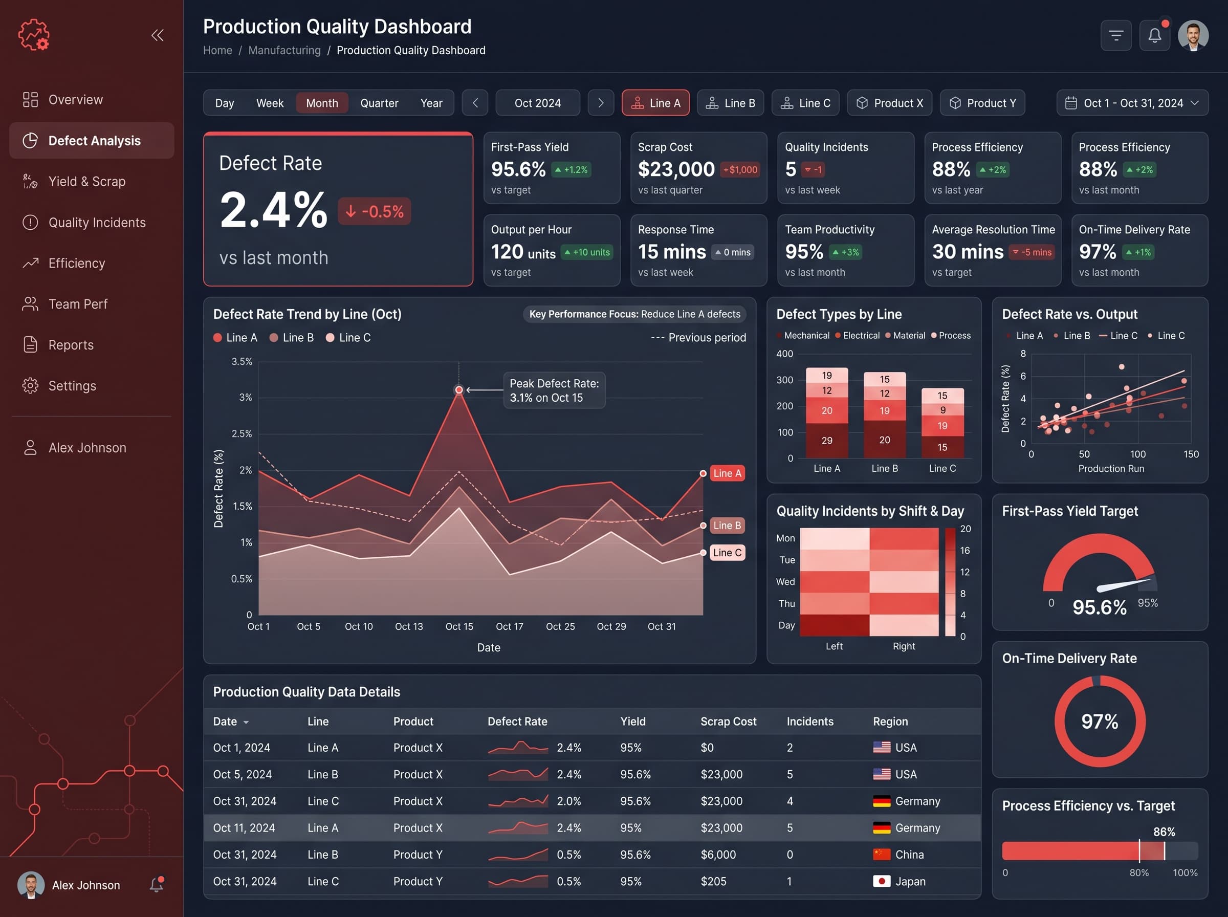
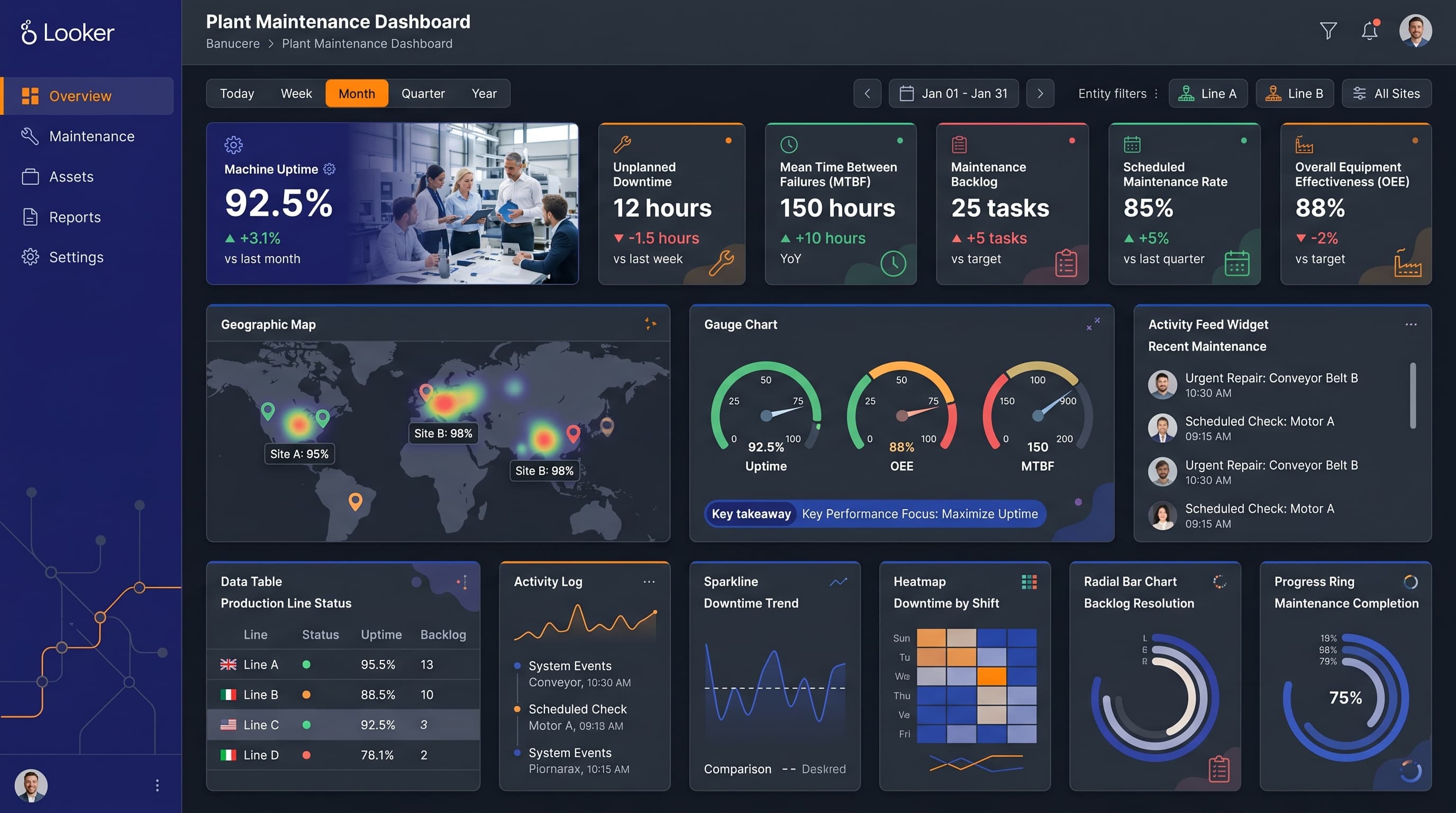
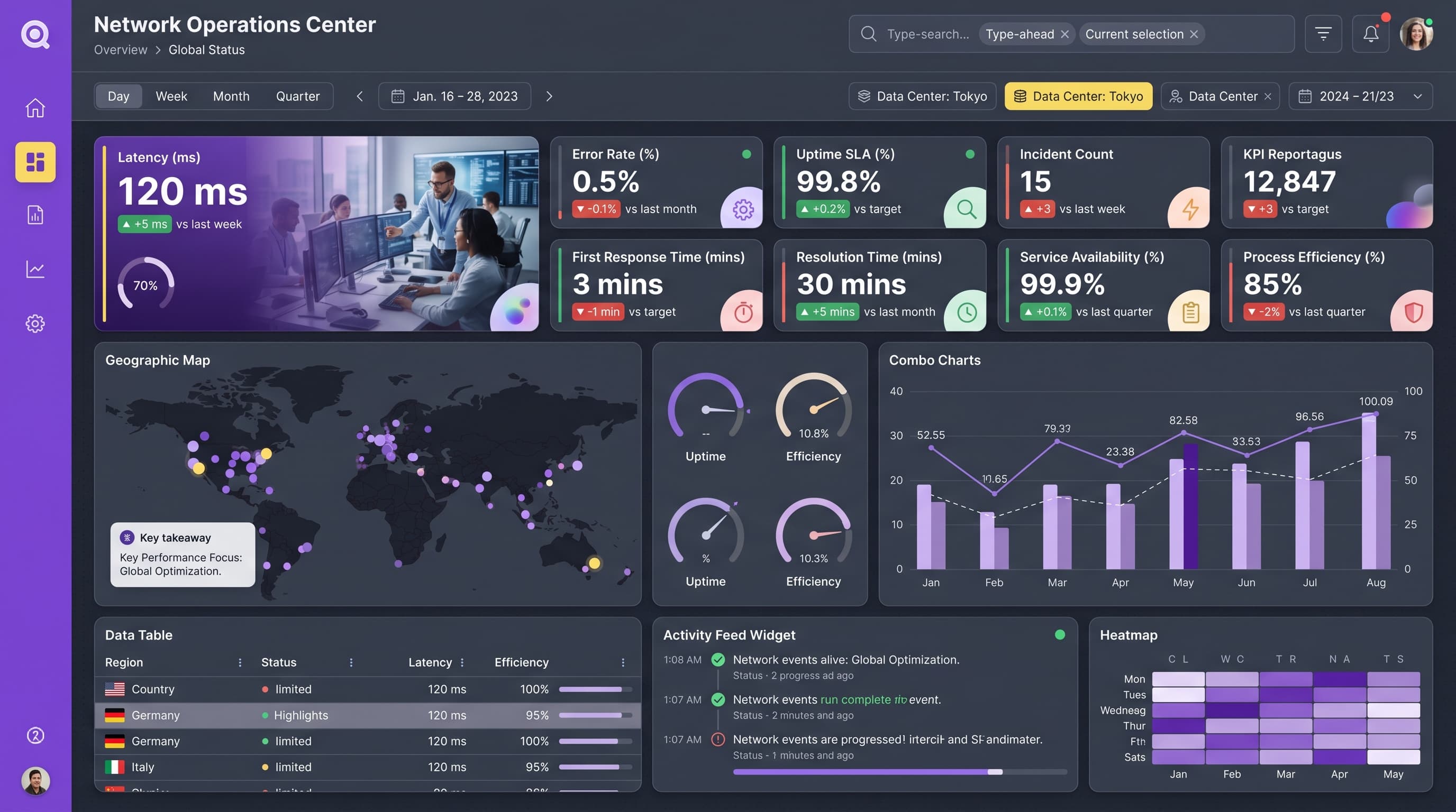
HighSelect chart types that fit the data narrative: a geographic map for spatial data, a gauge for performance metrics, and a heatmap for comparative analysis. Limit colors per chart to 5-7 to avoid confusion, and ensure clear legends and tooltips for user clarity.
Visual Hierarchy & Focus
MediumCreate a clear visual hierarchy with the most important metrics standing out through size and color usage. Ensure adequate whitespace around sections and apply conditional formatting to highlight negative trends in red and positive trends in green.
Interaction & Feedback
LowImplement hover states on interactive elements for better user experience, such as reducing opacity or adding shadows. Include loading states during data refresh and provide feedback on filter selections for seamless navigation.