About this dashboard
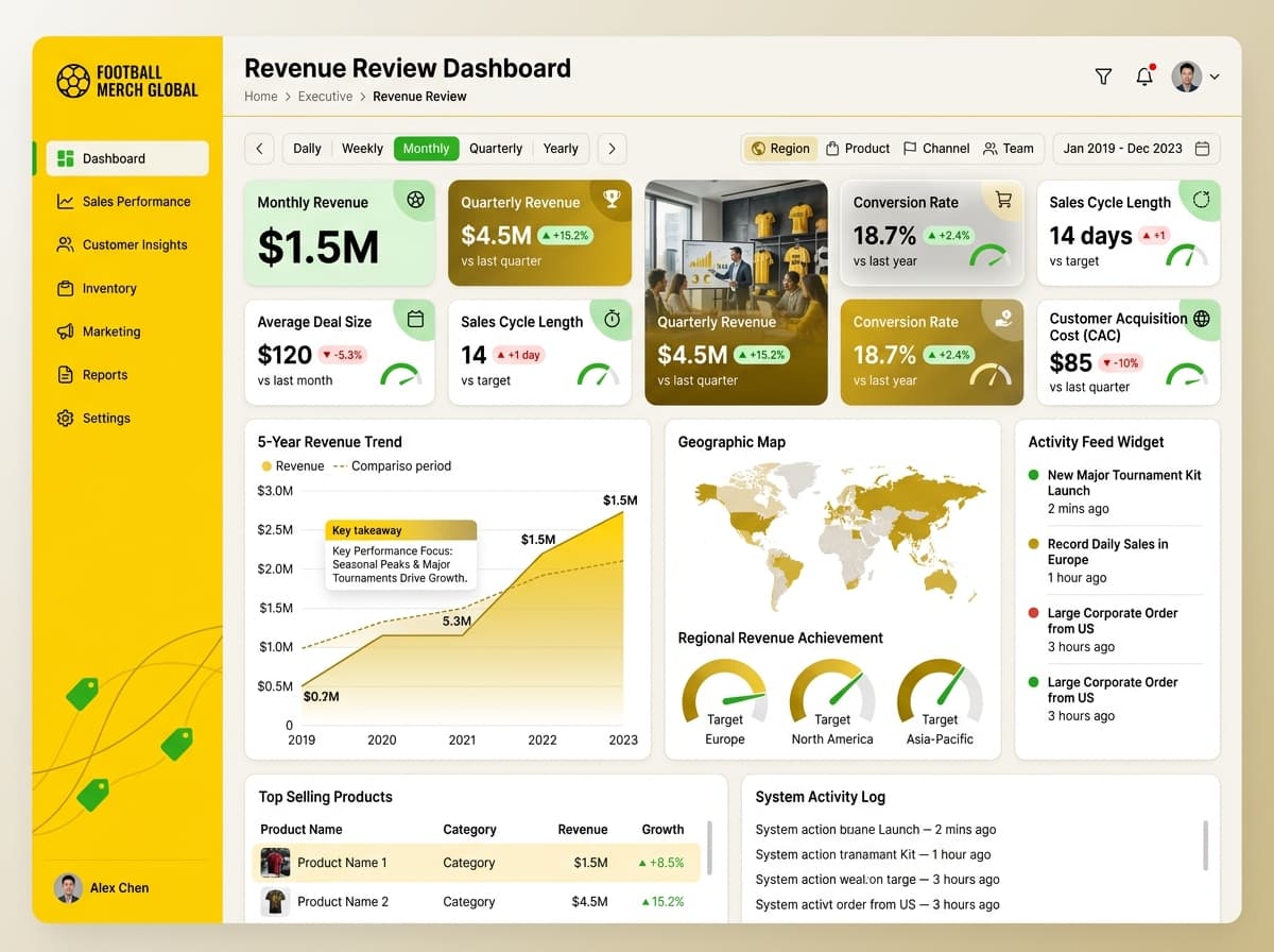
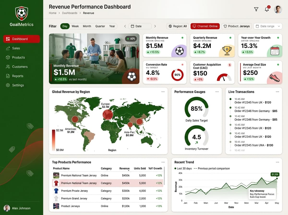
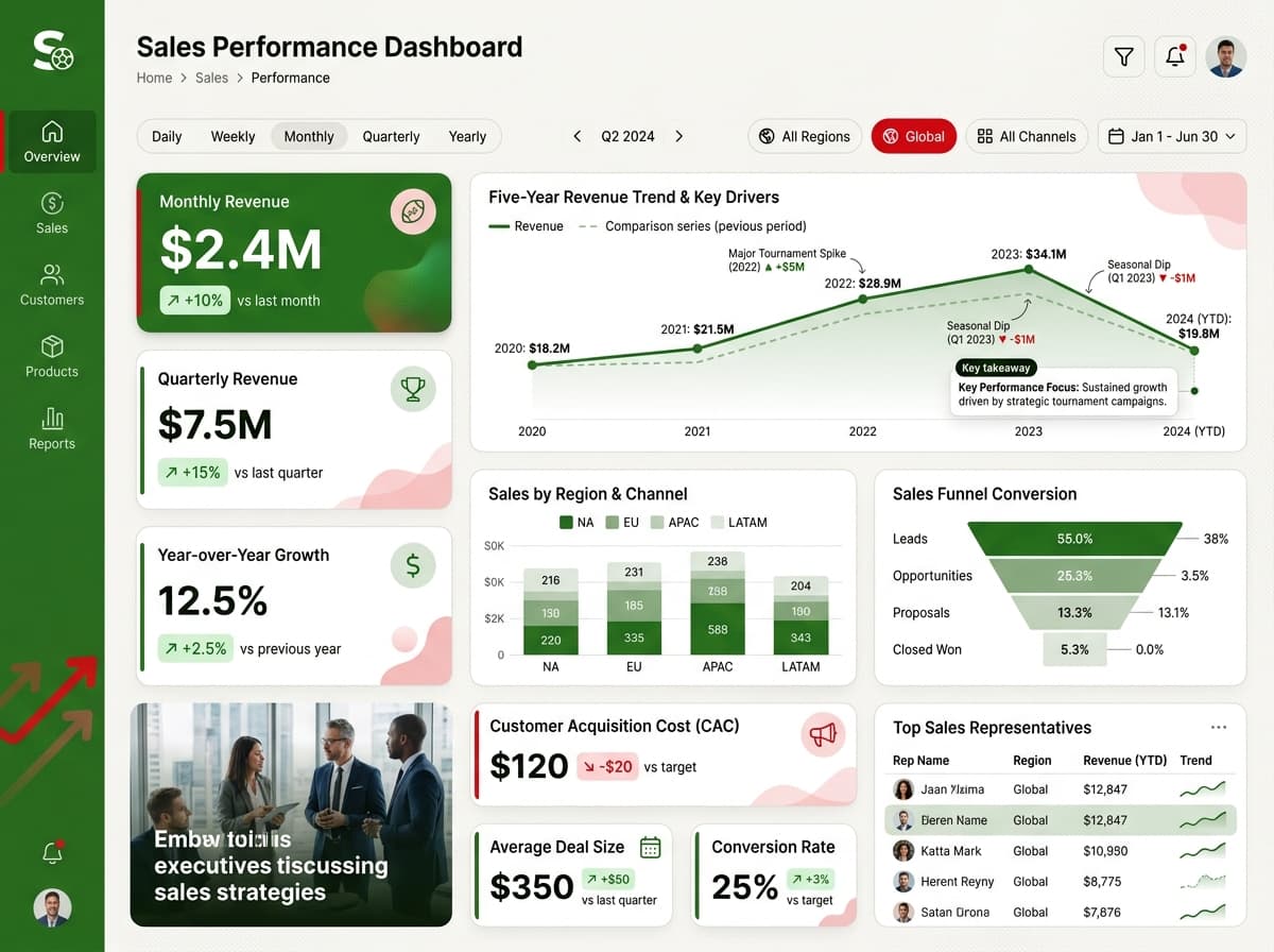
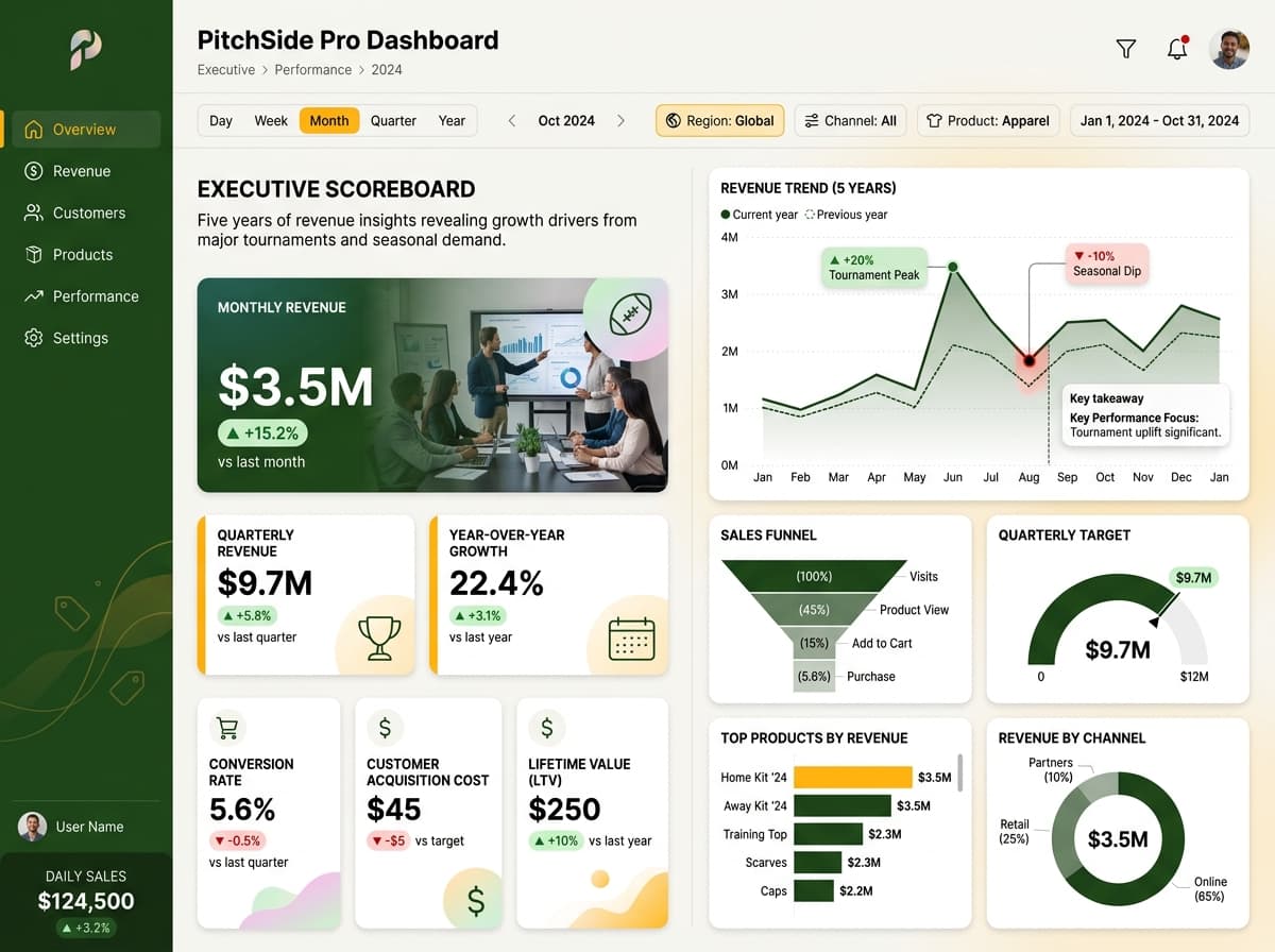
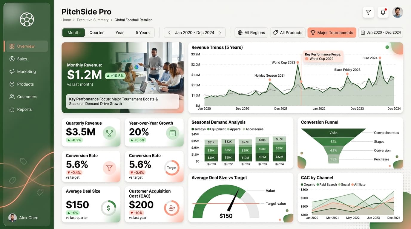
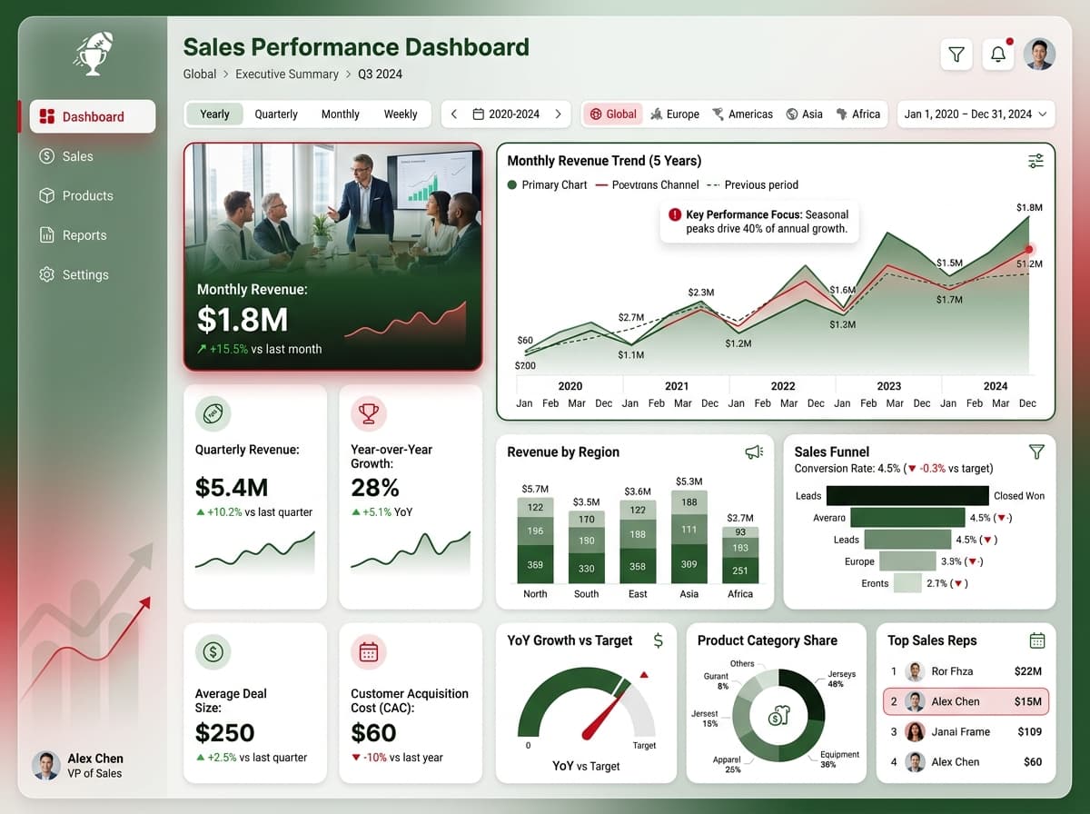
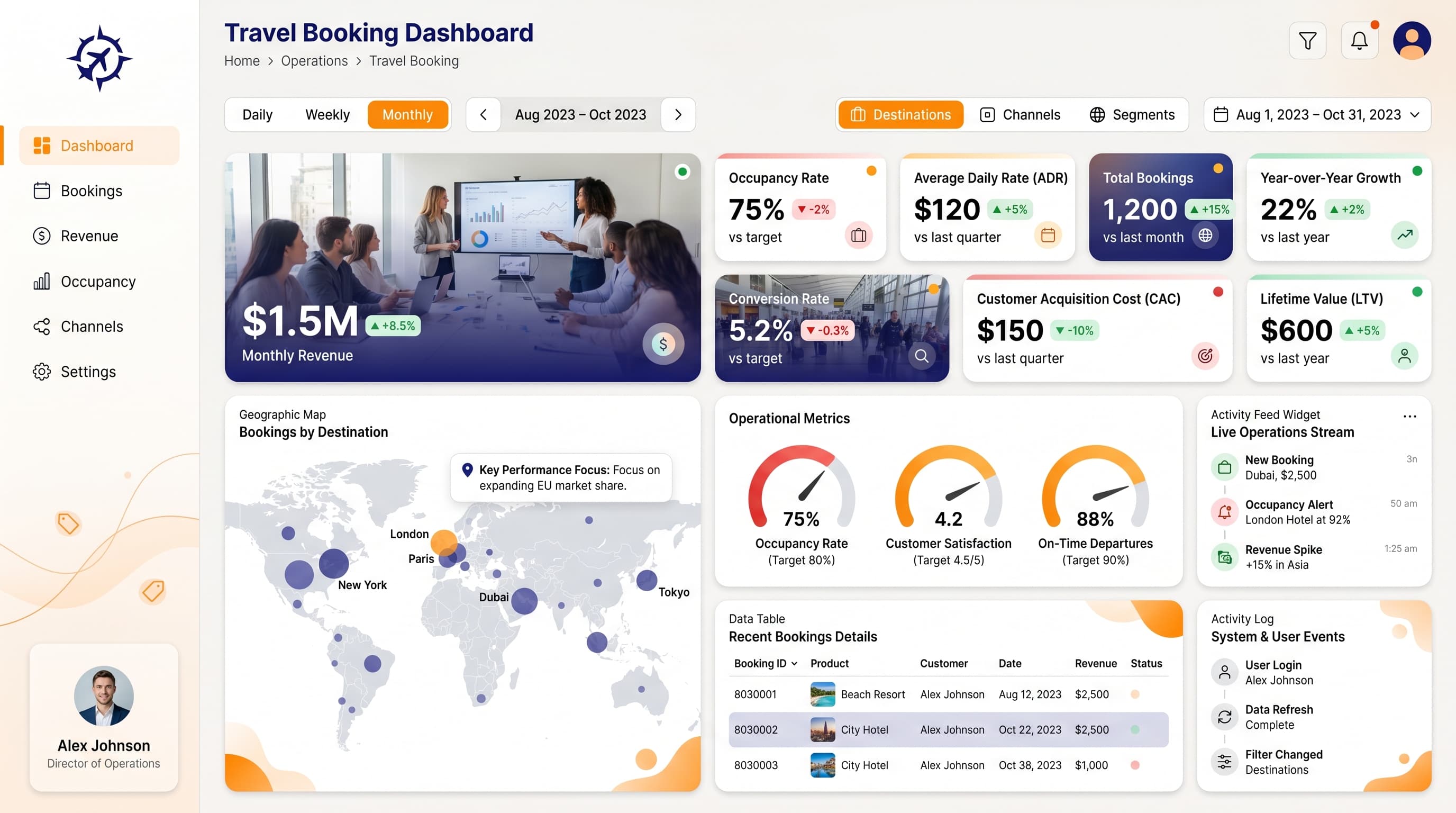
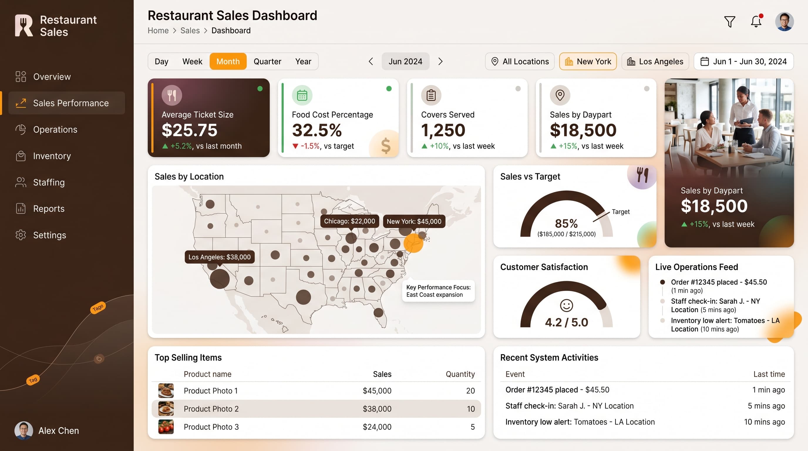
A strategic dashboard to track quota attainment, goal progress, and forecast accuracy by rep and team.
KPIs tracked
Charts
Strategic insights
Design recommendations
Color Palette Strategy
HighUtilize the indigo-amber palette strategically: use indigo for headers and navigation, amber for key metrics, and lighter shades for backgrounds. Ensure all elements maintain a contrast ratio of at least 4.5:1 for accessibility.
Layout & Grid System
HighImplement a 12-column grid system suitable for a 16:9 ratio. Position KPIs in the top row for immediate visibility, while charts occupy the middle section. Maintain 16-24px padding and 16-20px gaps between components for clarity.
Typography Hierarchy
MediumEstablish a clear typography hierarchy: Dashboard title should be 24-28px bold, section headers at 18-20px semibold, and body text at 12-14px regular. Use a consistent font family, such as Inter or Segoe UI, for uniformity.
Data Visualization UX
HighSelect appropriate chart types: use Multi-Line Charts for trends, Progress Rings for targets, and Funnel Charts for sales processes. Limit colors per chart to a maximum of 5-7, and ensure legends are clear and positioned outside the chart area.
Visual Hierarchy & Focus
MediumCreate a clear visual hierarchy by emphasizing the most critical metrics with larger, bolder elements. Use whitespace effectively to separate sections and employ subtle shadows to enhance card depth. Highlight anomalies with conditional formatting.
Interaction & Feedback
LowIncorporate hover states for interactive elements to enhance user engagement. Provide visual feedback during data refreshes, and include drill-through options for detailed analysis of specific metrics.