

Free reports
Colis Pro: a free designed Power BI report you can download
Download Colis Pro, a free designed Power BI report built with an AI agent: 5 pages, 2 panels, 347 visuals, French and English. What's inside, how to open it.
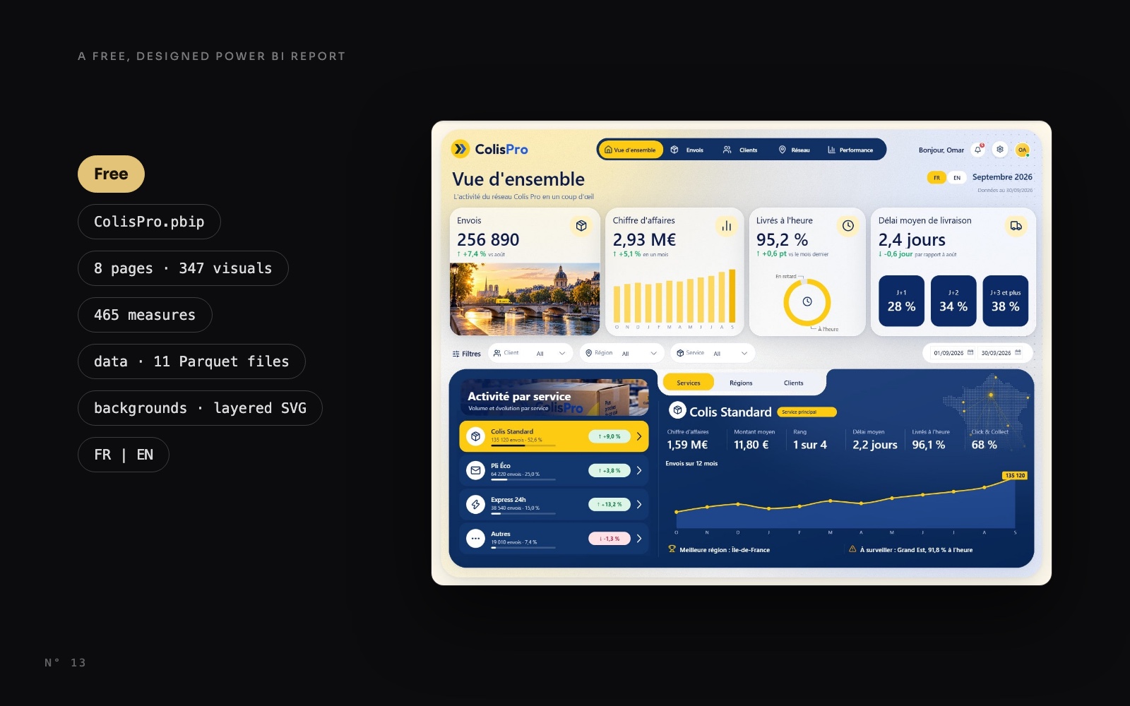
Most free Power BI samples are a .pbix with a few default charts on a white page. Colis Pro is the other kind: a complete, designed report that you can open in Power BI Desktop, take apart and reuse.
We built it with an AI agent, Claude Code, working through the Power BI Desktop Bridge. The agent wrote the files, reloaded the report in Desktop and captured its own render. Each round was reviewed, a few hand edits in Desktop became rules for every page, and it took 77 rounds in two days. The result is free to download.
Here is what is in the zip, how to open it, what each page shows, and where each technique inside is explained.
What Colis Pro is
Colis Pro is a fictional parcel carrier (colis is French for parcel). The brand, the customers and every number are made up. The data was generated, then calibrated so that each figure matches the mockups the report was designed from.
- 5 report pages: Overview, Shipments, Customers, Network, Performance.
- 2 panels that open over the report: Alerts and Settings.
- 347 visuals, and only 9 of them are charts.
- A semantic model of 30 tables and 465 measures.
- About 4 million shipments, from January 2025 to September 2026.
- French and English, switched with one button.
What's in the zip
The zip weighs 103 MB. It holds the project as Power BI Desktop opens it, in the PBIP format, minus the caches.
| Path | What it is |
|---|---|
ColisPro.pbip | The file you open in Power BI Desktop |
ColisPro.Report/ | The report in PBIR format: 8 pages, one JSON file per visual, the theme and the PNG page backgrounds |
ColisPro.SemanticModel/ | The model in TMDL format: 30 tables, 18 relationships, 465 measures, French culture |
data/ | 11 Parquet files, plus the two Python scripts that generated and calibrated them |
assets/backgrounds/ | The 7 page and panel backgrounds as layered SVG files, editable in Figma |
LICENSES/ | lucide.txt, the licence of the icons |
README.md | How to open it, in English and in French |
The 8 pages are the five report pages, the two panels and a hidden check page named Recette (more on it below).
All 465 measures live in one table, _Mesures, sorted into 17 numbered display folders from 00 Base to 99 Technique. The model speaks French: [Envois] is shipments, [Chiffre d'affaires] is revenue.
How to open it, step by step
You need Power BI Desktop for Windows, a 2026 release. On a Mac, run Desktop in a Windows virtual machine.
- Download the zip from the Colis Pro page or from the GitHub release.
- Unzip it at the root of
C:\. The zip holds aColisProfolder, so the data lands inC:\ColisPro\data\, the path the model expects. - Open
ColisPro.pbipin Power BI Desktop. - Unzipped somewhere else? Go to Transform data > Edit parameters and set
DossierDonneesto the full path of thedatafolder, ending with a backslash, for exampleD:\Projects\ColisPro\data\. - Click Refresh. The data loads from the Parquet files. The shipments table holds about 4 million rows, so expect one to two minutes.
The parameter is one line of TMDL, in ColisPro.SemanticModel/definition/expressions.tmdl:
expression DossierDonnees = "C:\ColisPro\data\" meta [IsParameterQuery=true, Type="Text", IsParameterQueryRequired=true]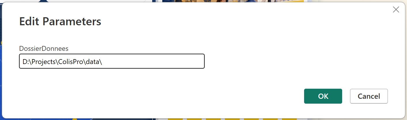
Why refresh at all? The zip ships without the data cache, to stay small. Until you refresh, the visuals have nothing to show.
Then check the refresh. In Desktop, open the hidden page Recette, the last page tab. It shows 14 key figures for September 2026, each followed by the value it should show, in brackets (cible is French for target). We used it during the build to check the model against the mockups.
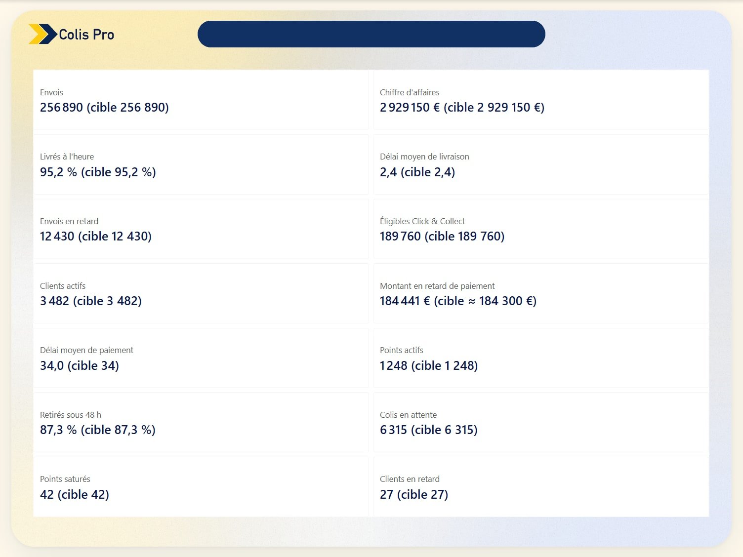
Three things to know once it is open:
- The report opens on the Overview, in French, with the period set to September 2026. Click EN in the header to switch to English.
- In Desktop, hold Ctrl and click to use a button: the menu, the bell, the gear. Once published, a plain click works.
- The page tabs keep their French names: Vue d'ensemble, Envois, Clients, Réseau and Performance, then the hidden Alertes, Réglages and Recette.
A tour of the pages
The five report pages share one frame, one menu and one header, with the bell, the gear and the FR | EN switch.
Overview
Four KPI cards (shipments, revenue, on-time delivery, average delivery time) sit above the activity panel. Its tabs switch between services, regions and customers, and the list on the left drives a detail sheet with a 12-month trend for the selected row. The frame, the card surfaces and the navy panel are pixels of the page background, not visuals: anatomy of a designed Power BI report takes the page apart.
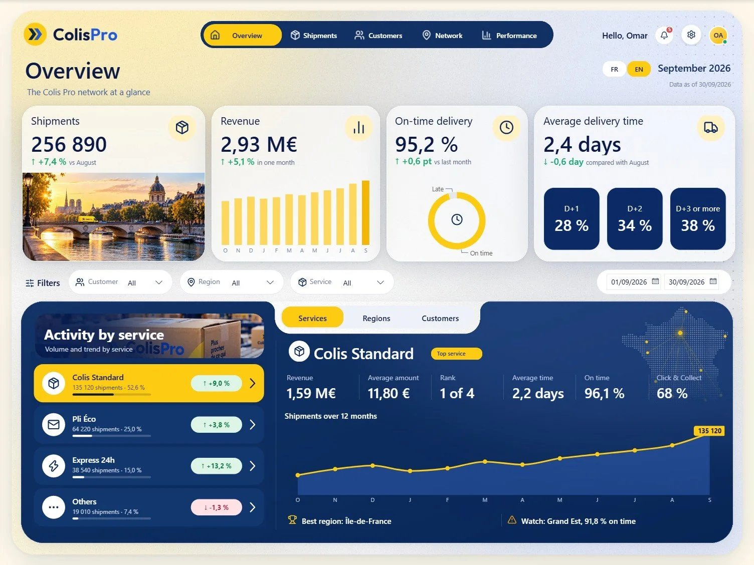
Shipments
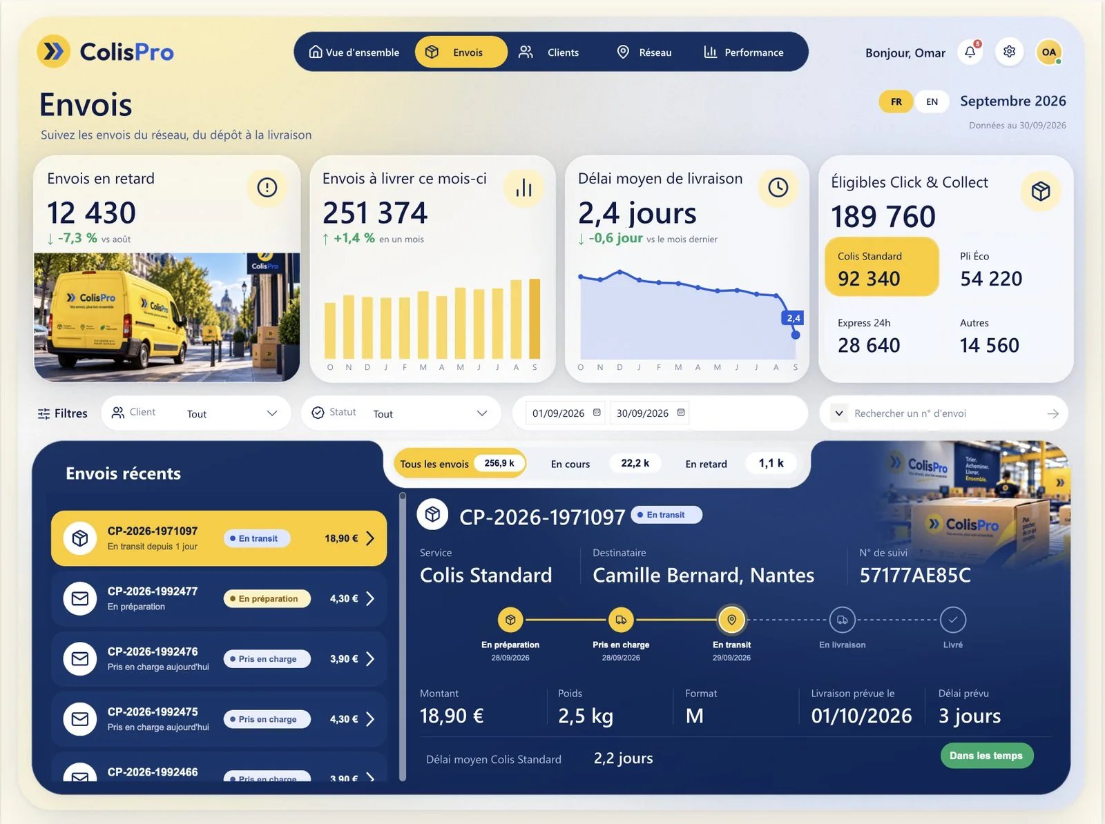
Late shipments, shipments to deliver this month, delivery time and Click & Collect, then the recent shipments. Pick a parcel in the list and the sheet shows its tracking timeline, from preparation to delivery. Each row of the list is an SVG tile drawn by a measure: see table rows as cards.
Customers
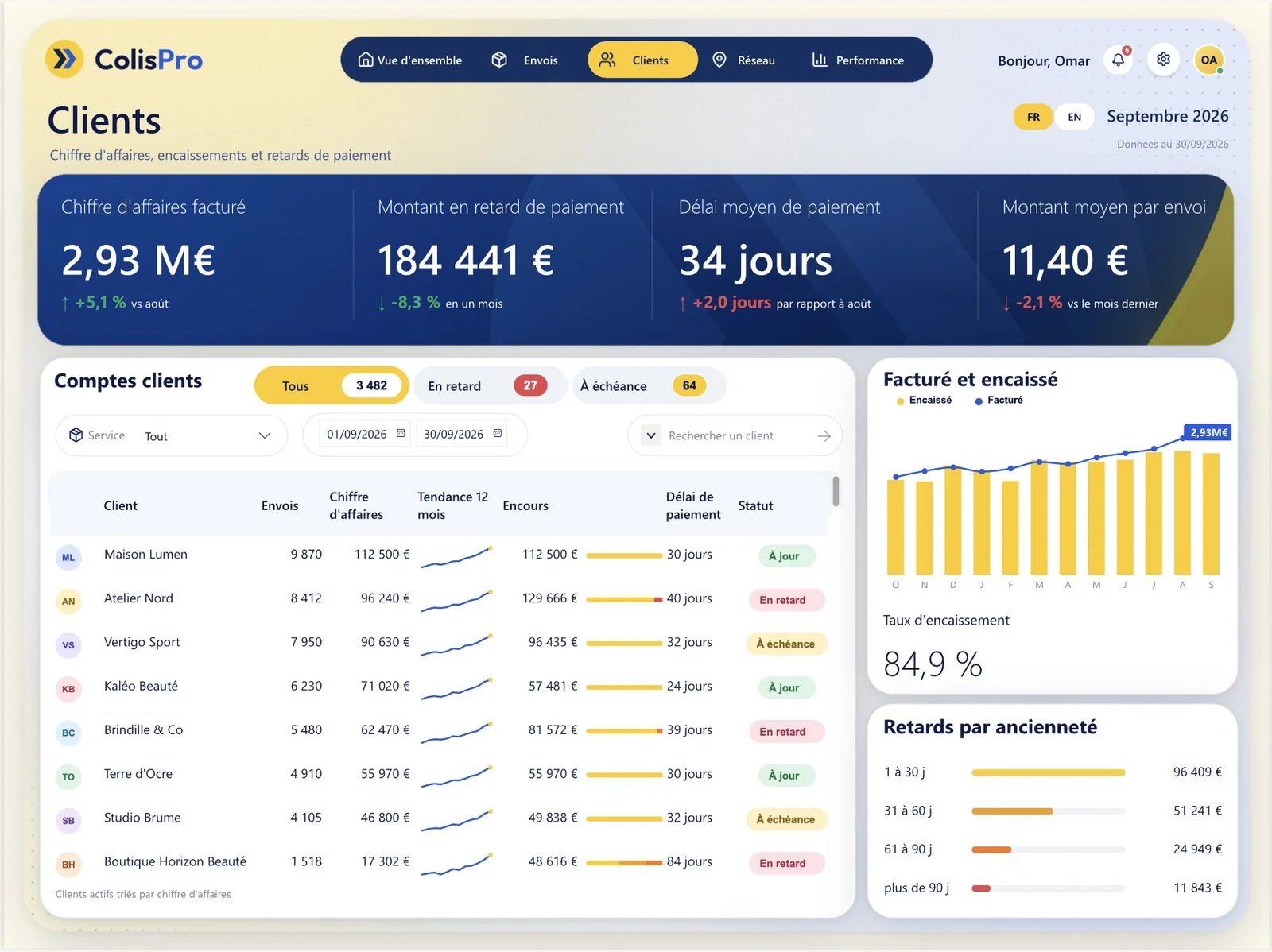
Four KPIs run across a navy banner: billed revenue, overdue payments, payment delay and average amount per shipment. The customer accounts table carries an initials badge, a 12-month trend, the outstanding balance with its bar and a status pill. On the right: billed versus collected, and overdue amounts by age. The badges, bars and pills are SVG images returned by measures: SVG measures in Power BI cards.
Network
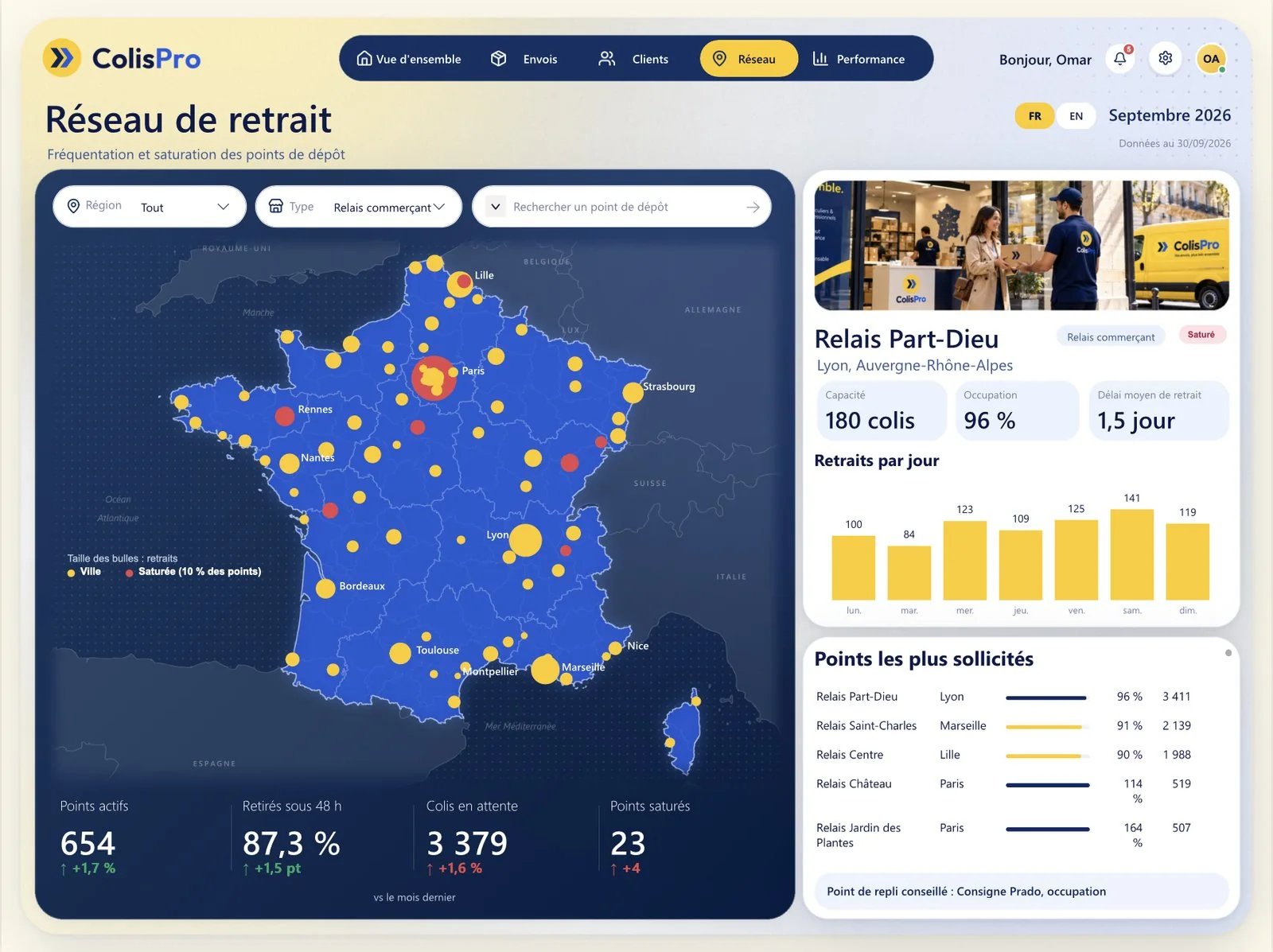
Pickup points on a drawn map of France. It is not Azure Maps but a scatter chart over a map image: one bubble per city, sized by pickups, red where at least 10 % of the city's points are saturated. A click on a city filters the pickup point sheet on the right (capacity, occupancy, average pickup time, pickups per day). How the map is built: a Power BI map without Azure Maps.
Performance
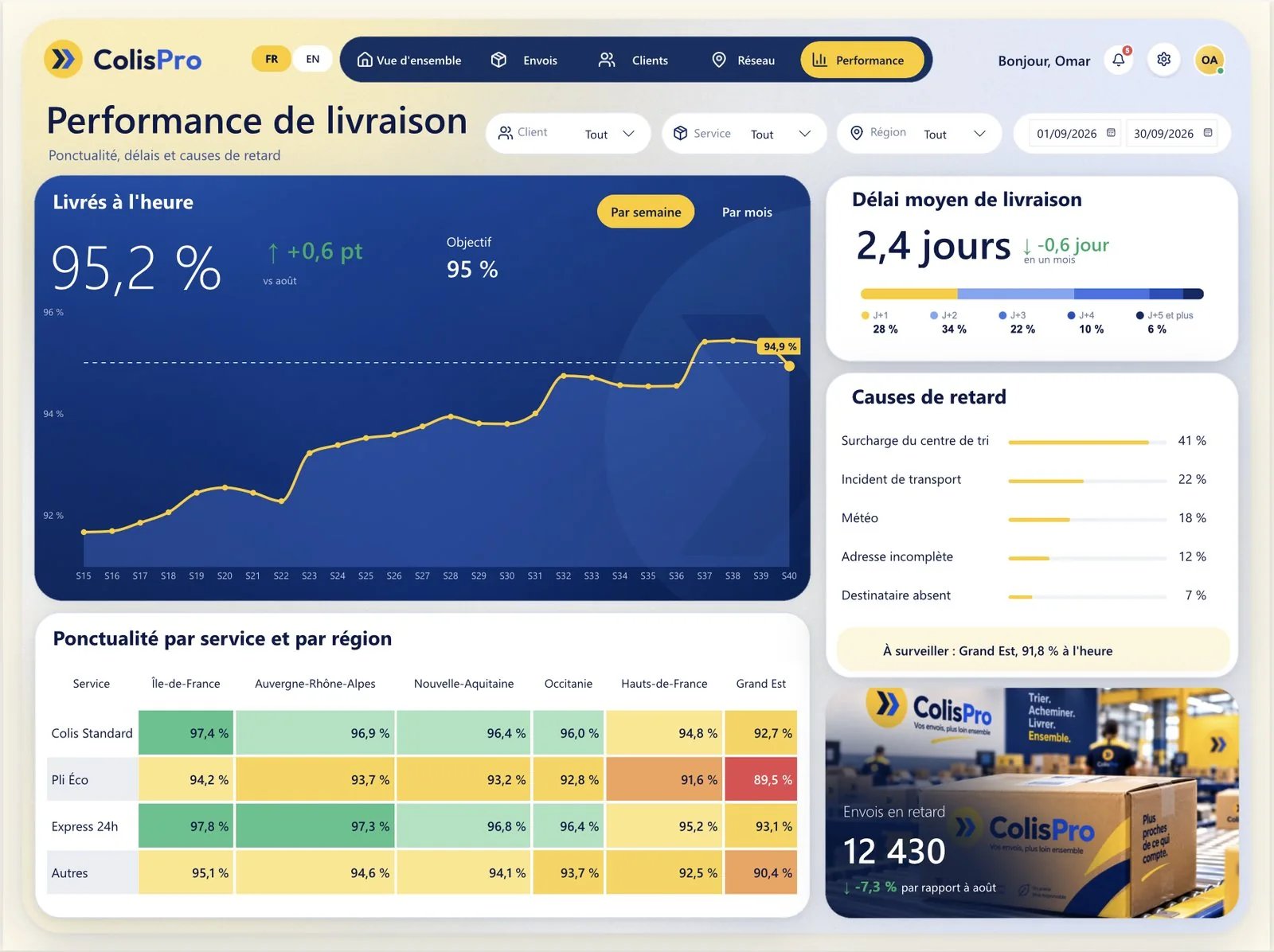
On-time delivery by week or by month against a dashed target line, delivery time split by day (D+1 to D+5 and more), delay causes, and a heatmap of punctuality by service and region. The navy tile, the white surfaces and the sorting centre photo behind the late shipments figure are all drawn in the page background: page background design.
The Alerts and Settings panels
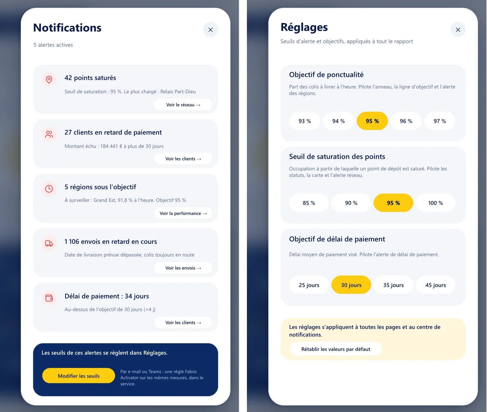
The bell in the header counts the active alerts. Click it and the Alerts panel opens over the blurred report with five alerts: saturated pickup points, late-paying customers, regions under target, late shipments in transit and payment delay. Each one links to the page that explains it. The gear opens the Settings panel: the on-time target, the saturation threshold and the payment delay target. They drive the statuses, the target lines, the map and the alerts on every page. Both panels are hidden pages, not bookmarks: a settings panel in Power BI.
Index of the techniques inside
| Technique | Where to find it in Colis Pro | Article |
|---|---|---|
| Where the design lives | Every page: 347 visuals, 167 cards, 9 charts | Anatomy of a designed report |
| Page backgrounds | PNG in ColisPro.Report/StaticResources/RegisteredResources/, layered SVG in assets/backgrounds/ | Page background design |
| SVG measures | Status pills, customer badges, the tracking timeline, the icon in the donut | SVG measures in cards |
| Table rows as cards | The activity list (Overview), the recent shipments (Shipments) | Table rows as cards |
| A map without Azure Maps | Network: a scatter chart over a drawn map | Map without Azure Maps |
| A settings panel | The gear, the hidden page Réglages, three parameter tables | Settings panel |
| A bilingual report | The FR / EN switch, the Langue table, the 85 Langue measure folder | Bilingual report |
| PBIP, PBIR and TMDL | The folder itself: .pbip, .Report, .SemanticModel | PBIP, PBIR and TMDL explained |
| Validator traps | The visual.json files: what the PBIR validator passes and Desktop draws differently | PBIR validator traps |
| The Desktop Bridge loop | How each round was checked: reload in Desktop, capture every page, read the render | Desktop Bridge on a Mac |
| The method | Mockups, generated data, the TMDL model, the PBIR report, 77 review rounds | The AI agent method |
What you may do with it
The README sets the terms: Colis Pro is free to open, study, adapt and reuse, including in your own work. Please don't resell it as a template. Piece by piece:
- Icons: Lucide, under the ISC License, in
LICENSES/lucide.txt. The same file carries the MIT License that covers the Lucide icons derived from the Feather project. Both allow use, copying, modification and distribution, as long as the copyright and permission notices stay with the copies. - Base map: the map of France on the Network page is drawn from france-geojson, under the Etalab Open Licence 2.0.
- Photos: all generated with AI.
LICENSES/holds no separate file for them. - Data: the brand, the customers and every number are fictional. The Parquet files come from
data/generate_data.py, which is in the zip. - Fonts: the package contains no font files, and
LICENSES/no font licence. The text is set mostly in Segoe UI, which comes with Windows.
Download
- The Colis Pro page: every page in screenshots, how it was built, and the download button.
- The GitHub repository: browse the files online. The zip is the asset of release v1.0, and this direct link always points to the latest release.
A designed report on your own model
Colis Pro took 77 review rounds, on a fictional model. ChartCraft Forge generates a designed Power BI project in a few clicks, and its MCP server lets your agent forge one bound to your own semantic model. You take it from there.
FAQ
Do I need Power BI Pro to open it?
No. It opens in Power BI Desktop for Windows, which is free. A licence only matters if you publish and share the report in the Power BI Service.
Can I use it with my own data?
Not as is: the 465 measures expect the Colis Pro tables and columns. Reuse its pages, measures and backgrounds in your own report, or let ChartCraft's MCP server forge a designed report bound to your model.
Is it really free?
Yes. No account and no sign-up: download the zip from GitHub, then open, study, adapt and reuse it, including in your own work. Just don't resell it as a template.