

Design techniques
Let users set the thresholds: a settings panel in Power BI
Move thresholds out of DAX and into a settings panel: a parameter table, one measure with a default, a synced slicer and a hidden page. The whole report follows.
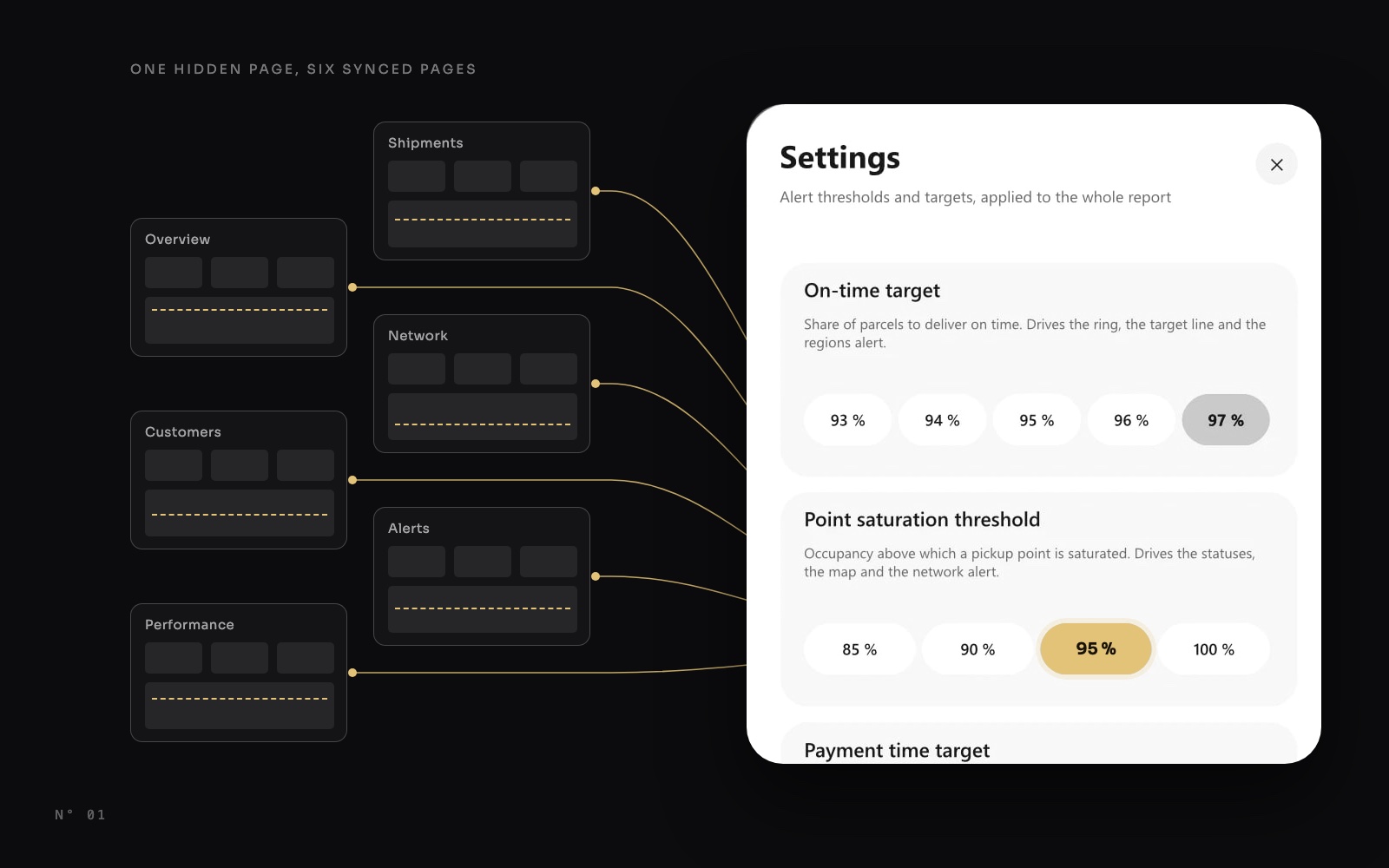
In most Power BI reports, thresholds live inside DAX. A pickup point is "saturated" above 95 % occupancy because someone once typed >= 0.95 in a measure. Want 90 % instead? Open the model, edit the measure, republish. And the person who knows the right threshold is rarely the person who can edit the model.
In Colis Pro, a free Power BI report built with an AI agent, the user sets them. A settings panel holds three thresholds: the on-time target, the pickup point saturation threshold and the payment time target. Move one, and the whole report follows, on every page.
This article shows how it works, and how to build it in Power BI Desktop with no script and no bookmark.
What it does
Same data, same page. Only the saturation threshold moved, from 85 % to 95 %.
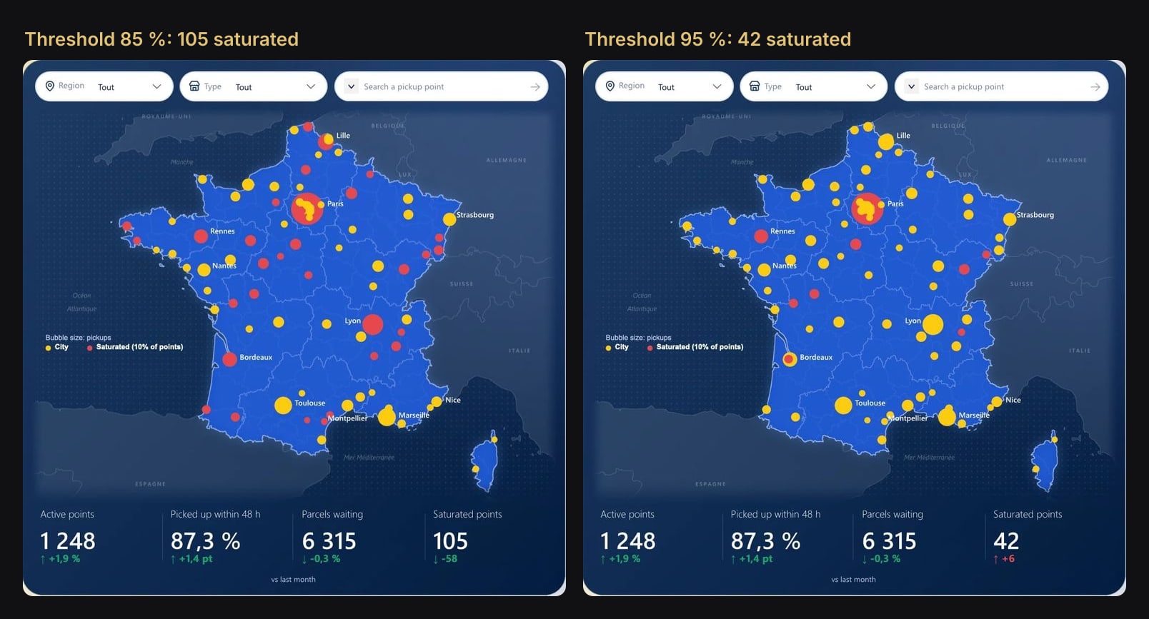
The map colours change, each point's status pill changes, and the saturated count and its trend update. So do the bars of the busiest points: navy means saturated.
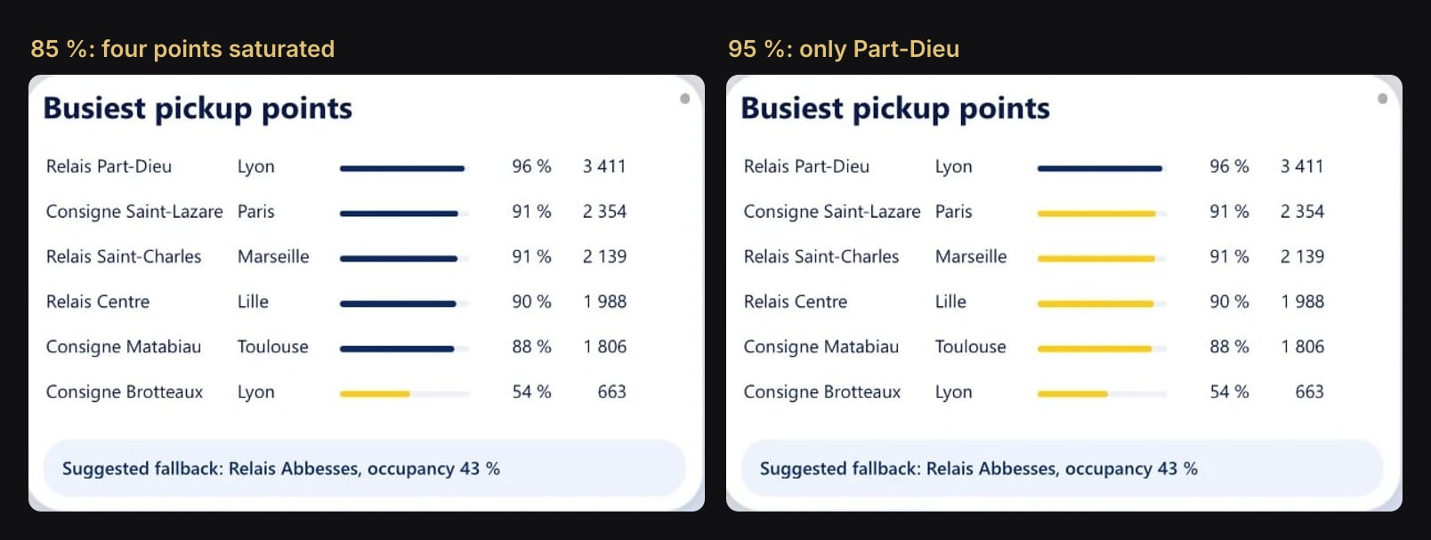
The effect is not limited to one page. The on-time target moves the target line on the Performance page, and the bell in the header of every page counts the active alerts. More on that at the end.
Before and after
The change is smaller than it looks. Everything that judges against the threshold stays exactly as it is. Only the source of the threshold moves: from a constant written in a measure to a value the user picks.
How it works
Four pieces, all native Power BI:
- A parameter table related to nothing. It holds the choices: a label for the user ("95 %") and a value for DAX (0.95).
- One measure with a default. It reads the selected value, or falls back to the default when nothing is picked.
- One slicer, synced to every page. It is visible on the settings page only. Every other page holds a hidden copy, so the selection applies everywhere.
- A hidden page as the panel. A gear button opens it, and a Back action closes it.
Step 1: a parameter table and a measure with a default
In Power BI Desktop, go to Modeling > New table and create the choices:
Réglage saturation =
DATATABLE (
    "Seuil de saturation", STRING,
    "Valeur", DOUBLE,
    {
        { "85 %", 0.85 },
        { "90 %", 0.9 },
        { "95 %", 0.95 },
        { "100 %", 1.0 }
    }
)
Two settings make it behave:
- Select the label column and set Sort by column to
Valeur, so "100 %" comes after "95 %" and not before "85 %". - Hide
Valeur. The user only ever sees the labels.
Do not relate this table to anything. It is a list of choices, not data.
Then the measure that every other measure will read:
Seuil saturation =
SELECTEDVALUE ( 'Réglage saturation'[Valeur], 0.95 )
The second argument matters. When the slicer is empty, SELECTEDVALUE returns that default instead of blank. Without it, an empty slicer returns blank, [Occupation] >= BLANK() is true for every point, and the whole network turns red.
Finally, replace the constant wherever the threshold was used:
Points saturés =
COUNTROWS (
    FILTER (
        VALUES ( DimPointDepot[PointID] ),
        [Occupation] >= [Seuil saturation]
    )
)
Why not a What-if parameter? Modeling > New parameter > Numeric range builds the same table and measure for you, with a slider over a numeric series. A table gives you named choices instead ("30 days", "95 %"), which render as pills and read better in a panel. Both work with the rest of this article.
Colis Pro has three of these tables, one per threshold:
| Table | Choices | Default | Measure |
|---|---|---|---|
Réglage ponctualité | 93 % to 97 % | 95 % | [Objectif ponctualité] |
Réglage saturation | 85 %, 90 %, 95 %, 100 % | 95 % | [Seuil saturation] |
Réglage délai paiement | 25, 30, 35, 45 days | 30 days | [Objectif délai de paiement] |
Step 2: one slicer, synced to every page
On the settings page, add a button slicer on the label column, 'Réglage saturation'[Seuil de saturation]. In Format > Selection, turn on Single select: with two pills picked, SELECTEDVALUE would fall back to the default.
Then open View > Sync slicers. For this slicer, tick Sync on every page, and tick Visible on the settings page only.
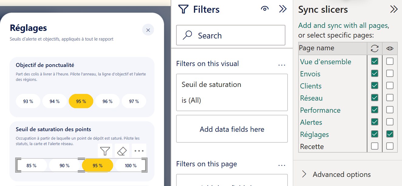
This is the step that makes it work everywhere. Sync without Visible puts a hidden copy of the slicer on each page, and the selection applies wherever a copy exists. In the report files (PBIR), each copy is an ordinary slicer marked hidden, in the same sync group:
"isHidden": true,
"visual": {
  "visualType": "advancedSlicerVisual",
  "syncGroup": {
    "groupName": "Reglage saturation",
    "fieldChanges": true,
    "filterChanges": true
  }
}
A page without a copy ignores the setting and uses the default. That includes pages you might forget: in Colis Pro, the Alerts panel has its own copies, so its alert texts follow the thresholds too.
Step 3: the panel is a hidden page
The panel is not a group of visuals that you show and hide. It is a page of its own.
- Create the page and hide it. Right-click its tab and choose Hide page. Readers never see it in the page list.
- Draw its background. Take a screenshot of your report, blur it, and draw a white drawer on the right with a grey row per setting. Figma's layer blur is enough, and so is PowerPoint's Blur effect. Export it, then set it as the page background: Format page > Canvas background > Image, scaling Fit.
- Place the native visuals on the drawer: the titles, the help texts, the three button slicers, and a Restore defaults button.
- Add an invisible Back button over the blurred area, with its fill turned off and the action Back. A click anywhere outside the drawer closes it. A ✕ in the corner does the same.
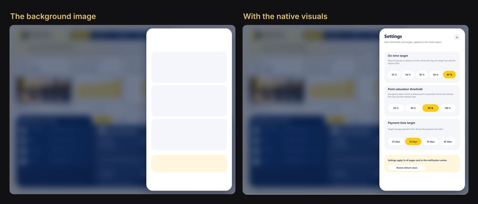
Then wire the buttons:
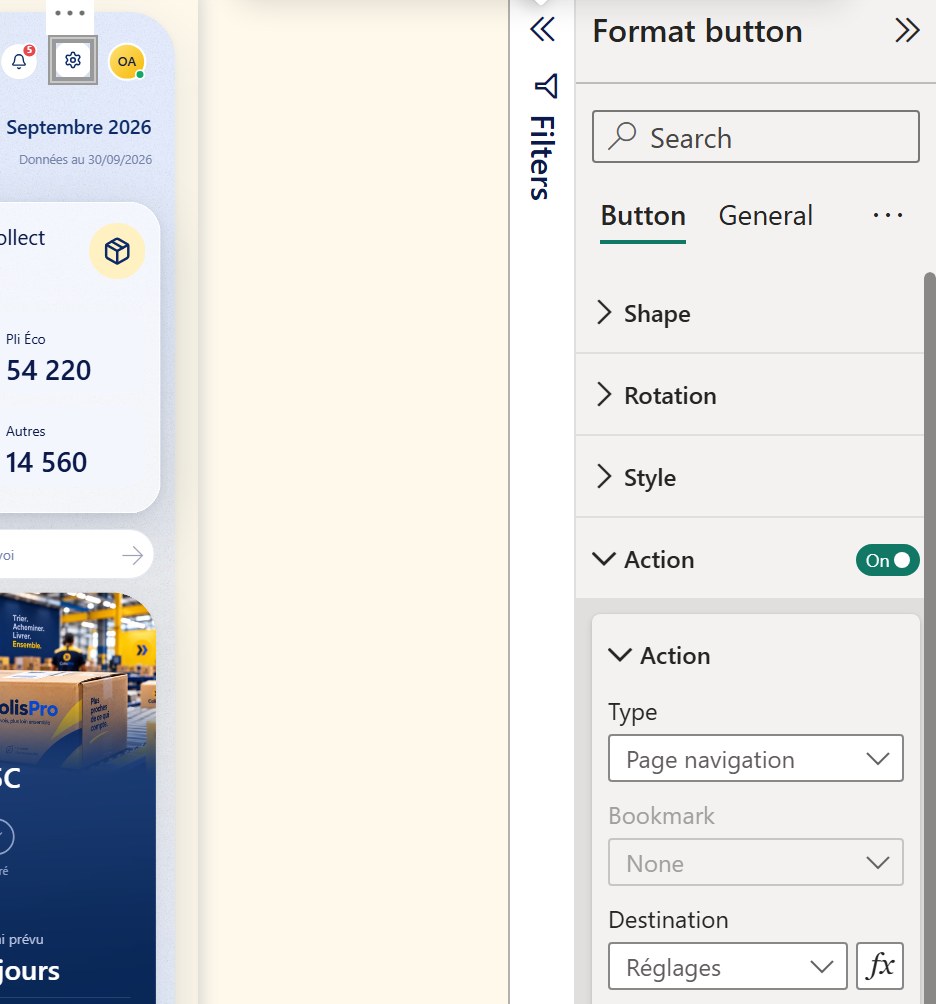
- On every report page, the gear icon is a button with the action Page navigation, destination the settings page.
- Restore defaults uses the action Clear all slicers. Empty slicers mean every threshold measure returns its default.
Why a hidden page and not bookmarks
The classic panel is a group of visuals shown and hidden with bookmarks. It works, but it scales badly.
| Show / hide with bookmarks | A hidden page | |
|---|---|---|
| Panels to maintain | One copy on every page | One for the whole report |
| Bookmarks | Two per page, kept in sync | None |
| Adding a visual later | Update every bookmark | Nothing to update |
| Closing | A bookmark per page | Back returns to the page you came from |
The trade-off: the blurred background is a fixed image, so it shows the same page whichever page you came from. Capture it from your busiest page. Behind a blur, nobody notices.
The traps
- A hidden copy on every page that reads a threshold, the alerts page included. A page without a copy silently uses the default.
- Clear all slicers clears every slicer on that page. Keep only the settings slicers on the settings page, or the Restore button will reset more than the thresholds.
- Single select on. Two pills picked means no single value, and
SELECTEDVALUEfalls back to the default. - Always give
SELECTEDVALUEa default. Blank compared with a number is treated as zero, and every comparison flips. - Sort the labels by their value, or "100 %" sorts before "85 %".
Going further: alerts that follow the thresholds
Once thresholds are measures, alerts come almost for free. In Colis Pro, each alert is a measure that returns 1 when it is active, and the bell badge is their sum:
Alertes : nombre =
    [Alerte réseau : active] + [Alerte paiements : active]
  + [Alerte ponctualité : active] + [Alerte envois : active]
  + [Alerte délai : active]
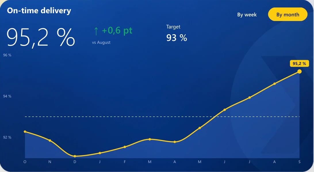
Change the on-time target from 97 % to 93 % and the bell on every page drops from 5 alerts to 4, while the target line on the Performance page moves down to 93 %.

For alerts that reach people outside the report, by e-mail or in Teams, point a Fabric Activator rule at the same measures in the Power BI Service. The thresholds stay in one place.
Try it
Download Colis Pro, free. The panel is the hidden page Réglages. The three parameter tables and their measures ([Objectif ponctualité], [Seuil saturation], [Objectif délai de paiement]) are in the model, ready to read.
If you want this kind of finish on your own model without building it by hand, ChartCraft generates designed Power BI projects, and its MCP server lets your agent do it on your semantic model.
FAQ
Can I use a What-if parameter instead of a table?
Yes. Modeling > New parameter > Numeric range creates a table, a SELECTEDVALUE measure and a slider in one step. Use a table when you want named choices shown as pills.
Does it work once published to the Power BI Service?
Yes. Synced slicers, hidden pages and button actions (Page navigation, Back, Clear all slicers) behave the same in the Service.
How many thresholds can I add?
As many as you need. Each one is a table, a measure and a synced slicer with its own sync group, plus a row in the drawer background.