

Design techniques
A bilingual Power BI report with one slicer
Switch a whole Power BI report between French and English with one slicer: a language table, one measure per text, FORMAT with a culture, and one row per language for chart categories.
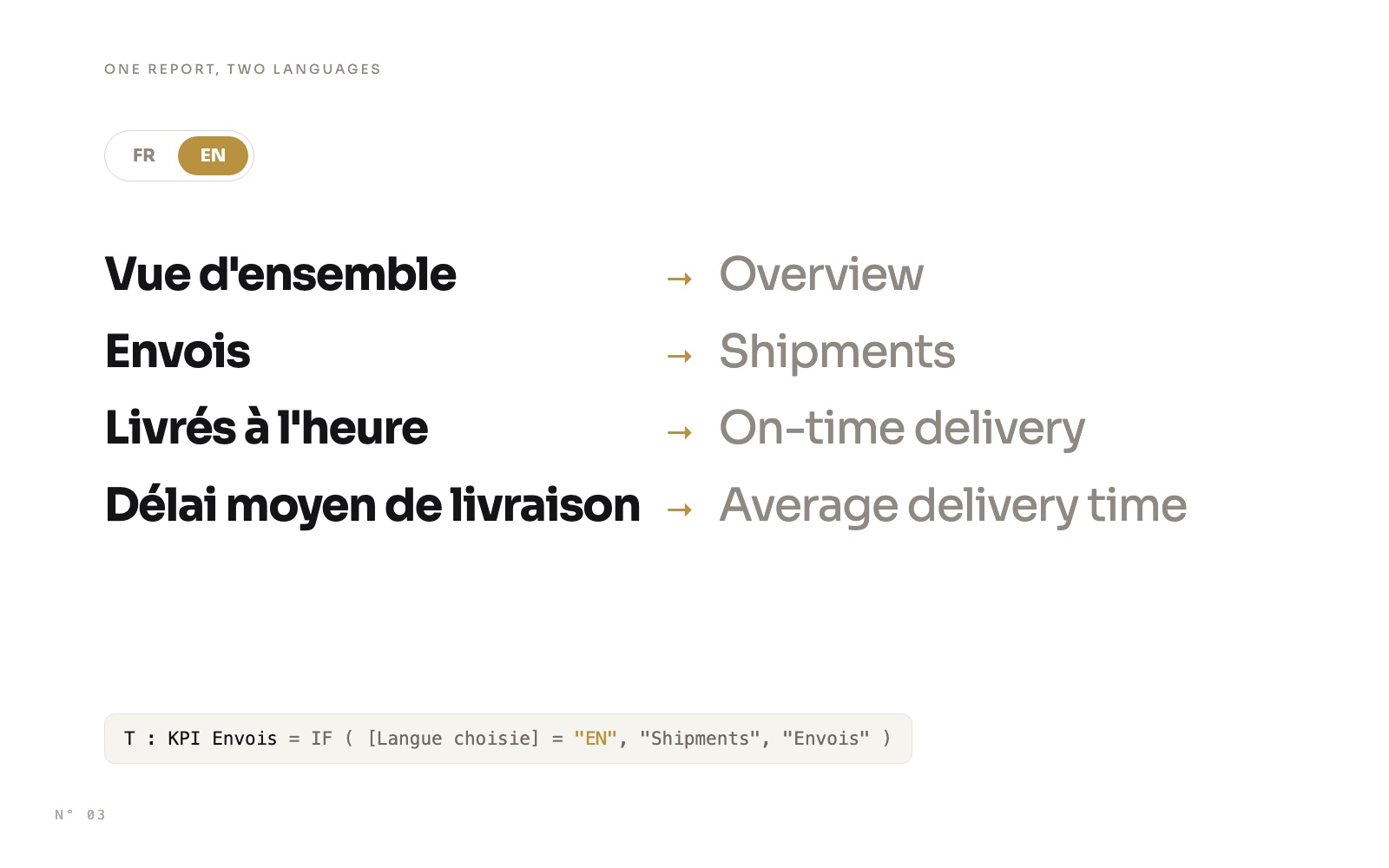
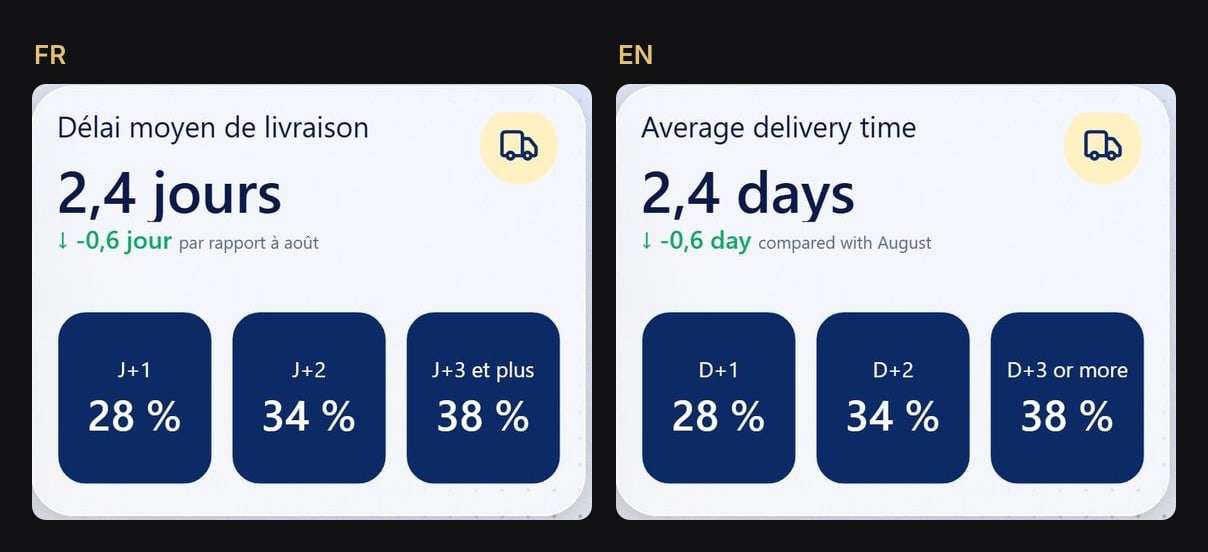
Most bilingual Power BI reports are two reports, or two copies of every page, kept in sync by hand. In Colis Pro, the free report we built with an AI agent, a small FR | EN button in the header switches everything at once: the menu, the titles, the KPI cards and their comparisons, the filters, the tabs, the chart categories, even the search box placeholder.
No duplicate page, no model translation. One table, one slicer, and measures.
Why not Power BI's built-in translations?
Power BI models can carry translations, but they translate the model's object names (tables, columns, measures) according to the reader's language settings. They don't translate the titles typed in visuals, the text boxes, the button labels or the data, and they don't follow a slicer. For a report that a reader switches with one click, the text has to come from measures.
How it works
One slicer filters a two-row language table. One measure reads the chosen language, a second turns it into a culture code, and every text in the report reads one of them.
Step 1: the language table and the switch
A table with two rows, related to nothing:
Langue =
DATATABLE ( "Code", STRING, "Ordre", DOUBLE, { { "FR", 1 }, { "EN", 2 } } )
Sort Code by Ordre. Then add a button slicer on Langue[Code]: single select, French selected by default, and synced to every page so the choice follows the reader. In Colis Pro, the switch exists on all 7 pages; on the two hidden panel pages it is a hidden synced copy.
"visualType": "advancedSlicerVisual",
"selection": [{ "properties": { "strictSingleSelect": true, "singleSelect": true } }],
"syncGroup": { "groupName": "Langue", "fieldChanges": true, "filterChanges": true }
Step 2: two measures read the language
Langue choisie = SELECTEDVALUE ( Langue[Code], "FR" )

Culture = IF ( [Langue choisie] = "EN", "en-US", "fr-FR" )
The default in SELECTEDVALUE keeps the report in French when nothing is selected.
Step 3: one measure per fixed text
Every piece of fixed text becomes a measure:
T : KPI Envois = IF ( [Langue choisie] = "EN", "Shipments", "Envois" )Then bind it wherever Power BI accepts a measure (the fx button): a card's title, a button's text, a card's value, even a search slicer's placeholder. A plain text box can't take a measure, so each one becomes a card whose value is the text measure.
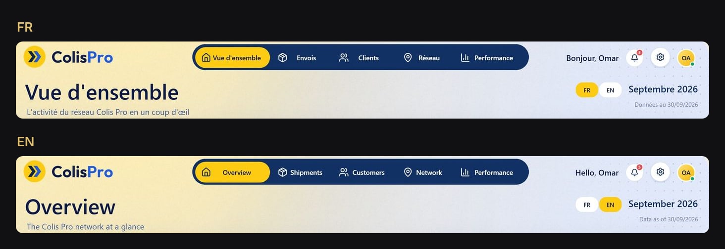
Colis Pro has 88 of these "T :" measures, plus 5 for the menu buttons.
Step 4: computed labels use the culture
Some texts are built from data: "vs August", "2.4 days", "September 2026". Month names go through FORMAT with the culture measure, and words go through IF:
Période précédente libellé =
VAR _c = [Culture]
RETURN FORMAT ( _p1, "MMMM", _c )
    & IF ( [Langue choisie] = "EN", " to ", " à " )
    & FORMAT ( _p2, "MMMM", _c )

Comparaison : vs =
VAR _p = [Période précédente libellé]
RETURN IF ( ISBLANK ( _p ),
    IF ( [Langue choisie] = "EN", "vs prior period", "vs période préc." ),
    "vs " & _p )
Units work the same way: "jour" or "jours", "day" or "days".
Step 5: tabs translate through the Label role
The activity panel has tabs (Services, Régions, Clients) built with a button slicer. Its values come from data, so they can't simply be retitled. The button slicer has a Label role: bind it to a measure that returns the translated name for each item.
Onglet axe libellé =
VAR _k = SELECTEDVALUE ( 'Axe activité'[Axe activité Commande] )
RETURN SWITCH ( _k,
    0, "Services",
    1, IF ( [Langue choisie] = "EN", "Regions", "Régions" ),
    2, IF ( [Langue choisie] = "EN", "Customers", "Clients" ) )
The French value still shows above the label, and hiding it is where the trap is. Setting value.text with fx does nothing. Setting value.show to false hides it, but the labels then stick to the left and ignore their alignment. What works: keep the value shown, at 1 pt and 100 % transparent.
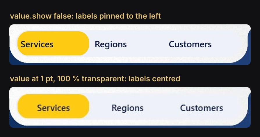
"value": [{
  "properties": {
    "show": true, "fontSize": "1D", "transparency": "100D",
    "horizontalAlignment": "'center'"
  },
  "selector": { "id": "default", "hierarchyMatching": 1 }
}]
Step 6: chart categories, one row per language
A donut or a table shows categories that come from data: "À l'heure" and "En retard". To switch them, the category table holds both languages, and the measure returns a value only for the rows of the chosen language.
Ponctualité (anneau) =
VAR _t = [Taux livrés à l'heure]
RETURN IF (
    NOT ISBLANK ( _t ) && SELECTEDVALUE ( 'Segments ponctualité'[Langue] ) = [Langue choisie],
    SWITCH ( SELECTEDVALUE ( 'Segments ponctualité'[Clé] ), "H", _t, "R", MAX ( 1 - _t, 0 ) )
)
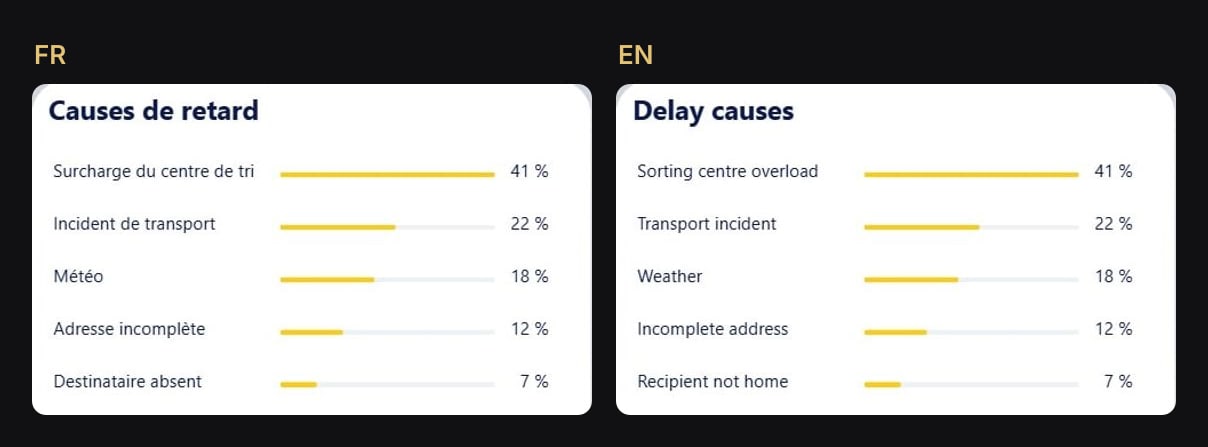
Rows of the other language return blank, and a category with no value disappears from the chart. The same pattern translates the delay causes, the days of the week and the service names.
The traps we hit
- A text box converted to a card renders about 8 px lower. Raise its y by 8 and keep its height. A long sentence also needs text wrap, or it ends in "…".
- A label identical in both languages merges two rows. "Colis Standard" is the same in French and English, so the FR and EN rows collapse into one and
SELECTEDVALUE ( [Langue] )returns blank. Filter on the key instead, withCALCULATETABLE ( VALUES ( [Clé] ), [Langue] = [Langue choisie] ). - Donut colours are keyed by the category text. "On time" and "Late" need their own colour entries, in the same colours as "À l'heure" and "En retard".
- Table column headers can't take a measure. We set the header font to the header's background colour and placed translated cards on top.
- Apostrophes are doubled in TMDL names:
'T : KPI Chiffre d''affaires'. A single one and Desktop refuses the model. - A reload doesn't re-read the model. After changing measures in TMDL, close Desktop without saving and reopen the project.
What it takes, and what stays French
The language layer of Colis Pro is 111 measures in one display folder, 48 existing measures rewritten to read the language, and 6 small tables related to nothing. It touches 185 of the 347 visuals.
Some things stay French, by choice: the slicers' "All", the number and date formats (2,4, 12 430, dd/MM/yyyy), the slogans printed on the photos, and the place names drawn on the network map.

Try it
Download Colis Pro, free. The switch sits in the header of every page, and the whole language layer is in the 85 Langue display folder of the model.
FAQ
Does it work in the Power BI Service?
Yes. It only uses slicers, measures and synced slicers, which behave the same once published.
Can I add a third language?
Yes: add a row to the language table, a culture in the Culture measure, and a branch in each text measure. A SWITCH reads better than nested IF beyond two languages.
Why keep numbers in the French format?
It was an accepted limit for this report: the number formats pass an explicit "fr-FR". Pass [Culture] to FORMAT instead and they follow the switch too.