

Design techniques
Power BI table rows as cards: one SVG measure per row
A native table row can't have rounded corners or a highlight. One DAX measure draws an SVG tile per row, and the table shows only that image column.
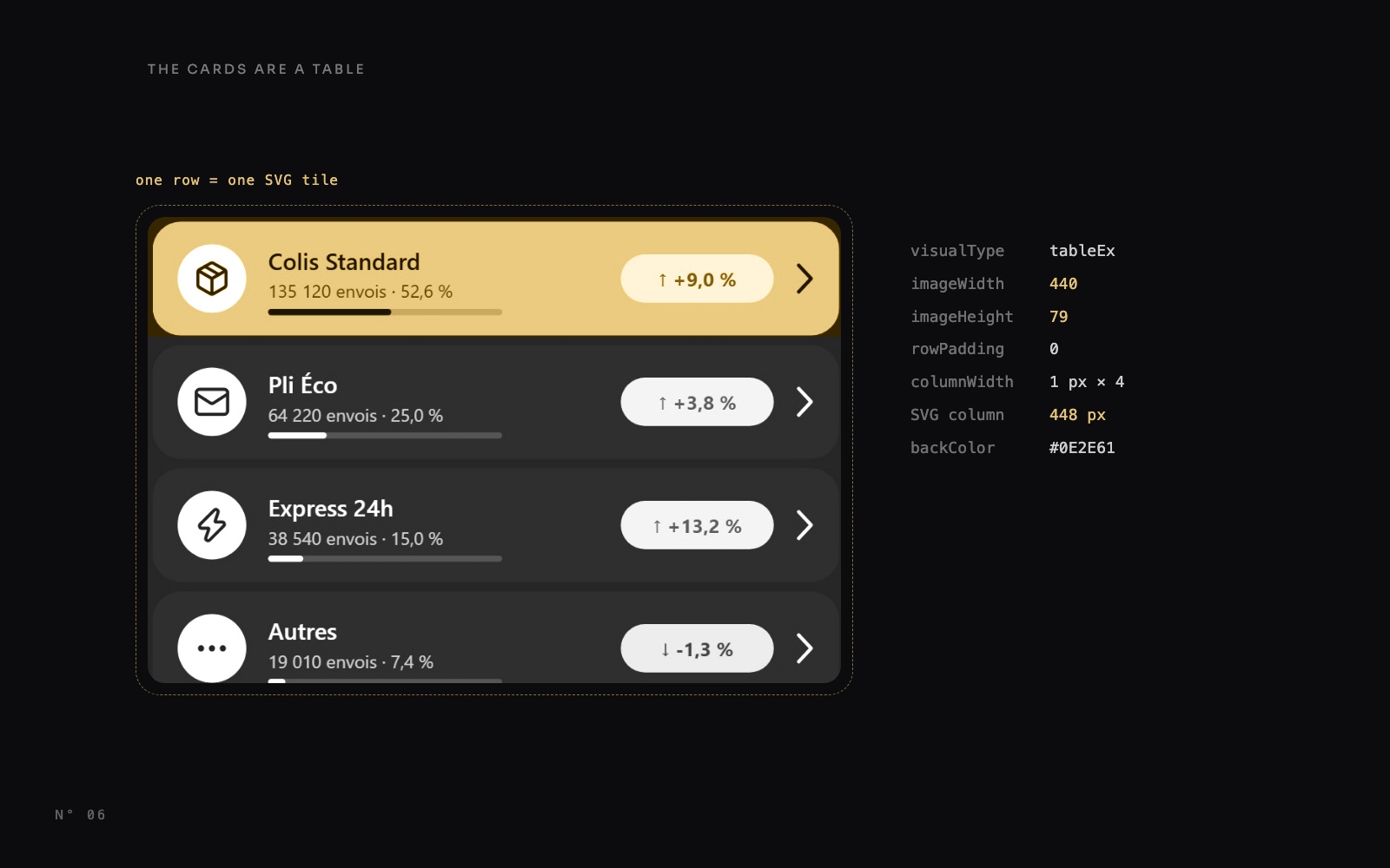
The mockup asked for a list of rounded tiles: an icon, a name, a share bar, a coloured change pill, a chevron, and the item shown in the detail card in yellow. A table behaves the right way (one row per item, sorted, clickable), but a table row can't look like a card.
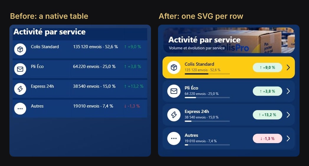
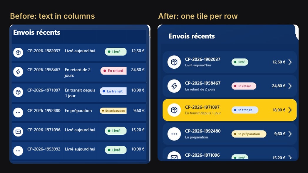
In Colis Pro, a free Power BI report built with an AI agent, two lists work this way: "Activité par service" on the overview page and "Envois récents" on the shipments page. Each one is a native table whose only visible column is an image. One DAX measure draws that image, an SVG tile, once per row.
This article shows how it works, and how to build it in Power BI Desktop with no custom visual.
Before and after
Why a native row can't do it
A table formats cells, and a cell is a rectangle:
- No rounded corners per row. Gridlines and borders are straight lines across the whole table.
- No transparent cells. A table can't be see-through, so a row can't float on the panel behind it.
- A fixed layout. Each field is its own column, at the same place in every row. A long text wraps onto two lines, and nothing can sit inside something else: no bar under a name, no pill within a row.
The idea: the row is an image
A table column can show images. When a measure's data category is Image URL, the table draws its value as a picture, and that value can be an SVG written in DAX as a data URI. So the measure doesn't return a number. It returns a complete tile for the row it's evaluated in.
The table keeps three fields:
- The row field,
DimService[Service]. It makes one row per service and gives the measure its row context. Shrunk to 1 px. - The SVG measure,
Ligne activité (SVG). The only visible column: 448 px wide for a 440 px tile. - The sort measure,
[Envois]. A table sorts by a field it contains, so it stays, at 1 px.
On the overview page, the tabs above the list (Services, Régions, Clients) swap the row field through a field parameter. The same measure then draws a pin for regions and initials for customers.
The measure: one tile per row
Each tile is 440 × 79. The measure reads the row's values, picks colours and concatenates SVG text. Here is the services version, trimmed: the real measure also switches between the three axes, draws an icon per item, adds the volume line under the name, and translates "Autres" to "Others".
Ligne activité (SVG) =
VAR _nom = SELECTEDVALUE ( DimService[Service] )
VAR _max = CALCULATE ( MAXX ( VALUES ( DimService[Service] ), [Envois] ), REMOVEFILTERS ( DimService ) )
VAR _premier = [Envois] = _max
VAR _part = MAX ( MIN ( [Part du total], 1 ), 0 )
VAR _e = [Envois écart]
VAR _hausse = _e >= 0
VAR _tuile = IF ( _premier, "#FDCB12", "#12376F" )
VAR _encre = IF ( _premier, "#0B1A4A", "#FFFFFF" )
VAR _nomAff = SUBSTITUTE ( IF ( LEN ( _nom ) > 24, LEFT ( _nom, 23 ) & "…", _nom ), "&", "&" )
VAR _ecartTxt = IF ( _hausse, "↑ ", "↓ " ) & SUBSTITUTE ( SUBSTITUTE ( FORMAT ( _e, "+0.0 %;-0.0 %", "fr-FR" ), UNICHAR ( 8239 ), " " ), UNICHAR ( 160 ), " " )
VAR _svg =
    "<svg xmlns='http://www.w3.org/2000/svg' width='440' height='79' viewBox='0 0 440 79'>"
        & "<rect x='0' y='3' width='440' height='73' rx='18' fill='" & _tuile & "'/>"
        & "<text x='74' y='34' font-family='Segoe UI Semibold, Segoe UI, Arial, sans-serif' font-size='15' font-weight='600' fill='" & _encre & "'>" & _nomAff & "</text>"
        & "<rect x='74' y='59' width='150' height='4' rx='2' fill='" & _encre & "' fill-opacity='0.18'/>"
        & "<rect x='74' y='59' width='" & FORMAT ( 150 * _part, "0.0", "en-US" ) & "' height='4' rx='2' fill='" & _encre & "'/>"
        & IF ( NOT ISBLANK ( _e ), "<rect x='300' y='24' width='98' height='31' rx='15.5' fill='" & IF ( _hausse, "#DDF5E7", "#FFE1E6" ) & "'/>"
            & "<text x='349' y='44.5' text-anchor='middle' font-family='Segoe UI, Arial, sans-serif' font-size='12.5' font-weight='700' fill='" & IF ( _hausse, "#0F7A43", "#B4234A" ) & "'>" & _ecartTxt & "</text>" )
        & "<polyline points='414,31 422,39.5 414,48' fill='none' stroke='" & _encre & "' stroke-width='2.2' stroke-linecap='round' stroke-linejoin='round'/></svg>"
RETURN
    IF ( NOT ISBLANK ( _nom ) && NOT ISBLANK ( [Envois] ),
        "data:image/svg+xml;utf8," & SUBSTITUTE ( SUBSTITUTE ( _svg, "%", "%25" ), "#", "%23" ) )
Every piece is placed by coordinates inside the 440 × 79 box:
A few lines do more than they seem:
y='3'andheight='73'. The tile is 6 px shorter than the image. With no gridlines and no row padding, that leaves 6 px of panel colour between two tiles.- The share bar is two rectangles: a 150 px track at 18 % opacity, and
150 * [Part du total]on top. The width goes throughFORMAT ( …, "0.0", "en-US" )because a French format would write the decimal with a comma, which is not an SVG number. - Names are cut. SVG text never wraps, so a name over 24 characters keeps 23 and gets "…". An
&becomes&, or the SVG is not valid XML. - The string is encoded. The pill text contains
%and every colour contains#, and both mean something in a URI. Replace%with%25first, then#with%23: in the other order, the%of%23gets encoded again. Our article on SVG measures in Power BI cards covers this in depth.
The shipments list, Ligne envoi (SVG), uses the same frame with other content: the service icon, the shipment number, a relative status ("En transit depuis 1 jour"), a status pill and the amount. SVG can't measure text, so the pill's width is estimated from the label: 22 + LEN ( _statut ) * 6.6.
Step by step in Power BI Desktop
- Write the measure and set its category. Select it, then Measure tools > Data category > Image URL. In the model files (TMDL), the measure gets
dataCategory: ImageUrl. - Build the table. Add the row field, the SVG measure and the sort measure. Turn totals off.
- Size the images to the SVG. Image height 79, image width 440, row padding 0, horizontal and vertical gridlines off.
- Paint the cells the panel colour. In Values, set the background colour, the alternate background colour and both text colours to the colour behind the table:
#0E2E61in Colis Pro. Whatever the tile doesn't cover melts into the panel. - Make the header invisible. Rename the SVG column to a single space, and give the column headers the panel colour for both text and background, at 8 pt.
- Set the column widths. 448 px for the SVG column, 1 px for the others. You can drag column edges in Desktop; we wrote the widths in the visual's file.
- Sort by the measure. From the visual's More options (…) menu, sort by
[Envois], descending. The biggest item comes first, whatever the tab.
The formatting of the overview list, abridged from its visual.json (PBIR):
"grid": [{ "properties": {
  "gridHorizontal": { "expr": { "Literal": { "Value": "false" } } },
  "gridVertical":   { "expr": { "Literal": { "Value": "false" } } },
  "rowPadding":     { "expr": { "Literal": { "Value": "0L" } } },
  "imageHeight":    { "expr": { "Literal": { "Value": "79L" } } },
  "imageWidth":     { "expr": { "Literal": { "Value": "440L" } } }
}}],
"values": [{ "properties": {
  "backColorPrimary":   { "solid": { "color": { "expr": { "Literal": { "Value": "'#0E2E61'" } } } } },
  "backColorSecondary": { "solid": { "color": { "expr": { "Literal": { "Value": "'#0E2E61'" } } } } }
}}],
"columnWidth": [
  { "properties": { "value": { "expr": { "Literal": { "Value": "1D" } } } },
    "selector": { "metadata": "DimService.Service" } },
  { "properties": { "value": { "expr": { "Literal": { "Value": "448D" } } } },
    "selector": { "metadata": "_Mesures.Ligne activité (SVG)" } },
  { "properties": { "value": { "expr": { "Literal": { "Value": "1D" } } } },
    "selector": { "metadata": "_Mesures.Envois" } }
]
The real file also gives 1 px to DimRegion.Region and DimClient.Client, the other fields the tabs can put in the row. If you write PBIR by hand or with an agent, our list of PBIR validator traps is worth a read.
The yellow tile and the detail card
Each list sits next to a detail card, and the two follow one rule.
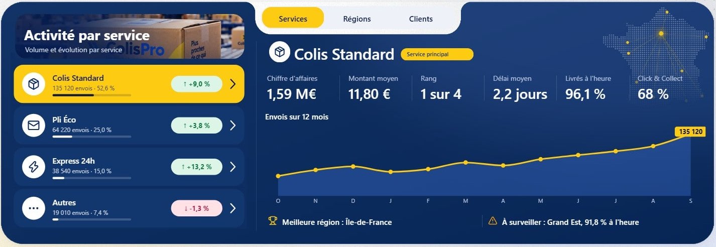
The list filters the card, and only the card. Select the list, open Format > Edit interactions, and set every other visual on the page to None. In the file, each of those is a NoFilter interaction from the list: 26 on the overview page, 25 on the shipments page. Otherwise a click on a tile would also filter or highlight the KPI cards and charts.
The card has a default item. With nothing selected, the card's measures fall back to the top of the ranking. This is the services branch of Détail : nom:
IF ( HASONEVALUE ( DimService[Service] ), VALUES ( DimService[Service] ),
    MAXX ( TOPN ( 1, VALUES ( DimService[Service] ), [Envois] ), DimService[Service] ) )
The yellow tile uses the same rule. In the list, _premier is true when the row's [Envois] equals the maximum across all services, computed with REMOVEFILTERS ( DimService ). On the shipments page, the list asks the card's own measure: a row is yellow when its number equals CALCULATE ( [Envoi affiché], REMOVEFILTERS ( FactEnvoi[NumeroEnvoi] ) ). [Envoi affiché] returns the selected shipment, or else the most recent one in transit.
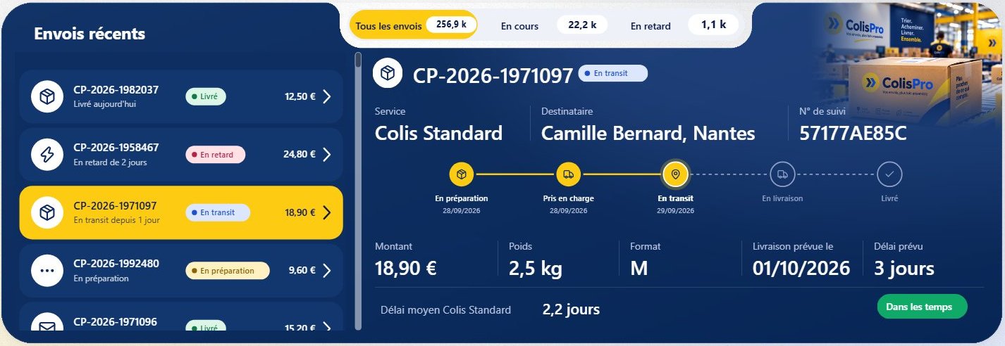
One limit follows: the yellow comes from the measure, not from the click. A visual is not filtered by its own selection, so after a click the card changes and the yellow tile stays on the default item.
The traps
- Two columns with the same name break the query. A single space hides the SVG column's name, but a second column named
" "gives "Error fetching data for this visual". On the shipments page, the number column is namedN°instead. - Keep the sizes in step. The SVG's
width='440' height='79', the table's image width and height, and a column a little wider than the image (448). With row padding at 0, each row is as tall as the image: four tiles take 316 px. - Leave room for the scrollbar. The shipments list scrolls. Its table is 472 px wide for a 448 px column; narrower, a horizontal scrollbar appeared as well.
- The header is invisible, not gone. A click on a column header still sorts the table, and the sort is saved with the visual. Check it after editing in Desktop: a stray click changed the order of our shipments list once.
- The text is pixels. Readers can't select it, a screen reader can't read it as text, and translation has to happen inside the measure: ours switches "Autres" to "Others" when English is chosen (see our bilingual report). The 1 px columns keep real values in the visual, and the tooltips are sentences built from them, such as
Envoi {N°}, dernier événement le {Tri}. - Limit the rows on a big fact table. The shipments list reads a fact table of about 4 million shipments. It carries a visual-level Top N filter: the 300 most recent, by a hidden timestamp column. Before that filter, the list had not loaded after 50 seconds when the report opened.
Try it
Download Colis Pro, free. The lists are on the Vue d'ensemble and Envois pages, and the measures Ligne activité (SVG) and Ligne envoi (SVG) are in the 96 Activité folder of the _Mesures table. Switch the tabs above the overview list to see the same measure draw regions and customers.
If you want this kind of finish on your own model without writing SVG by hand, ChartCraft generates designed Power BI projects, and its MCP server lets your agent do it on your semantic model.
FAQ
Do I need a custom visual?
No. It is the native table visual plus one DAX measure with the Image URL data category.
Can readers still click a tile?
Yes. A click selects the row like in any table, and Edit interactions decides which visuals it filters.
Does it work in the Power BI Service?
Yes. SVG data URIs returned by an Image URL measure render in the Service as they do in Desktop.