

Design techniques
Design the page, not the visuals: Power BI page backgrounds
Shadows, gradients, a notch and photos drawn into one 2x image under transparent visuals: how Colis Pro designs each Power BI page, with or without code.
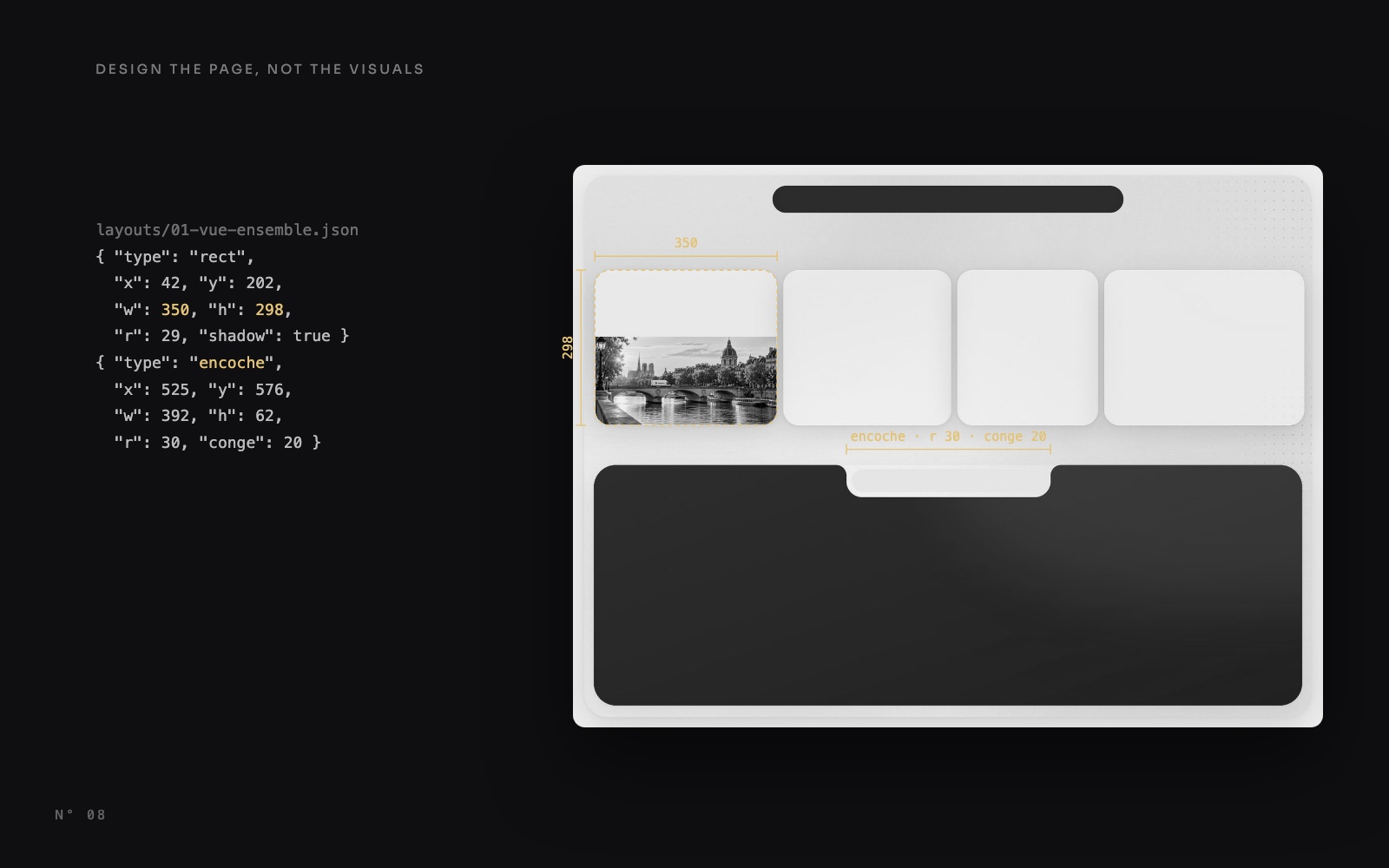
Most Power BI reports get their look from the visuals: a white background on each one, a border, a shadow, a rectangle shape behind a group. In Colis Pro, a free Power BI report built with an AI agent, the surfaces are not visuals. The frame, the cards, the soft shadows, the dark panels, the tab bar bitten into a panel and the photos are pixels of one image per page. The visuals sit on top, transparent.
The anatomy of the report showed the result. This article goes one level down: what is in that image, how to draw one, what must stay out of it, and the traps.
What a shape can't draw
A shape has one solid fill and one shadow, and so does a visual's container. A Colis Pro page asks for more:
- Two shadows per card, a wide faint one and a tight one, tinted navy.
- A diagonal gradient on the dark panels, with a soft glow in one corner and a light rim.
- A glow and a grain on the white frame, and dot patterns that fade out.
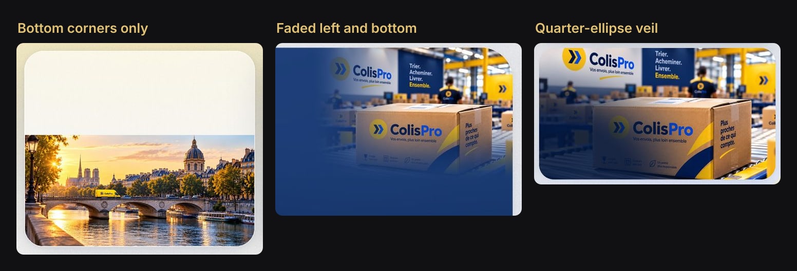
- Photos with only some corners rounded, a veil under the text, or a fade into the panel.
- A cut-out: the tab bar bites into the top of a panel. Power BI cannot cut one surface out of another.
None of these is a setting. All of them are easy in an image.
One image that knows where the visuals go
Each page gets one PNG at twice the page size: 2880 × 2160 pixels for a 1440 × 1080 page. Every surface is drawn exactly where a visual will sit, and the visuals on top have no background, border or shadow.
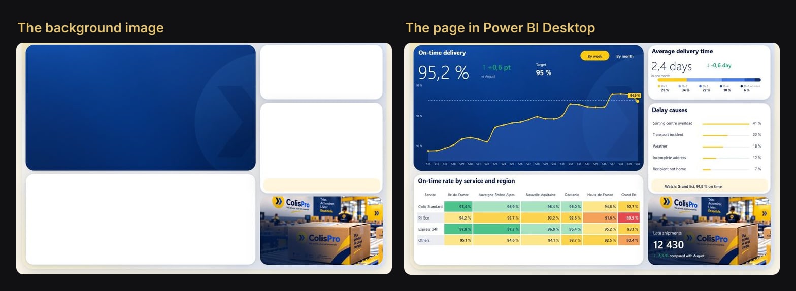
The textured panel, the three white cards and their shadows, the pale yellow strip under Delay causes, the photo and its dark corner: all of it is still pixels on the right. The visuals add only what changes, the numbers, the words, the curve and the matrix.
Anatomy of a background
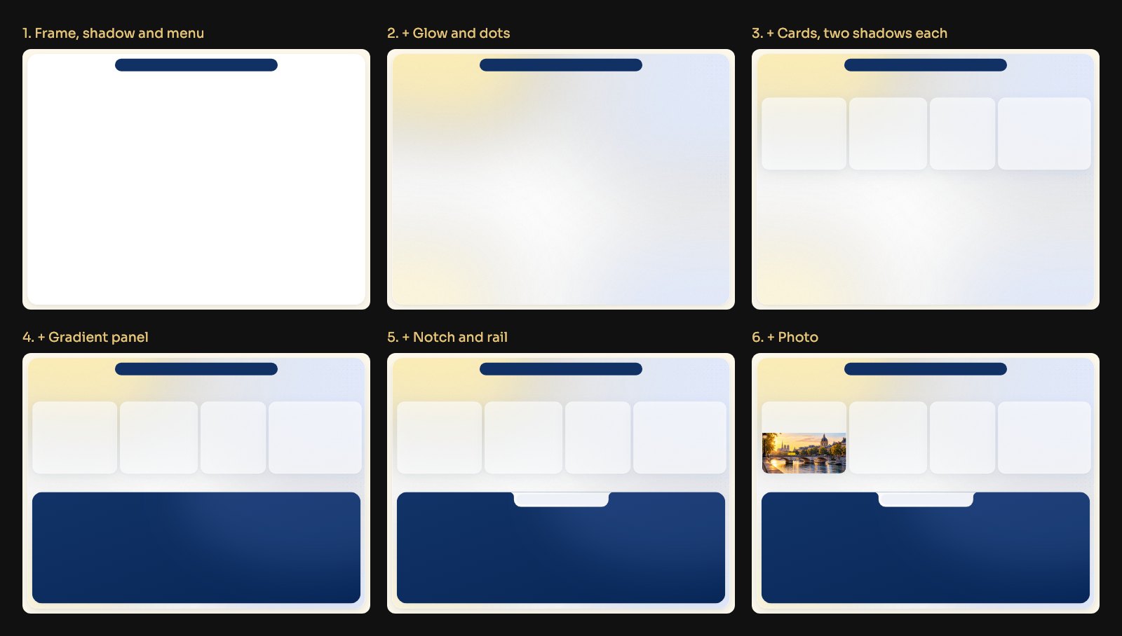
Our script paints six layers, in this order:
- Page and frame. A cream page (
#FEF9EB), a white frame of 1396 × 1040 with a radius of 44 and a soft shadow, the navy menu pill (#113064). Identical on every page. - Glow, grain and dots. Four very blurred ellipses (two yellow, two blue) at 12 to 30 % opacity, a light grain, and a dot every 18 px fading out around zones chosen per page. Shipments and Performance have no dots.
- Card surfaces. White, with a 1 px rim and two stacked navy shadows.
- Gradient panels. A diagonal gradient from the colour mixed with white (
clair) at the top left to the colour mixed with black (sombre), a soft blue glow top right, and a 1 px white rim (liseré) at 10 % opacity. - The notch. See below.
- Photos. Cropped to their slot, then shaped.
The two shadows are one line of the script:
for dy, flou, alpha in (((14, 26, 36), (2, 4, 20)) if e.get("ombre_forte") else ((14, 26, 22), (2, 3, 12))):Each tuple is an offset down, a blur and an alpha out of 255, in navy (11, 42, 102). Cards get the stronger pair, the frame, panels and photos the softer one. The KPI cards of the Overview and Shipments are also 62 % opaque, so the glow shows through, with their shadow cut out under the card so it does not darken it.
Each page is described by a JSON template. An excerpt of the Overview's (three cards left out):
{
 "page": "Vue d'ensemble",
 "elements": [
  { "type": "rect", "x": 42, "y": 202, "w": 350, "h": 298, "r": 29,
    "fill": "#FFFFFF", "stroke": "#E9EDF5", "shadow": true },
  { "type": "rect", "x": 40, "y": 576, "w": 1360, "h": 462, "r": 42,
    "fill": "#082A61", "shadow": true,
    "degrade_fond": { "clair": 0.04, "sombre": 0.1, "liseré": 0.1 } },
  { "type": "encoche", "x": 525, "y": 576, "w": 392, "h": 62, "r": 30,
    "conge": 20, "fond": "#FFFFFF", "panneau": "#082A61" },
  { "type": "rect", "x": 535, "y": 584, "w": 372, "h": 44, "r": 22, "fill": "#EEF2F8" },
  { "type": "photo", "src": "paris-seine.png", "x": 43, "y": 330, "w": 348, "h": 169,
    "r": 27, "coins": [0, 0, 1, 1], "cadrage": [0, 300, 1536, 1024] }
 ]
}
Coordinates are page pixels, the same numbers as a visual's position in Desktop. The keys are French; the photo ones do most of the work:
| Key | What it does | In Colis Pro |
|---|---|---|
cadrage | Crop box in source pixels, fitted to the slot | Paris: [0, 300, 1536, 1024] |
coins | Which corners are rounded, clockwise from top left | Paris: bottom only |
degrade | A dark veil: vertical, from the left, or a quarter ellipse from a corner | Performance: "sens": "coin" |
fondu | Fades the photo into what lies under it | Shipments: "gauche": 0.5, "bas": 0.55 |
opacite | A texture at reduced opacity | Chevrons at 0.55 on two panels |
Make one without code
The script is optional. Any tool that exports PNG will do. With Figma:
- In Desktop, fix the page size: Format page > Canvas settings, type Custom, here 1440 × 1080.
- Place your visuals first, roughly. Their sizes and positions are in Format > General > Properties.
- In Figma, draw a frame of exactly the page size, then the surfaces at those coordinates. Multiple shadows, gradients, masks and blurs are all native there.
- Export the frame as PNG at 2x.
- Back in Desktop, open Format page > Canvas background, pick the image, set Image fit to Fit and Transparency to 0 %.
- Set Format page > Wallpaper to the colour of the image's edge. The wallpaper fills the space around the page, so the two blend at any window size.
In the report files (PBIR), step 5 is the page's background object. The Overview's page.json, whitespace compacted:
"displayOption": "FitToPage",
"height": 1080,
"width": 1440,
"objects": {
  "background": [ { "properties": {
    "image": { "image": {
      "name": { "expr": { "Literal": { "Value": "'fond-01-vue-ensemble.png'" } } },
      "url": { "expr": { "ResourcePackageItem": {
        "PackageName": "RegisteredResources", "PackageType": 1,
        "ItemName": "fond-01-vue-ensemble.png" } } },
      "scaling": { "expr": { "Literal": { "Value": "'Fit'" } } } } },
    "transparency": { "expr": { "Literal": { "Value": "0D" } } } } } ]
}
ResourcePackageItem points to the PNG stored in StaticResources/RegisteredResources, and 0D is a transparency of zero.
Colis Pro draws them from templates
We did not use Figma. Each page has its template in tools/layouts/, measured on the mockups, and a Python script, build_backgrounds.py, draws every element at twice the page size (S = 2) into one PNG per page. The frame and the menu live in a shared list, COMMUNS, so they cannot drift between pages.
The script also takes a style, which is how we compared looks on the same layouts:
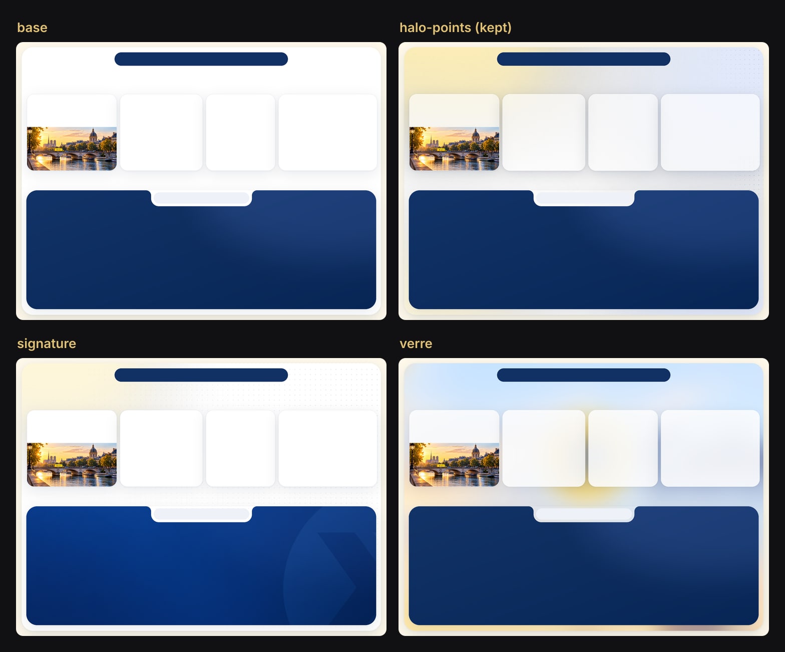
halo-points was kept. The styles matter less than the loop: move a card or change a colour in a template, rerun, and every page is redrawn with the same shadows and radii. No pixel is retouched by hand.
Background or visual?
The background is frozen: it doesn't move with a visual, react to a filter or translate. Hence the rule:
| In the background | A native visual |
|---|---|
| Frame, card and panel surfaces | Every number, title and label |
| Shadows, gradients, glows, grain | Icons that belong to a card |
| Fixed photos and textures | A photo that changes with a selection |
| The notch and its rail | The tabs themselves (a slicer) |
| Dividers in a fixed banner | Anything you click |
We learned it on three elements:
- The icons. The pale circles behind the KPI icons were first drawn into the background (the script still has a
cercleelement). But a circle in the image stays put when the card moves or is resized. Each icon is now one SVG, a#FFF1C2circle with a Lucide icon, in the card's own image slot. See SVG measures in Power BI cards. - The logo. It was drawn into the backgrounds too, then became an Image visual at (43, 41), 185 × 50.
- The activity photo on the Overview changes with the selected tab, so it is a measure returning base64 JPEGs into a card's image.
Titles and labels never go into the image, which is also why the whole report can switch between French and English. Only the slogans printed on the photos stay in French.
The notch
The tab bar of the Overview and Shipments panels does not float on the panel: it is cut into it. Power BI can't subtract one surface from another, so the background draws the cut and the slicer on top only fills the selected tab.
The encoche element is 392 × 62, with bottom corners of radius 30 and two inverted fillets (conge) of 20 where it meets the panel's edge. The script doesn't paint it white: it copies the frame's own surface into that shape, glow and grain included, so the frame seems to run into the panel. A light rail (#EEF2F8, radius 22) sits inside, 10 px from each side.
The tabs are a button slicer of 364 × 40, set 4 px in from each end of the rail. Its fill is transparent by default and solid yellow when selected (whitespace compacted):
"fillCustom": [
  { "properties": {
      "fillColor": { "solid": { "color": { "expr": { "Literal": { "Value": "'#FDCB12'" } } } } },
      "transparency": { "expr": { "Literal": { "Value": "100D" } } } },
    "selector": { "id": "default" } },
  { "properties": {
      "fillColor": { "solid": { "color": { "expr": { "Literal": { "Value": "'#FDCB12'" } } } } },
      "transparency": { "expr": { "Literal": { "Value": "0D" } } } },
    "selector": { "id": "selection:selected" } }
]
A third entry, interaction:hover, sets 70 % transparency, and shapeCustomRectangle rounds the pills (rectangleRoundedCurve 17).
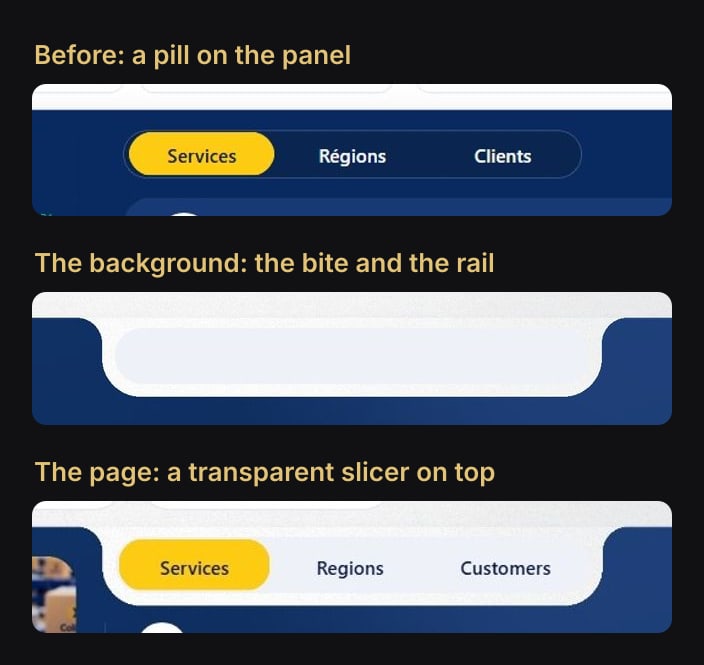
Each page sizes its own notch: on Shipments it is 560 px wide and holds three tabs with their counters.
A theme that makes every visual transparent
Switching off the background of 347 visuals one by one is not a plan. The theme does it once, for every visual type. An excerpt of ColisPro.json:
"visualStyles": {
  "*": {
    "*": {
      "background": [{ "show": false }],
      "border": [{ "show": false }],
      "visualHeader": [{ "show": false }],
      "dropShadow": [{ "show": false }]
    }
  },
  "page": {
    "*": {
      "outspace": [{ "color": { "solid": { "color": "#FEF9EB" } } }]
    }
  }
}
Import it with View > Themes > Browse for themes. Every new visual then lands with no background, no border, no shadow and no header. outspace is the wallpaper, set to the same cream as the edge of the images.
The traps
- The geometry lives in two places. Move a visual, move its surface. When we reordered the right column of Performance, the visuals and the template rectangles (y 198, 422 and 781) moved together.
- Redrawing is not updating. The script writes to
assets/backgrounds; the report reads its own copy inStaticResources/RegisteredResources. Copy the new PNG over the old one, same name. - Twice the page size, same proportions. Export at 2x so the image stays sharp, with the page's proportions so Fit only scales it. Colis Pro's photo sources were also requested at twice their displayed size.
- Opaque cards behind tables. We could not make a table transparent, and its pure white stood out on a translucent card, so white cards are fully opaque in the kept style. On a dark panel, give the cells the panel's colour at that spot: the Overview's activity list uses
#0E2E61, picked from the gradient. See table rows as cards. - Texture has a weight. The PNGs in the report go from 0.35 MB (the two drawers) to 4.1 MB (Shipments). In the style trials, the same five pages weighed 0.46 to 1.41 MB in the plain base style and 2.7 to 4.2 MB with glow and grain.
Layered SVG files for Figma
The free package ships every background as a layered SVG in assets/backgrounds/: the five pages plus the Alerts and Settings drawers, exported from the same templates as the PNGs. The frame, menu, dot grid, cards, panels, notches, dividers and shadows are vector layers; the glow and grain, the photos (already cropped and veiled) and the blurred backdrop of the drawers are embedded images. Layers are named (Frame, Glow, Dots, Card-1, Panel-1, Notch-1, Photo-1…), and the shadows are written in the form Figma reads back as drop shadows.
Open one in Figma, change what you need, export the frame at 2x and replace the page's canvas background.
Try it
Download Colis Pro, free. The PNG backgrounds are in ColisPro.Report/StaticResources/RegisteredResources/, the layered SVG versions in assets/backgrounds/. Open a page in Desktop and drag a card: the surface stays behind, which is the whole idea.
If you want this kind of finish without drawing every page yourself, ChartCraft generates designed Power BI projects: its Forge composes the backgrounds and assets for you, and its MCP server lets your agent do it on your semantic model.
FAQ
What size should a Power BI background image be?
Twice the page size in pixels, with the same proportions: Colis Pro's pages are 1440 × 1080, so each PNG is 2880 × 2160, set with Image fit Fit and Transparency 0 %.
Can I put titles and labels in the background image?
You can, but they won't translate, react to filters or be editable in Desktop. Colis Pro keeps every title and label out of its backgrounds; even the logo moved out, into an Image visual.
How do I update a background in a PBIP project?
Overwrite the PNG of the same name in StaticResources/RegisteredResources, then close and reopen the project in Desktop, or pick the new image in Format page > Canvas background.