

Design techniques
A Power BI map without Azure Maps: a scatter chart over an image
Replace Azure Maps with a native scatter chart: longitude on X, latitude on Y, axes bounded to a map image set as the plot area background.
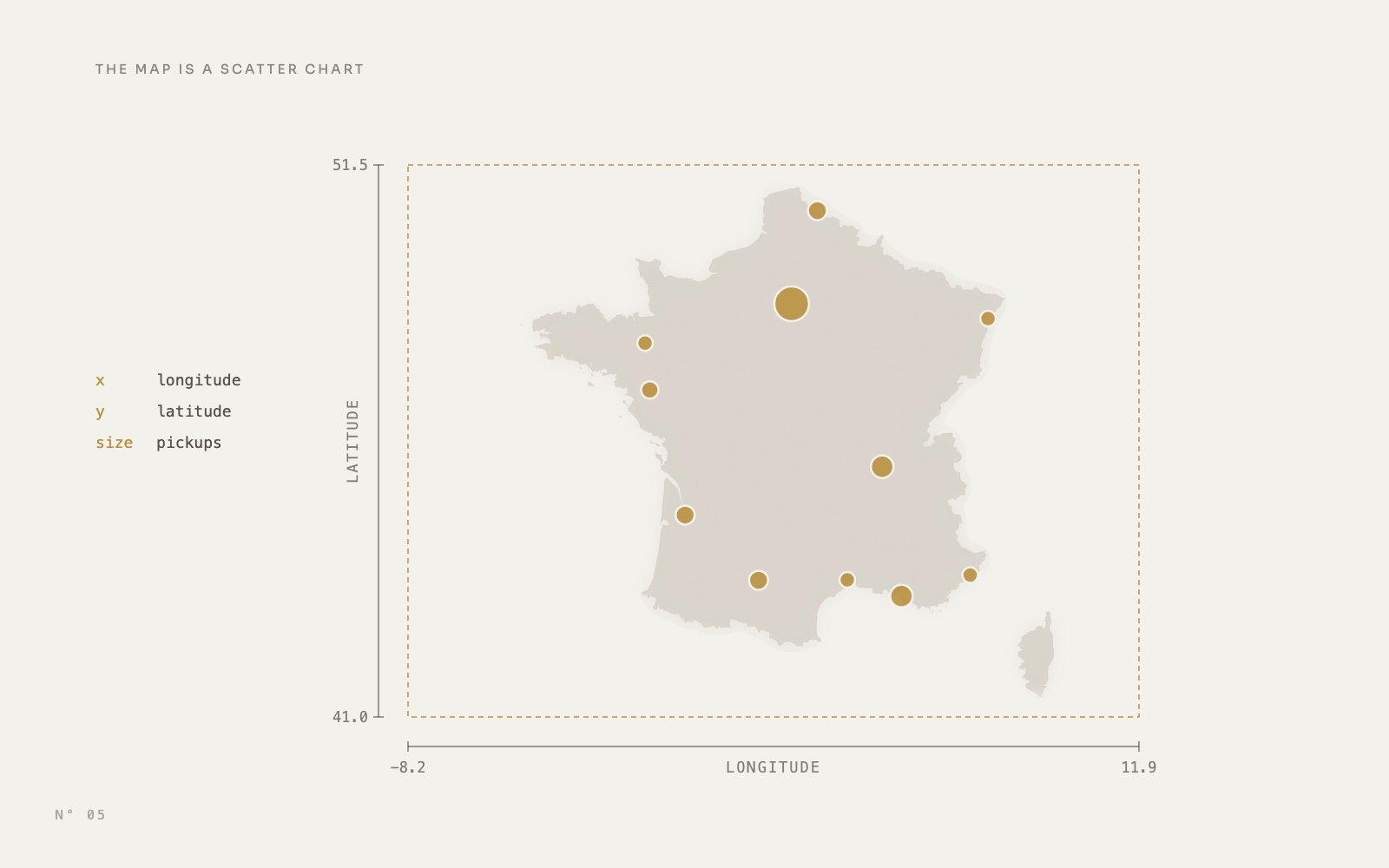
The Network page of Colis Pro, a free Power BI report built with an AI agent, started with an Azure Maps visual: one bubble per pickup point, dark map style. It gave us three problems. The map moved on its own. It asked for a Microsoft sign-in. And after a reload, a sign-in dialog blocked Power BI Desktop, which stopped the loop we use to render and capture every page.
So we replaced it with a native visual: a scatter chart drawn over an image of France. Longitude on X, latitude on Y, the axes hidden and bounded to the edges of the image. This article shows how it works, why the image has to be drawn a certain way, and how to build it in Power BI Desktop.
Before and after
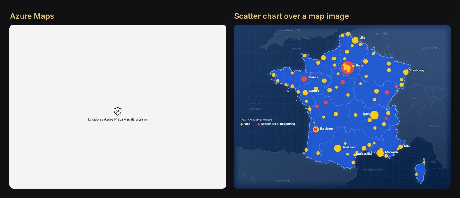
What the replacement gives you:
- A native visual. No online map service and no sign-in prompt: the scatter chart and its image are saved inside the report.
- A map that stays put. Same extent, same framing, every time the page opens.
- A look you choose. Colours, borders, country names, the dotted sea: everything is drawn in the image.
- The usual interactions. Tooltips still work, and a click on a bubble filters the pickup point sheet on the right of the page.
How it works
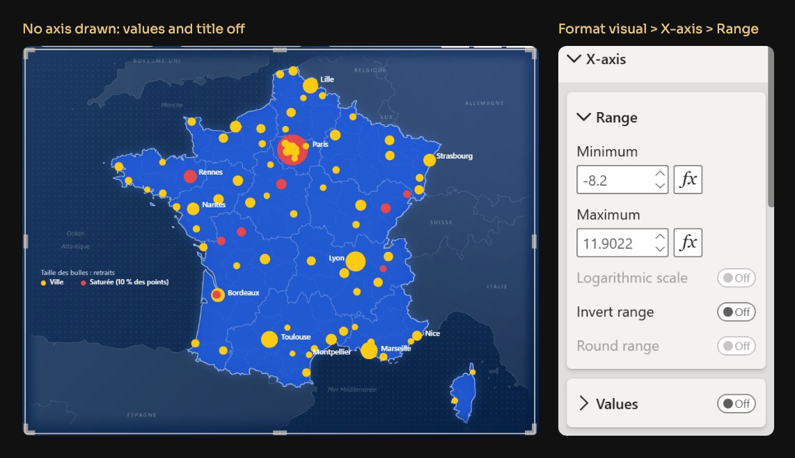
Two settings of the scatter chart do the job. Its plot area can hold a background image, and its axes accept a fixed start and end. Give the axes the geographic edges of the image, hide them, and every longitude and latitude pair lands on the right pixel of the drawing.
In Colis Pro, the visual is 842 x 636 px. The X axis runs from -8.2 to 11.9022 and the Y axis from 41 to 51.5. The image covers exactly that rectangle, so a bubble at a given longitude sits at the same fraction of the width as that longitude in the drawing. We measured the result on a Desktop capture: the bubbles land within one pixel of where the map puts their cities.
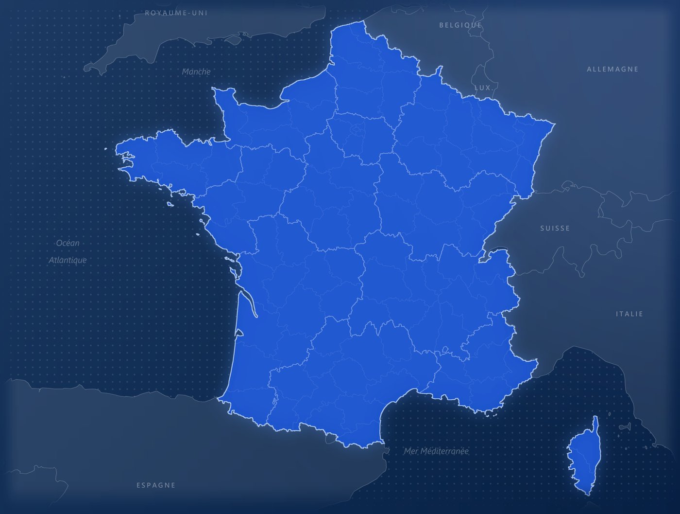
The image must be drawn in the same projection
Scatter axes are linear: one degree is the same number of pixels anywhere on the axis. The image has to follow the same rule, in both directions. Colis Pro's map is generated by a Python script, tools/reseau.py, and this is its whole projection:
X0, Y0, W, H = 48, 262, 842, 636
LAT_MIN, LAT_MAX = 41.0, 51.5
PX_DEG = H / (LAT_MAX - LAT_MIN)
K_LON = math.cos(math.radians((LAT_MIN + LAT_MAX) / 2))
LON_MIN = -8.2
LON_MAX = LON_MIN + W / (PX_DEG * K_LON)

def proj(lon, lat):
    return ((lon - LON_MIN) / (LON_MAX - LON_MIN) * W, (LAT_MAX - lat) / (LAT_MAX - LAT_MIN) * H)
proj is linear in longitude and linear in latitude, the same as the axes. Every border, coastline and country name in the image goes through it.
K_LON only sets the shape. At the middle latitude of the map (46.25° N), a degree of longitude is about 0.69 of a degree of latitude on the ground, so the script gives it 0.69 of the pixels: 41.89 px per degree of longitude against 60.57 px per degree of latitude. Without it, France comes out stretched sideways. That is also why the right edge is 11.9022, a number nobody would pick by hand: the script computes it from the width of the visual.
The trap is the map you did not draw. Most web maps use Web Mercator, where the gap between two latitudes grows towards the north. Bound a Mercator image with linear axes and only the edges match.
Over France, on a 636 px map, the drift reaches about 15 px around 46.5° N: a quarter of a degree, some 28 km on the ground.
Step by step in Power BI Desktop
First, the coordinates. Colis Pro shows one bubble per city, at the average position of its pickup points, so the axes take two measures:
Carte longitude = AVERAGE ( DimPointDepot[Longitude] )

Carte latitude = AVERAGE ( DimPointDepot[Latitude] )
Then the visual:
- Add a scatter chart and fill its wells: Values
DimPointDepot[Ville](one point per city), X Axis[Carte longitude], Y Axis[Carte latitude], Size[Retraits](pickups). Colis Pro adds occupancy, parcels waiting and saturated points as tooltips. - Fix the axes. In X axis > Range, set Minimum -8.2 and Maximum 11.9022. In Y axis > Range, 41 and 51.5. Use the bounds of your own image.
- Hide everything around the plot. Turn off the X axis and Y axis, their titles, the gridlines and the legend. In General, turn off the title, background and border, and set the padding to 0.
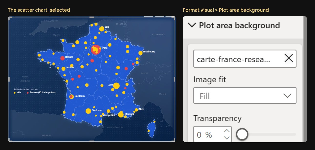
- Set the image. In Plot area background, pick your PNG, set the image fit to Fill and the transparency to 0 %.
- Size the visual to the image's ratio. Colis Pro's visual is 842 x 636 and the image 2526 x 1908, three times larger, so Fill has nothing to crop or distort.
In the report files (PBIR), the whole trick is a few properties of the visual:
"categoryAxis": [{ "properties": {
  "show":          { "expr": { "Literal": { "Value": "false" } } },
  "start":         { "expr": { "Literal": { "Value": "-8.2000D" } } },
  "end":           { "expr": { "Literal": { "Value": "11.9022D" } } },
  "showAxisTitle": { "expr": { "Literal": { "Value": "false" } } }
}}],
"plotArea": [{ "properties": {
  "transparency": { "expr": { "Literal": { "Value": "0D" } } },
  "image": { "image": {
    "name":    { "expr": { "Literal": { "Value": "'carte-france-reseau.png'" } } },
    "url":     { "expr": { "ResourcePackageItem": {
      "PackageName": "RegisteredResources", "PackageType": 1,
      "ItemName": "carte-france-reseau.png" } } },
    "scaling": { "expr": { "Literal": { "Value": "'Fill'" } } }
  }}
}}]
valueAxis is the same with 41.0000D and 51.5000D. The image itself sits in StaticResources/RegisteredResources, and Desktop registers it for you when you pick it in the Format pane.
Colour and size by measure
The bubble colour is a measure that returns a hex code:
Carte couleur ville =
IF ( DIVIDE ( [Points saturés], [Points actifs] ) >= 0.1, "#E5484D", "#FDCB12" )

Points saturés =
COUNTROWS ( FILTER ( VALUES ( DimPointDepot[PointID] ), [Occupation] >= [Seuil saturation] ) )
Apply it through the conditional formatting (fx) of the marker colour, format style Field value. In the file, it is a dataPoint.fill that points to the measure.
The 10 % rule came from counting. Red for any city with one saturated point turned 18 cities red; 20 % left a single one. At 10 %, 9 cities of 87 are red, Paris included (18 of its 130 points). And because [Points saturés] reads [Seuil saturation], the map follows the threshold set in the report's settings panel.
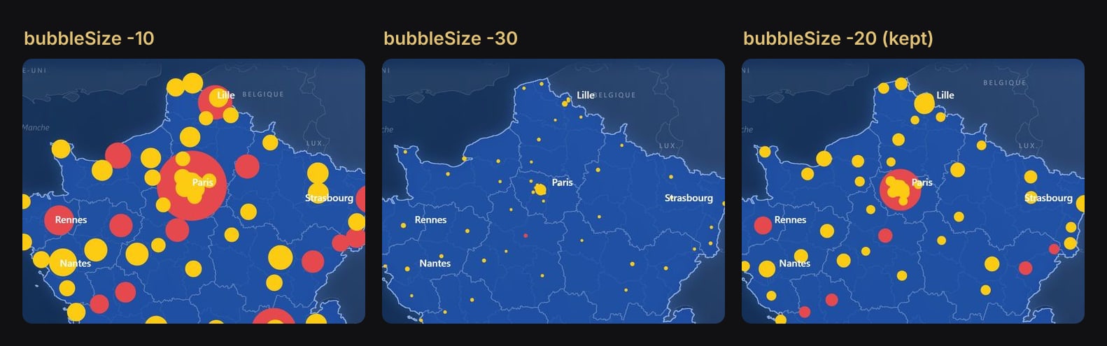
The bubble size setting (bubbleSize in the file) took three renders to settle:
City names are text boxes
The scatter chart's own category labels would name all 87 cities. Colis Pro names 11 large ones instead, with plain text boxes (Segoe UI Semibold, 9 pt, white) laid over the chart.
Each text box is placed with the same projection, plus the visual's position on the page and the bubble's radius:
x, y = proj(*centres[nom])
larg = 110
r = RAYONS.get(nom, DECALAGE_LIBELLE - 5) + 5
gx, gy = (X0 + x + r if cote == "d" else X0 + x - r - larg), Y0 + y - 12
cote is the side of the label ("d" right, "g" left), larg the width of the text box. The radii were measured on a capture at bubble size -20: Paris is 27.8 px. Its label lands at x = 48 + 442 + 33 = 523, which is where it sits in the report.
The legend followed the same path. It started as a text box in the Atlantic, the one empty area of the map, then became a card showing an SVG measure so it could switch to English with the rest of the report.
Restyling means redrawing one PNG
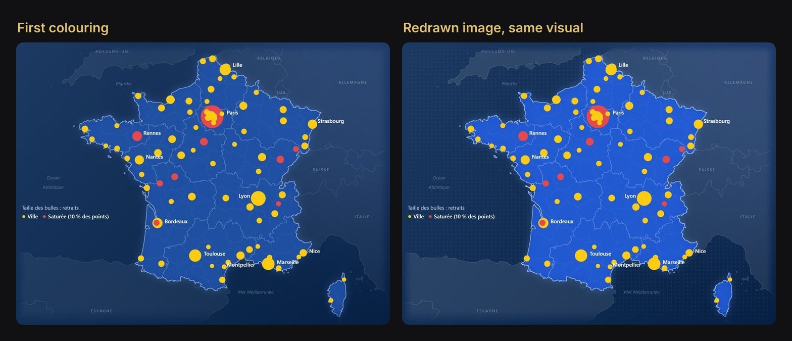
Because the scatter chart only knows the extent, the map's look can change without touching the visual. We compared six colourings as mockups, then applied the chosen one by regenerating the PNG.
What you give up
| Azure Maps | Scatter over an image | |
|---|---|---|
| Zoom and pan | Yes | No, one fixed extent |
| Base map | Online map styles at any scale | Your drawing, at one scale |
| Locations | Coordinates or place names | Numeric longitude and latitude |
| Layers | Bubbles, heat map and more | Bubbles |
| Online service | Required (it showed us a sign-in prompt) | None |
| Text on the map | Drawn by the map service | Baked into the image |
That last row has a cost. When Colis Pro switches to English, the country and sea names stay in French, because they are pixels. Our bilingual report lists it as an accepted limit.
The traps
- Hide the axis titles, not just the axes. In our first render, the axes were gone but "Latitude" and "Longitude" still showed along the edges.
- Padding 0, no axis, no title, no legend. Labels are placed in page pixels, so they assume the plot area fills the whole visual. Anything that shrinks it moves the map and the bubbles away from the text boxes.
- Keep the aspect ratio. Resize the visual proportionally, or redraw the image at the new ratio.
- Leave the zoom slider off. Zooming changes the axis range, and the background image does not follow.
- No web map screenshots over a large area. Their latitudes are not linear (see above).
- Text boxes ignore filters. If a slicer hides Paris, the word Paris stays on the map.
Getting a map image without Python
Any tool that draws longitude and latitude linearly will do. In a GIS such as QGIS, display your layers in plain longitude and latitude (EPSG:4326, WGS 84) and export exactly the extent you will type into the axes. Restyle the export in your design tool if you like, under one rule: a resize, even a non-proportional one to match the visual's ratio, keeps both scales linear and is safe; a crop moves the edges, so the axis bounds have to move with it.
The same technique works for any flat coordinates, not only maps: a warehouse floor plan with X and Y in metres, for instance, under a scatter of its bins.
Try it
Download Colis Pro, free. The map is on the page Réseau (Network): the scatter chart sits over the panel, the image is carte-france-reseau.png in the report's registered resources, and the measures [Carte longitude], [Carte latitude] and [Carte couleur ville] are in the display folder 40 Réseau.
If you want this kind of finish on your own model without building it by hand, ChartCraft generates designed Power BI projects, and its MCP server lets your agent do it on your semantic model.
FAQ
Does it work once published to the Power BI Service?
Yes. The scatter chart is a core visual and the image is saved in the report, so nothing depends on an online map service.
Can users zoom into a region?
Not in the same visual: the extent is fixed. Build a second scatter chart with its own image and bounds, on another page.
Do I need to code to make the map image?
No. Any tool that draws longitude and latitude linearly, such as a GIS in EPSG:4326, can export the image; Desktop does the rest.