

Design techniques
347 visuals, only 9 charts: anatomy of a designed Power BI report
An X-ray of a designed Power BI report: 347 visuals, 167 of them cards and only 9 charts. Where the design of a Power BI report really lives, region by region.
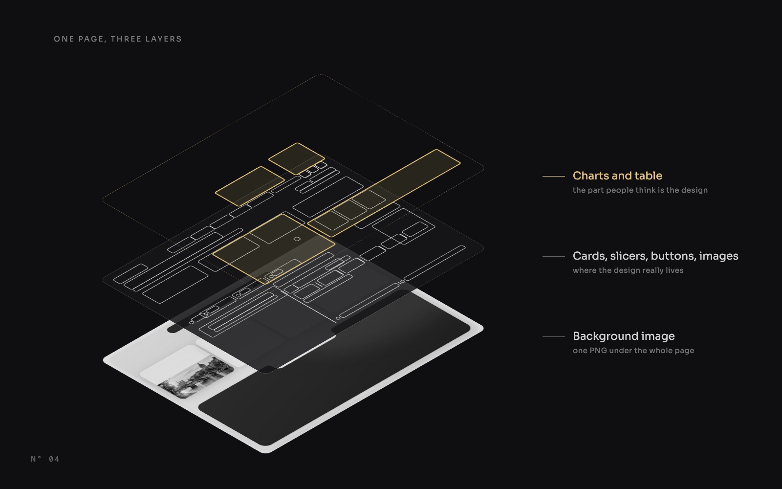
When a Power BI report looks designed, people assume the work went into the charts. We counted. Colis Pro, the free report we built with an AI agent, has 5 pages, an alerts panel and a settings panel, and 347 visuals. Only 9 of them are charts.
This article takes the report apart to show where the design actually lives.
The whole report, by visual type
Cards make up almost half the report. Slicers and buttons come next, then images and shapes. Charts are 2.6 % of the visuals.
The Overview, X-rayed
Here is the Overview page with every visible visual outlined and coloured by type: 68 of them.
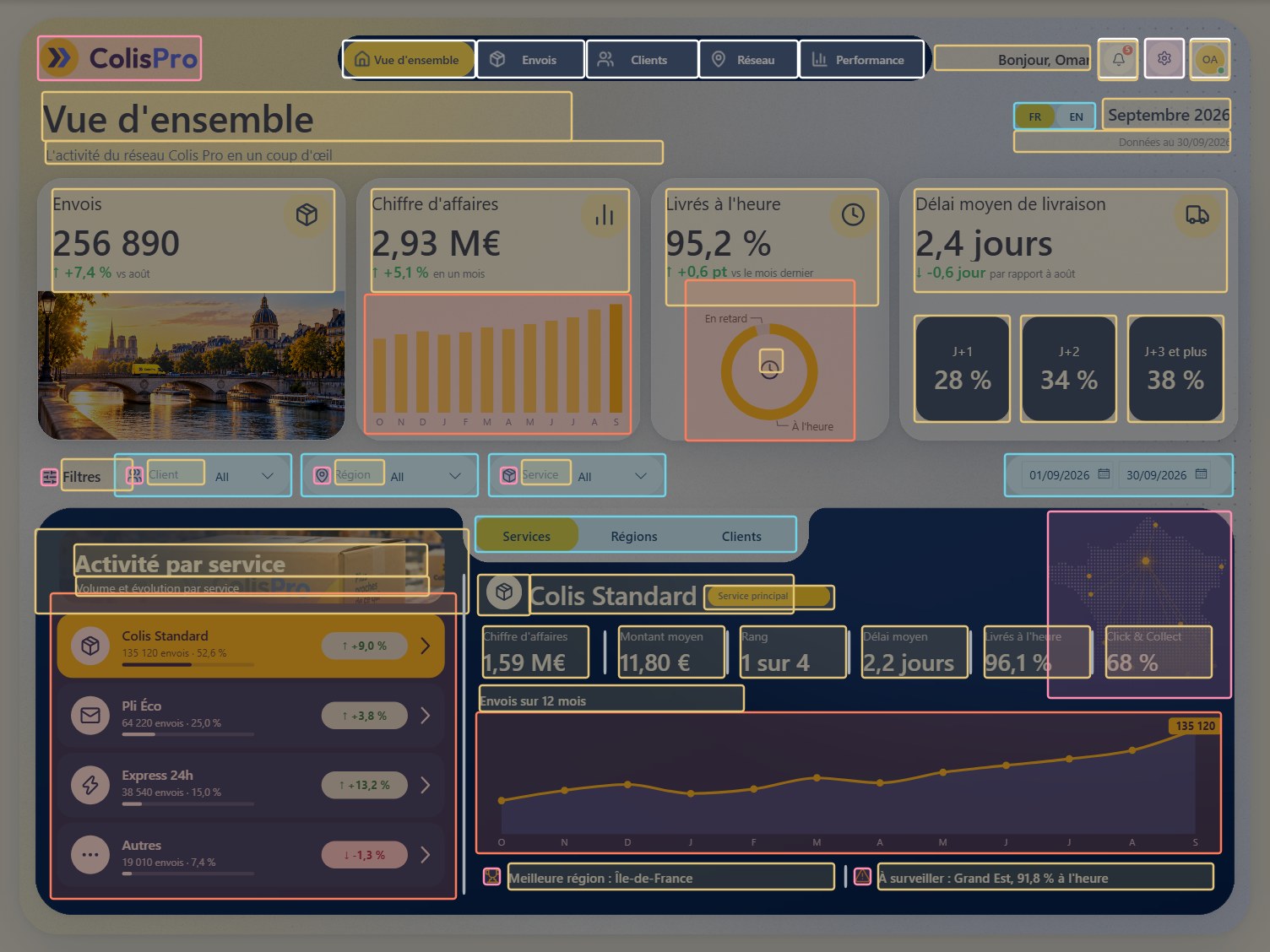
Look at what has no outline: the white frame, the surfaces of the KPI cards, the Paris photo, the navy panel and its notch. None of them is a visual. They are pixels in the page background image, and every visual sits on top of it with a transparent background.
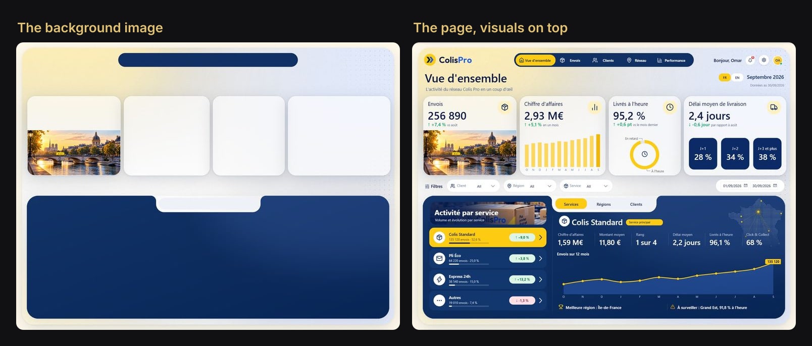
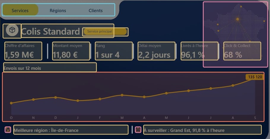
On this page, no visual draws a surface. The 7 shapes are all one-pixel dividers.
Region by region
| Region | Visuals | What they are |
|---|---|---|
| Menu | 5 | Buttons on a pill drawn in the background |
| Header | 13 | 7 cards (title, period, data date, greeting, bell, avatar), 3 buttons, 2 images, the FR / EN slicer |
| KPI row | 10 | 8 cards (4 KPIs, 3 delivery-time tiles, the donut icon), 1 donut, 1 column chart |
| Filter bar | 12 | 4 slicers, 4 label cards, 4 icons |
| Tabs | 1 | A button slicer sitting in the notch |
| Activity list | 4 | 3 cards (photo header, title, subtitle) and 1 table whose rows are SVG tiles |
| Detail sheet | 23 | 12 cards, 3 images, 7 one-pixel dividers, 1 line chart |
| Hidden | 4 | 3 synced settings slicers and a replaced card |
Cards do the heavy lifting
With 167 cards, the new card visual is the workhorse of the report. Every KPI, every title and label, the status pills and the badges are cards. A card has a value, a title, a reference label and an image slot, and each of them can be driven by a measure:
- the value is a measure, formatted;
- the title and the comparison line ("vs August") are measures, which is also how the report switches between French and English;
- the image slot holds an SVG returned by a measure: rings, pills, a delivery timeline.
The 17 text boxes that remain hold static text. 42 others became cards during the bilingual pass, because a text box can't take a measure.
The 9 charts that remain
Charts are kept for what only a chart can show: a trend, a share, a position.
- 3 column charts and 3 line charts for the 12-month trends.
- 1 combo chart for billed versus collected.
- 1 donut for the on-time share, with an SVG icon laid in its centre.
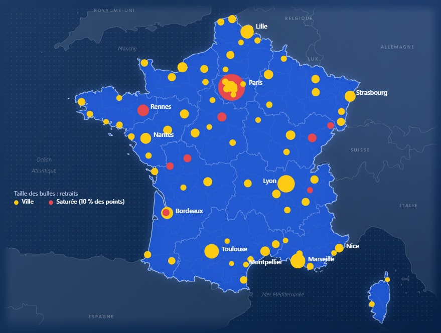
- 1 scatter chart, which is the network map.
That last one is worth a second look. The map of France is not Azure Maps: it is a scatter chart with longitude on X, latitude on Y and pickups as bubble size, drawn over a map image set as the plot area background.
What it means for your reports
- Draw the frame first. The look of the page (frame, surfaces, shadows, photos) is cheaper and freer as one background image than as dozens of shapes.
- Then place the cards. They carry the numbers and the words, and measures can drive every part of them.
- Keep charts for what only a chart can show. A chart that repeats a number already on a card is noise.
The background and the cards make the report. The charts make the point.
Try it
Download Colis Pro, free: all 347 visuals, the page backgrounds as layered SVG files you can open in Figma, the model and the data.
FAQ
Doesn't a background image make the report harder to change?
Only its look. Anything that moves or changes stays a visual; only the surfaces are pixels. Colis Pro keeps the layered SVG of each background, so a change in Figma is one export away.
Why cards rather than text boxes?
A card's value, title and image can all come from measures. A text box is static, so it can't translate, react to a filter or show a computed label.
How many visuals is too many?
Count matters less than what each visual queries. A card that reads one measure is light, and the surfaces add no visual at all, since they are part of the background image.