

Design techniques
SVG measures in Power BI cards: rings, pills and a timeline
Draw rings, status pills, gauges and a shipment timeline with DAX, as SVG in a card's image, and avoid the encoding trap that wipes out every colour.
Some designs ask for shapes that no built-in Power BI visual offers as such: a full ring with a target tick, a rounded status pill, a five-step shipment timeline. What Power BI does have is measures that return text. If that text is an SVG image, a card or a table will draw it.
In Colis Pro, a free Power BI report built with an AI agent, 44 measures carry the Image URL data category, and all but one (a photo) return SVG. Here is what they draw, how one works, the encoding trap that once erased every colour of our ring, and where static icons belong.
What it gives you
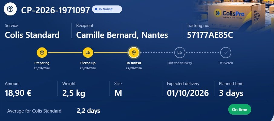
On the Shipments page, the status pill, the five-step timeline and the green "On time" pill are three SVG measures, each in a new card visual.
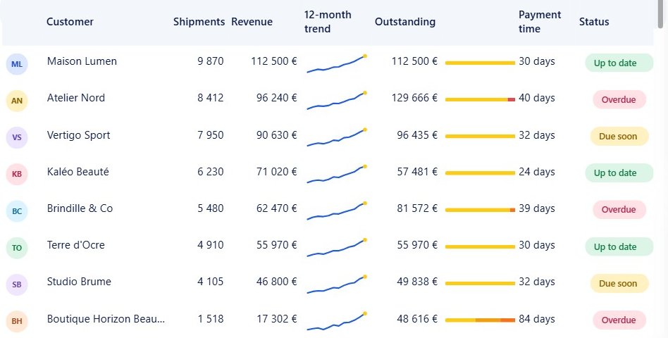
In a table, they become columns. On the Customers page, the initials badge, the outstanding bar and the payment status are three SVG columns.
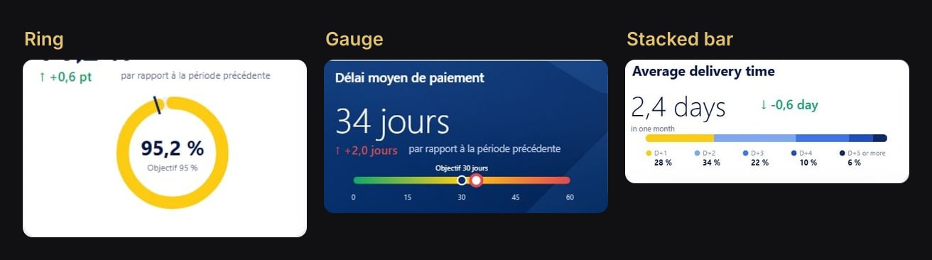
And in cards, anything you can draw:
How it works
The measure does three things: it builds the SVG as a string, encodes two characters, and returns the result as a data URI. Give it the Image URL category, point a visual at it, and Desktop draws the result.
Here is the ring from the model, trimmed only where noted:
Anneau ponctualité (SVG) =
VAR _v = MAX ( MIN ( [Taux livrés à l'heure], 1 ), 0 )
VAR _o = [Objectif ponctualité]
VAR _r = 64
VAR _c = 2 * PI () * _r
VAR _a = 2 * PI () * _o - PI () / 2
VAR _svg =
    "<svg xmlns='http://www.w3.org/2000/svg' width='170' height='170' viewBox='0 0 170 170'>"
        & "<circle cx='85' cy='85' r='64' fill='none' stroke='#EEF1F6' stroke-width='16'/>"
        & "<circle cx='85' cy='85' r='64' fill='none' stroke='#FDCB12' stroke-width='16' stroke-linecap='round' "
        & "stroke-dasharray='" & FORMAT ( _c * _v, "0.00", "en-US" ) & " " & FORMAT ( _c, "0.00", "en-US" ) & "' transform='rotate(-90 85 85)'/>"
        -- … the target tick: a <line> from radius 52 to 76 at angle _a (trimmed)
        & "<text x='85' y='88' text-anchor='middle' font-family='Segoe UI, Arial, sans-serif' font-size='28' font-weight='300' fill='#0B1A4A'>" & FORMAT ( _v, "0.0 %", "fr-FR" ) & "</text>"
        -- … a second <text>, "Objectif 95 %" (trimmed)
        & "</svg>"
RETURN
    IF ( NOT ISBLANK ( [Taux livrés à l'heure] ), "data:image/svg+xml;utf8," & SUBSTITUTE ( SUBSTITUTE ( _svg, "%", "%25" ), "#", "%23" ) )
The geometry fits in two lines:
- The arc is a dashed circle.
_cis the circumference, the dash is_c * _vlong and the gap is a full_c, so the gold stroke covers exactly the rate.rotate(-90 85 85)starts it at twelve o'clock. - The target tick is a line at angle
2 * PI () * _o - PI () / 2, from radius 52 to radius 76._ois[Objectif ponctualité], the on-time target that users set in the report's settings panel, so the tick moves when they change it.
Attributes use single quotes, so the DAX string stays delimited by double quotes. And as a measure, the image is recomputed in every filter context: per row, per selection.
The encoding trap: % before #
A data URI is a URL, and two characters of an SVG have a meaning in a URL:
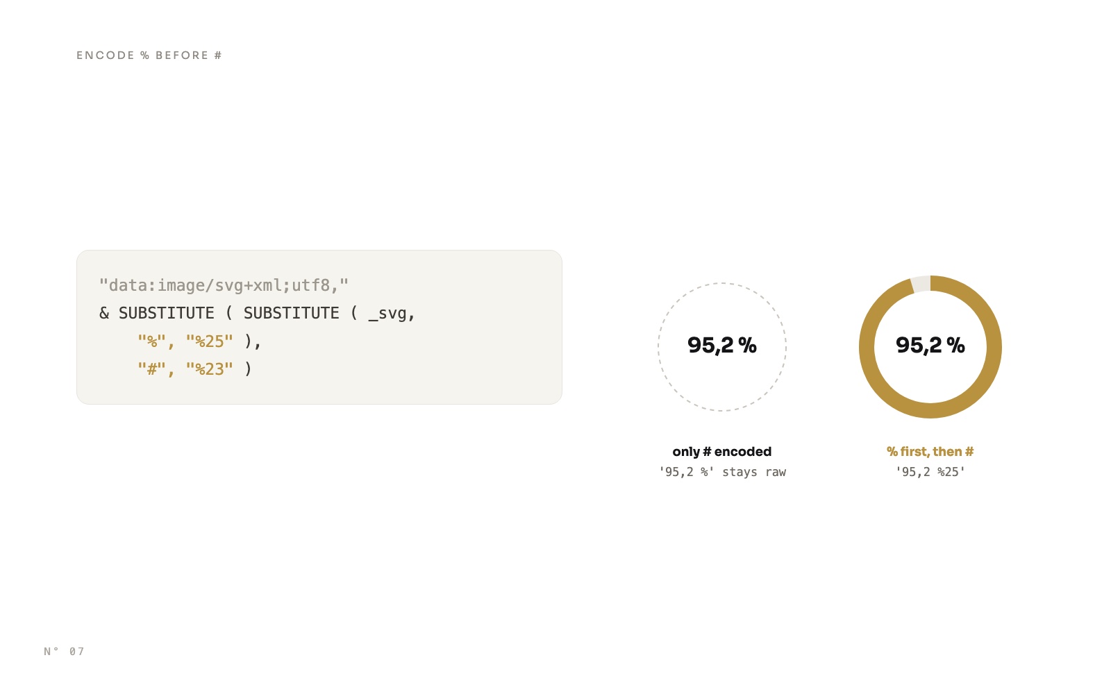
#starts the fragment. In a URL, everything after the first#is not part of the data, so a raw#FDCB12cuts the SVG off at its first colour. It must become%23.%starts an escape such as%23. A literal%must become%25. The ring prints "95,2 %" and "Objectif 95 %", and the delivery bar prints "28 %".
Both are needed, and the order matters:
Our first version encoded only #:
"data:image/svg+xml;utf8," & SUBSTITUTE ( _svg, "#", "%23" )The % in "95,2 %" stayed raw, and this is what Power BI Desktop drew:
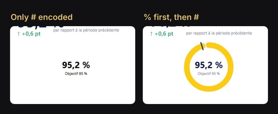
The image still rendered, with its two texts in default black, but the ring, the tick and every colour were gone. We fixed 18 SVG measures that day with the same line, % first, then #:
"data:image/svg+xml;utf8," & SUBSTITUTE ( SUBSTITUTE ( _svg, "%", "%25" ), "#", "%23" )Remember that # is not only in colours. The gauge fills its bar with fill='url(#g)', a gradient, and the delivery bar clips its segments with clip-path='url(#c)'. Both references need the same encoding.
Step by step in Power BI Desktop
- Create the measure. Build the SVG string, wrap it in
IF ( NOT ISBLANK ( … ), … )so a row with nothing to show returns blank instead of an empty drawing, and end with the encoding line above. - Set its category. Select the measure in the Data pane, then in Measure tools, set Data category to Image URL. Tables and matrices then draw it as an image.
- Put it in a card. Add a new card visual (
cardVisualin the file) with the measure as its field. Turn off the value and the label, then in the card's Images settings (thecardImageobject), set Image source to the data option and put the measure in Data. - Or in a table. Drop the measure in a table's columns. Each row gets its own image.
In the report files (PBIR), the timeline's card stores the image like this:
"cardImage": [{
  "properties": {
    "show":         { "expr": { "Literal": { "Value": "true" } } },
    "imageType":    { "expr": { "Literal": { "Value": "'imageData'" } } },
    "imageData":    { "expr": { "Measure": { "Expression": { "SourceRef": { "Entity": "_Mesures" } }, "Property": "Frise (SVG)" } } },
    "imageDataFit": { "expr": { "Literal": { "Value": "'Fit'" } } },
    "imageHeight":  { "expr": { "Literal": { "Value": "96L" } } }
  },
  "selector": { "id": "default" }
}]
The timeline was the only SVG card that rendered correctly in our first Desktop render, once adjusted by hand. Its settings became the recipe for the others: margins at 0, value.show false in the default entry and in an entry without a selector (see our validator traps), label.show false, contentOrder 'image_referenceLabel_callout', calloutSize 10D, and imageHeight equal to the visual's height.
Draw at the size of the slot
With Image fit set to Fit, the SVG's own proportions decide the result, so Colis Pro draws each one at the size of its slot:
| Measure | SVG | Card |
|---|---|---|
Frise (SVG) | 840 × 104 | 840 × 96, image height 96 |
Barre délais (SVG) | 440 × 62 | 440 × 62 |
Anneau ponctualité (SVG) | 170 × 170 | about 186 × 167, image height 167 |
Envoi affiché : pastille statut (SVG) | width from the text × 26 | 130 × 26 |
In a table, one image size for every cell
A table gives all its image cells the same box: grid.imageWidth and grid.imageHeight in the file, 110 by 30 on the customer table. A round badge drawn on a 44 by 44 canvas is not that shape, so the list measure widens the canvas to the cell's shape, circle still on the left:
Liste client : badge (SVG) = IF ( [Filtre onglet clients] = 1 && [Chiffre d'affaires] > 0, SUBSTITUTE ( [Badge initiales (SVG)], "width='44' height='44' viewBox='0 0 44 44'", "width='161' height='44' viewBox='0 0 161 44'" ) )The pills also carry preserveAspectRatio='xMinYMid meet', but that attribute only acts when the viewBox and the declared width and height differ in shape. Here they match, so it has nothing to align, and in the final customer table the pills sit in the middle of their column.
Static icons: one SVG in the card's own image slot
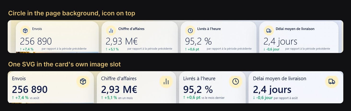
The KPI cards of the Overview and Shipments pages each carry an icon in a pale yellow medallion. For a while it was two layers: a 42 px circle (#FFF1C2) painted into the page background at fixed coordinates, and the icon in an Image visual on top.
Two layers line up only until someone touches the card. Now each medallion is one SVG file, circle and icon together (formatted, Lucide paths trimmed):
<svg xmlns='http://www.w3.org/2000/svg' width='84' height='84' viewBox='0 0 42 42'>
  <circle cx='21' cy='21' r='21' fill='#FFF1C2'/>
  <g transform='translate(10 10) scale(0.9167)' fill='none' stroke='#0B2A66'
     stroke-width='2' stroke-linecap='round' stroke-linejoin='round'>
    <!-- Lucide "package" paths -->
  </g>
</svg>
Lucide icons are drawn on a 24-unit grid: scale(0.9167) (22/24) makes a 22-unit icon, centred in the 42-unit circle by translate(10 10). The file is a registered resource in the new card's image object, the one next to the value (trimmed: fit and rectangleRoundedCurve left out):
"image": [{
  "properties": {
    "show":      { "expr": { "Literal": { "Value": "true" } } },
    "imageType": { "expr": { "Literal": { "Value": "'image'" } } },
    "image": { "image": {
      "name":    { "expr": { "Literal": { "Value": "'medaillon-package.svg'" } } },
      "url":     { "expr": { "ResourcePackageItem": { "PackageName": "RegisteredResources", "PackageType": 1, "ItemName": "medaillon-package.svg" } } },
      "scaling": { "expr": { "Literal": { "Value": "'Normal'" } } }
    } },
    "position":          { "expr": { "Literal": { "Value": "'Right'" } } },
    "size":              { "expr": { "Literal": { "Value": "54L" } } },
    "padding":           { "expr": { "Literal": { "Value": "12L" } } },
    "verticalAlignment": { "expr": { "Literal": { "Value": "'top'" } } }
  },
  "selector": { "id": "default" }
}]
The medallion first went in on the left at 42 px. Moving it to the top right at 54 px, after a hand edit of one card, was then a format change copied to the eight cards, with no circle to repaint in any background.
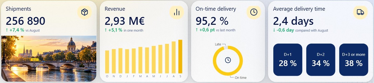
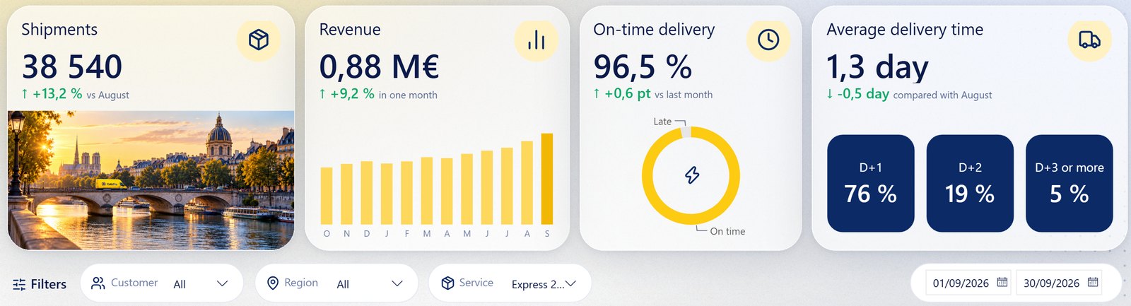
The donut centre: a card over the donut
The final on-time card is a native donut whose centre icon follows the selected service, with a clock when no single service is selected. The donut's centre image (its image object) has no data option in the schema: it takes a file. So the icon is a separate 26 by 26 card over the centre of the donut, with a measure as its image. That measure, Icône donut (SVG), switches on SELECTEDVALUE ( DimService[Service] ) to pick its Lucide paths, with the clock as the default.
The traps
- Encode
%first, then#. The other order turns every colour into%23…, which is not a colour. Skip#and the SVG is cut off at its first colour. - Numbers in the SVG need a dot. Write coordinates with
FORMAT ( x, "0.0", "en-US" ). In a model with a French culture (fr-FR), a decimal comes out with a comma. Text meant for people can use"fr-FR", as the ring's "95,2 %" does. - Fonts come from the viewer's machine. Text inside the SVG is drawn with the fonts installed where the report is viewed. Every Colis Pro measure names a fallback stack:
Segoe UI, Arial, sans-serif. - DAX cannot measure text. The status pill estimates its width from the number of characters:
36 + LEN ( _txt ) * 7. - Take colours from measures when they mean something. The pill reads
[Couleur statut]and[Couleur fond statut], and the occupancy bar turns navy when[Occupation] >= [Seuil saturation]. Change the threshold, the bars follow.
Try it
Download Colis Pro, free. The SVG measures are in the _Mesures table, display folder 90 SVG. The timeline is on the Shipments page, and the ring card is still on the Overview as a hidden visual, where the donut now sits.
If you want this kind of finish on your own model without building it by hand, ChartCraft generates designed Power BI projects, and its MCP server lets your agent do it on your semantic model.
FAQ
Why not encode the SVG in base64?
DAX has no base64 function, so a measure that builds its SVG on the fly returns it as text. Colis Pro uses base64 only for photos baked once into a measure.
Which visuals can show an SVG measure?
In Colis Pro, the new card visual (Images, image source set to data) and tables. Tables and matrices draw any field with the Image URL category as an image.
Does the image follow slicers and selections?
Yes. It is a measure: the timeline follows the parcel shown, the donut icon follows the selected service, and the ring's tick follows the settings panel.