About this dashboard
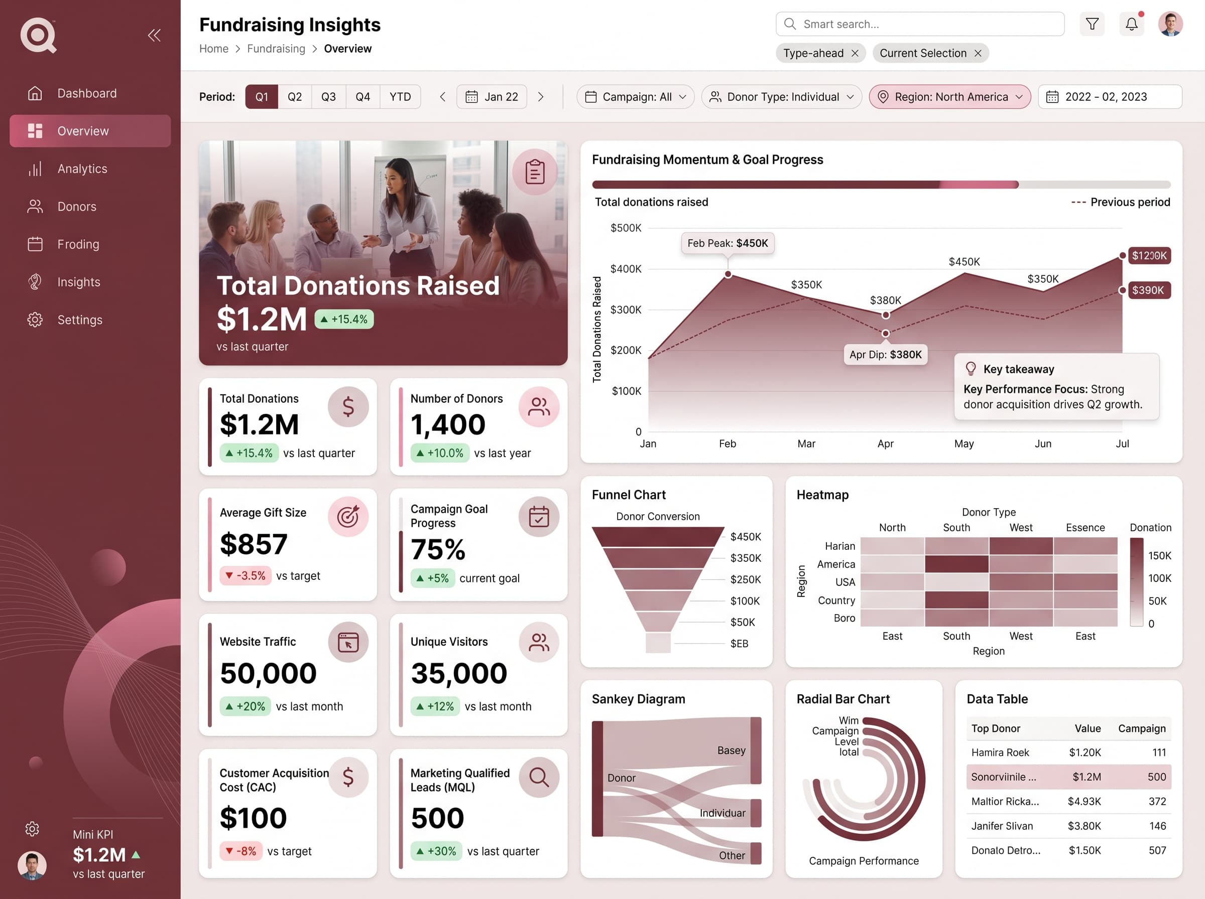
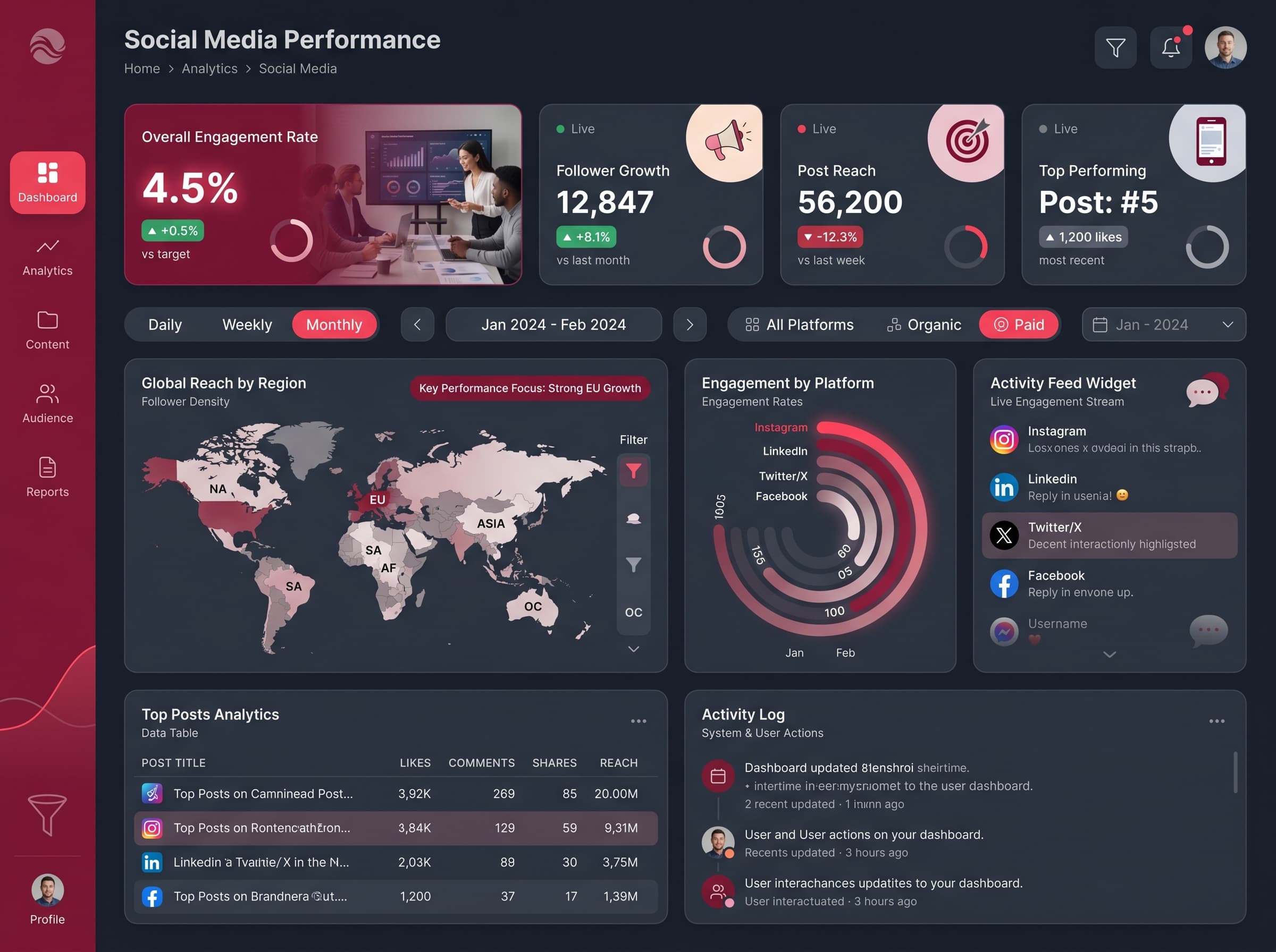
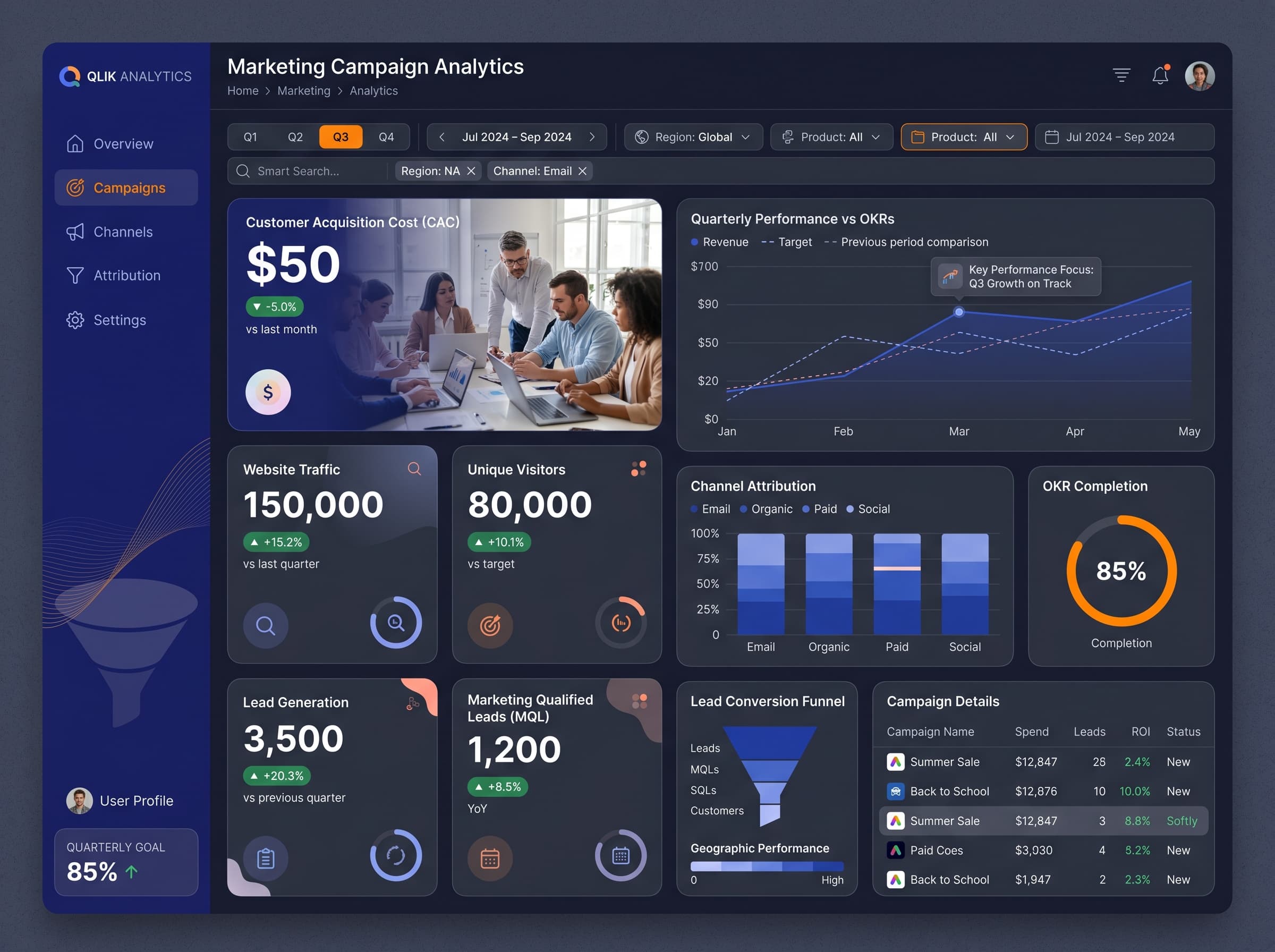
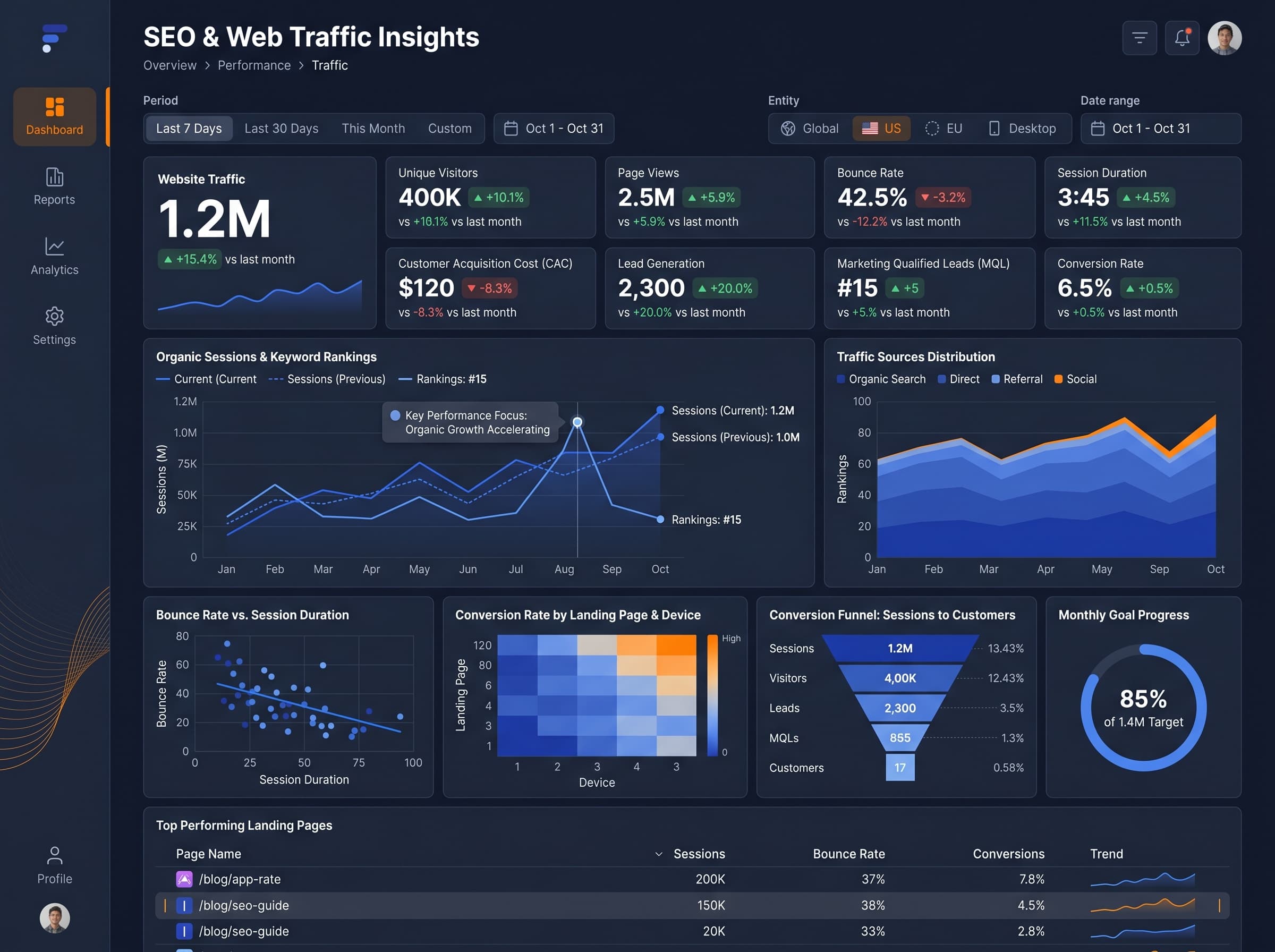
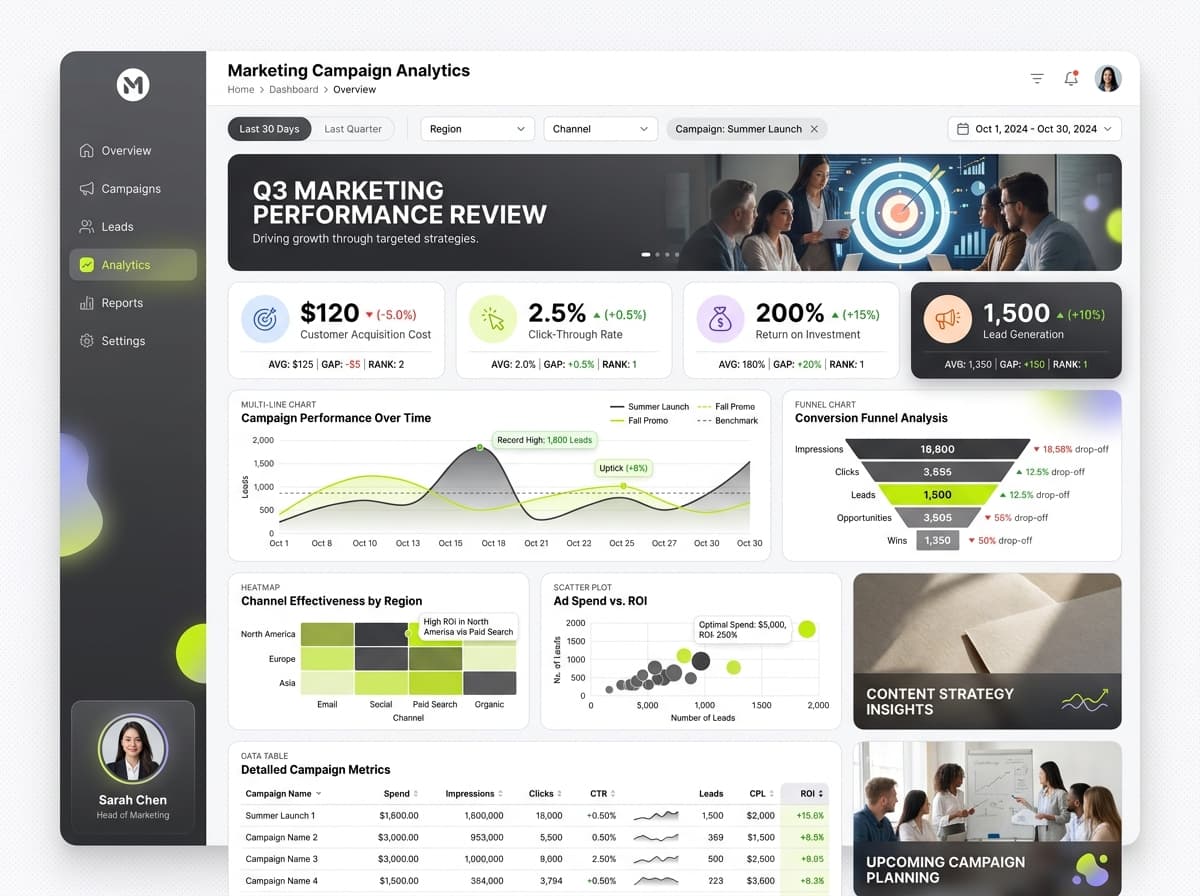
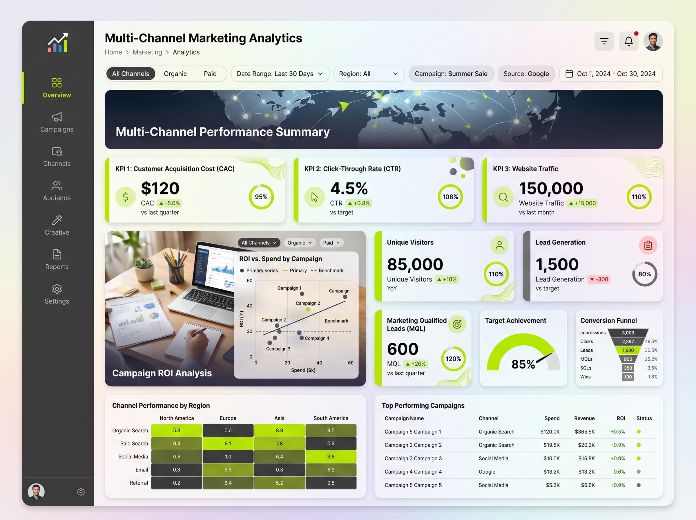
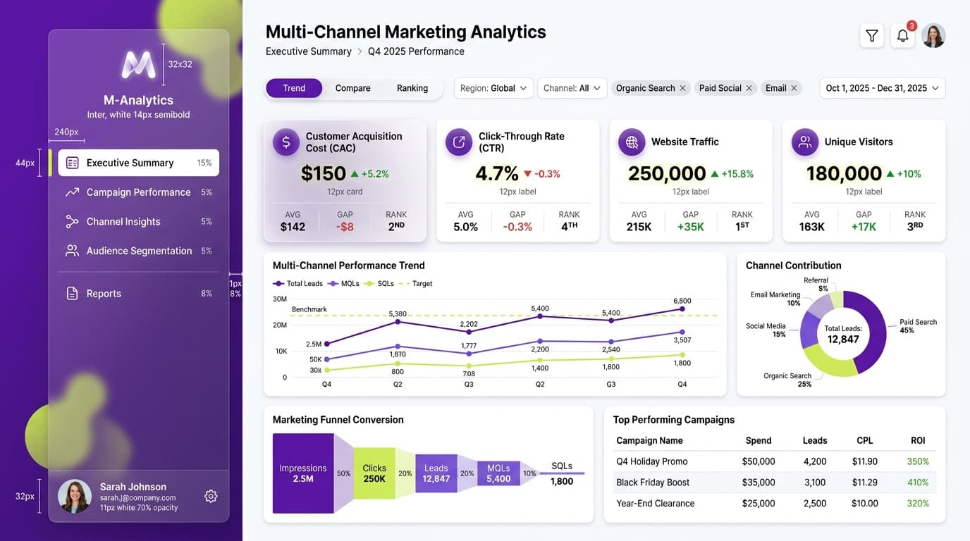
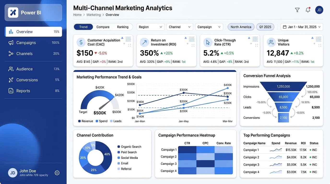
Analyze ROI, click-through rates, and customer acquisition costs across various marketing channels.
KPIs tracked
Charts
Strategic insights
Design recommendations
Color Palette Strategy
HighUtilize the graphite-lime palette effectively by using graphite (#3D3D3D) for backgrounds and headers, lime (#AEEA00) for key metrics and highlights, and ensure a contrast ratio of at least 4.5:1 for accessibility.
Layout & Grid System
HighImplement a 12-column grid for a 16:9 ratio. Place KPIs prominently at the top, with charts in the middle, ensuring 16-24px padding and 16-20px gaps between cards to enhance readability.
Typography Hierarchy
MediumUse a clear typography hierarchy: Dashboard title should be 28px bold, section headers at 20px semibold, card titles at 16px medium, and body text at 14px regular. Consistency is key in maintaining readability.
Data Visualization UX
HighSelect appropriate chart types: use a scatter plot for performance correlations, a multi-line chart for trend comparisons, and a funnel chart for conversion rates. Limit color usage to 5-7 per chart and ensure clear legends are positioned outside the chart area.
Visual Hierarchy & Focus
MediumEstablish a clear visual hierarchy with larger elements for key metrics. Use whitespace effectively to separate sections, and apply conditional formatting for key performance anomalies, highlighting red for underperforming metrics and green for successes.
Interaction & Feedback
LowInclude hover states for interactive elements with a slight opacity change to indicate selection. Implement loading skeletons during data refresh and provide filter feedback to enhance user interaction.