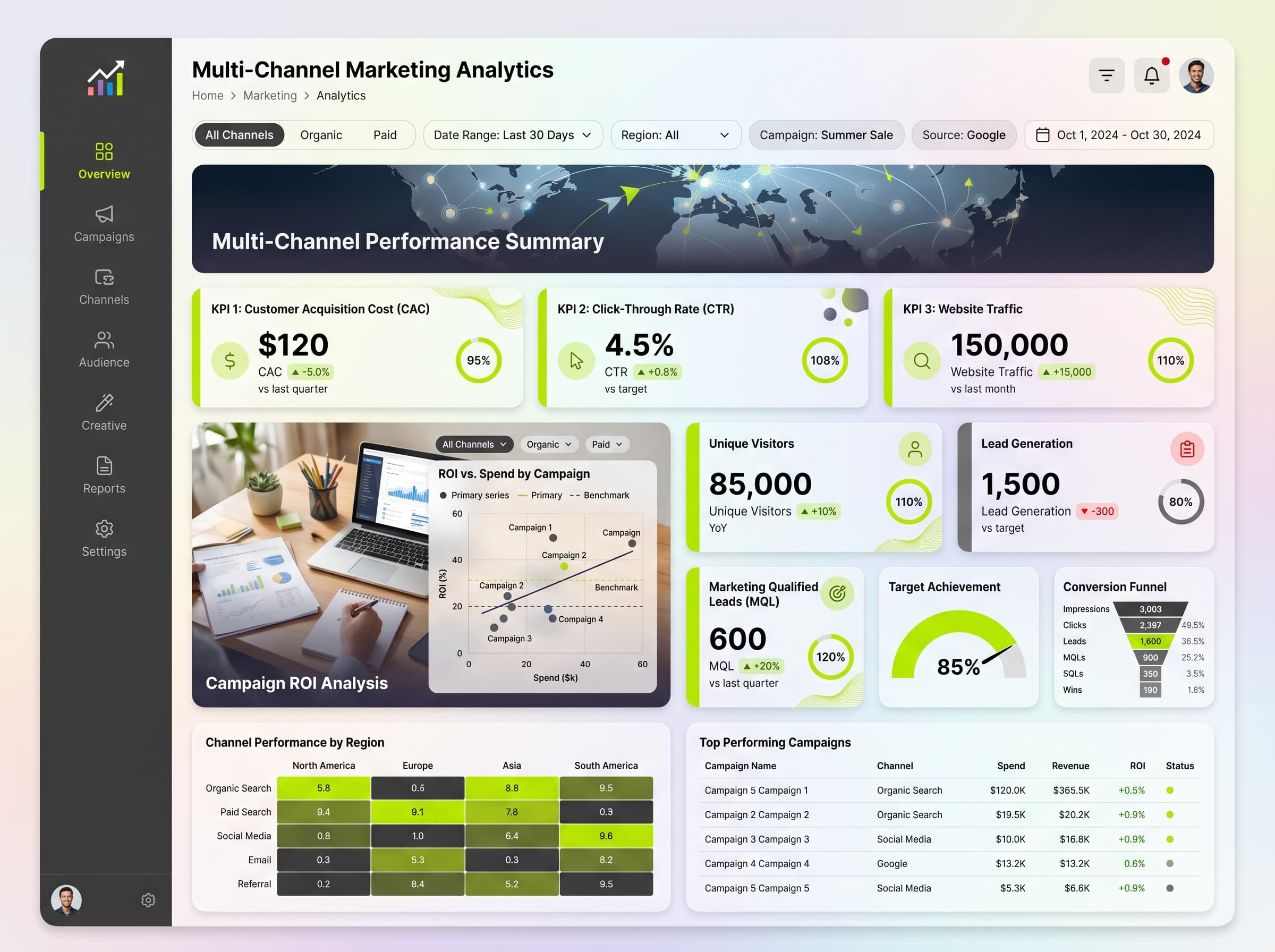
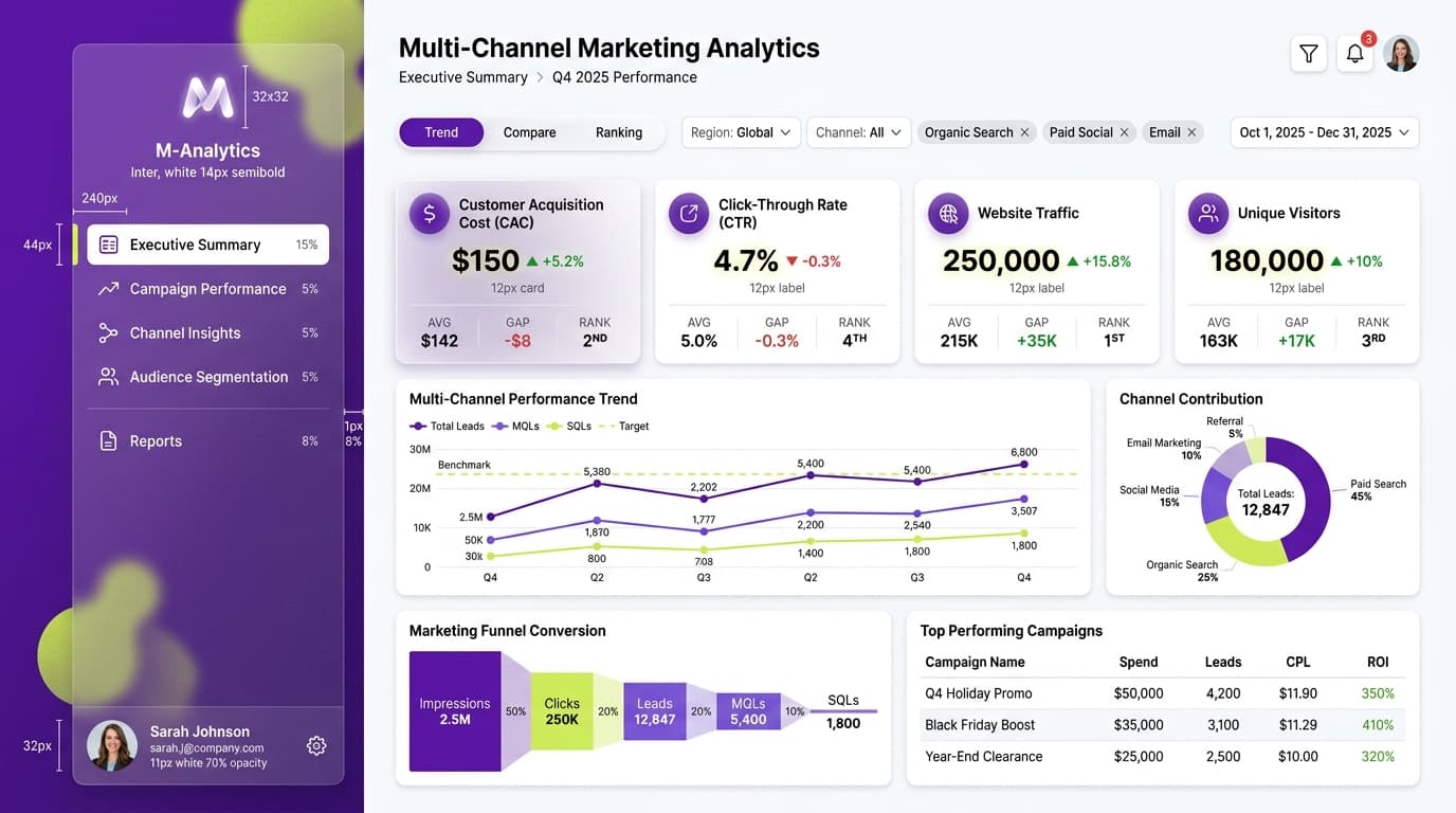
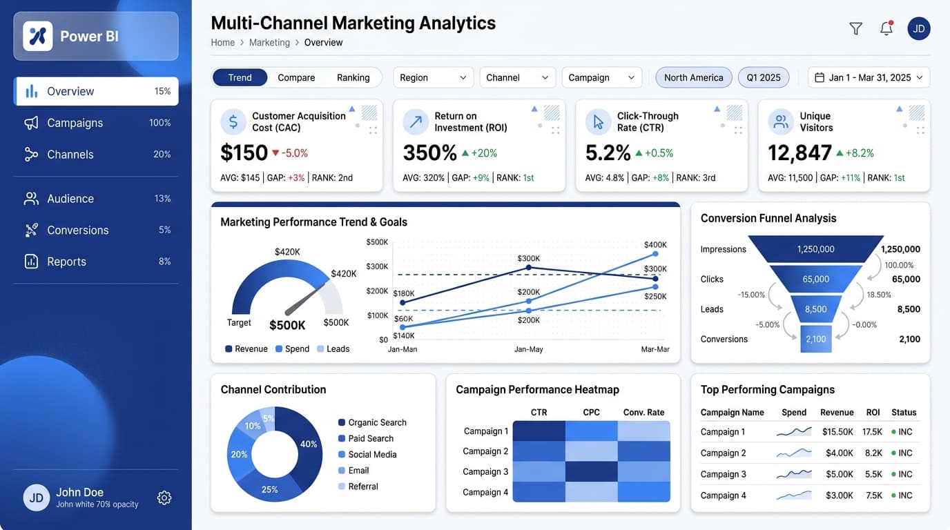
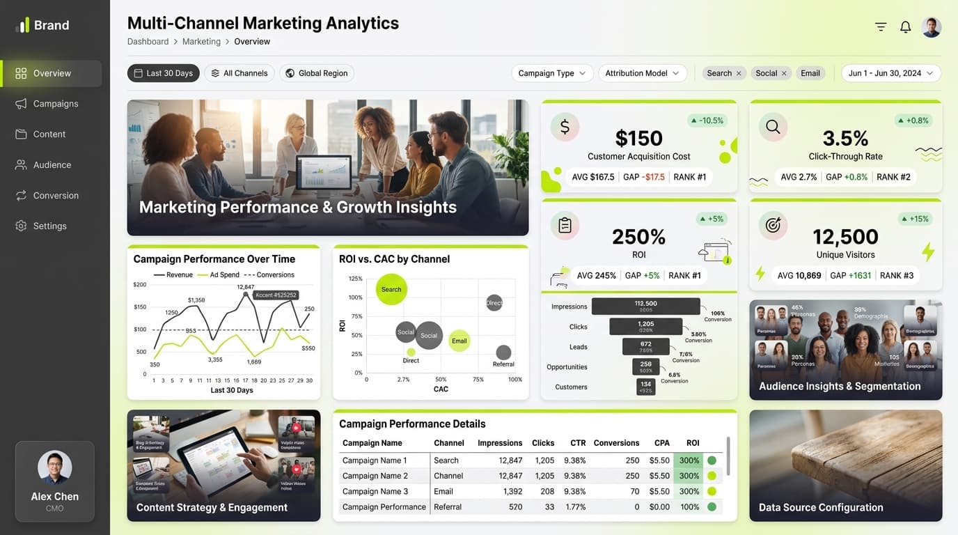
About this dashboard
Track follower growth, engagement rates, reach, and post performance across platforms in real-time.
KPIs tracked
Charts
Strategic insights
Design recommendations
Color Palette Strategy
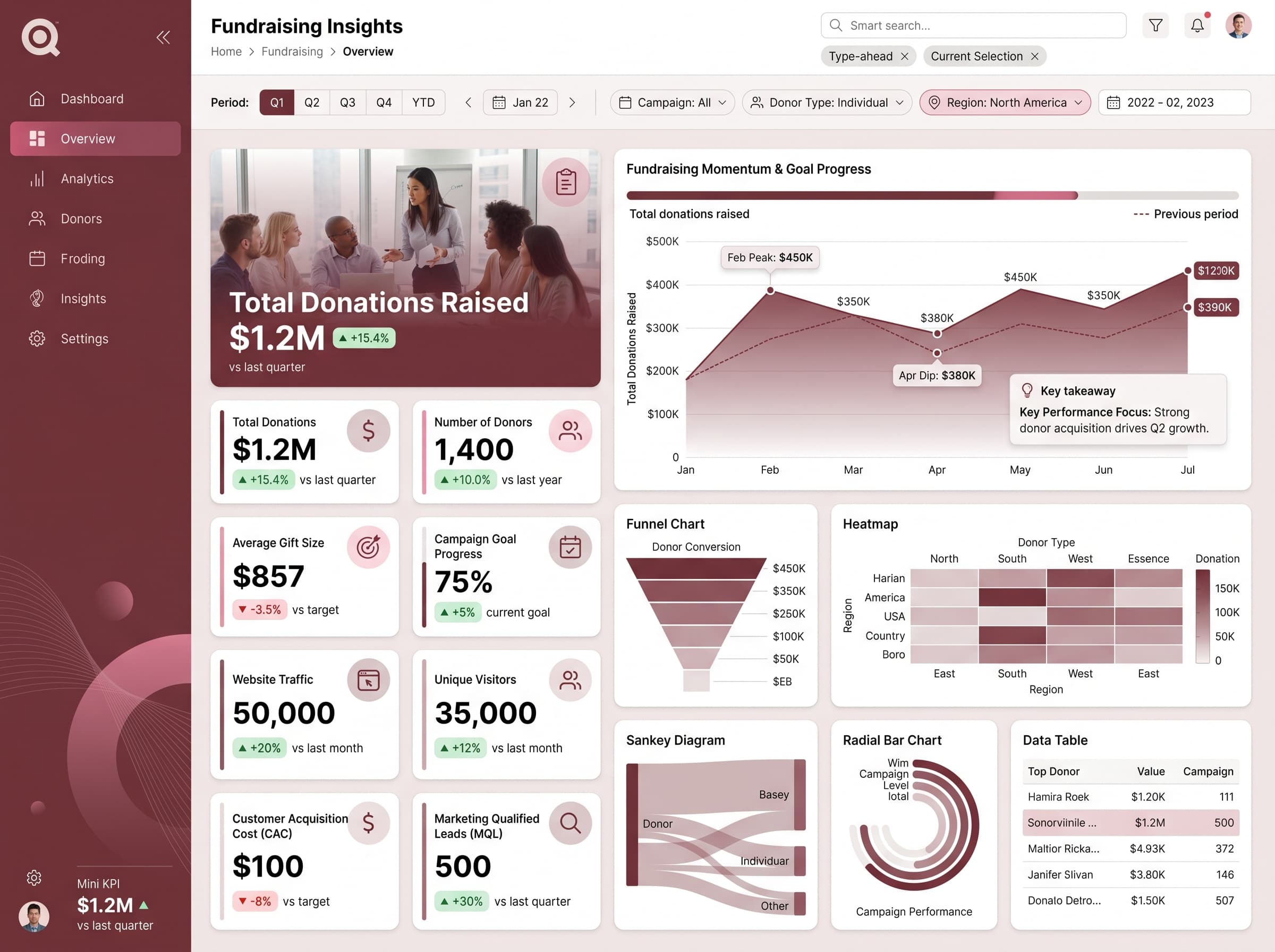
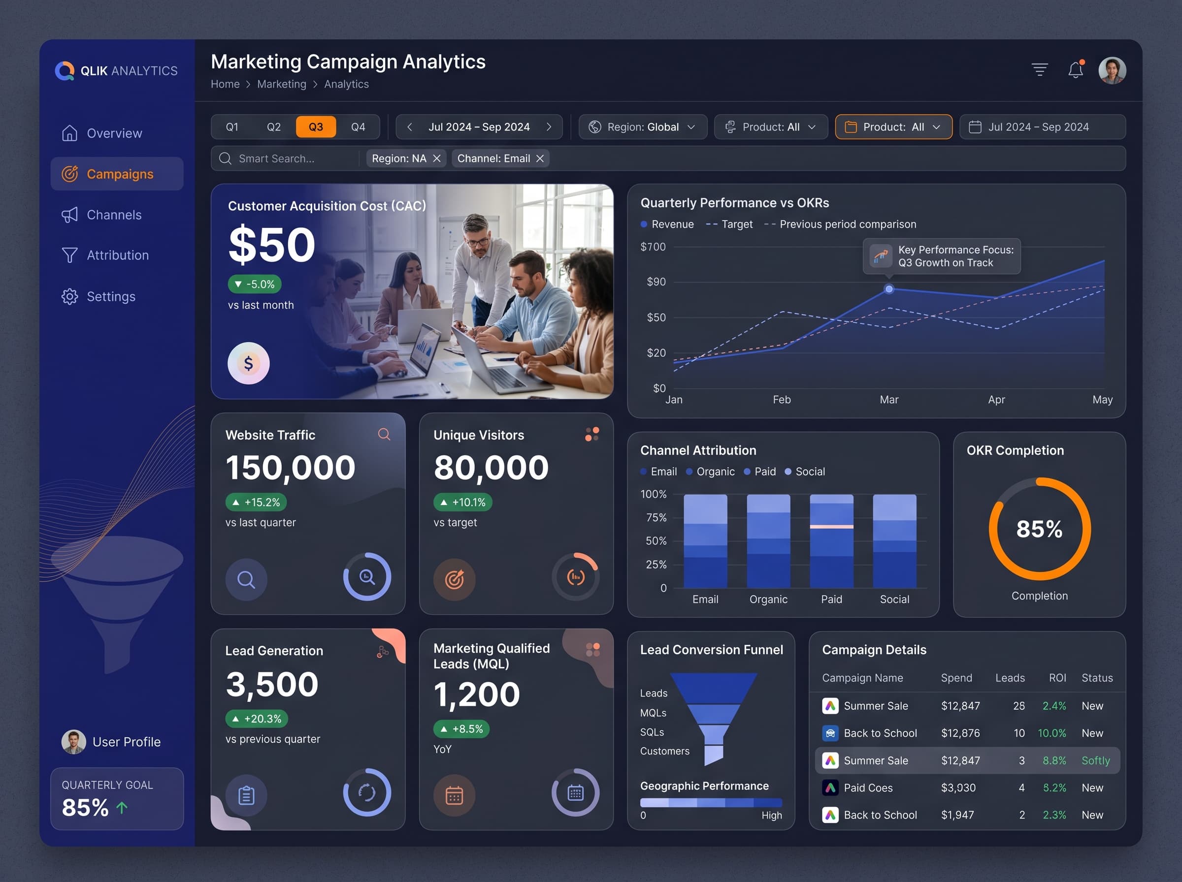
HighUtilize a mono-rose palette for a modern and cohesive look, with a focus on accessibility. Ensure a contrast ratio of at least 4.5:1 for all text to maintain readability against the dark background.
Layout & Grid System
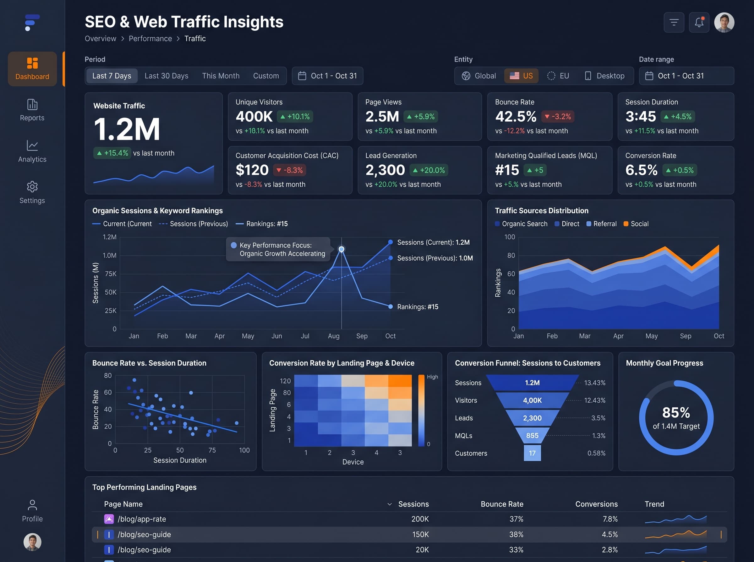
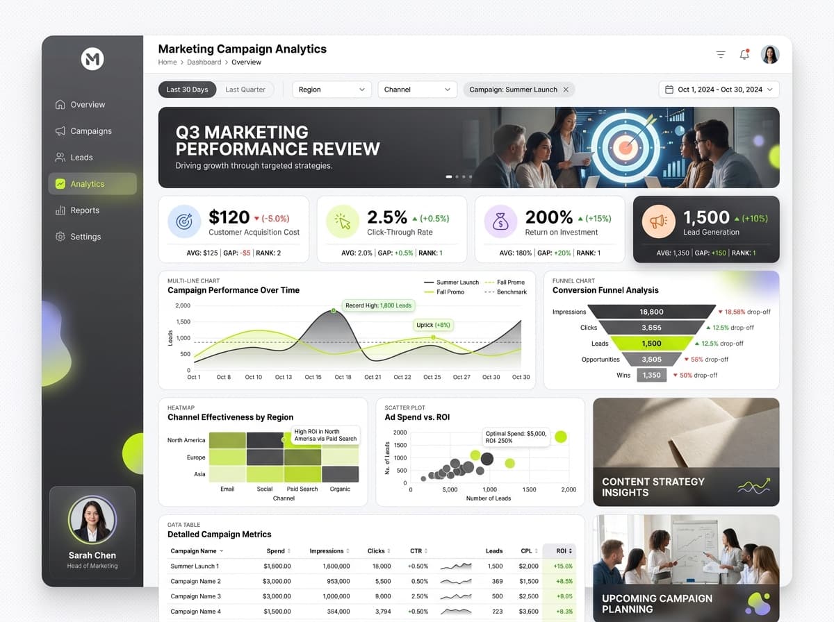
HighAdopt a 12-column grid system with a 4:3 aspect ratio. Position KPIs at the top for visibility, followed by charts in the middle sections, and an activity feed at the bottom for real-time updates.
Typography Hierarchy
MediumSet the dashboard title at 28px bold, section headers at 20px semibold, and body text at 14px regular. Maintain a consistent font, such as Inter, across the dashboard for clarity.
Data Visualization UX
HighSelect chart types that align with data semantics: use the Geographic Map for audience reach, Radial Bar Chart for engagement rates, and Activity Feed for real-time updates. Limit color usage to 5-7 per chart.
Visual Hierarchy & Focus
MediumUtilize whitespace to create separation between sections and emphasize key metrics. Implement conditional formatting to highlight positive performance in green and negative in red.
Interaction & Feedback
LowIncorporate hover effects for interactive elements, providing visual feedback during data refreshes. Use loading indicators to enhance user experience and encourage exploration.