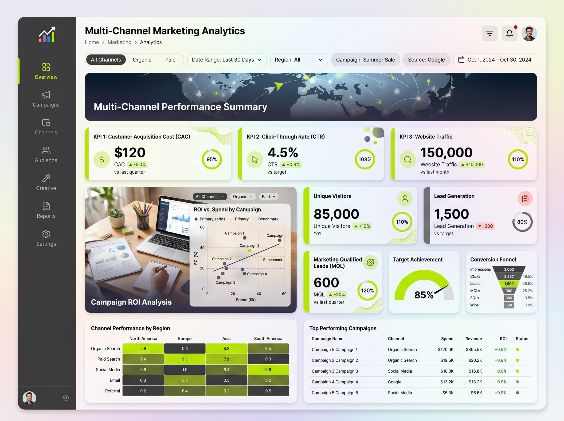
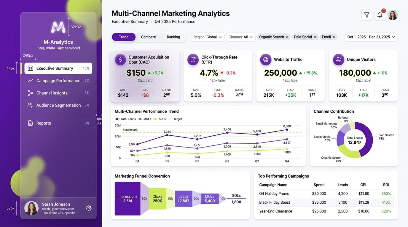
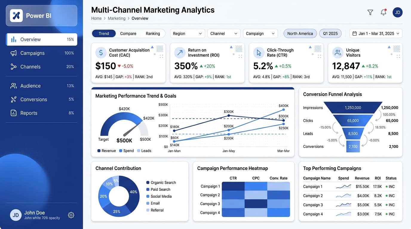
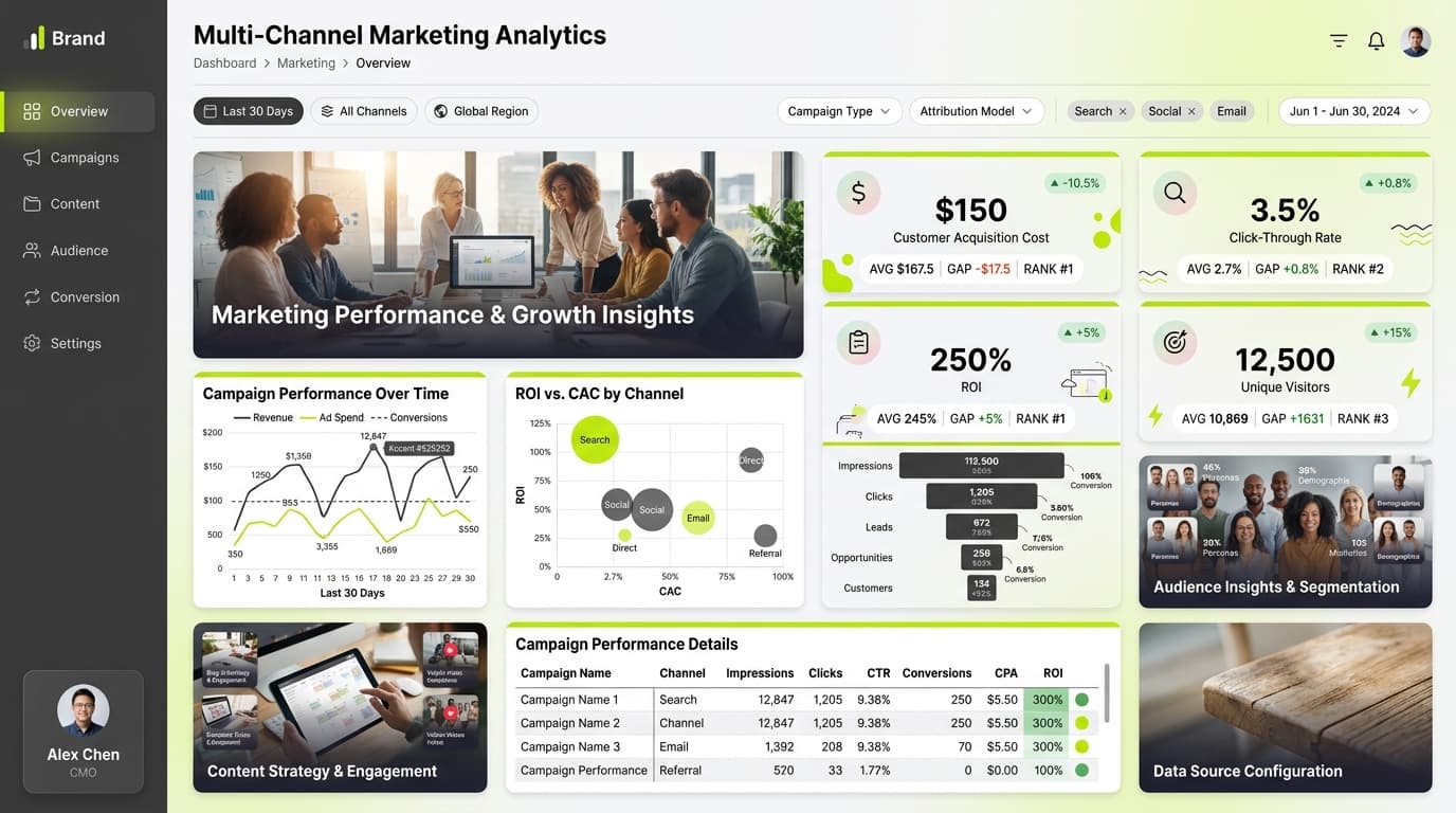
About this dashboard
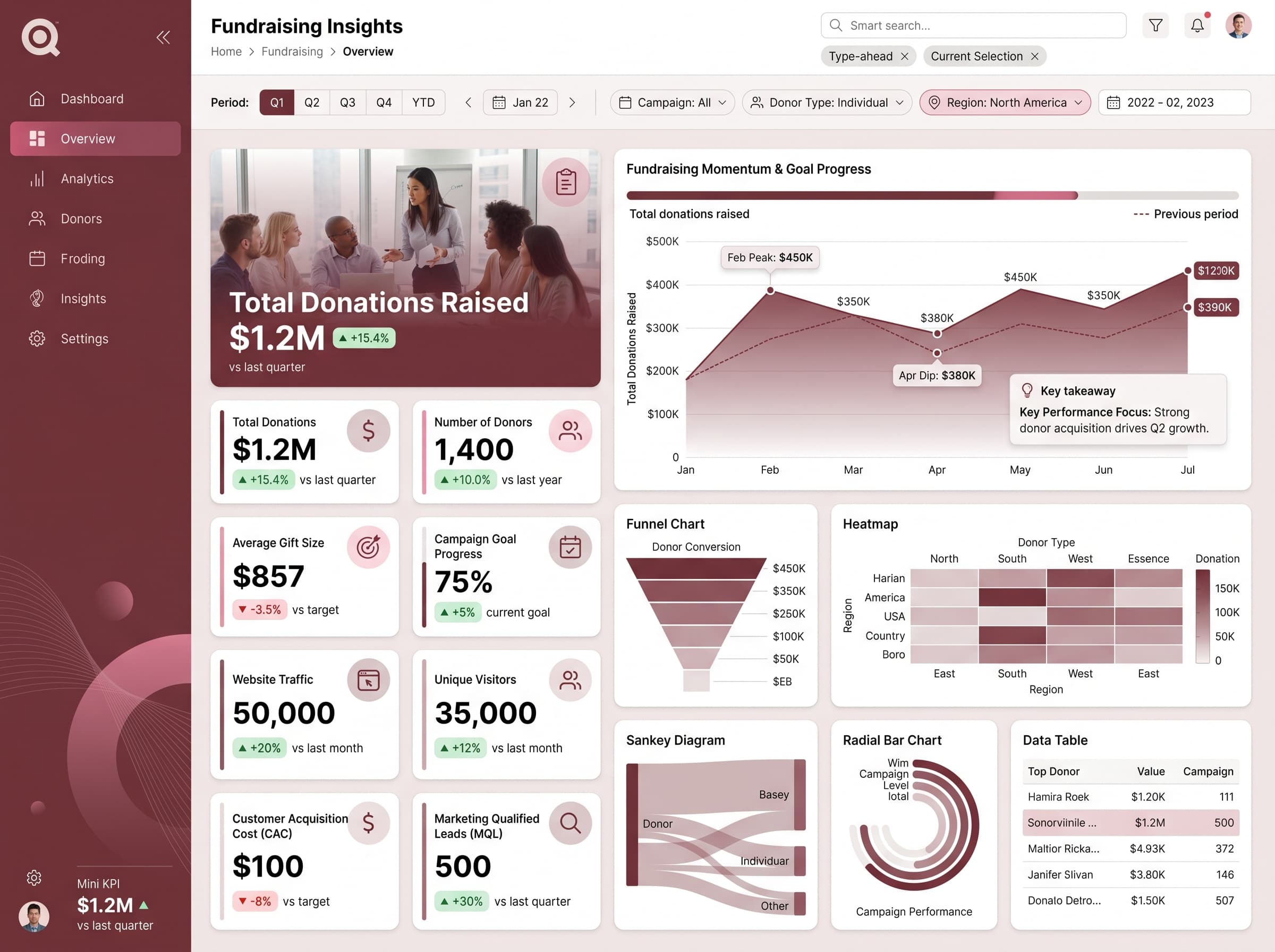
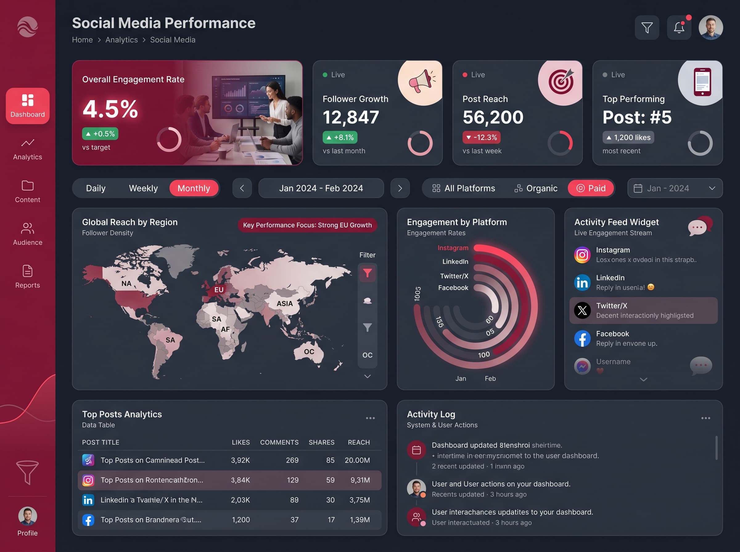
Comprehensive view of organic sessions, keyword rankings, bounce rate, and conversions by landing page.
KPIs tracked
Charts
Strategic insights
Design recommendations
Color Palette Strategy
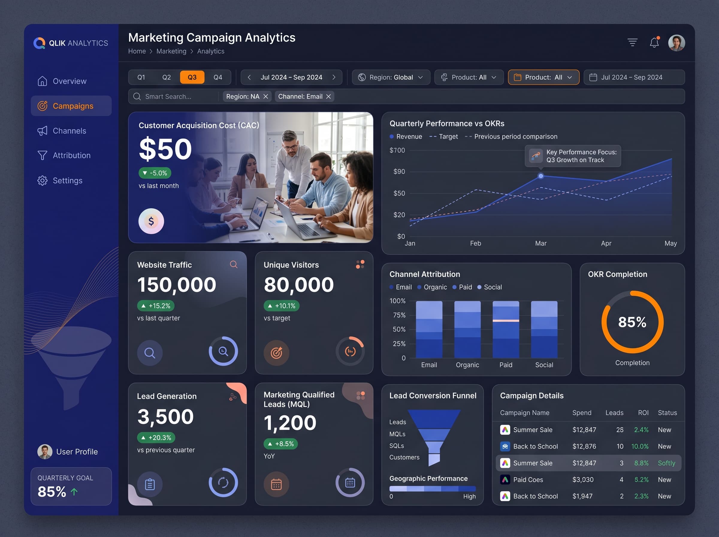
HighUtilize the midnight-orange palette with high contrast for text and key metrics to ensure readability. Maintain a 4.5:1 contrast ratio for accessibility.
Layout & Grid System
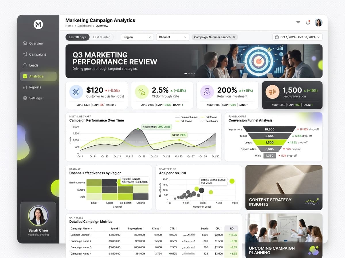
HighImplement a 12-column grid layout with 4:3 aspect ratio. KPIs should be placed at the top for immediate visibility, while charts occupy the mid-section for detailed analysis.
Typography Hierarchy
MediumUse 24-28px bold for the dashboard title, 18-20px semibold for section headers, and 12-14px for body text. Maintain a consistent font family for clarity.
Data Visualization UX
HighSelect chart types matching data semantics: multi-line for trends, stacked area for volume comparisons, and funnel for conversion rates. Use tooltips for additional context.
Visual Hierarchy & Focus
MediumCreate a clear visual hierarchy by emphasizing the most important metrics with size and color variations. Use whitespace effectively to separate sections.
Interaction & Feedback
LowImplement hover states for interactive elements and loading states during data refresh. Add visual feedback to filter selections for better user experience.