About this dashboard
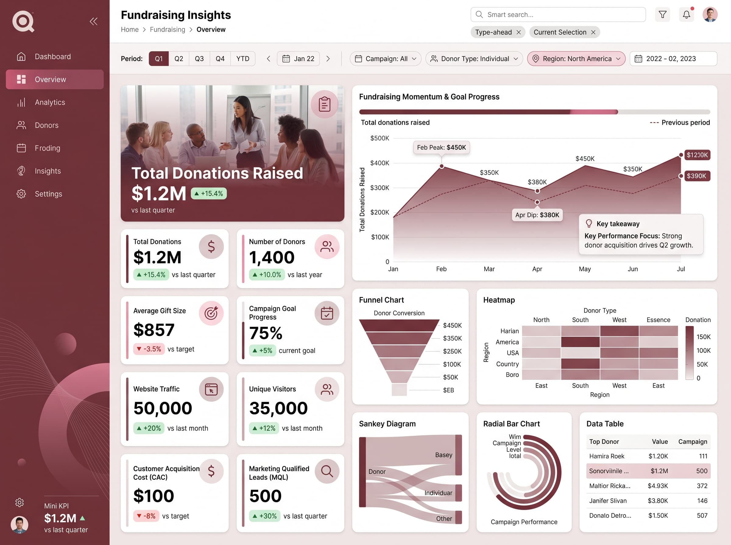
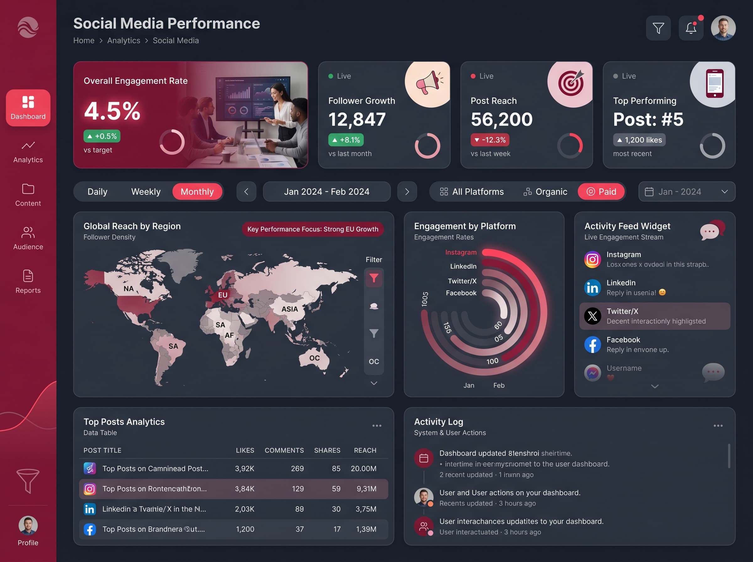
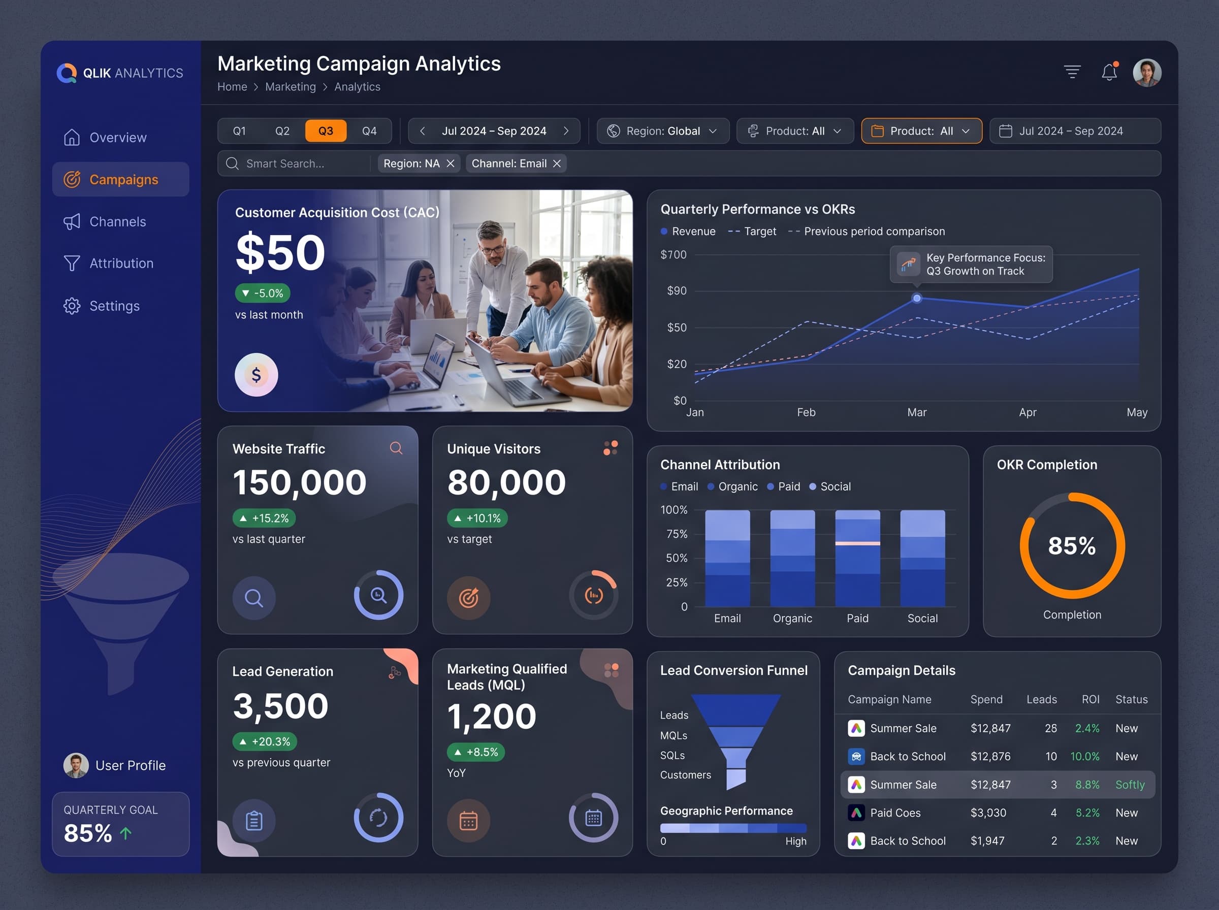
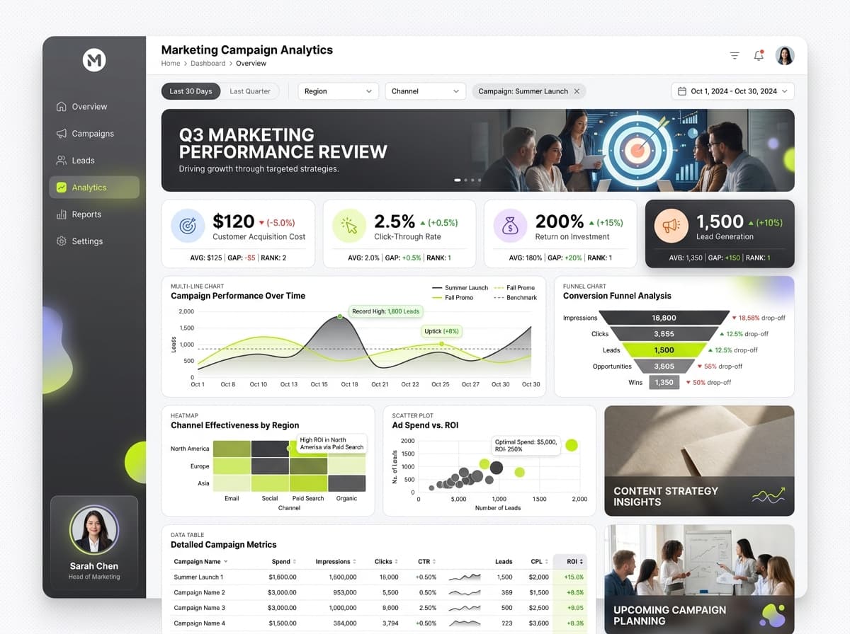
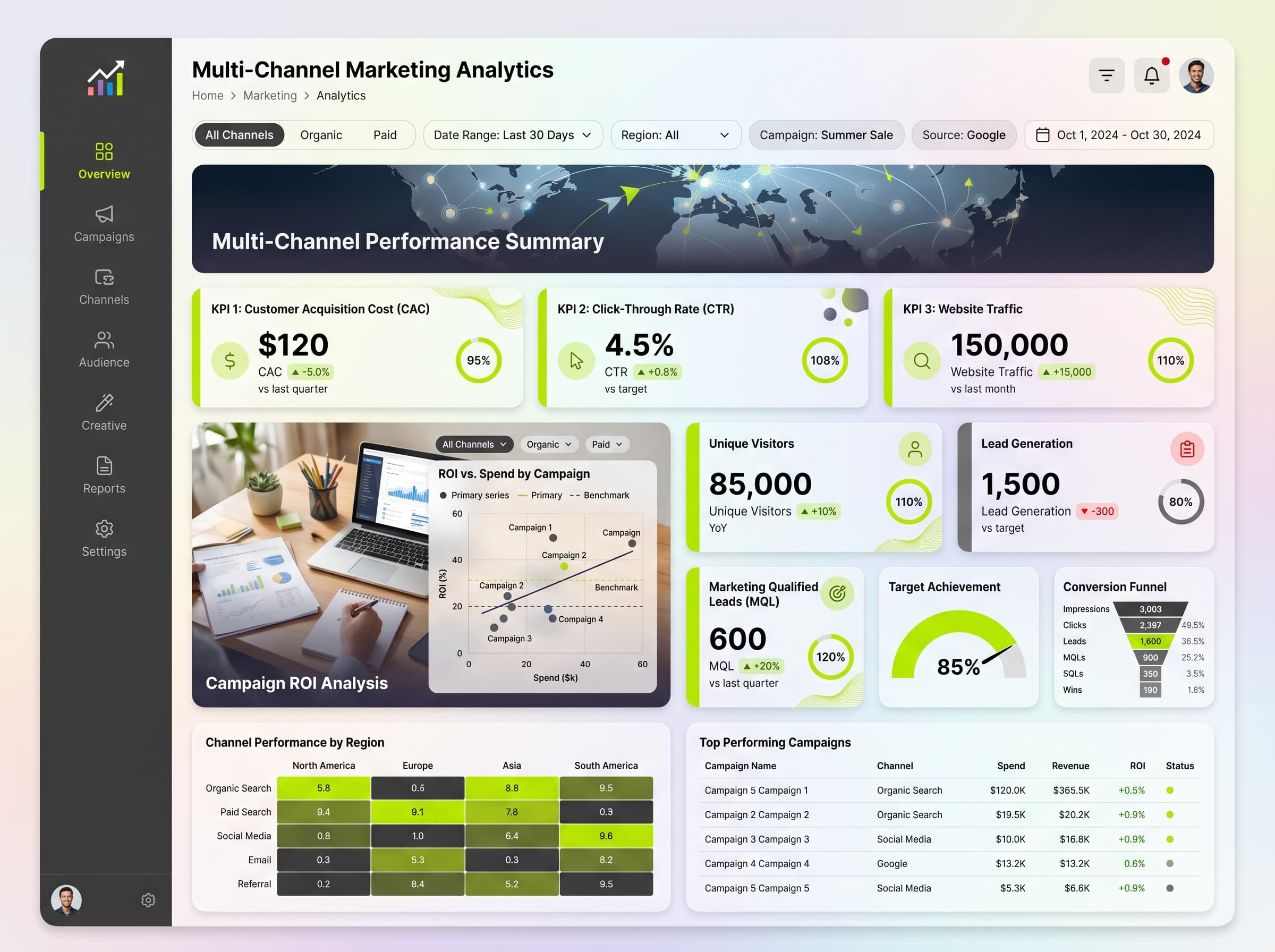
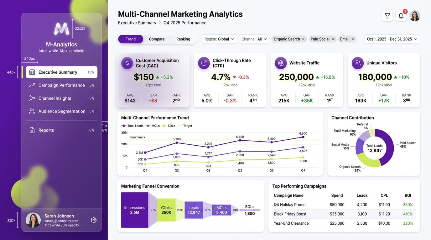
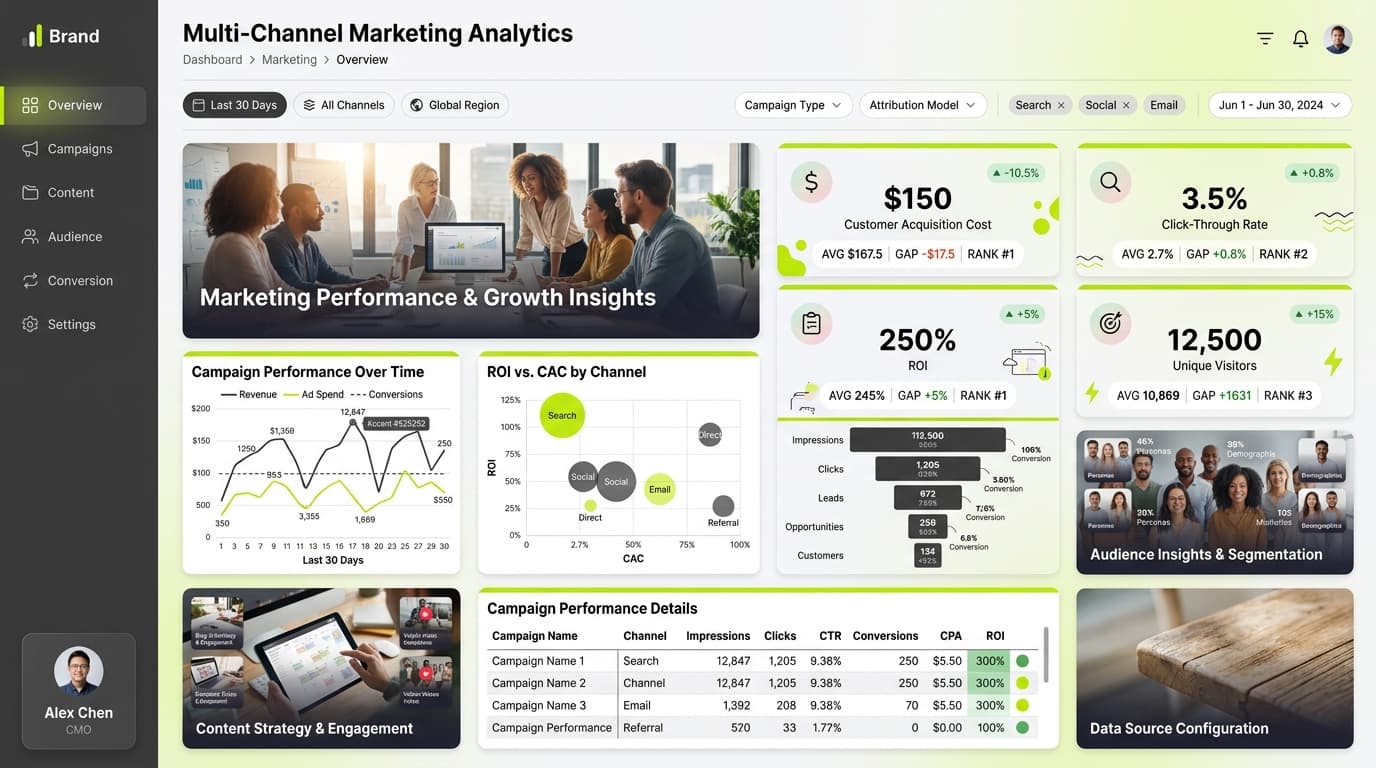
Comprehensive overview of marketing campaign performance across various channels to optimize ad spend.
KPIs tracked
Charts
Strategic insights
Design recommendations
Color Palette Strategy
HighUtilize the mono-blue palette to enhance visual clarity and maintain a professional appearance. Use the primary color (#1E3A8A) for headers, while the secondary (#3B82F6) highlights key metrics. Ensure a 4.5:1 contrast ratio for text.
Layout & Grid System
HighImplement a 12-column grid in a 16:9 ratio for optimal spacing. Position KPIs at the top for immediate visibility, with charts arranged in the middle, ensuring 16-24px padding and 16-20px gaps between cards.
Typography Hierarchy
MediumUse a clear typography hierarchy: Dashboard title at 24-28px bold, section headers at 18-20px semibold, card titles at 14-16px medium, and body text at 12-14px regular. Maintain a single font family for consistency.
Data Visualization UX
HighChoose appropriate chart types according to data semantics: use gauge charts for targets, multi-line charts for trend comparisons, and funnel charts for conversion flow. Limit color usage to 5-7 per chart and include tooltips for clarity.
Visual Hierarchy & Focus
MediumCreate a clear visual hierarchy with the largest elements representing the most important metrics. Use whitespace effectively to separate sections, and apply conditional formatting to highlight anomalies in KPI performance.
Interaction & Feedback
LowImplement hover states for interactive elements, with a subtle opacity change. Provide visual feedback during data refreshes and consider drill-through functionality for detailed exploration of metrics.