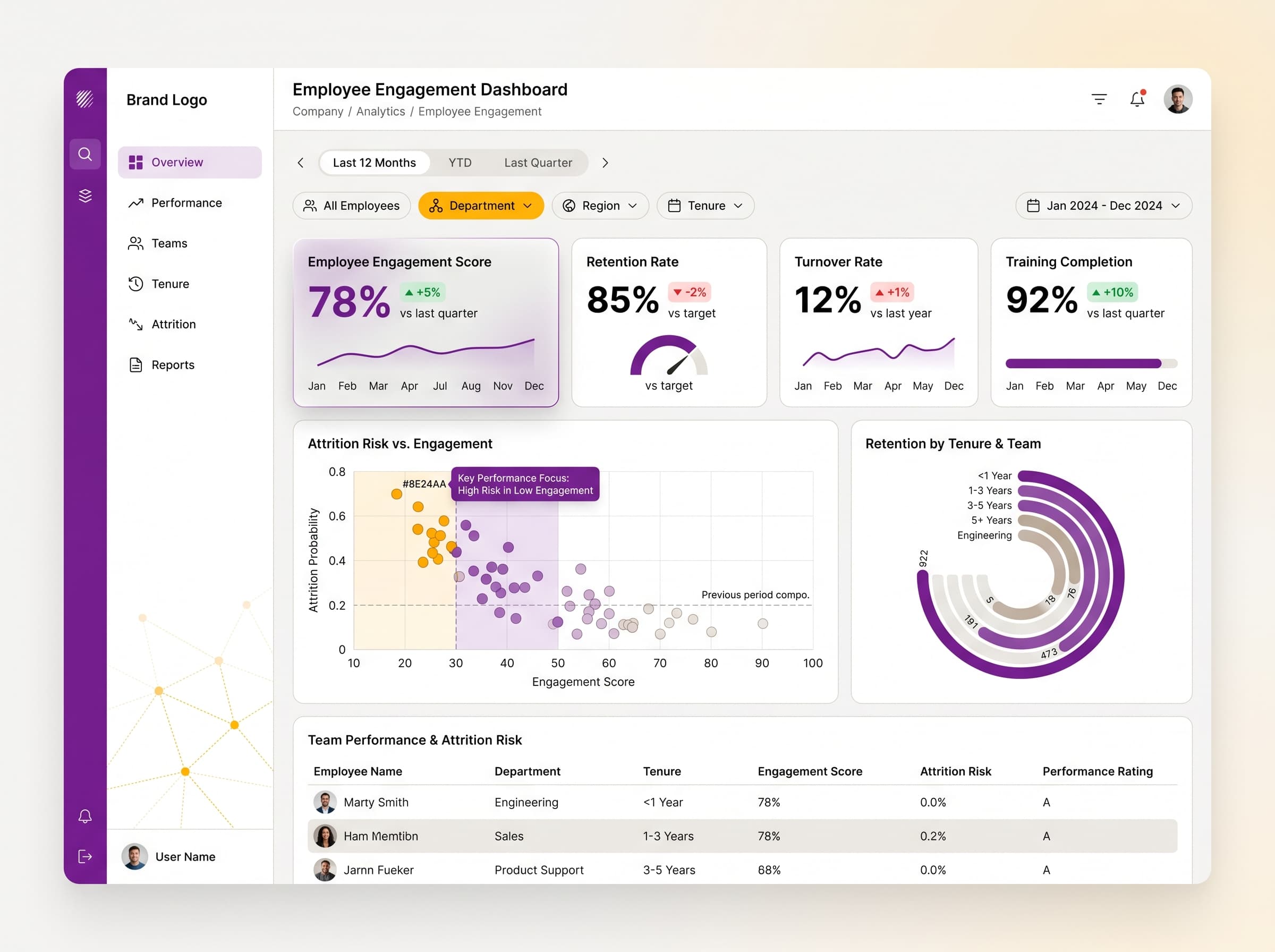
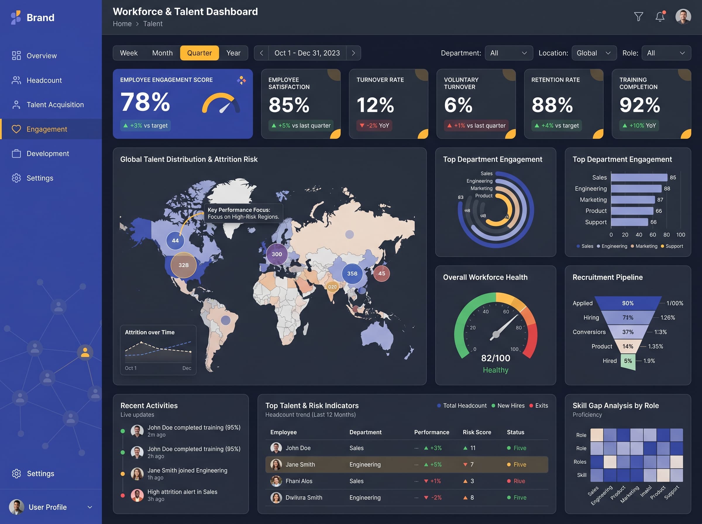
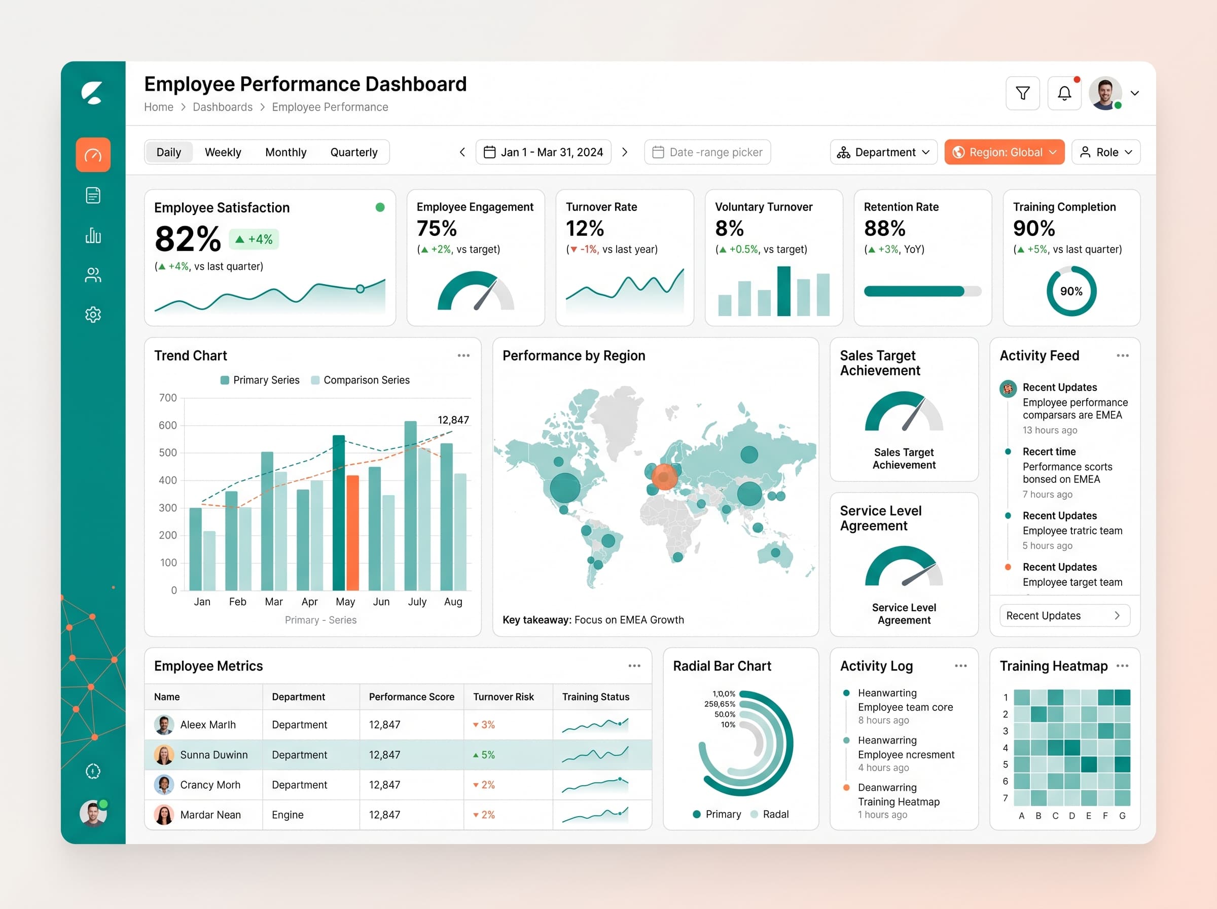
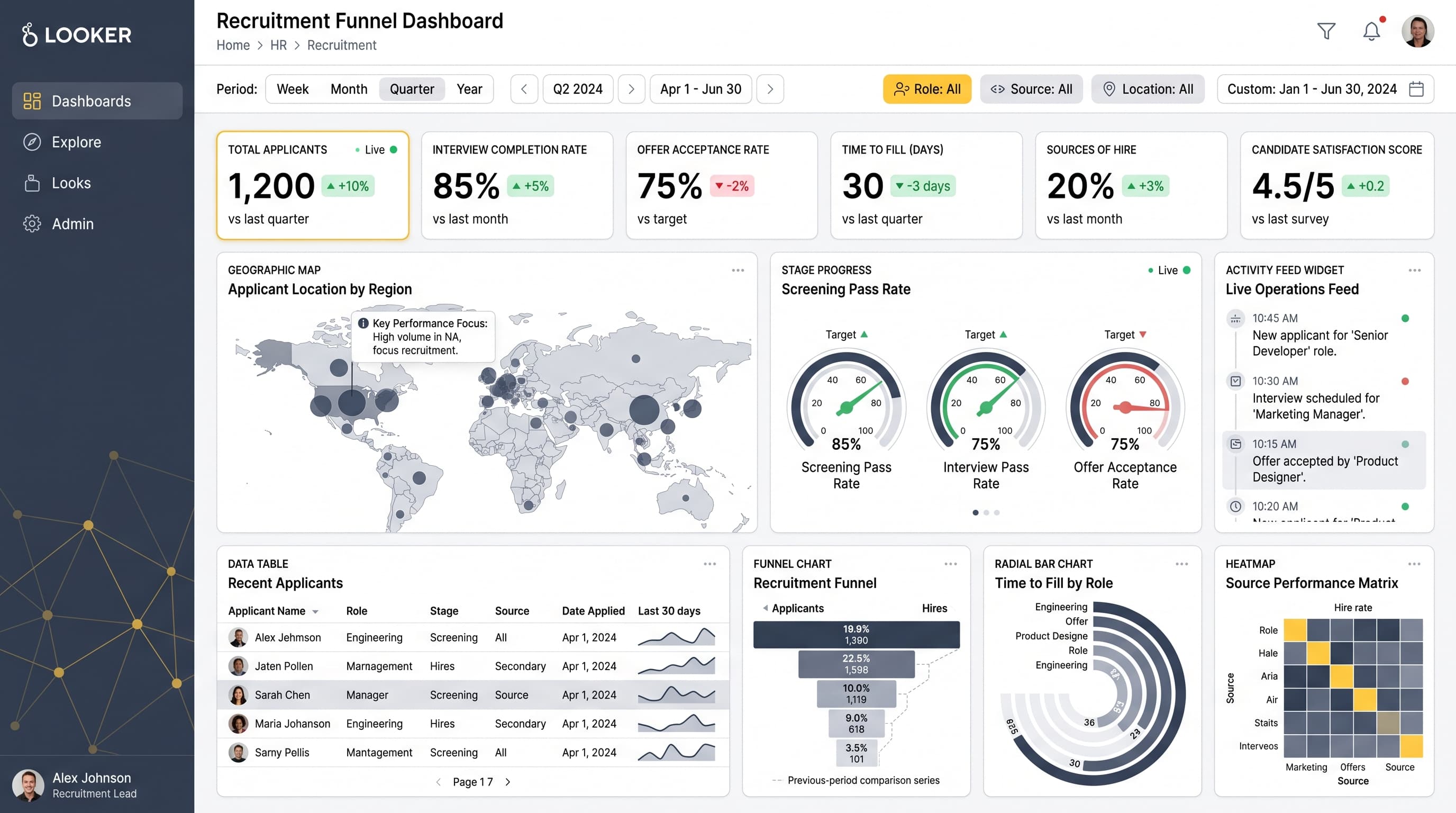
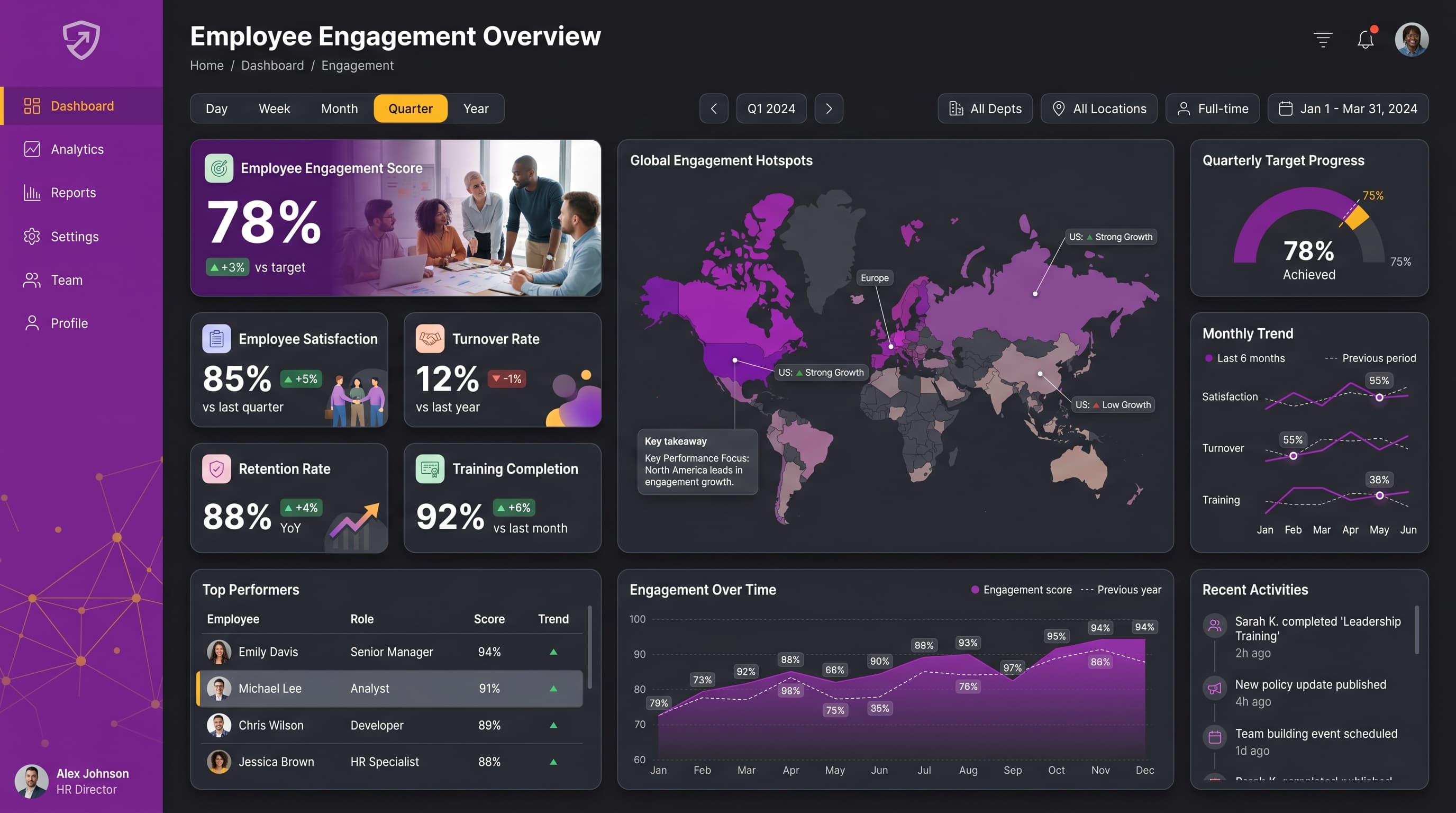
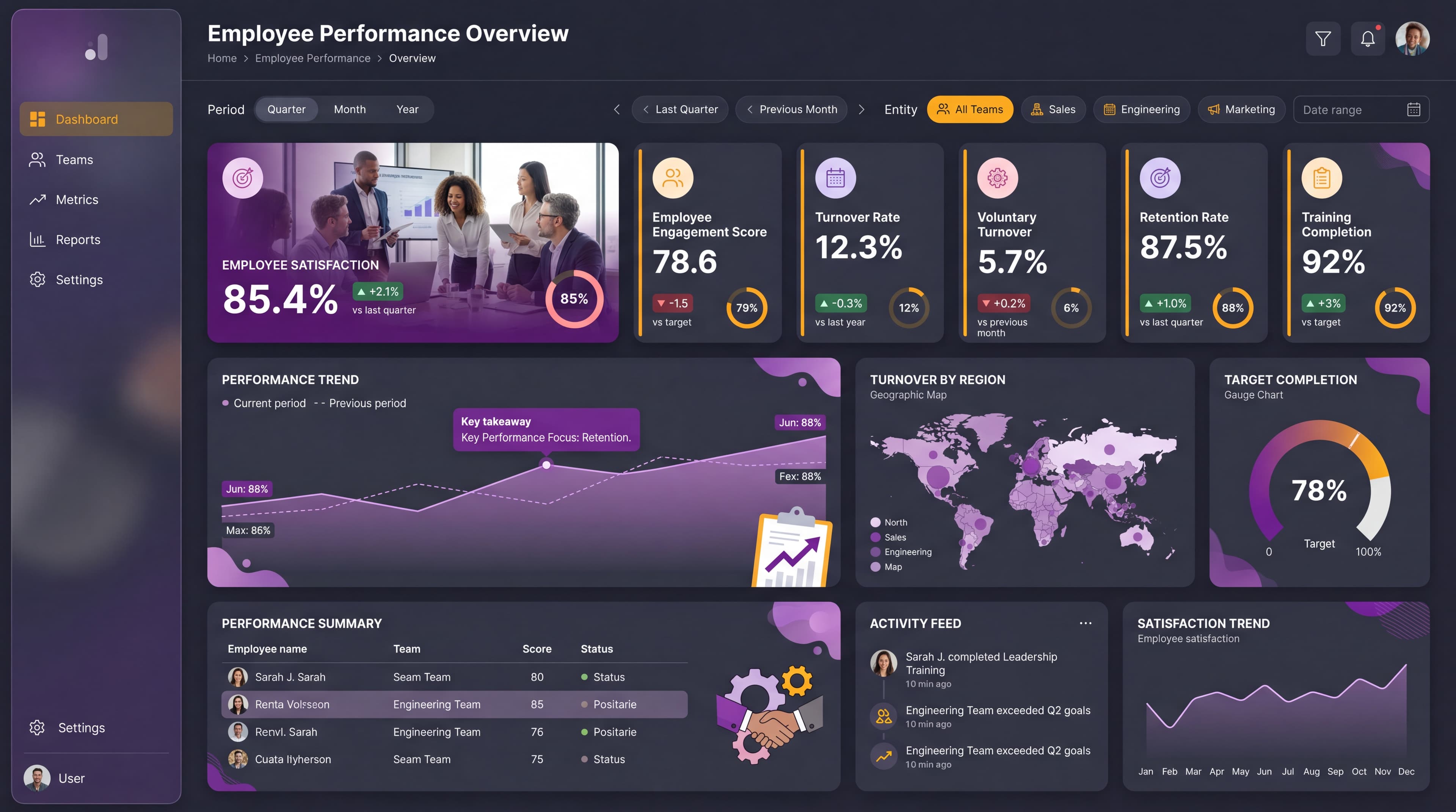
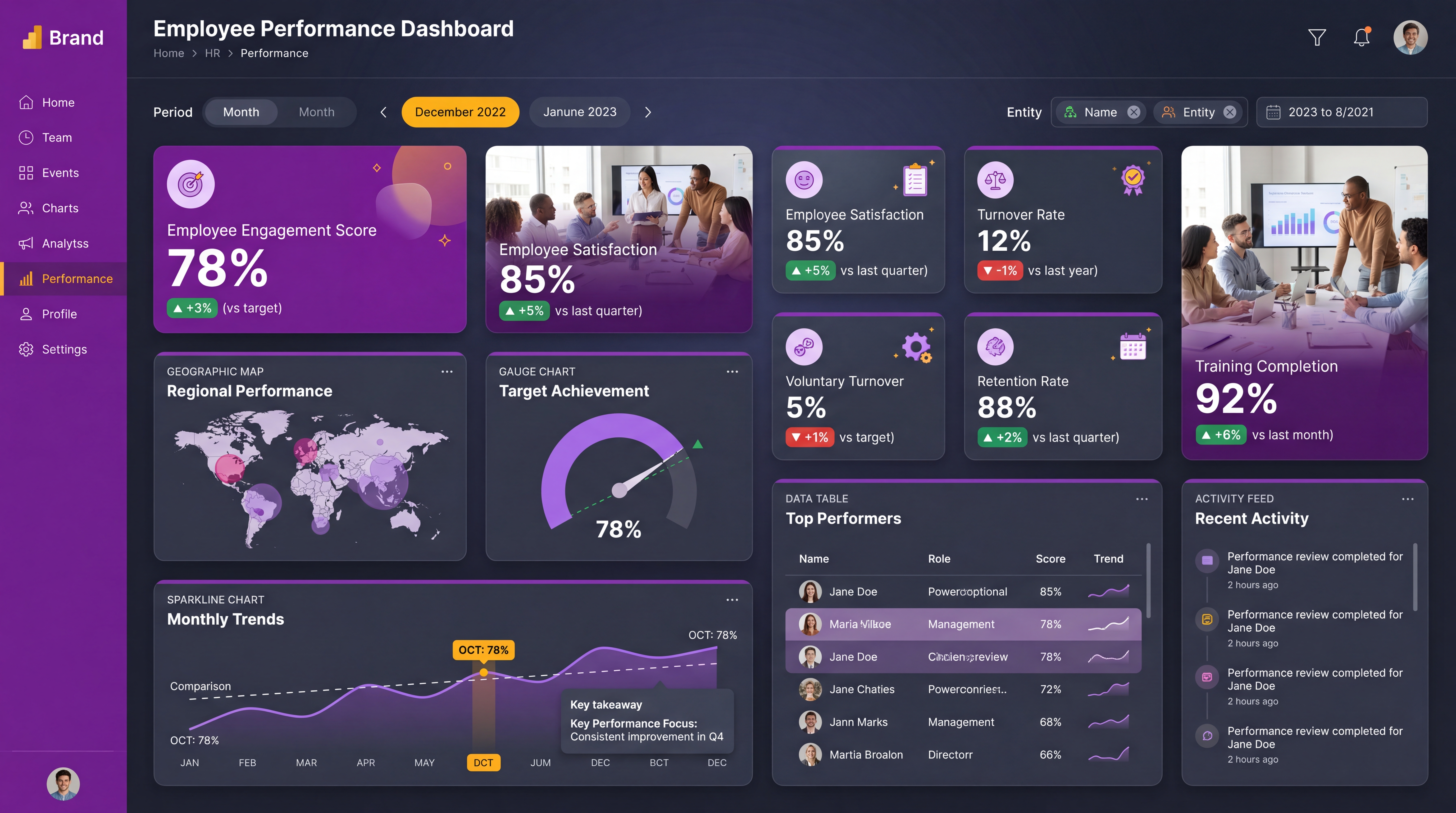
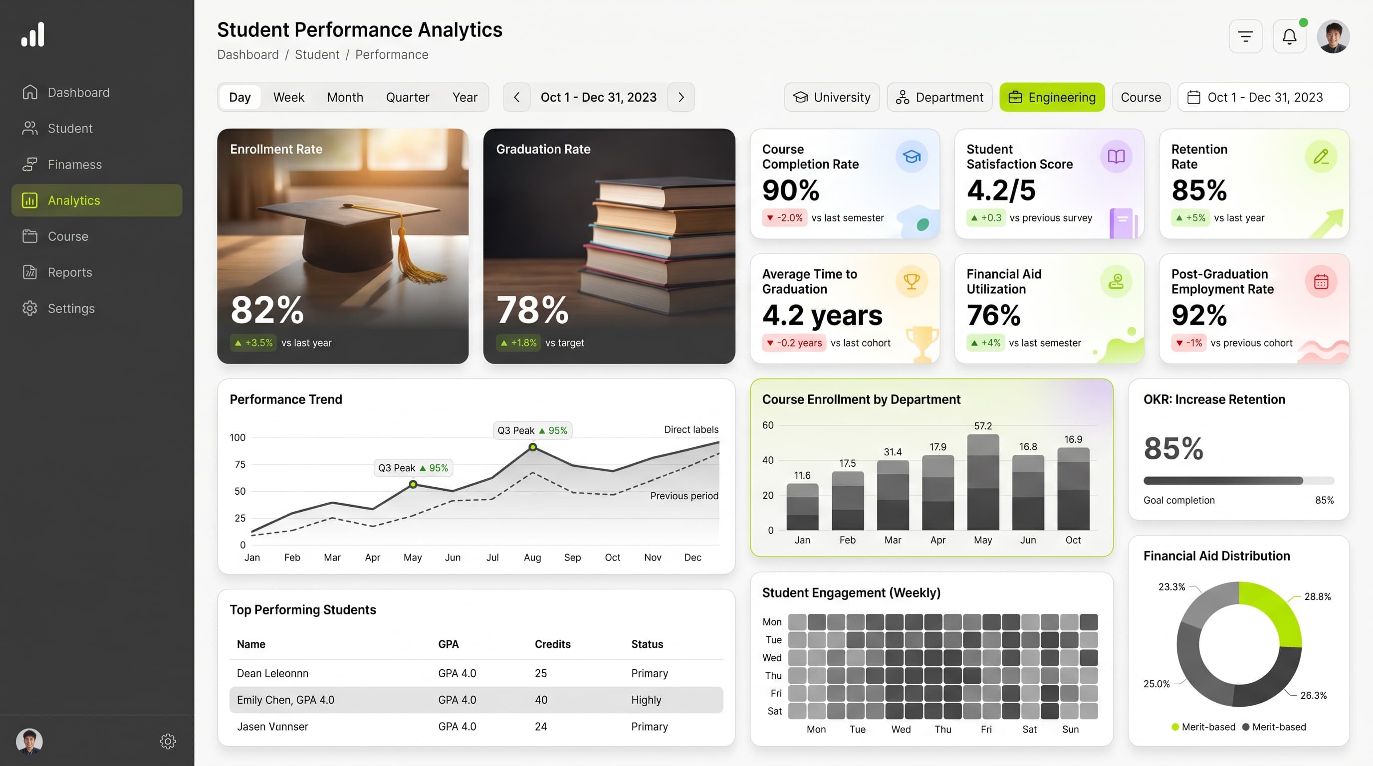
About this dashboard
Analyze enrollment trends, graduation rates, and course completion metrics to enhance academic programs and boost student success.
KPIs tracked
Charts
Strategic insights
Design recommendations
Color Palette Strategy
HighUtilize the custom-385536-AEEA00 palette with high contrast for readability. Use #385536 for backgrounds and #AEEA00 for key metrics to highlight positive trends. Ensure all text maintains a contrast ratio of at least 4.5:1 for accessibility.
Layout & Grid System
HighImplement a 12-column grid system for a 16:9 ratio. Place KPIs prominently at the top, followed by charts for detailed analysis. Use 16-24px padding and maintain 16-20px gaps between cards for clarity.
Typography Hierarchy
MediumEstablish a clear hierarchy: Dashboard title at 24-28px bold, section headers at 18-20px semibold, and body text at 12-14px regular to guide user focus effectively.
Data Visualization UX
HighSelect visualizations that suit the data types: Progress Rings for target achievements, Stacked Bar Charts for comparisons, and Heatmaps for performance distributions. Limit color usage to 5-7 per chart for clarity.
Visual Hierarchy & Focus
MediumCreate visual separation using whitespace and card styling. Highlight important metrics with conditional formatting, using red for negative trends and green for positive outcomes to draw attention to key data.
Interaction & Feedback
LowIncorporate hover effects on interactive elements for better user engagement. Implement loading indicators during data refresh and provide visual feedback on filter selections to enhance user experience.