About this dashboard
Monitor key HR metrics to enhance workforce satisfaction and performance.
KPIs tracked
Charts
Strategic insights
Design recommendations
Color Palette Strategy
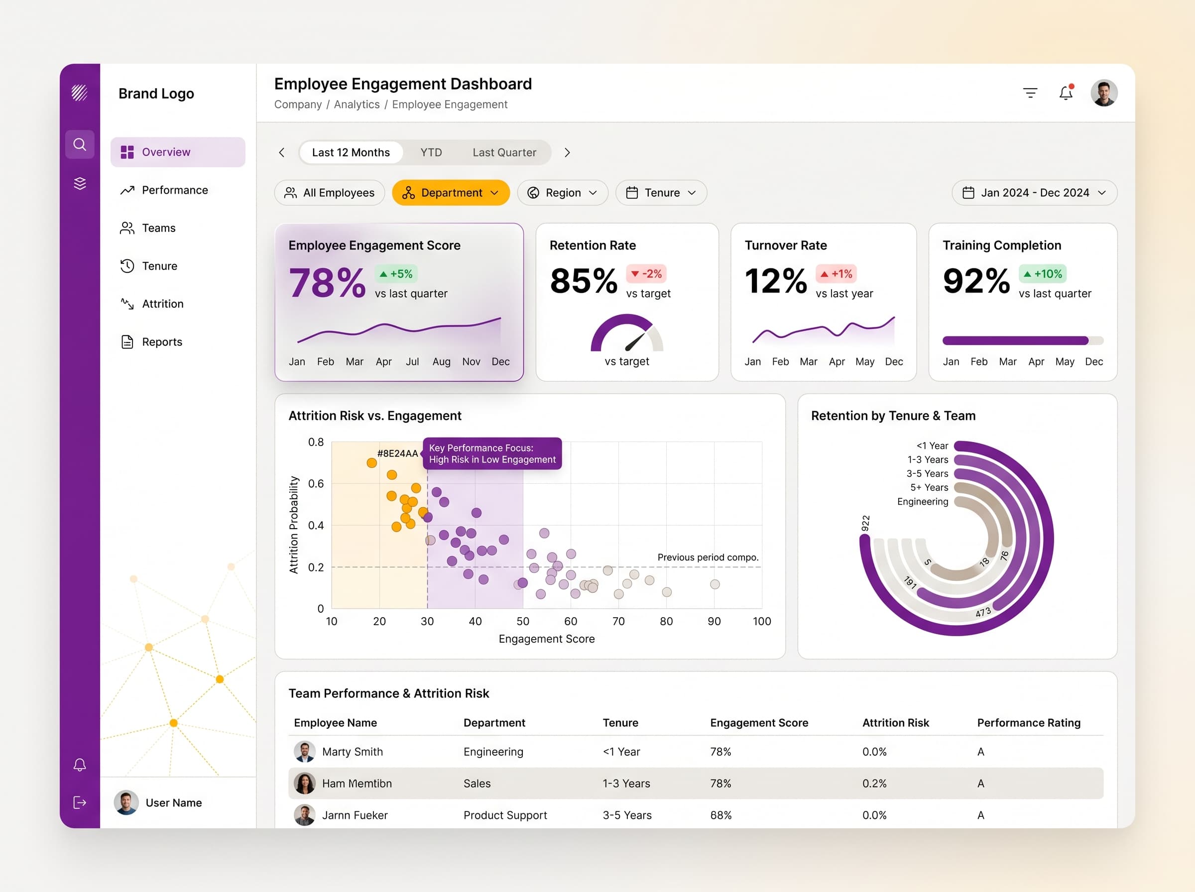
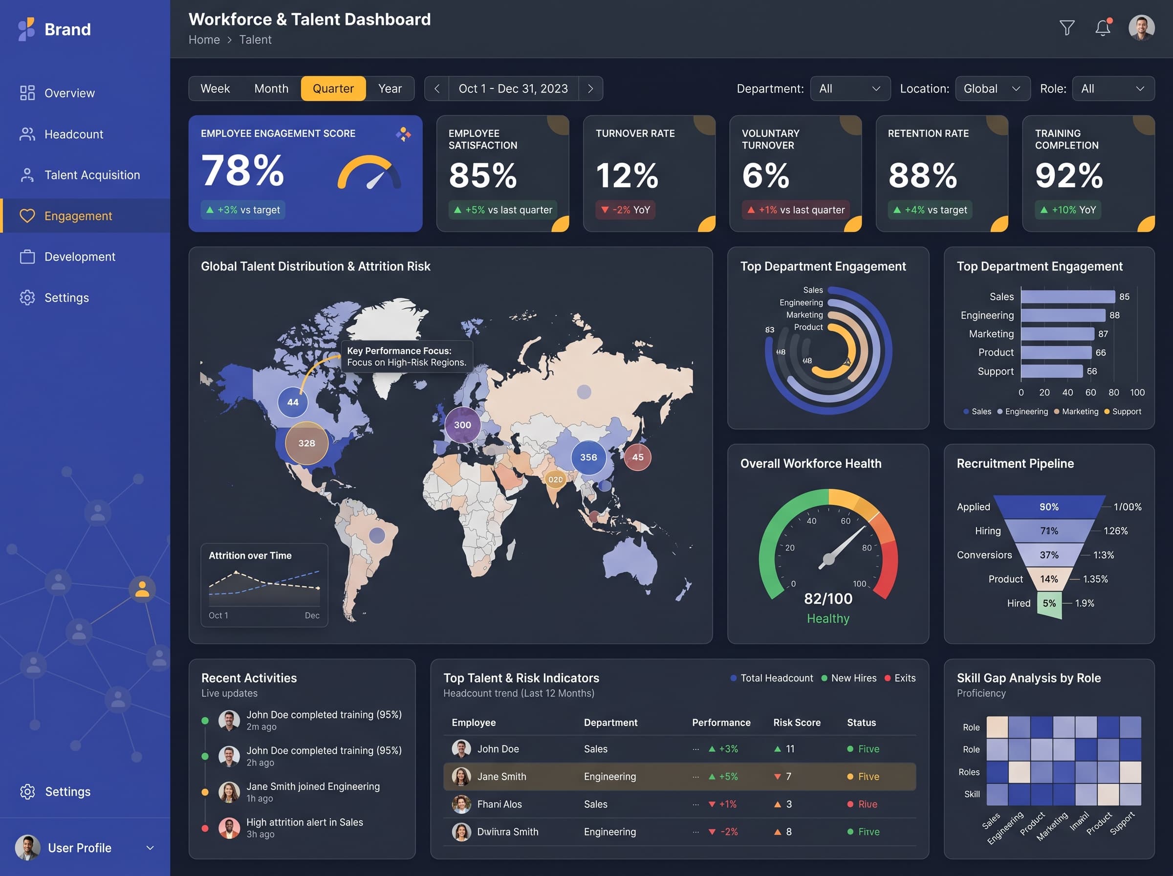
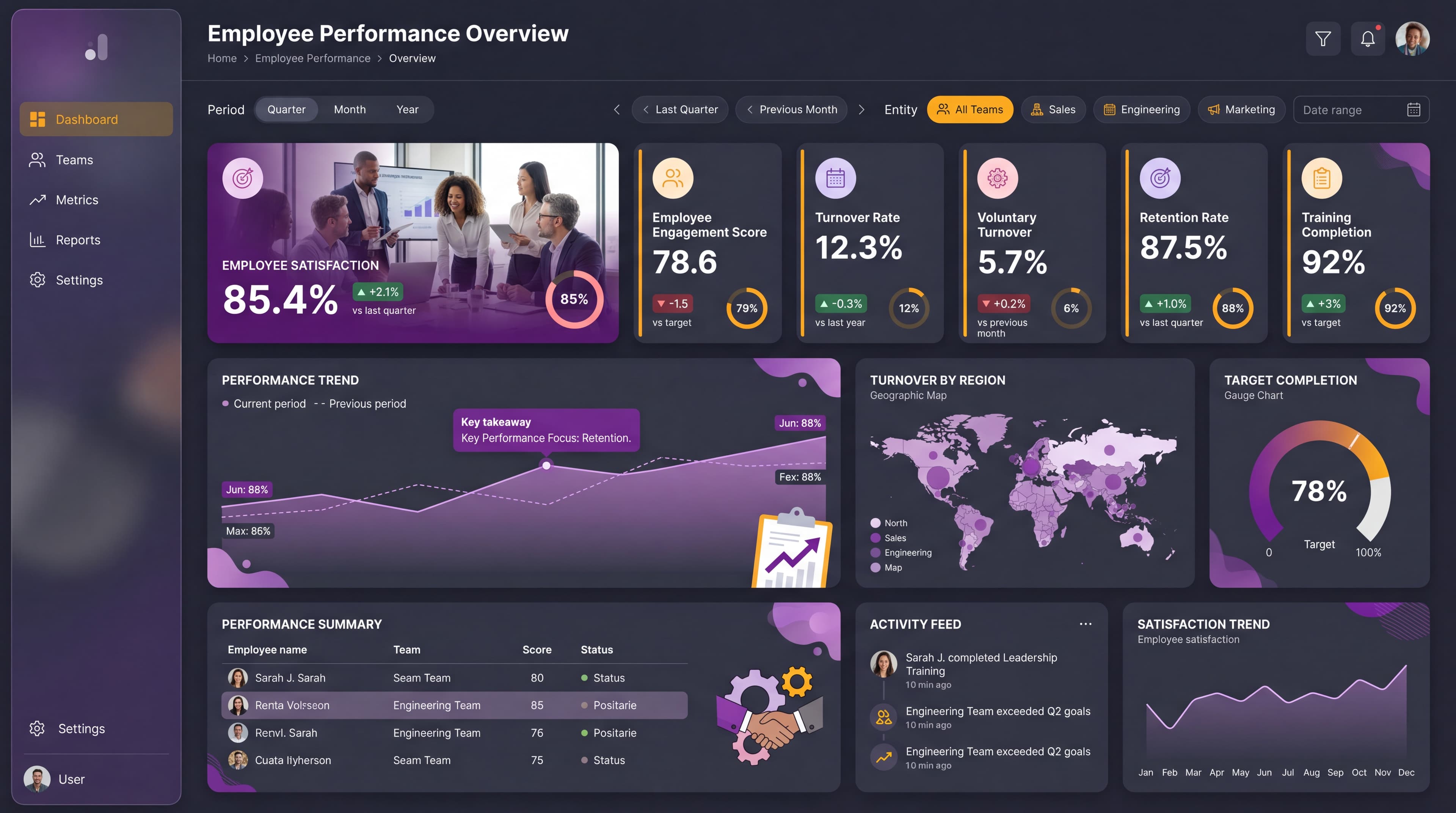
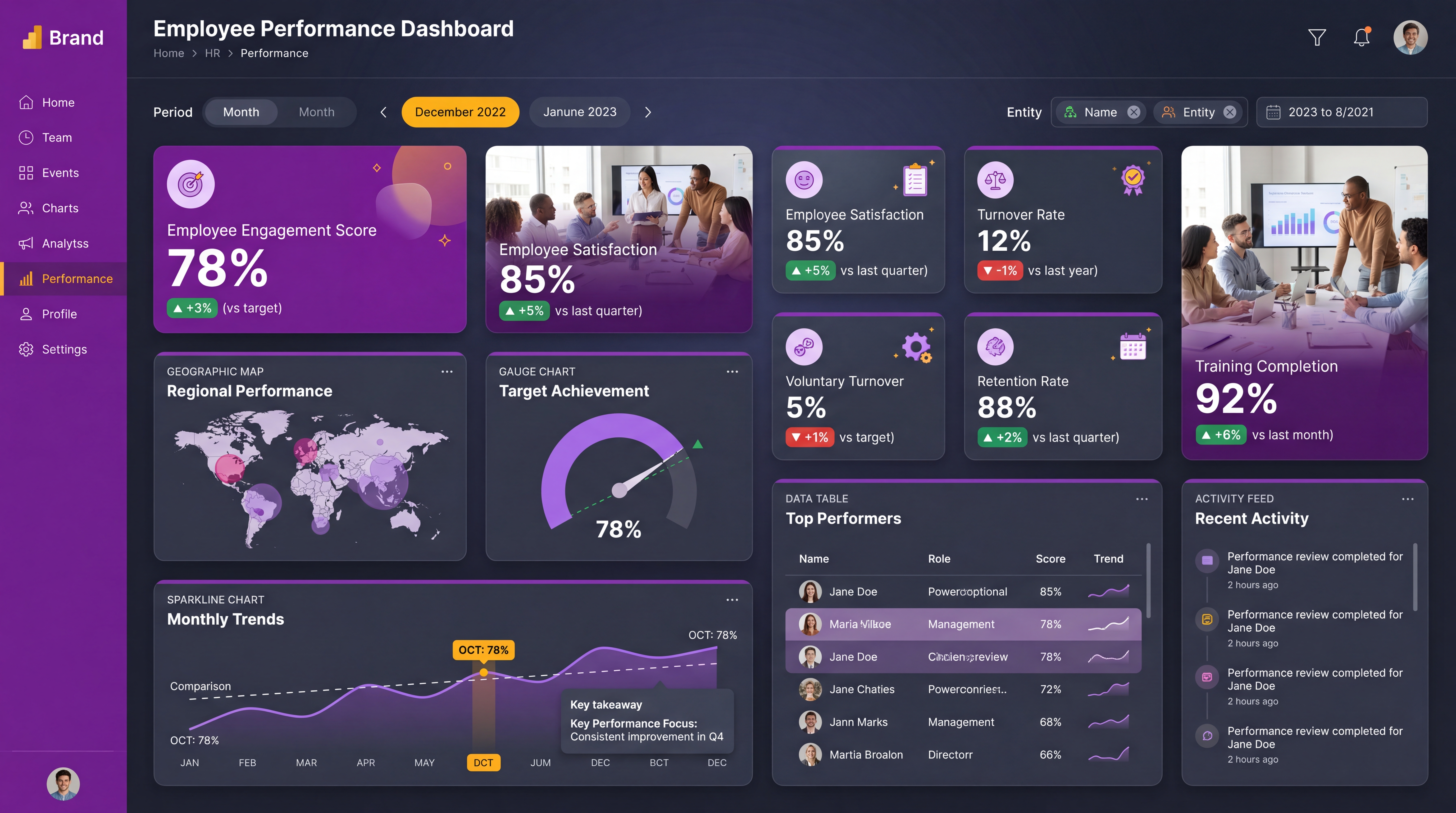
HighUtilize the dark theme effectively with a purple-gold palette. Ensure that all text has a contrast ratio of at least 4.5:1 for accessibility. Use gold for highlights and important metrics to draw attention.
Layout & Grid System
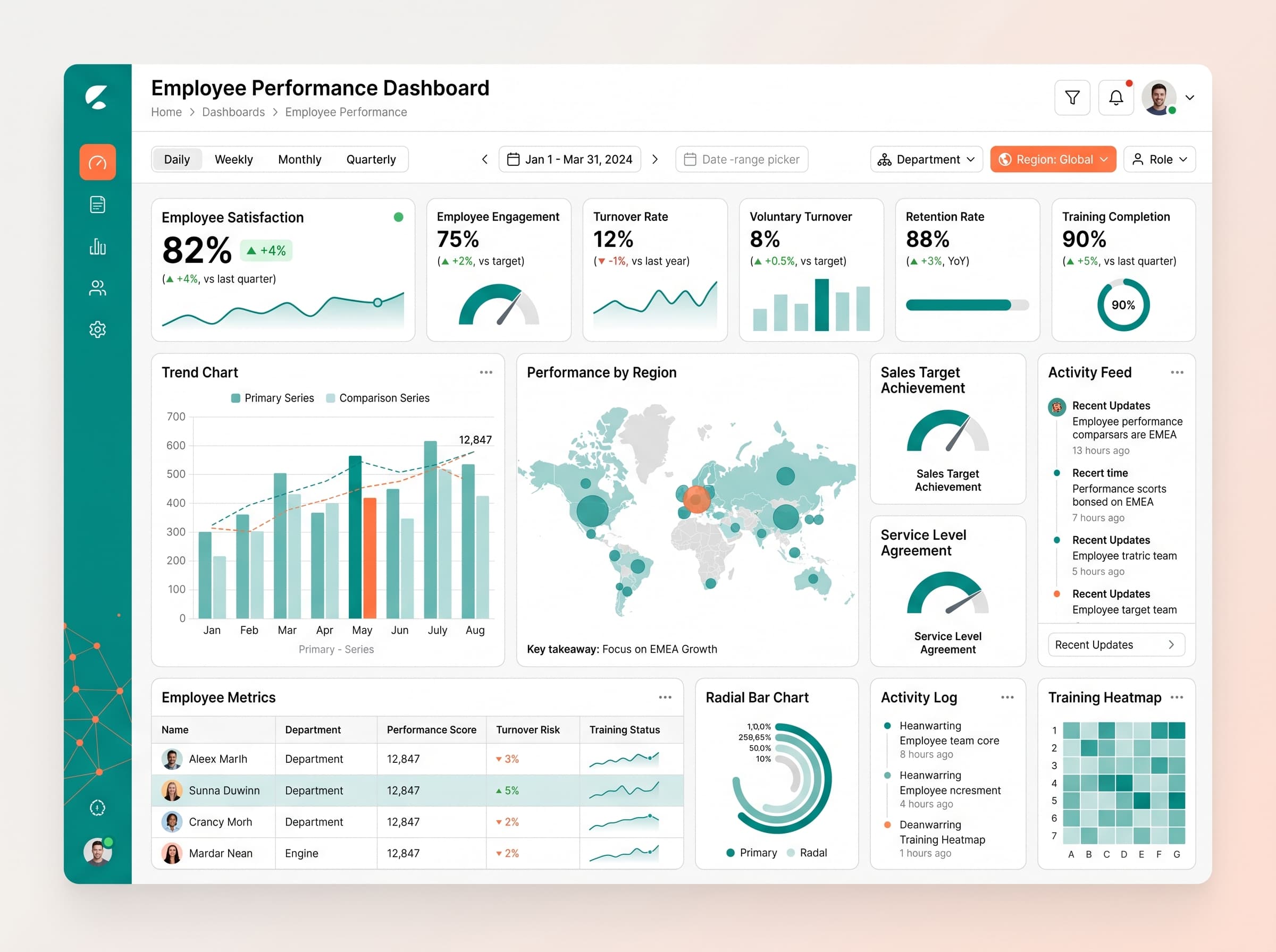
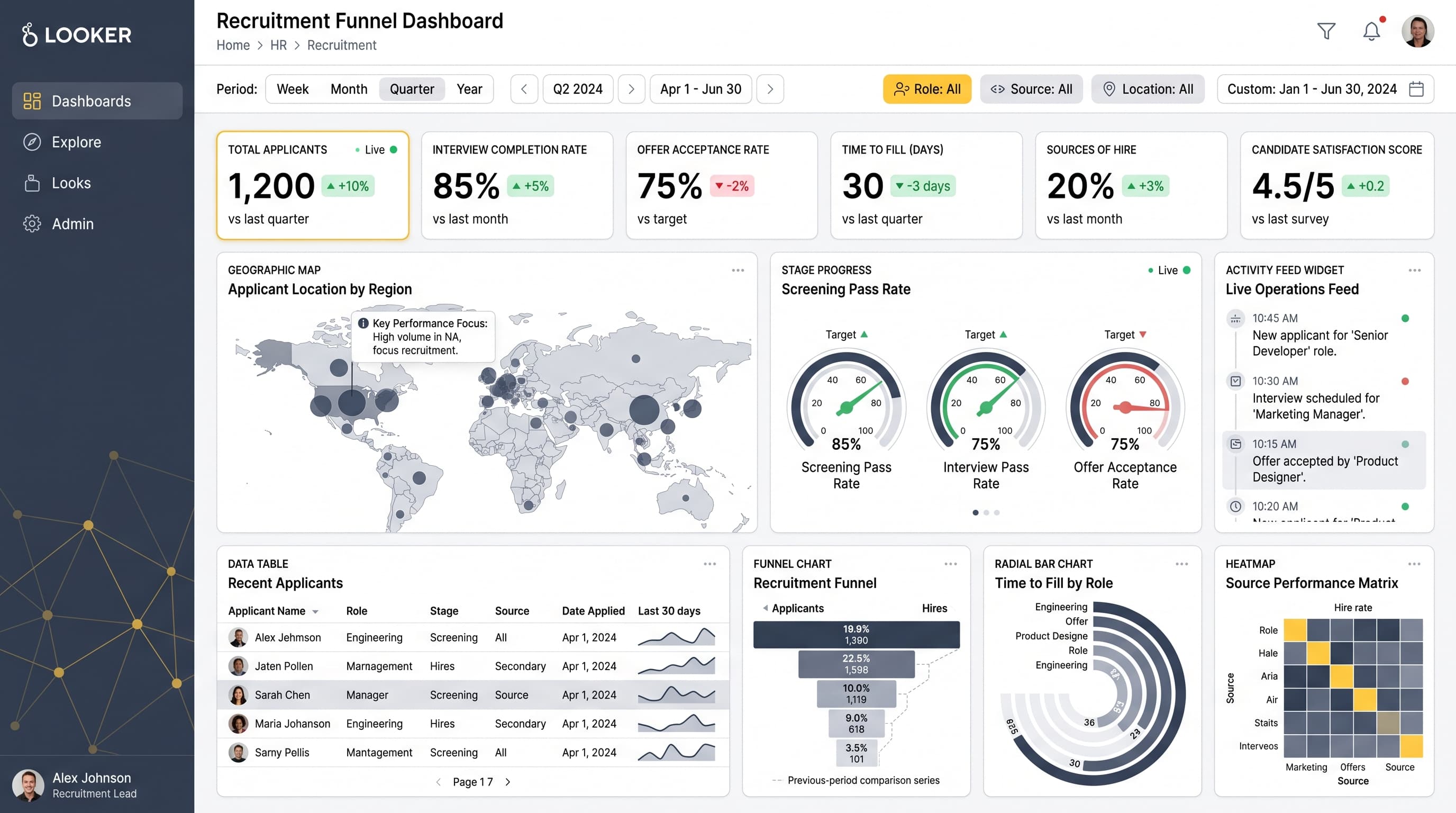
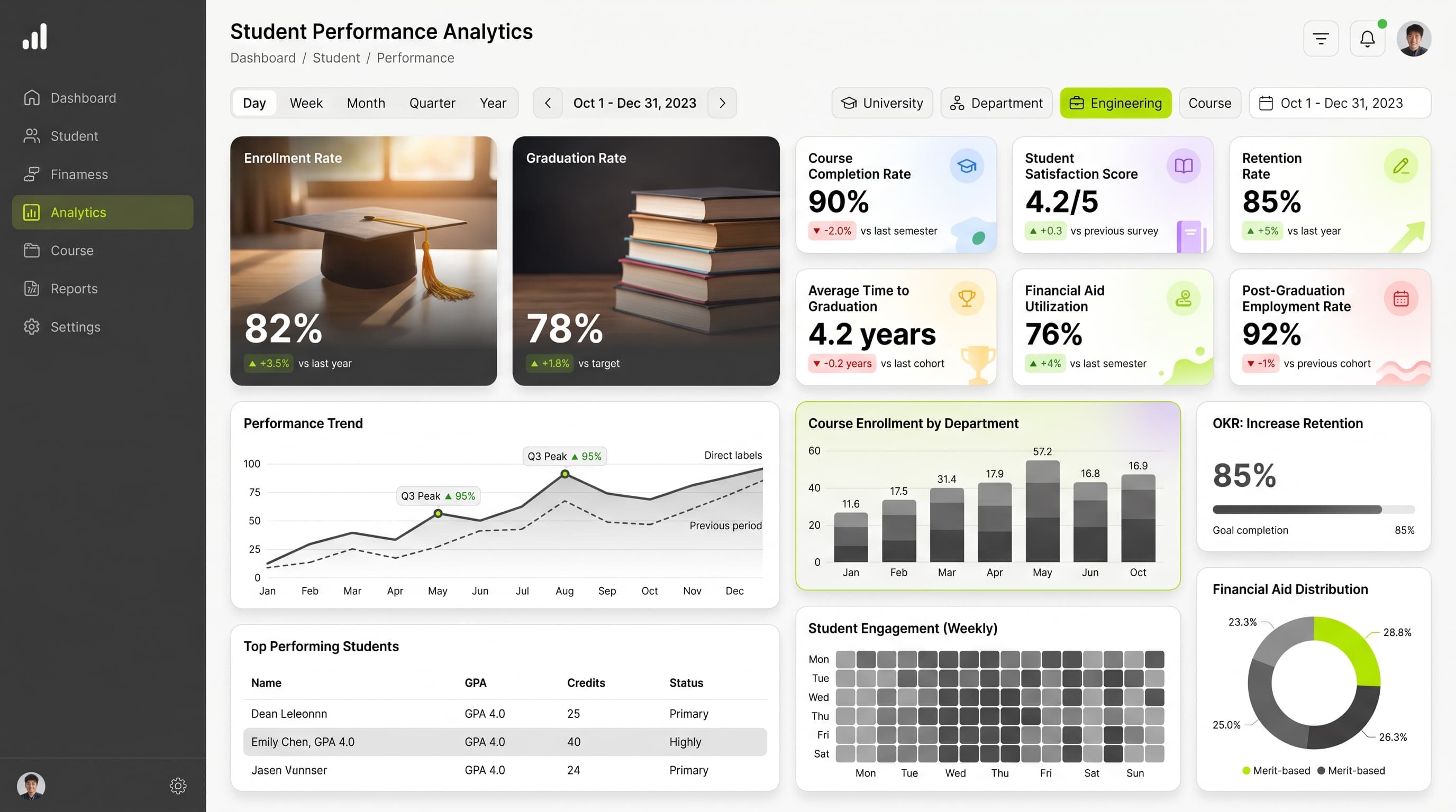
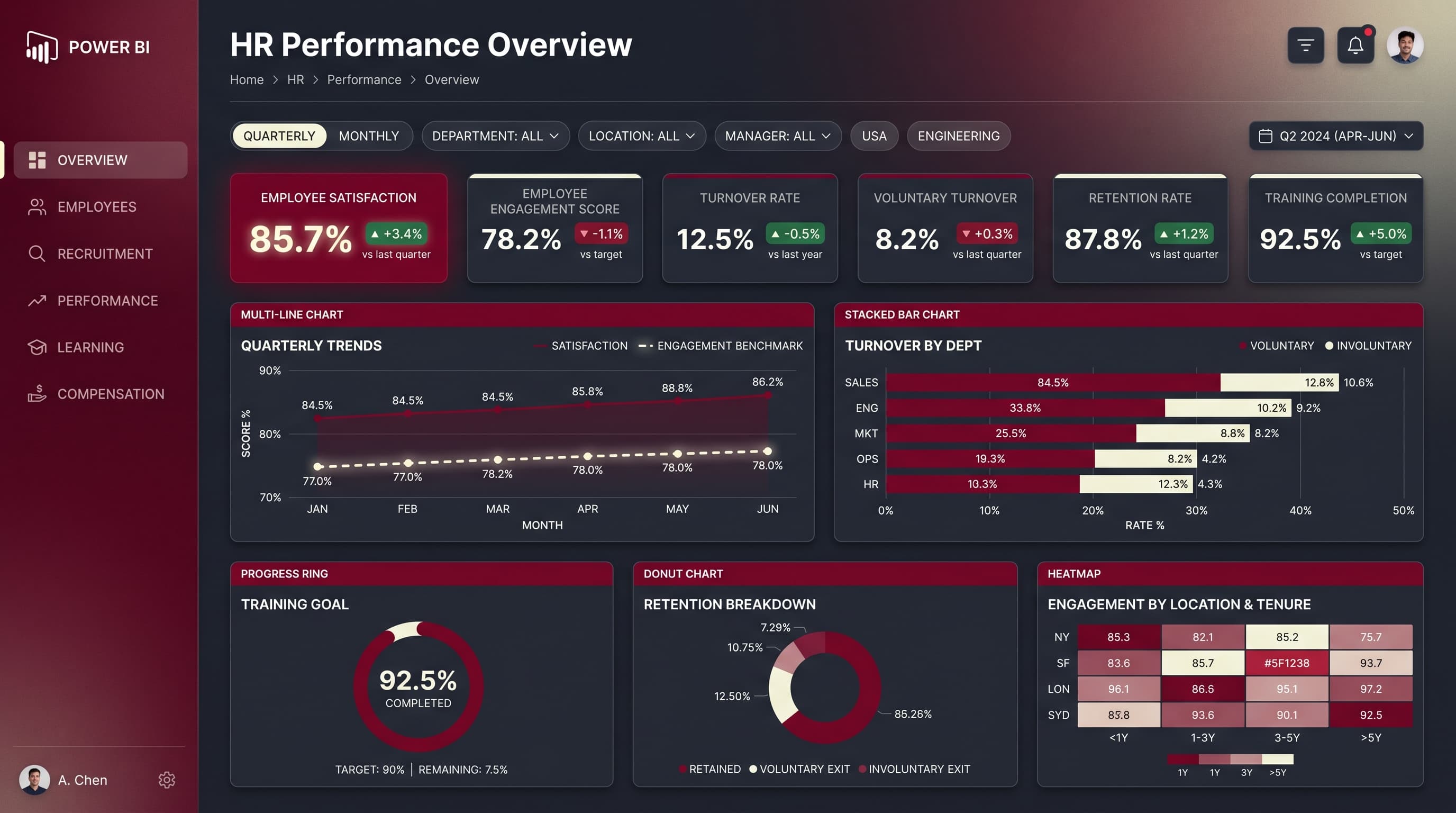
HighImplement a 12-column grid for a 16:9 ratio. Place KPIs at the top for immediate visibility, with charts in the middle for analysis, and activity feeds on the side. Maintain 16-24px padding and 16-20px gaps between cards.
Typography Hierarchy
MediumTitle: 24-28px bold. Section headers: 18-20px semibold. Card titles: 14-16px medium. Body text: 12-14px regular. Captions: 10-12px. Use a consistent font like Inter for readability.
Data Visualization UX
HighSelect appropriate chart types: use a geographic map for location data, a gauge for performance targets, and sparklines for trends. Limit colors per chart to 5-7 for clarity, and ensure tooltips provide context.
Visual Hierarchy & Focus
MediumCreate a clear visual hierarchy with the most critical metrics being the largest and boldest. Use whitespace to separate sections and add subtle shadows to cards for depth. Highlight negative trends in red and positive in green.
Interaction & Feedback
LowAdd hover states to interactive elements with opacity changes. Use loading indicators during data refresh and provide visual feedback on filter selections. Consider drill-through options for detailed insights.