
About this dashboard
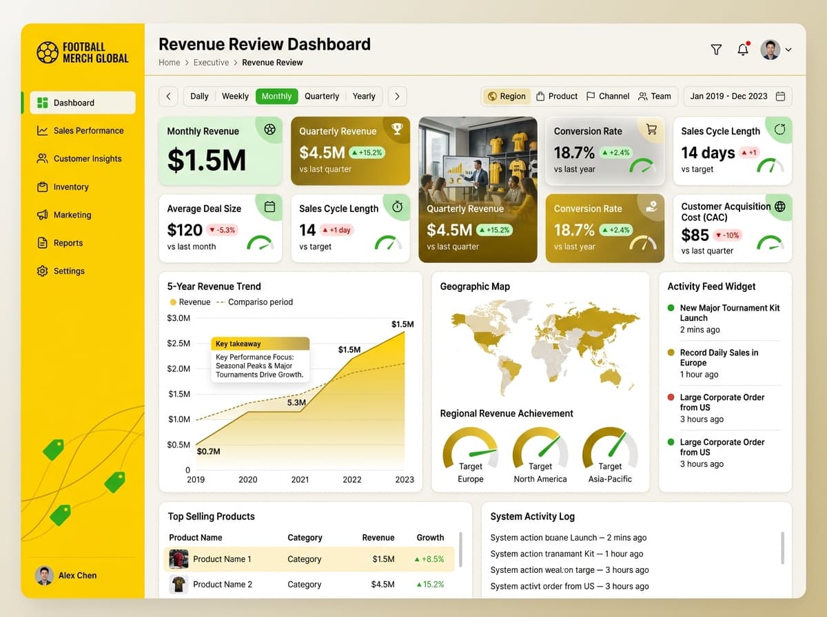
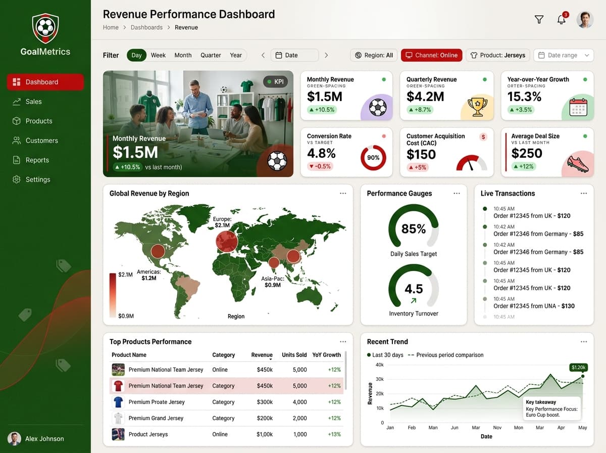
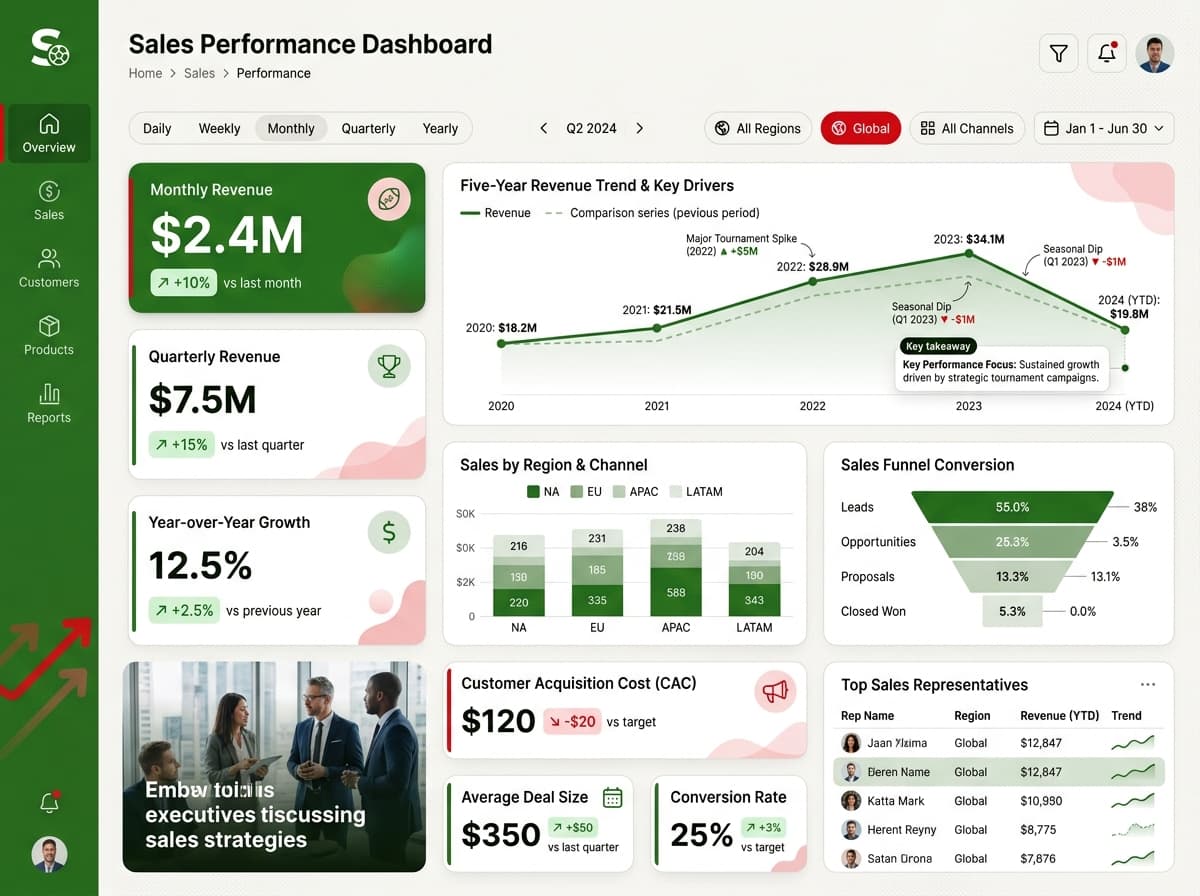
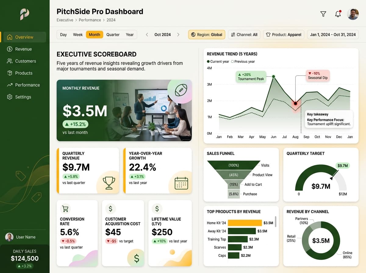
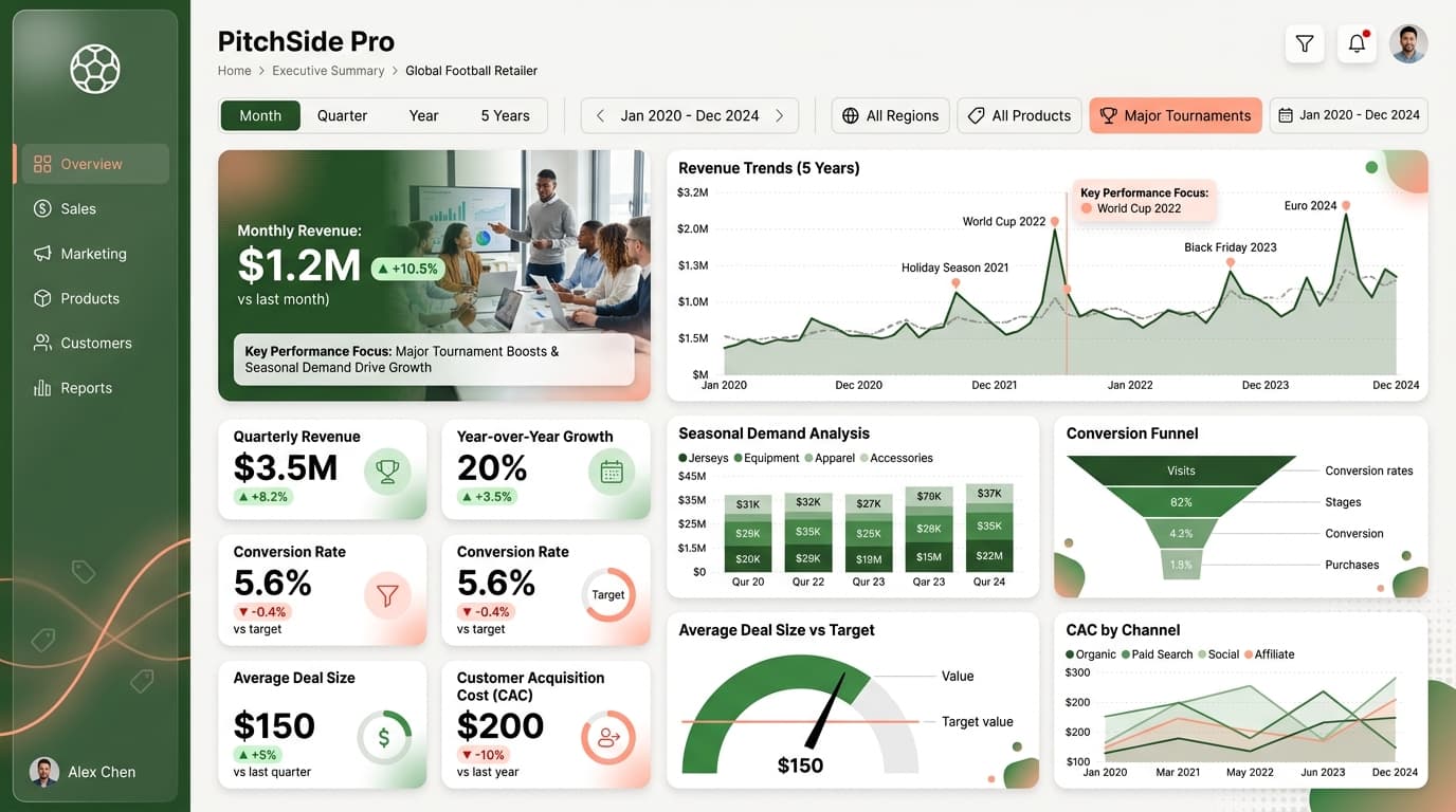
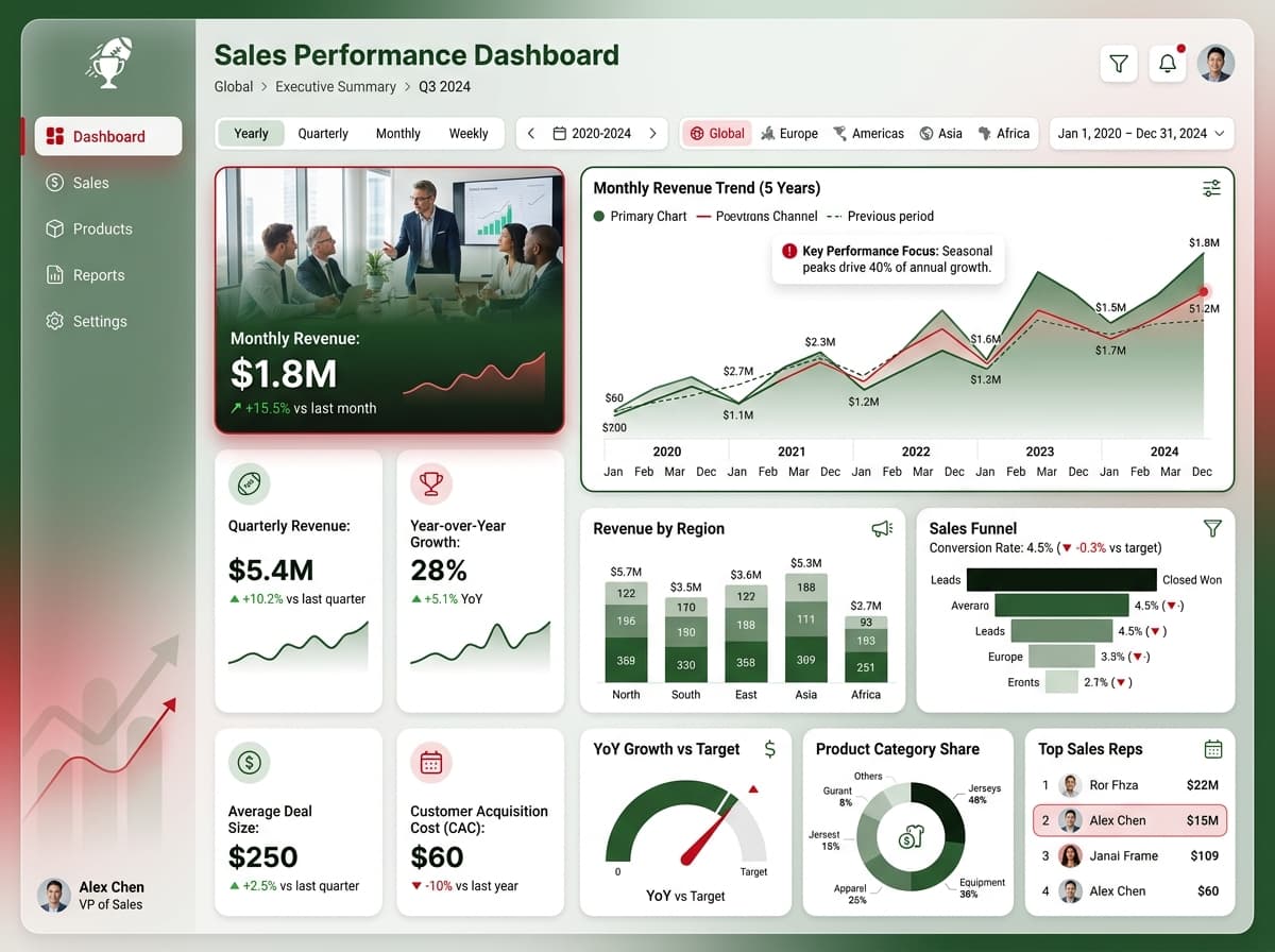
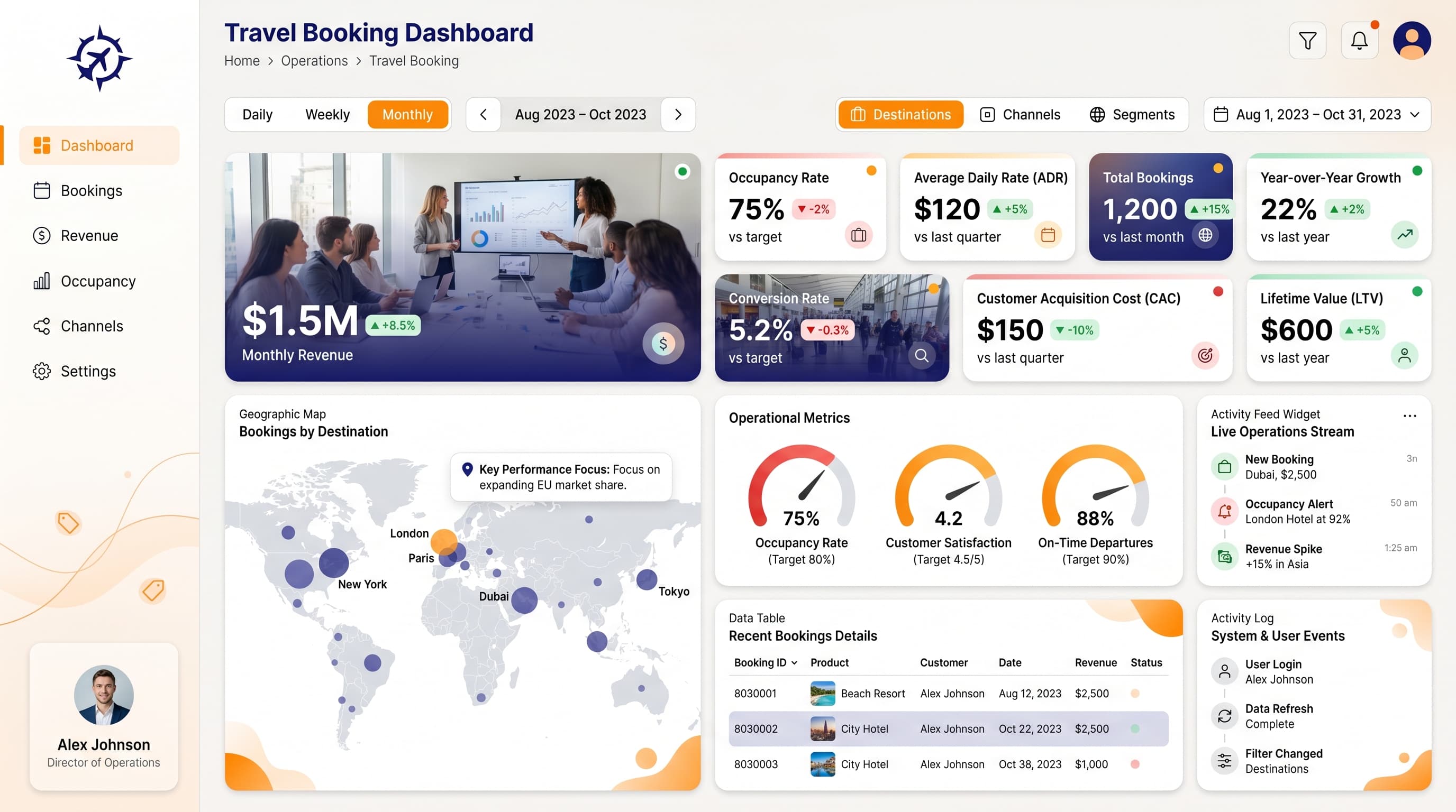
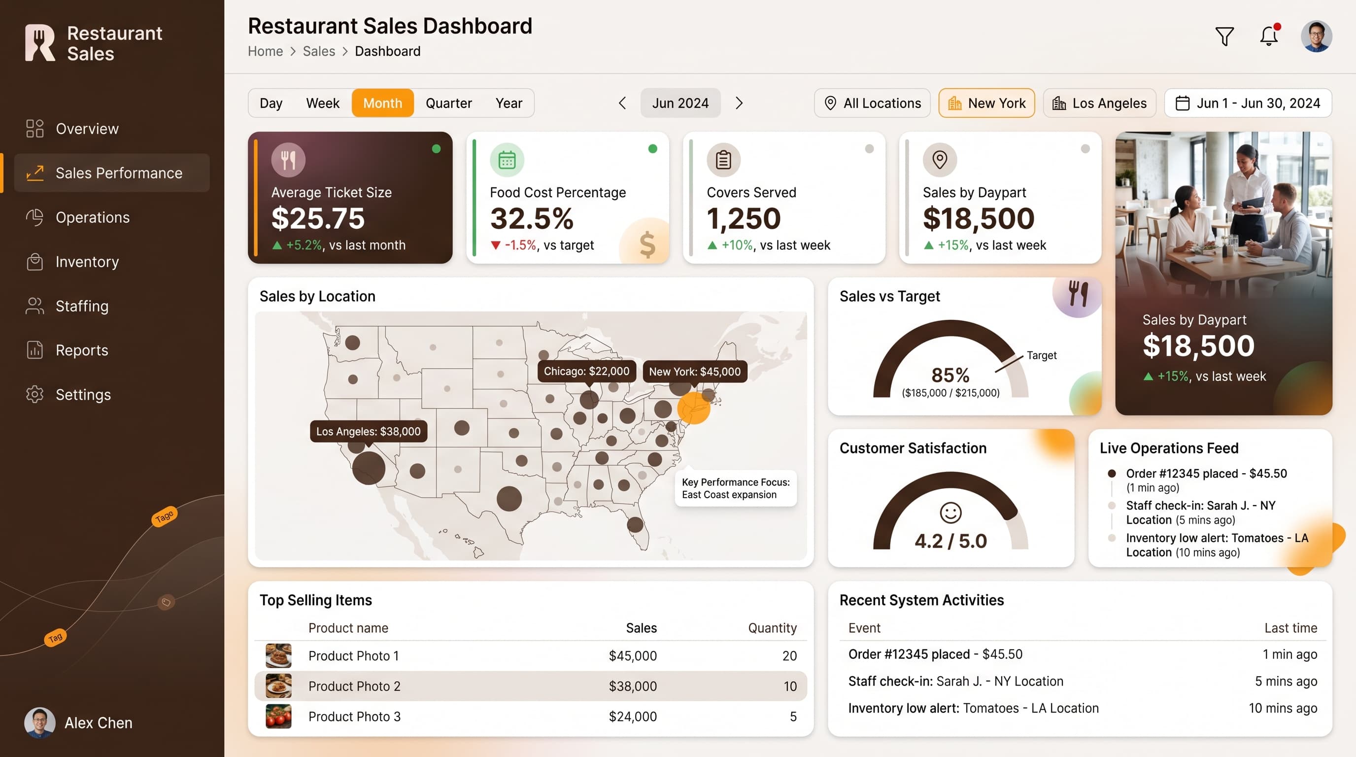
Comprehensive insights into sales metrics, including revenue, growth, and customer acquisition.
KPIs tracked
Charts
Strategic insights
Design recommendations
Color Palette Strategy
HighUtilize the custom-800020-e69530 palette effectively by using #800020 for headers and backgrounds, #e69530 for key metrics, and #1a0006 for secondary elements. Ensure a 4.5:1 contrast ratio to maintain accessibility standards. Consistent use of color helps users quickly recognize important data points.
Layout & Grid System
HighImplement a 12-column grid system for a 4:3 aspect ratio. Place KPI cards in the top section for immediate visibility, followed by charts in the central area for analytical insights, and filters in the sidebar for interactive exploration. Maintain 16-24px padding and 16-20px gaps between elements.
Typography Hierarchy
MediumEstablish a clear typography hierarchy: Dashboard title at 24-28px bold, section headers at 18-20px semibold, card titles at 14-16px medium, and body text at 12-14px regular. Use a single font family, such as Inter, for consistency and readability.
Data Visualization UX
HighSelect chart types that align with the data: use Line Charts for Monthly Revenue trends, Bar Charts for comparative metrics, and Donut Charts for percentage breakdowns. Limit the color palette per chart to 5-7 colors, ensuring clear legends and tooltips for context.
Visual Hierarchy & Focus
MediumCreate a clear visual hierarchy by using larger, bolder elements for the most important metrics. Incorporate ample whitespace to separate sections and use subtle shadows on cards for depth. Highlight anomalies with conditional formatting, indicating negative trends with red and positive trends with green.
Interaction & Feedback
LowEnhance user interaction by adding hover states (opacity: 0.8) to clickable elements and loading skeletons during data refreshes. Provide visual feedback for filter selections and consider drill-through navigation for deeper insights into specific metrics.