About this dashboard
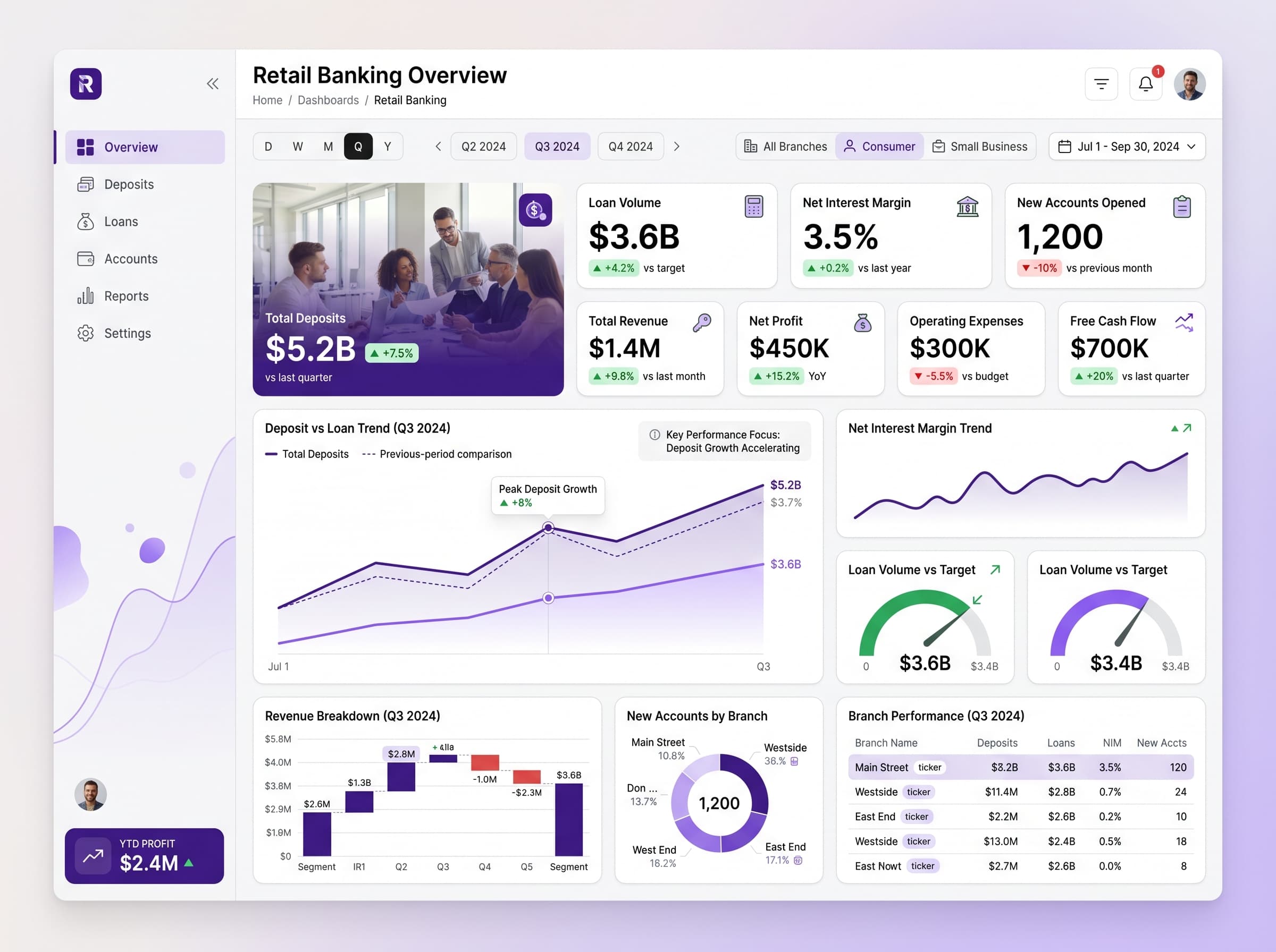
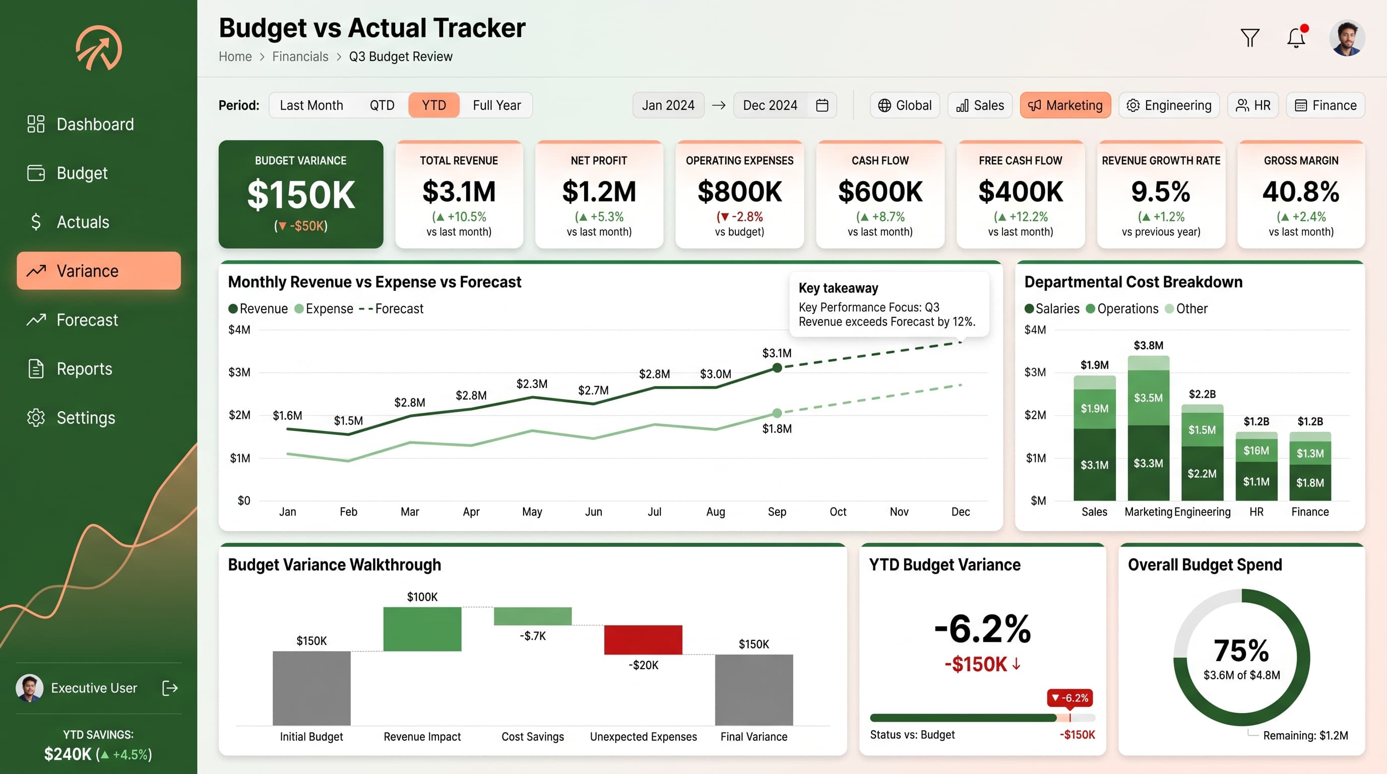
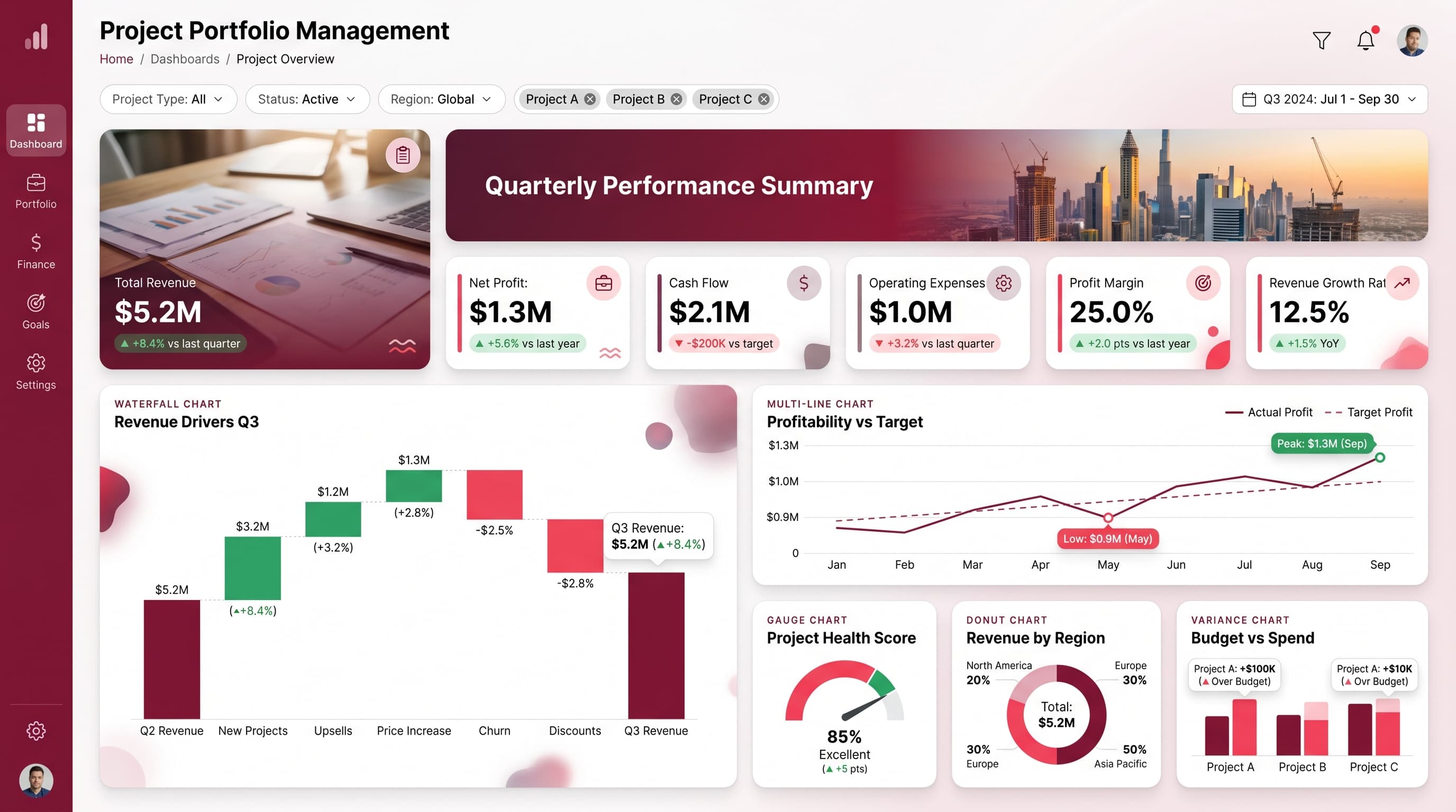
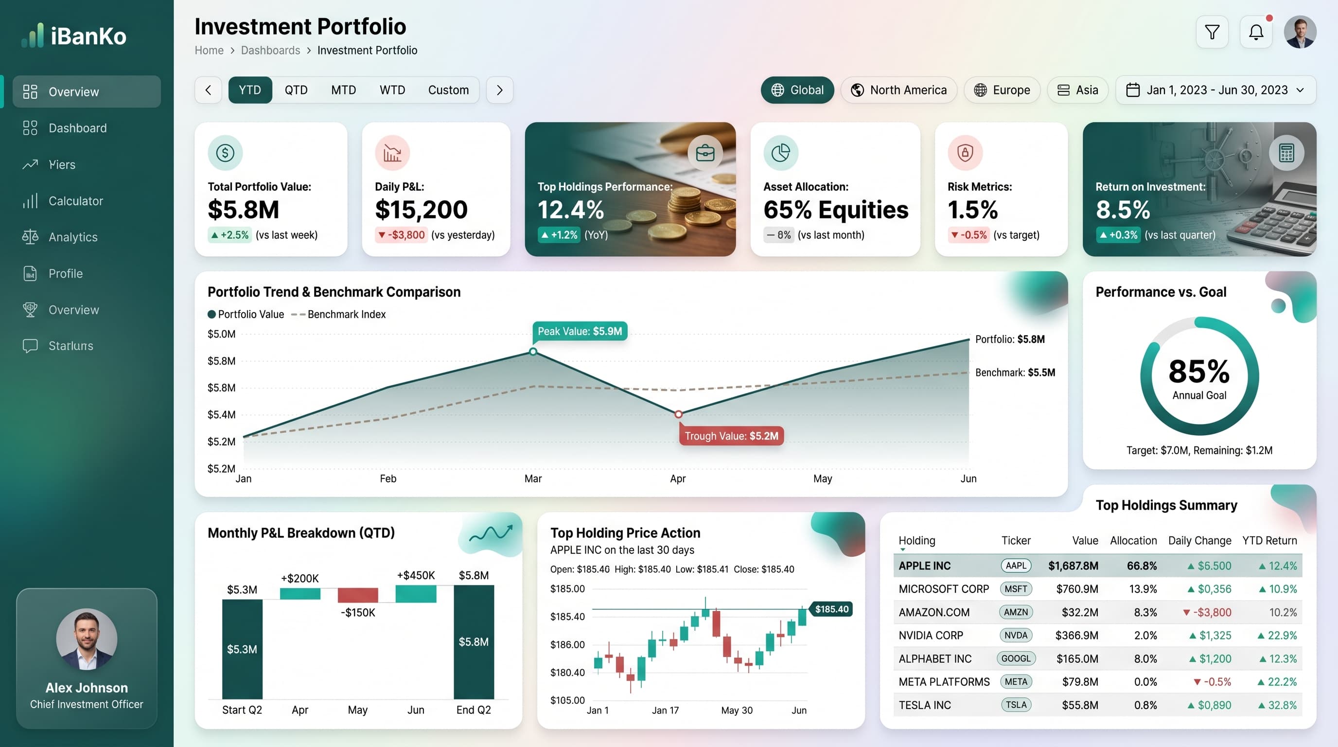
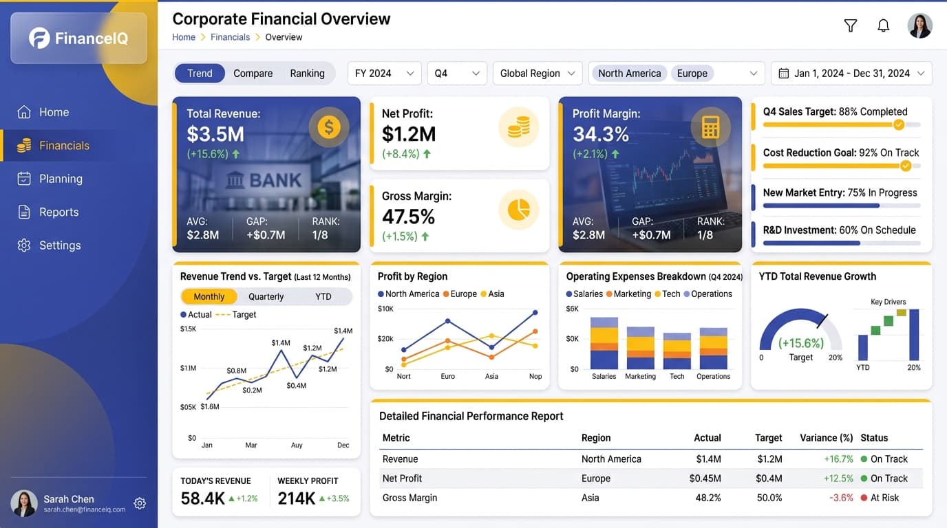
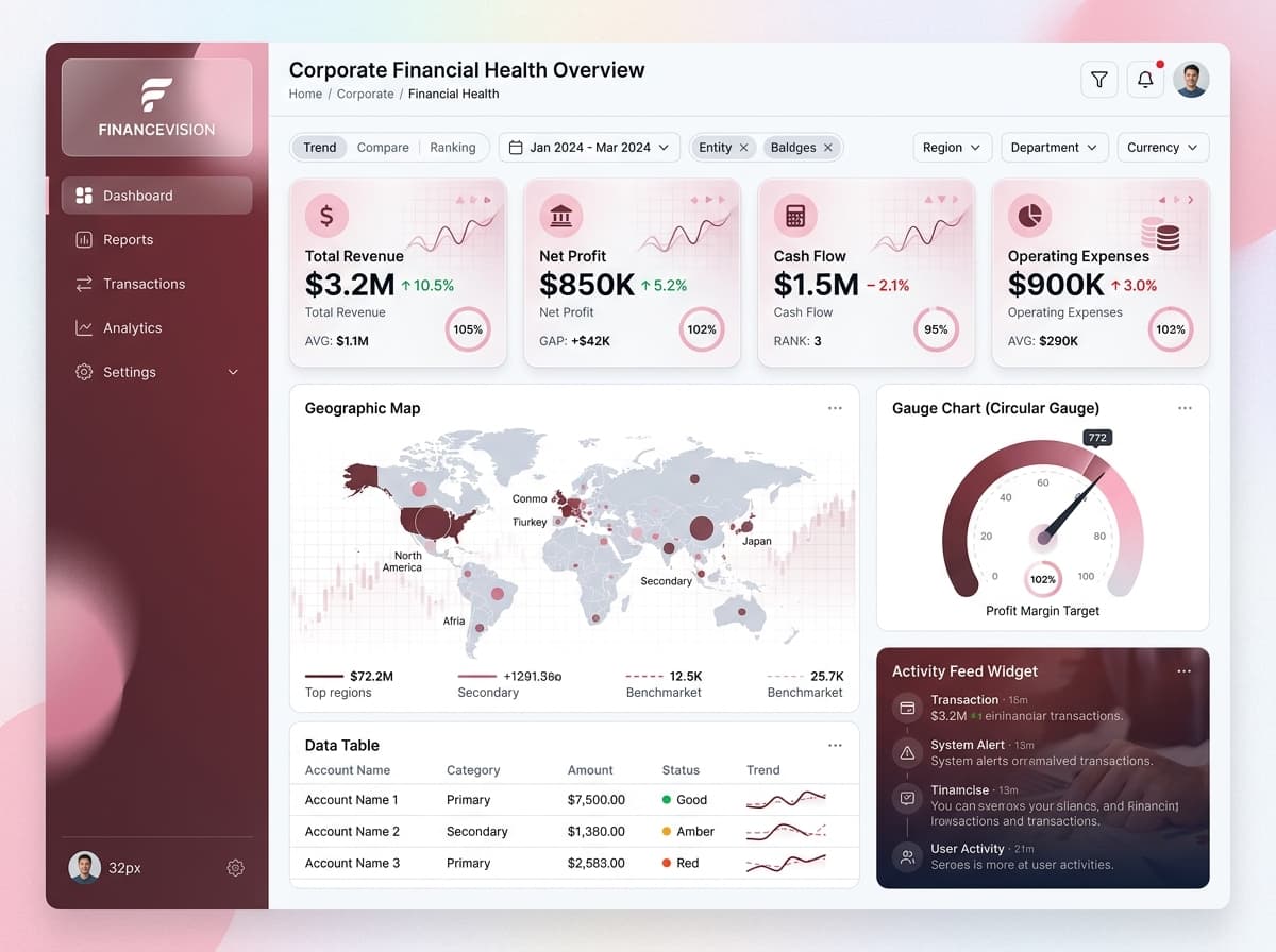
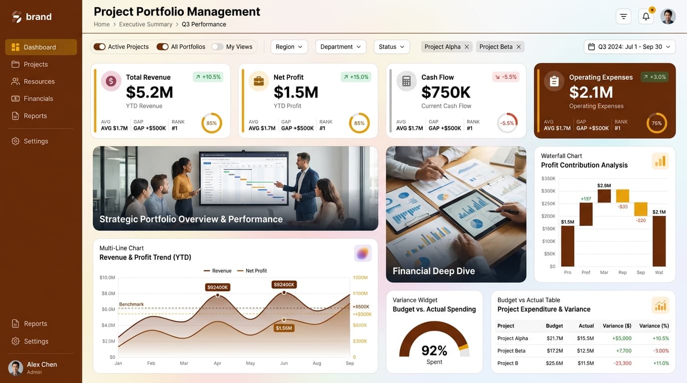
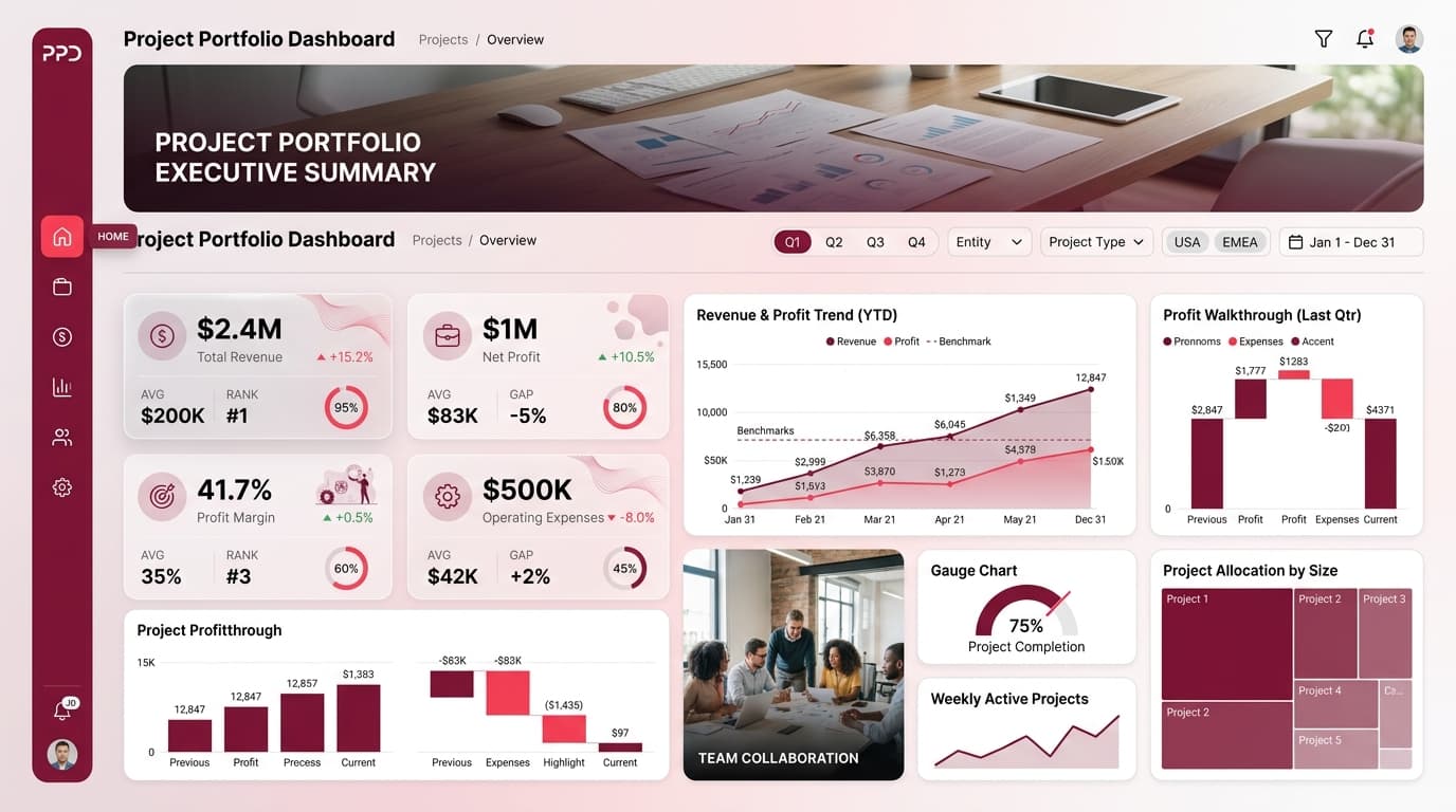
A dashboard designed to track cash flow, operating margin, burn rate, and runway for finance leadership.
KPIs tracked
Charts
Strategic insights
Design recommendations
Color Palette Strategy
HighUtilize a mono-slate palette to maintain a clean and professional aesthetic. Ensure a 4.5:1 contrast ratio for accessibility, particularly on the background and text. Use the primary color for headers and secondary for key metrics.
Layout & Grid System
HighImplement a 12-column grid for a 16:9 ratio layout. Position KPIs prominently at the top for immediate visibility, with charts below for detailed analysis. Maintain a 16-24px padding and 16-20px gaps between sections.
Typography Hierarchy
MediumUse a clear typography hierarchy: Dashboard title at 24-28px bold, section headers at 18-20px semi-bold, and body text at 12-14px regular. Stick to a single font family for consistency, such as Inter or Segoe UI.
Data Visualization UX
HighSelect appropriate chart types that match the data semantics: use a Waterfall Chart for cash flow visualization, a Multi-Line Chart for operational trends, and a Data Table for detailed metrics. Limit colors in each chart to 5-7 for clarity.
Visual Hierarchy & Focus
MediumCreate a clear visual hierarchy by using the largest elements for the most important metrics. Utilize whitespace to separate sections effectively and highlight anomalies using conditional formatting (e.g., red for negative trends).
Interaction & Feedback
LowImplement hover states for interactive elements, such as changing opacity or adding a subtle shadow. Provide visual feedback on filter selections and consider drill-through navigation to allow users to explore detailed data.