About this dashboard
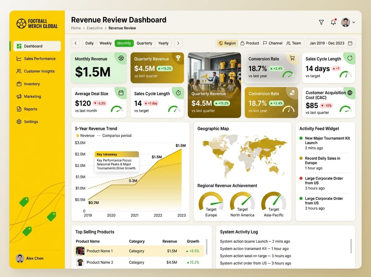
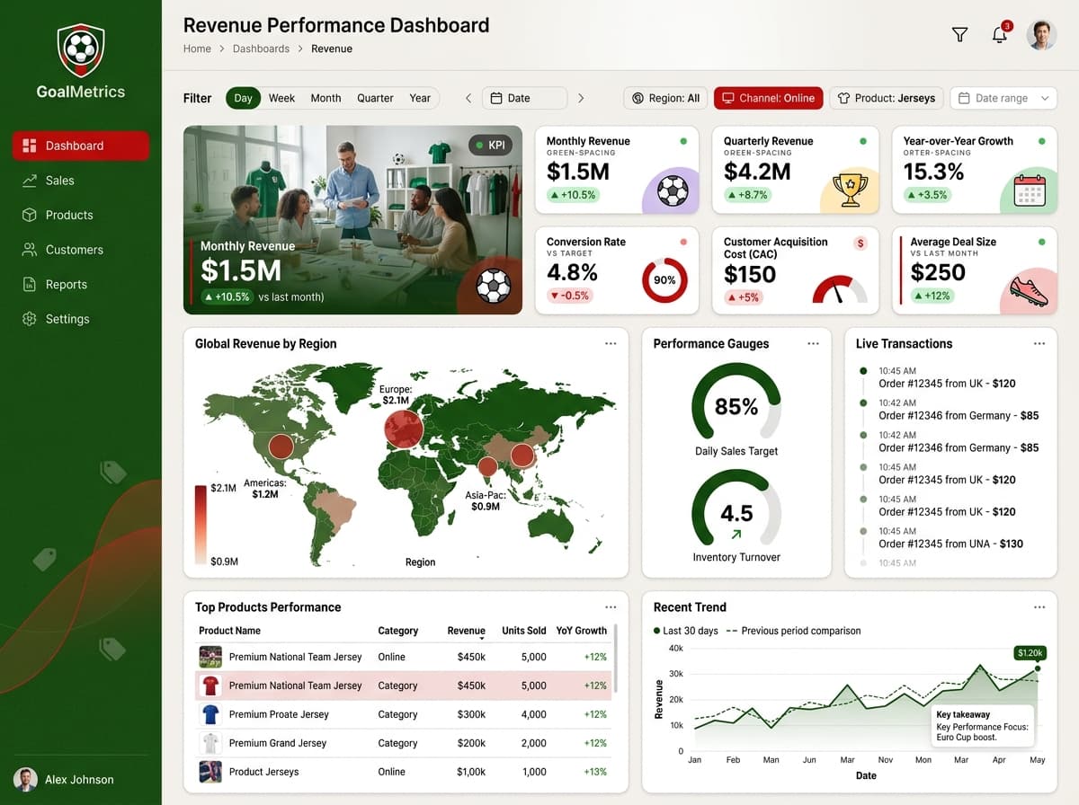
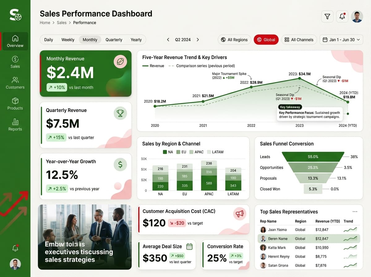
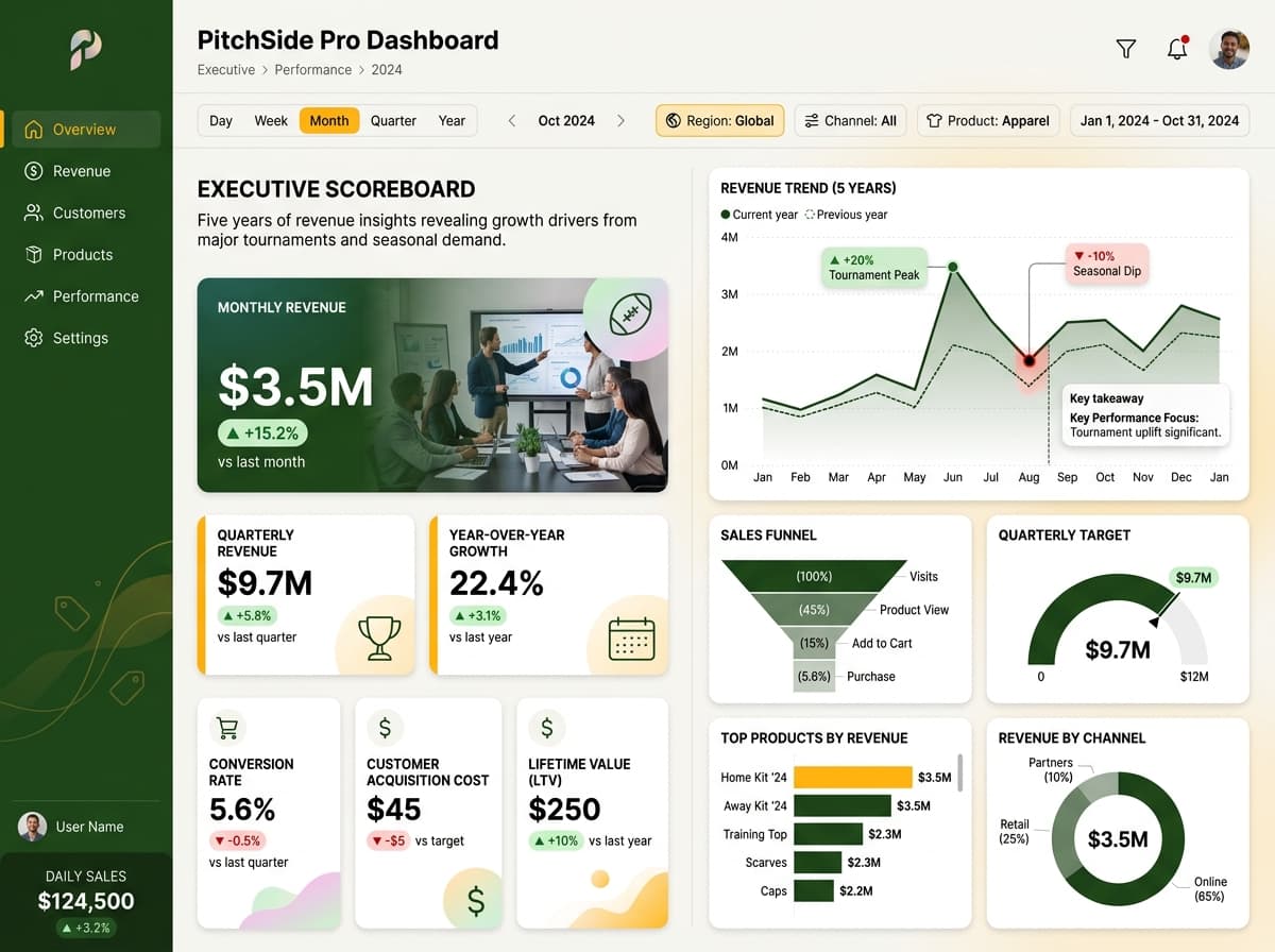
A comprehensive operational dashboard tracking key sales performance metrics for airplane sales.
KPIs tracked
Charts
Strategic insights
Design recommendations
Color Palette Strategy
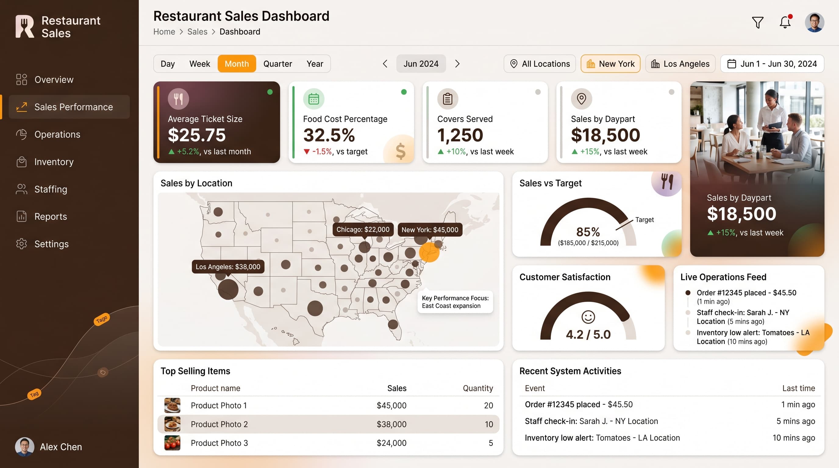
HighUtilize the mono-amber palette effectively, ensuring a 4.5:1 contrast ratio for readability. Use brighter shades for highlights and darker tones for backgrounds, maintaining consistency across the dashboard.
Layout & Grid System
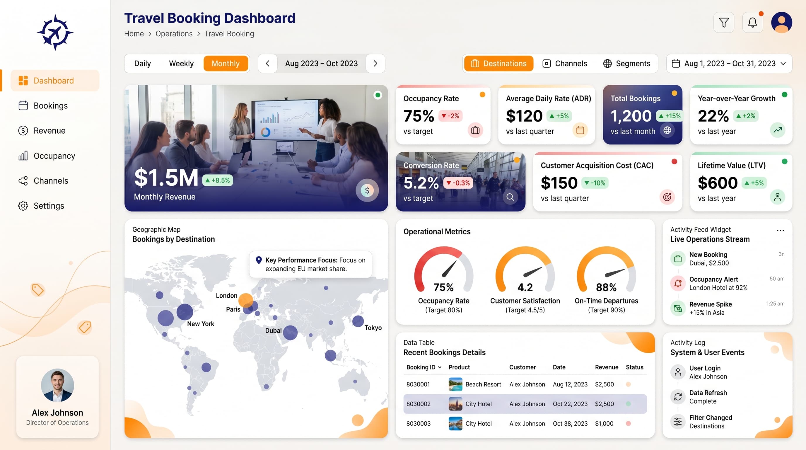
HighImplement a 12-column grid for a 16:9 ratio layout. Place KPIs at the top for immediate visibility, charts in the center for analysis, and use the bottom section for detailed tables and feeds. Maintain 16-24px padding and 16-20px gaps between elements.
Typography Hierarchy
MediumEstablish a clear typography hierarchy: Dashboard title at 24-28px bold, section headers at 18-20px semibold, card titles at 14-16px medium, and body text at 12-14px regular. Use a consistent font family like Inter for a cohesive look.
Data Visualization UX
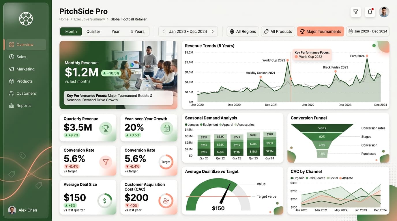
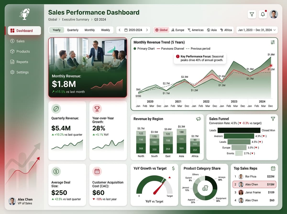
HighSelect chart types that reflect the data's nature: use a Geographic Map for sales distribution, a Gauge for performance targets, and a Data Table for detailed comparisons. Ensure tooltips provide context, and maintain consistent formatting across all visuals.
Visual Hierarchy & Focus
MediumEnhance visual hierarchy by making the most critical metrics prominent. Use whitespace effectively to separate sections, and apply conditional formatting to highlight anomalies or trends (red for negative changes, green for positive).
Interaction & Feedback
LowIncorporate hover states for interactive elements, indicating selection or loading states with subtle animations. Provide feedback for filter selections and consider drill-through options for detailed data exploration.