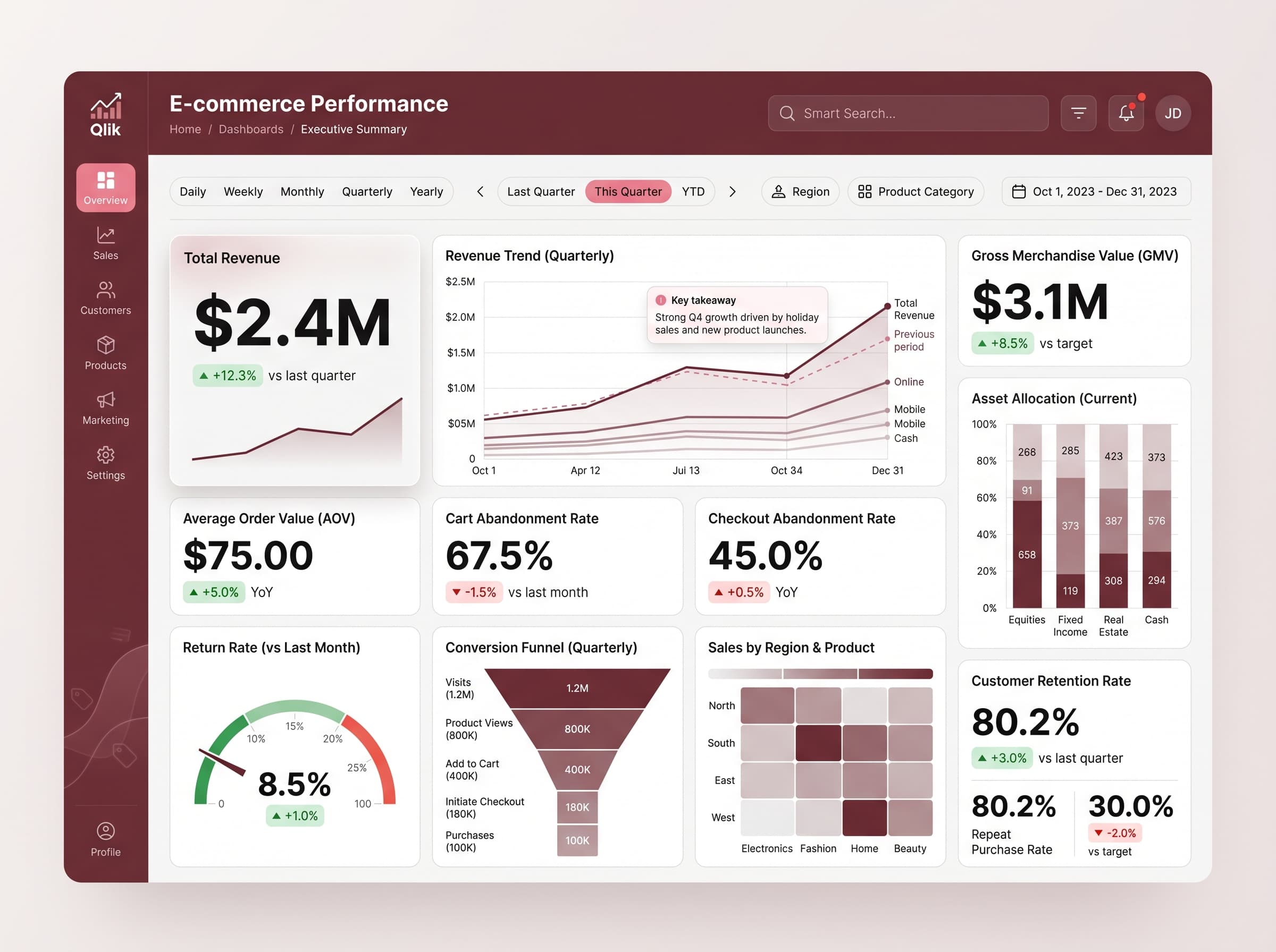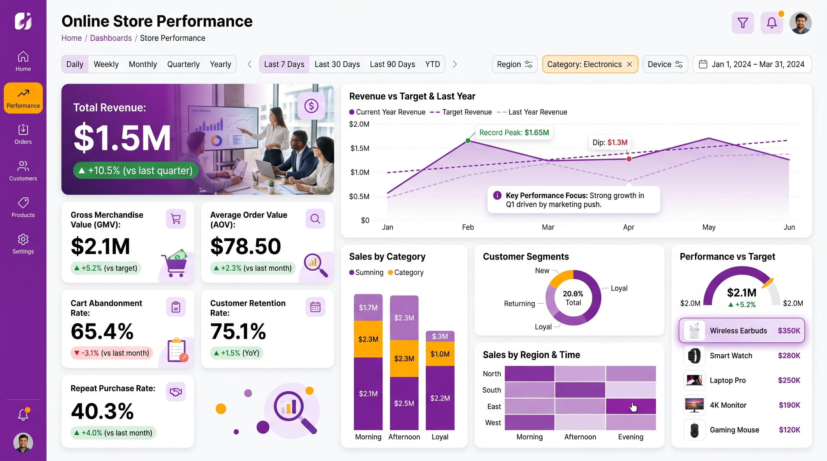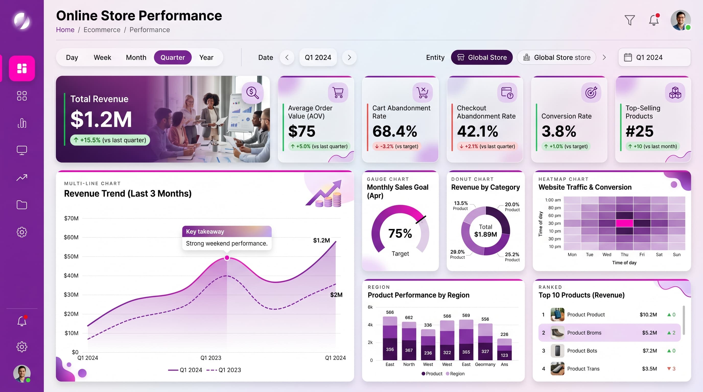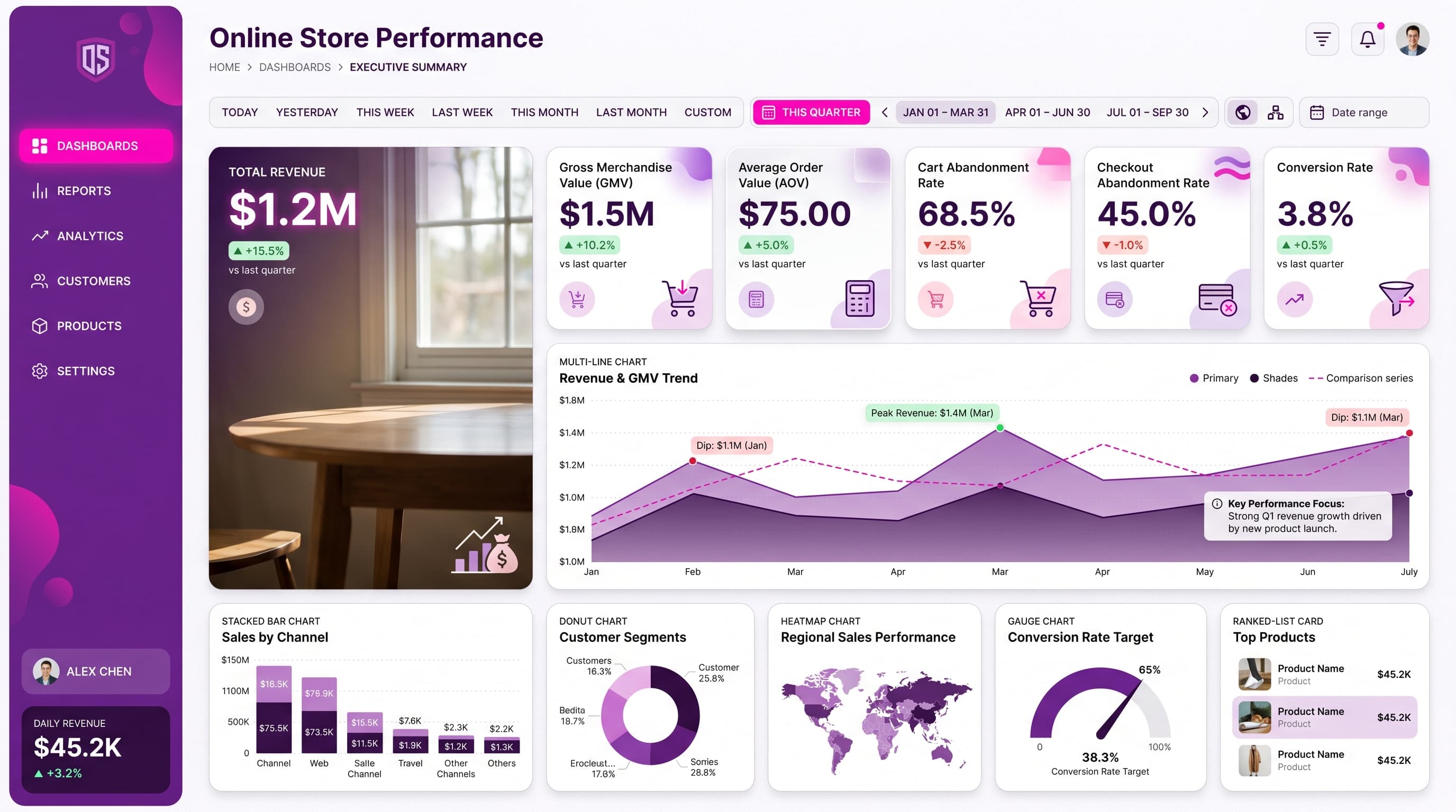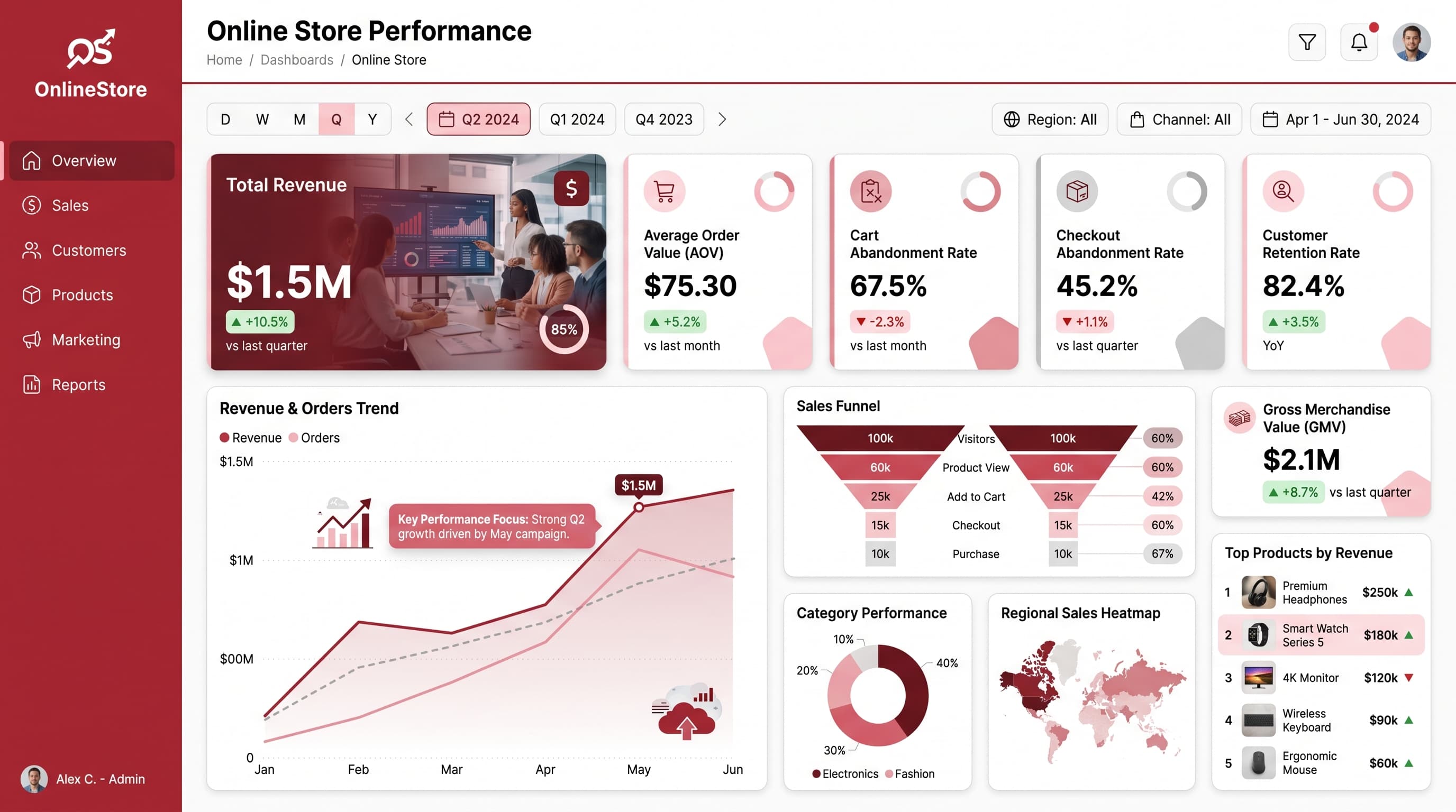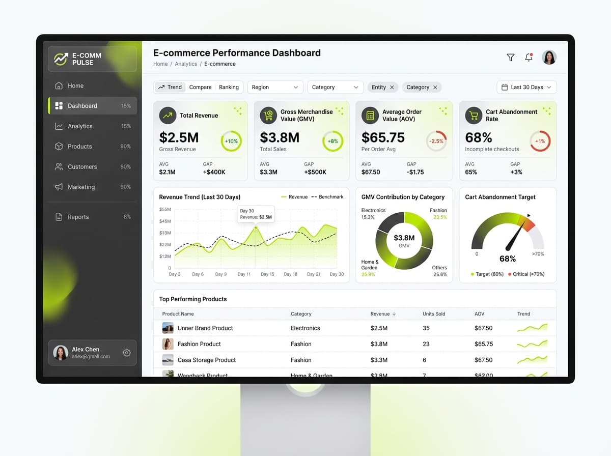

About this dashboard
Monitor key metrics to optimize online sales performance and enhance decision-making.
KPIs tracked
Charts
Strategic insights
Design recommendations
Color Palette Strategy
HighUtilize a light theme with a mono-amber palette for clarity. Use #FEF3C7 for backgrounds, #F59E0B for key metrics, and #B45309 for alerts. Ensure a contrast ratio of at least 4.5:1 for accessibility.
Layout & Grid System
HighAdopt a 12-column grid system for a 16:9 layout. Place KPIs in the top row for immediate visibility, followed by trend and comparison charts in the middle, and detailed metrics or insights in the lower sections.
Typography Hierarchy
MediumUse a consistent font like Inter throughout the dashboard. Title: 24-28px bold, Section headers: 18-20px semibold, Card titles: 14-16px medium, Body text: 12-14px regular, Labels: 10-12px.
Data Visualization UX
HighSelect chart types that align with data semantics: line charts for trends, gauges for performance targets, and heatmaps for visualizing customer interactions. Limit colors to 5-7 for clarity.
Visual Hierarchy & Focus
MediumEstablish a clear visual hierarchy using larger, bolder elements for primary KPIs. Use whitespace effectively to separate sections and apply subtle shadows to cards for depth. Conditional formatting should highlight anomalies.
Interaction & Feedback
LowIncorporate hover states with slight opacity changes on interactive elements. Use loading indicators during data refreshes and provide visual cues on filter selections for a seamless user experience.