
About this dashboard
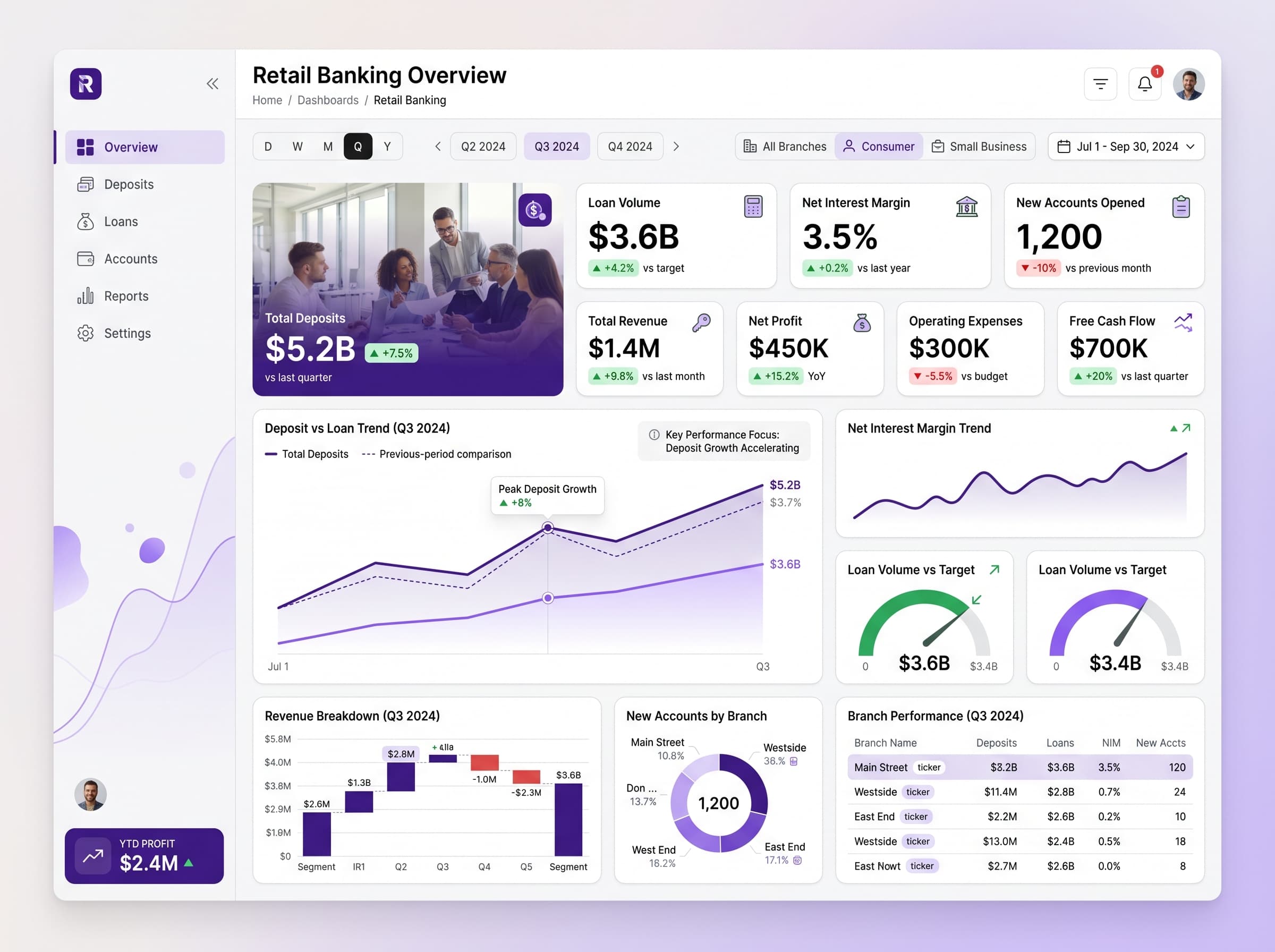
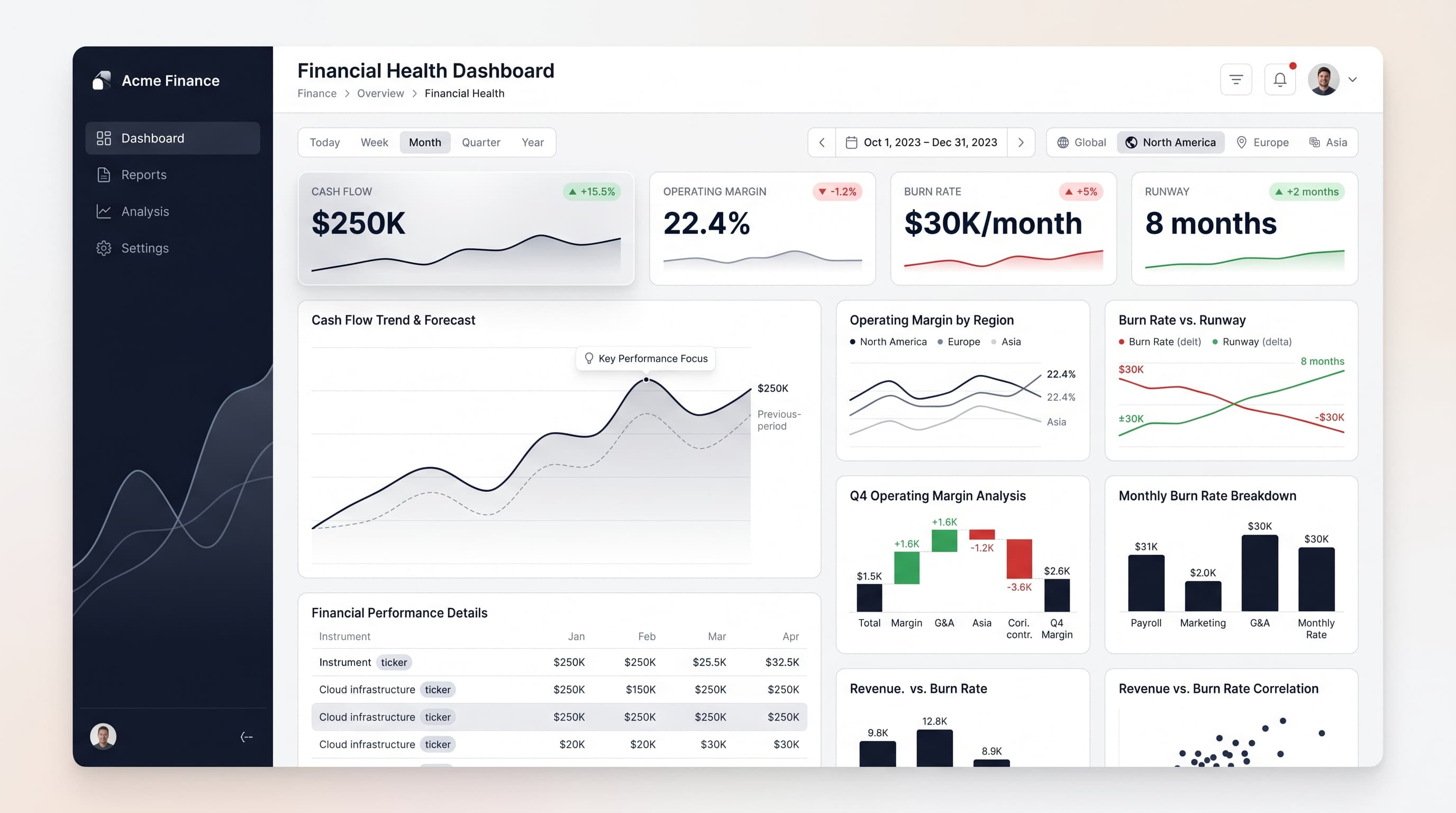
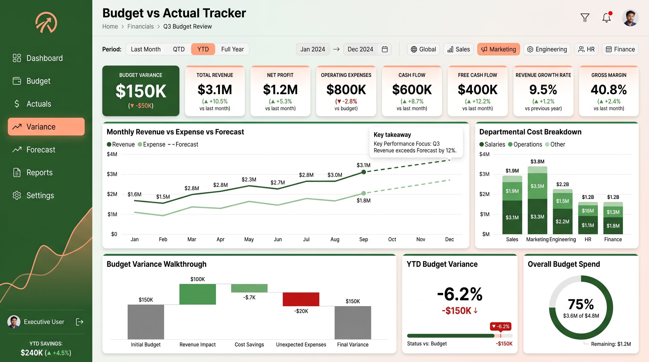
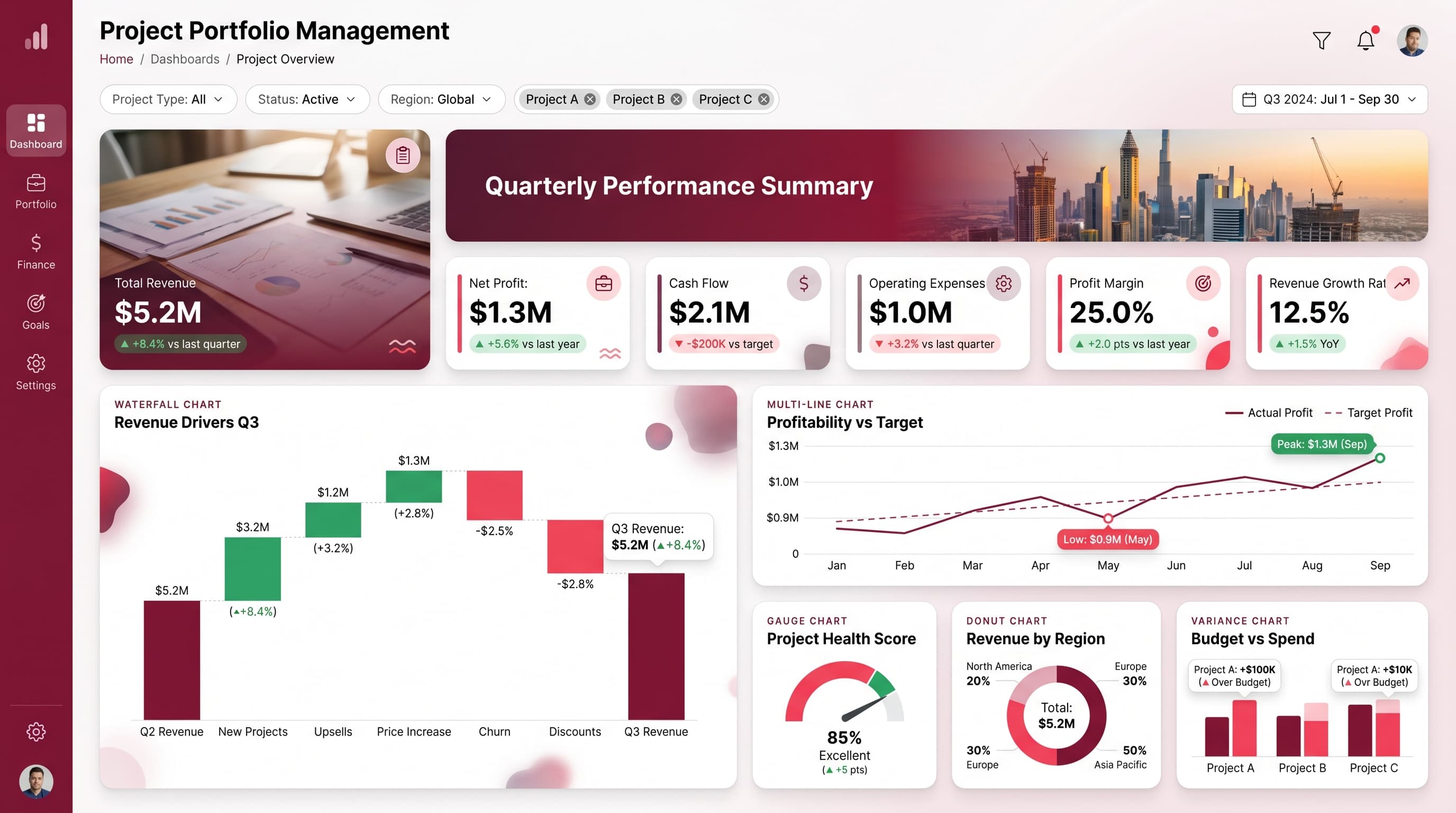
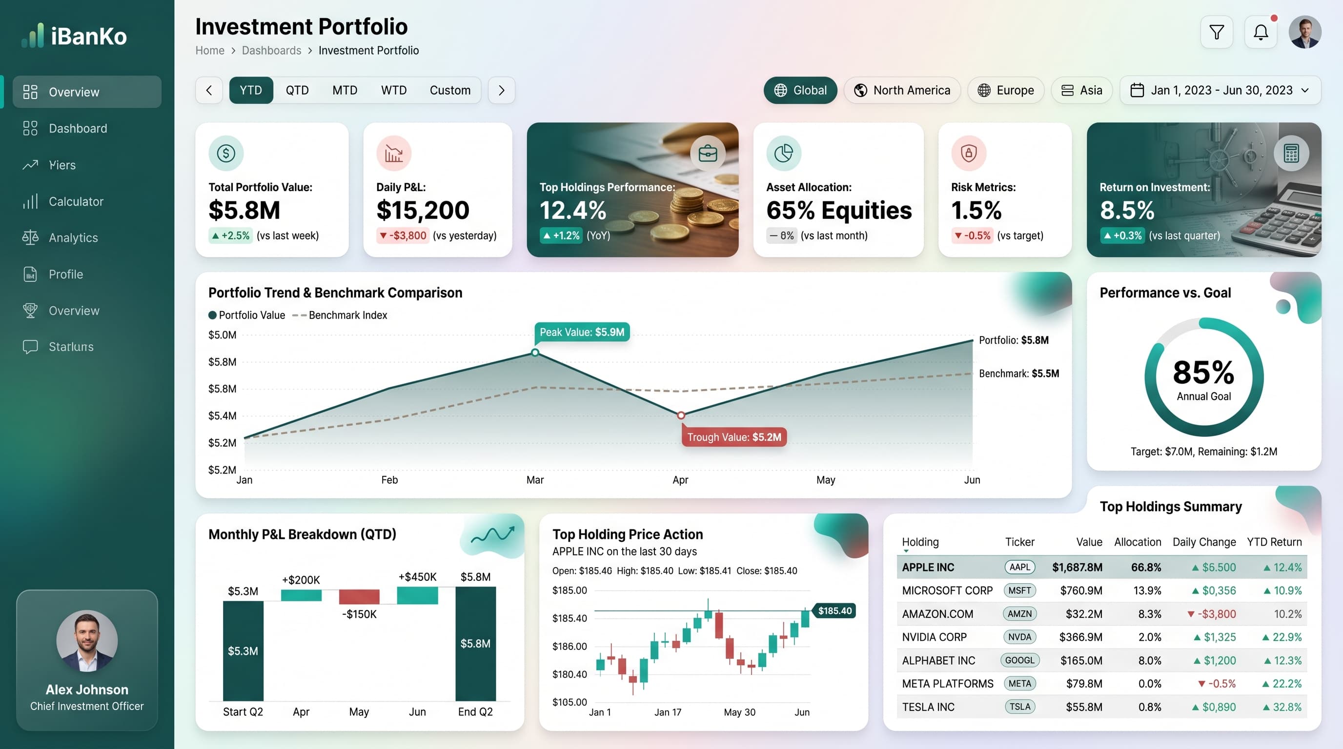
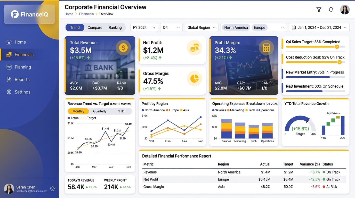
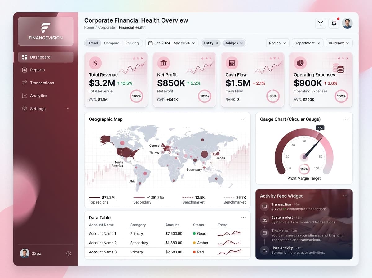
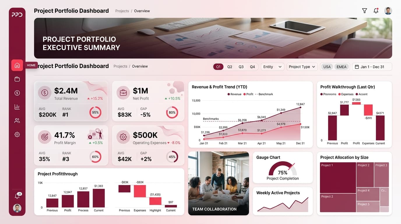
Monitor key financial metrics and manage budgets, milestones, and resource allocation effectively.
KPIs tracked
Charts
Strategic insights
Design recommendations
Color Palette Strategy
HighUtilize a mono-amber palette effectively, ensuring primary color (#F59E0B) for headers and navigation, secondary for key metrics, and an accent for highlights. Maintain a contrast ratio of at least 4.5:1 for accessibility.
Layout & Grid System
HighImplement a 12-column grid suitable for a 16:9 ratio. Place KPI cards at the top for immediate visibility, followed by charts in the middle section, and filters in a sidebar. Maintain 16-24px padding with adequate 16-20px gaps between elements.
Typography Hierarchy
MediumEstablish a clear typography hierarchy: Dashboard title should be 24-28px bold, section headers 18-20px semibold, and body text at 12-14px regular. Ensure to use a clean font family like Inter for consistency.
Data Visualization UX
HighSelect chart types that match data semantics: use the Waterfall Chart for financial variance, Gauge for targets, and Multi-Line Chart for trends. Limit color usage to 5-7 colors per chart and add context tooltips for clarity.
Visual Hierarchy & Focus
MediumCreate a clear visual hierarchy by making the most important metrics larger and bolder. Utilize whitespace effectively to separate sections, and highlight key anomalies with conditional formatting to attract attention.
Interaction & Feedback
LowIncorporate hover states for interactive elements, using a slight opacity change (0.8) to indicate selection. Implement loading states during data refresh and provide visual feedback on filter selections to enhance user experience.