About this dashboard
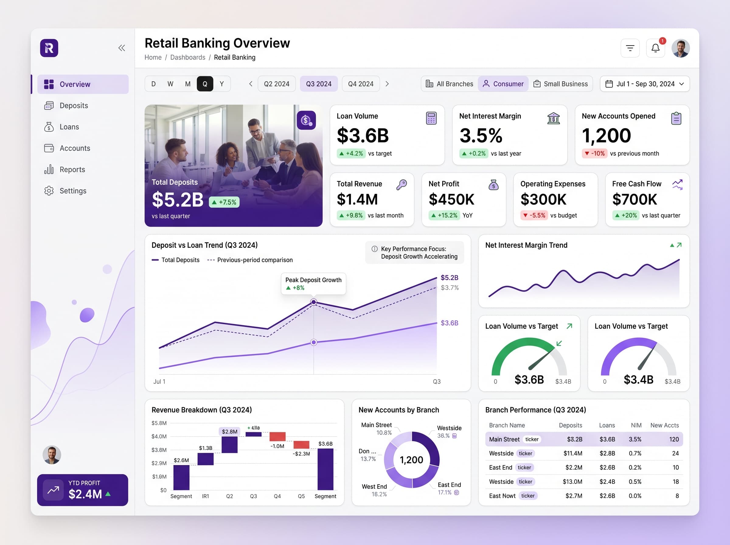
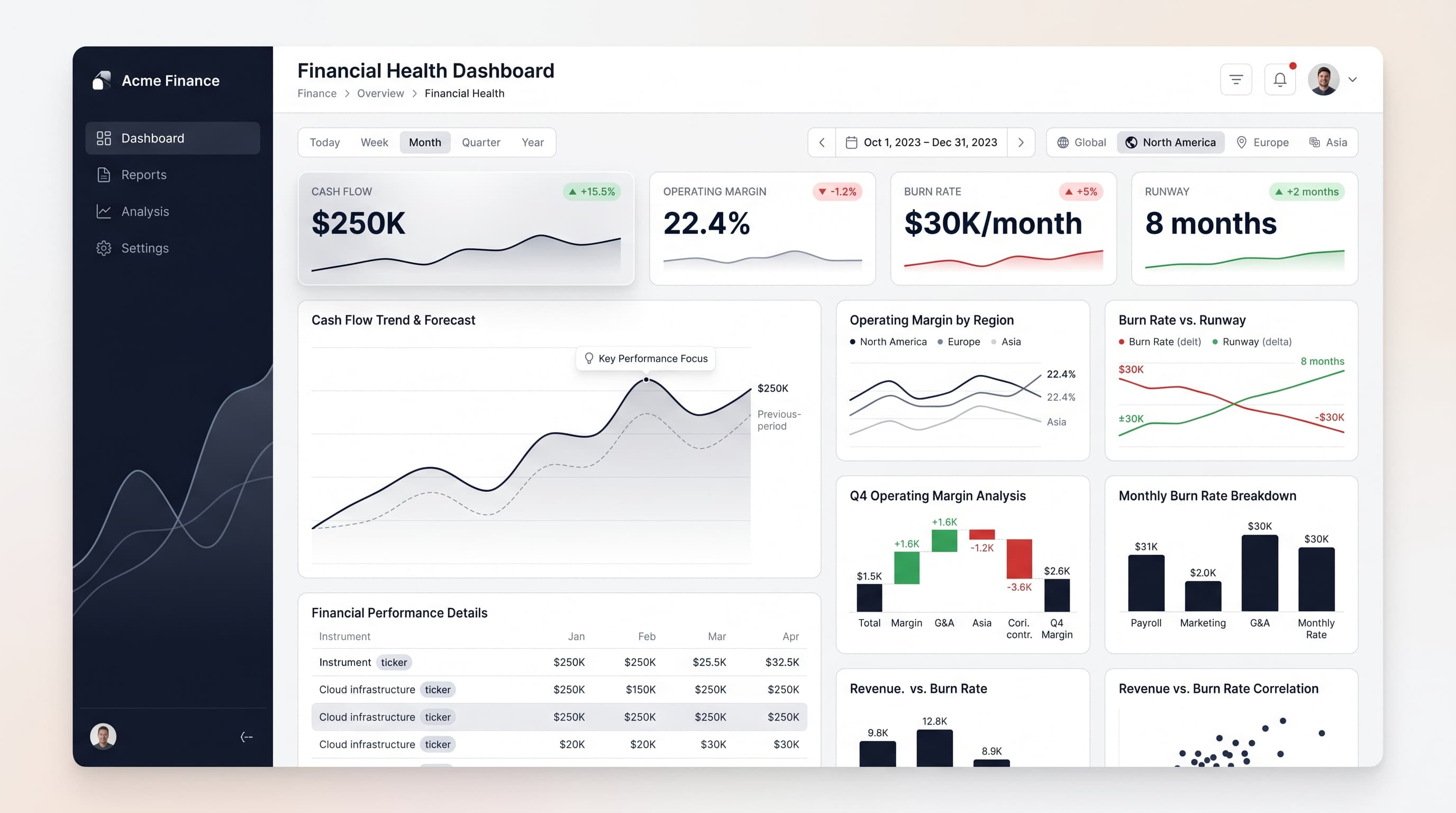
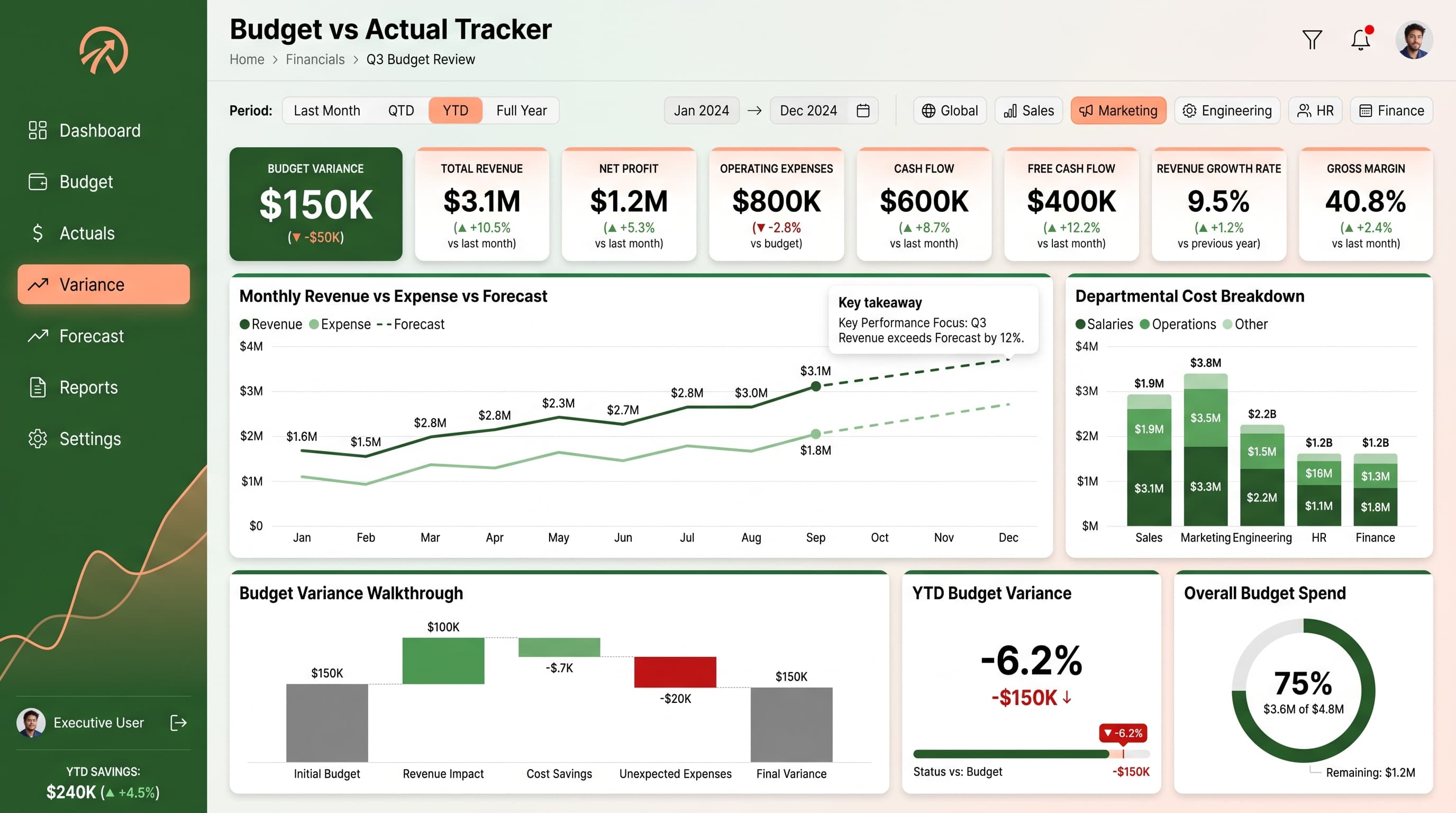
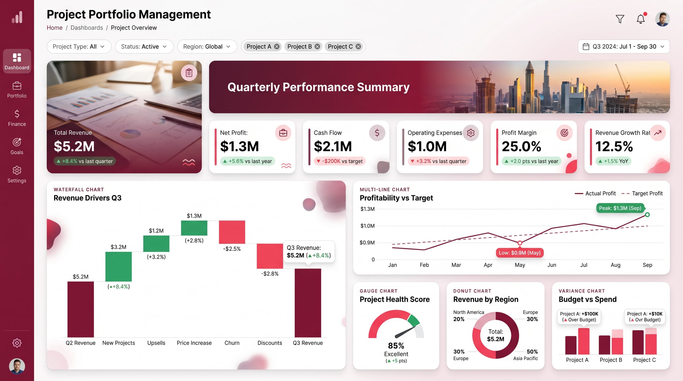
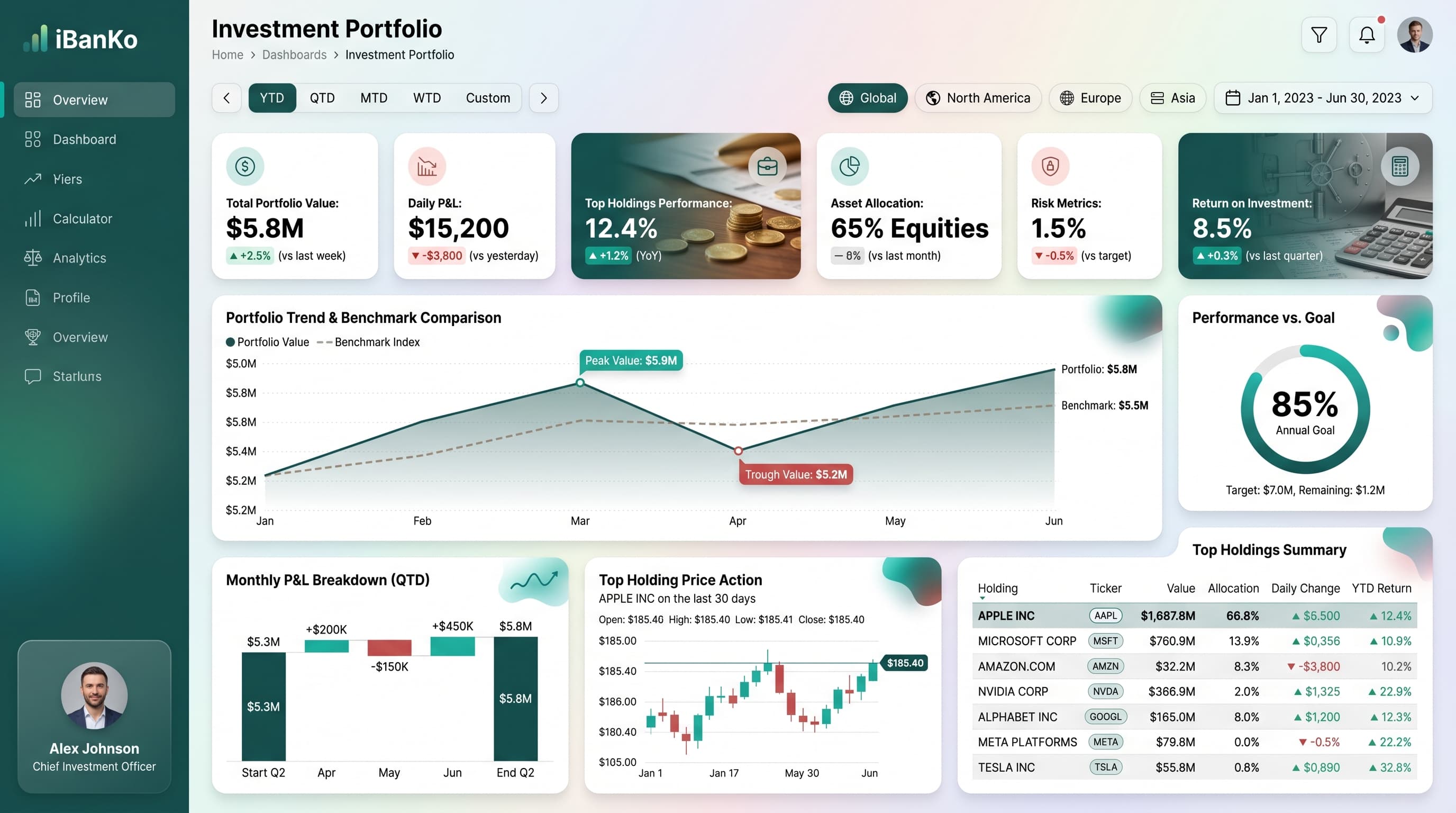
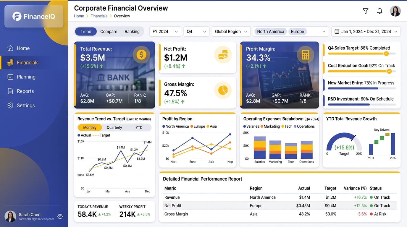
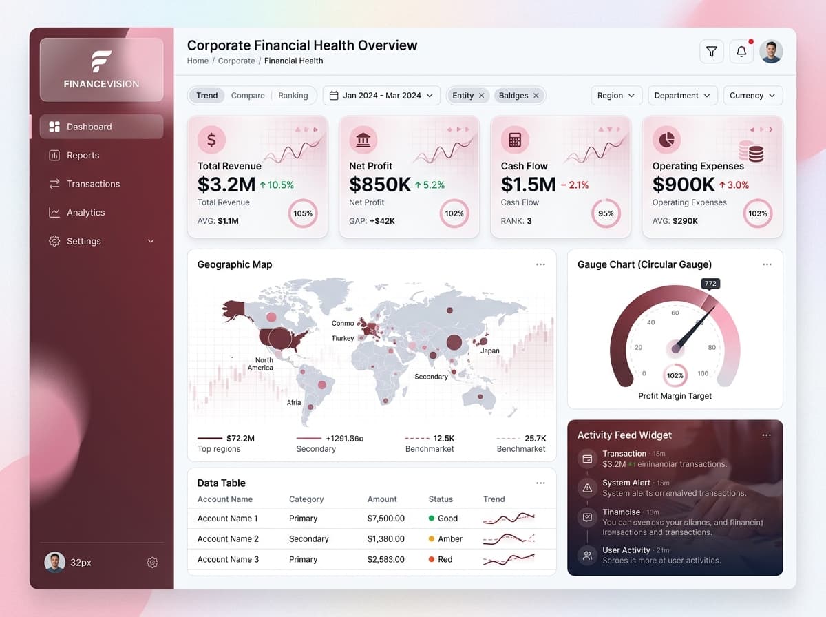
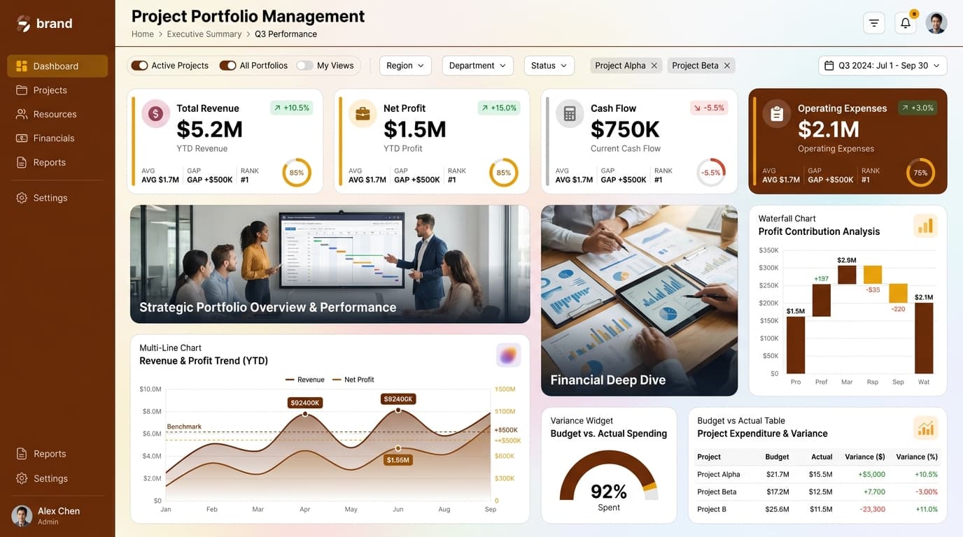
Visualize budget vs actuals, milestones, resource allocation, and risk analysis in a comprehensive manner.
KPIs tracked
Charts
Strategic insights
Design recommendations
Color Palette Strategy
HighUtilize the mono-rose palette to create a soft yet impactful visual experience. Use the primary color (#FF6F61) for headers and key metrics, and lighter shades for background elements to maintain clarity and accessibility.
Layout & Grid System
HighImplement a 12-column grid system to maintain a 16:9 ratio. Position KPIs at the top for immediate visibility, with charts below for analysis. Ensure consistent padding of 16px and 20px gaps between elements.
Typography Hierarchy
MediumEstablish a clear typography hierarchy: Dashboard title at 28px bold, section headers at 18px semibold, KPI labels at 16px medium, and body text at 12px regular. Use a single font family like 'Inter' for consistency.
Data Visualization UX
HighSelect appropriate chart types for the data: Waterfall for budget vs actual comparisons, Multi-Line for trend analysis, and Gauge for KPI targets. Limit color usage to 5-7 per chart for clarity, and ensure axes are labeled clearly.
Visual Hierarchy & Focus
MediumCreate a strong visual hierarchy by making the most critical metrics the largest and boldest. Use whitespace effectively to separate sections, and apply conditional formatting to highlight metrics that deviate from targets.
Interaction & Feedback
LowIncorporate hover states to enhance user engagement, with opacity changes for interactive elements. Utilize loading indicators during data refresh and provide visual feedback for filter selections to improve user experience.