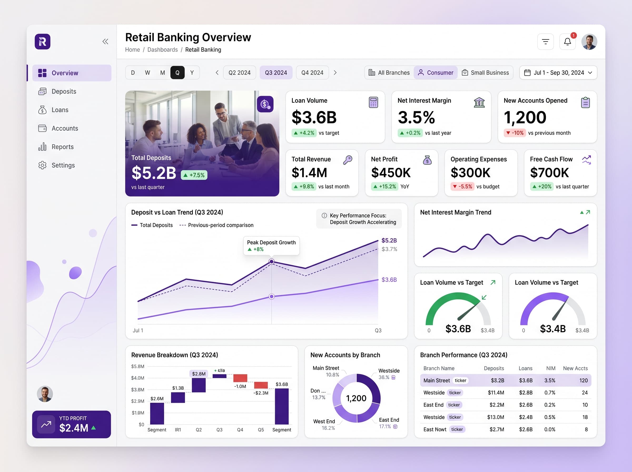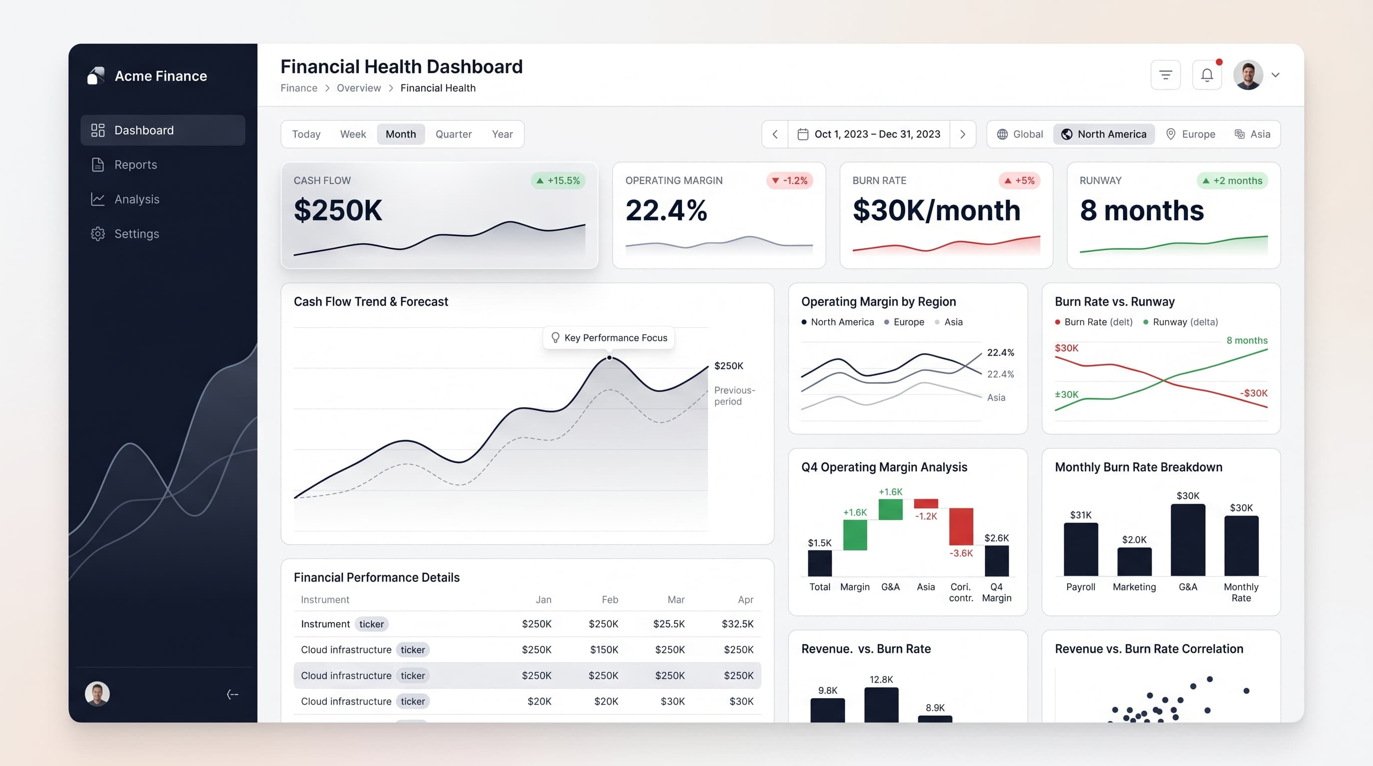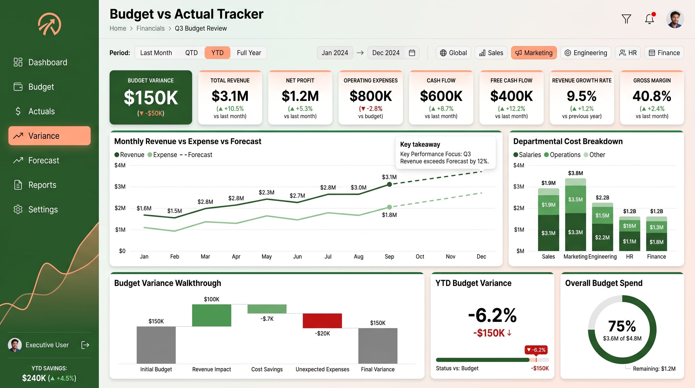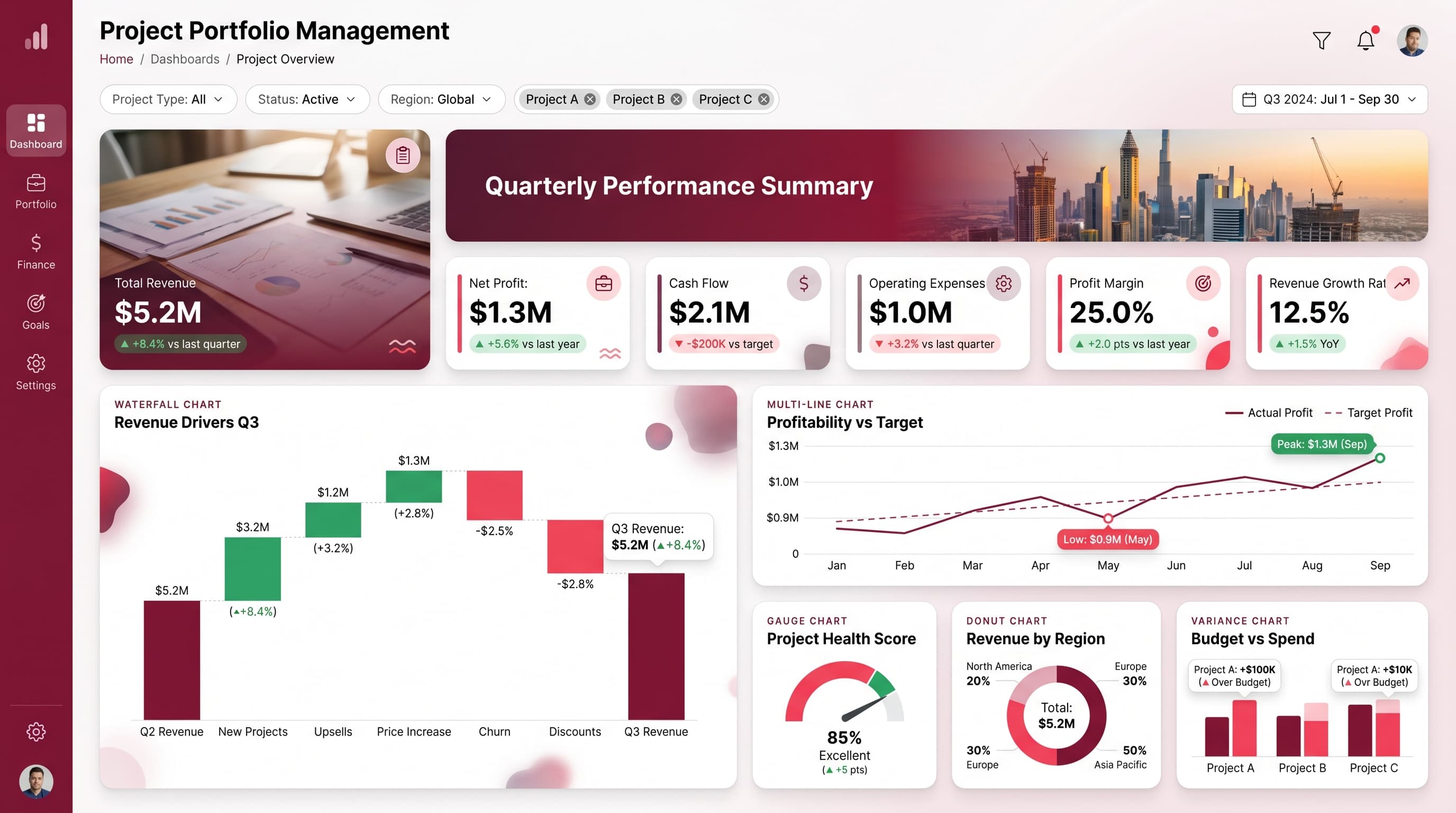

About this dashboard
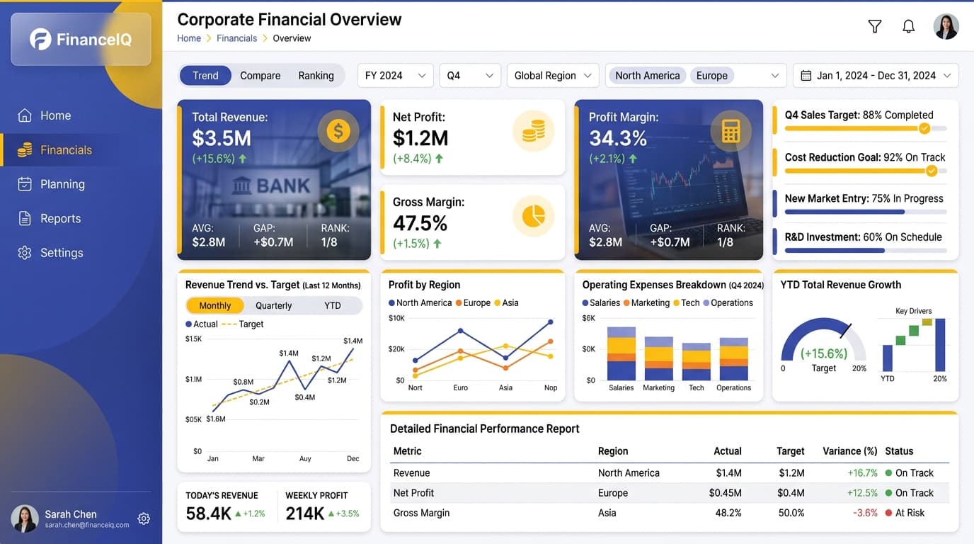
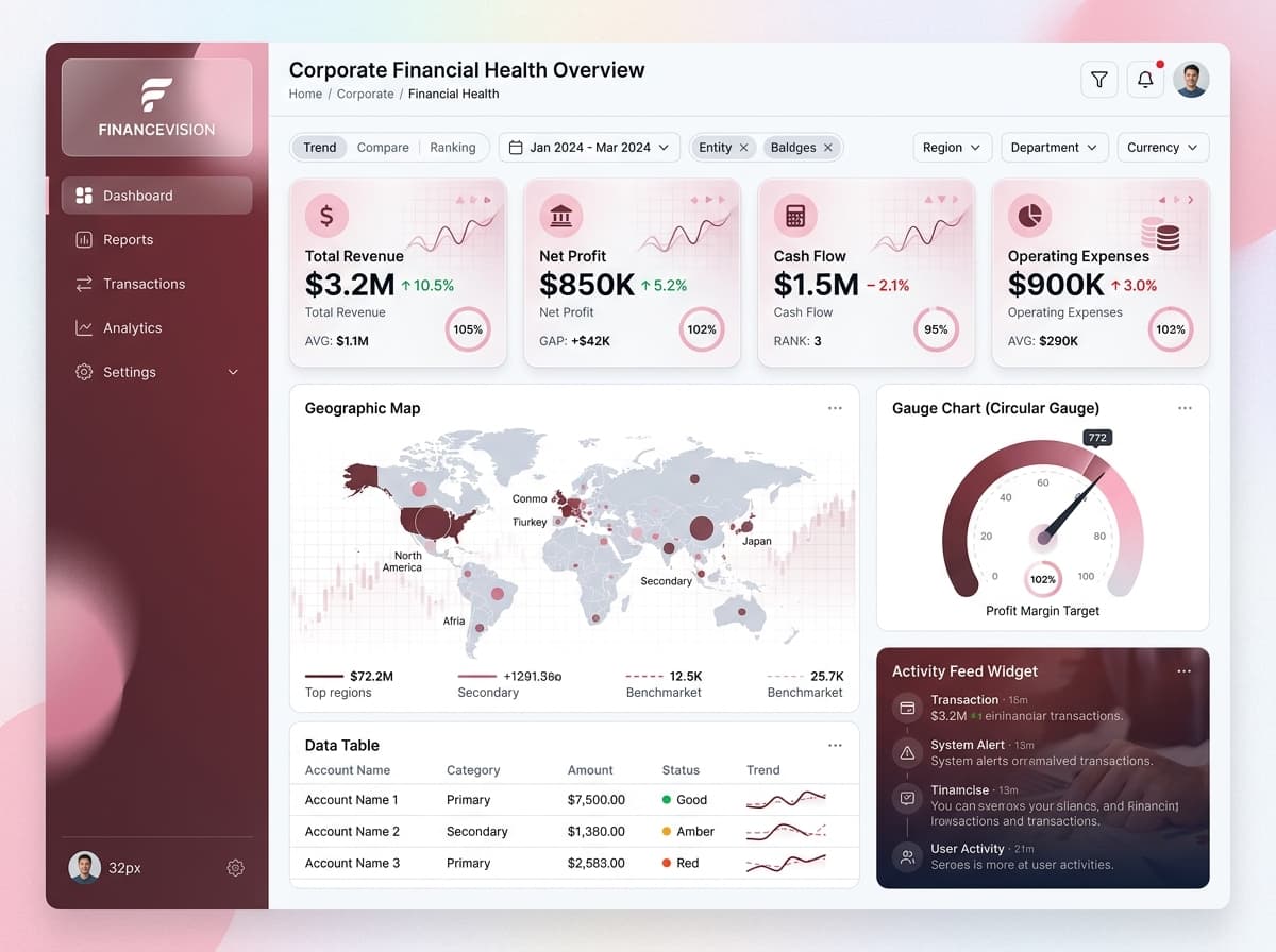
Visualize portfolio value, daily P&L, asset allocation, and top holdings performance.
KPIs tracked
Charts
Strategic insights
Design recommendations
Color Palette Strategy
HighUse the mono-teal palette effectively by defining a primary color for headers and backgrounds (#134E4A), a secondary for key metrics (#14B8A6), and an accent for highlights (#2DD4BF). This will ensure a consistent visual theme with a 4.5:1 contrast ratio for accessibility.
Layout & Grid System
HighImplement a 12-column grid for a 16:9 ratio, placing KPIs at the top for immediate visibility, followed by charts for analytical insights in the middle section. Maintain 16-24px padding and 16-20px gaps between cards for visual clarity.
Typography Hierarchy
MediumDashboard title should be in 24-28px bold, section headers at 18-20px semibold, card titles in 14-16px medium, and body text at 12-14px regular. Use a consistent font such as Inter or Segoe UI for readability.
Data Visualization UX
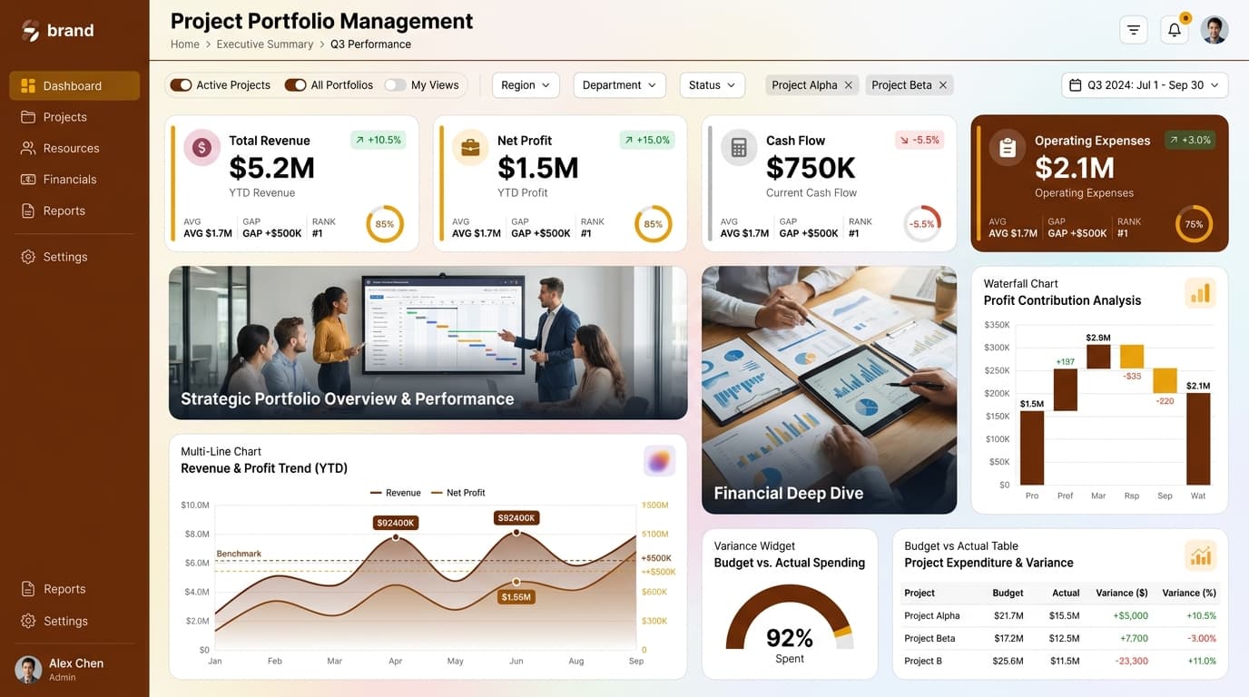
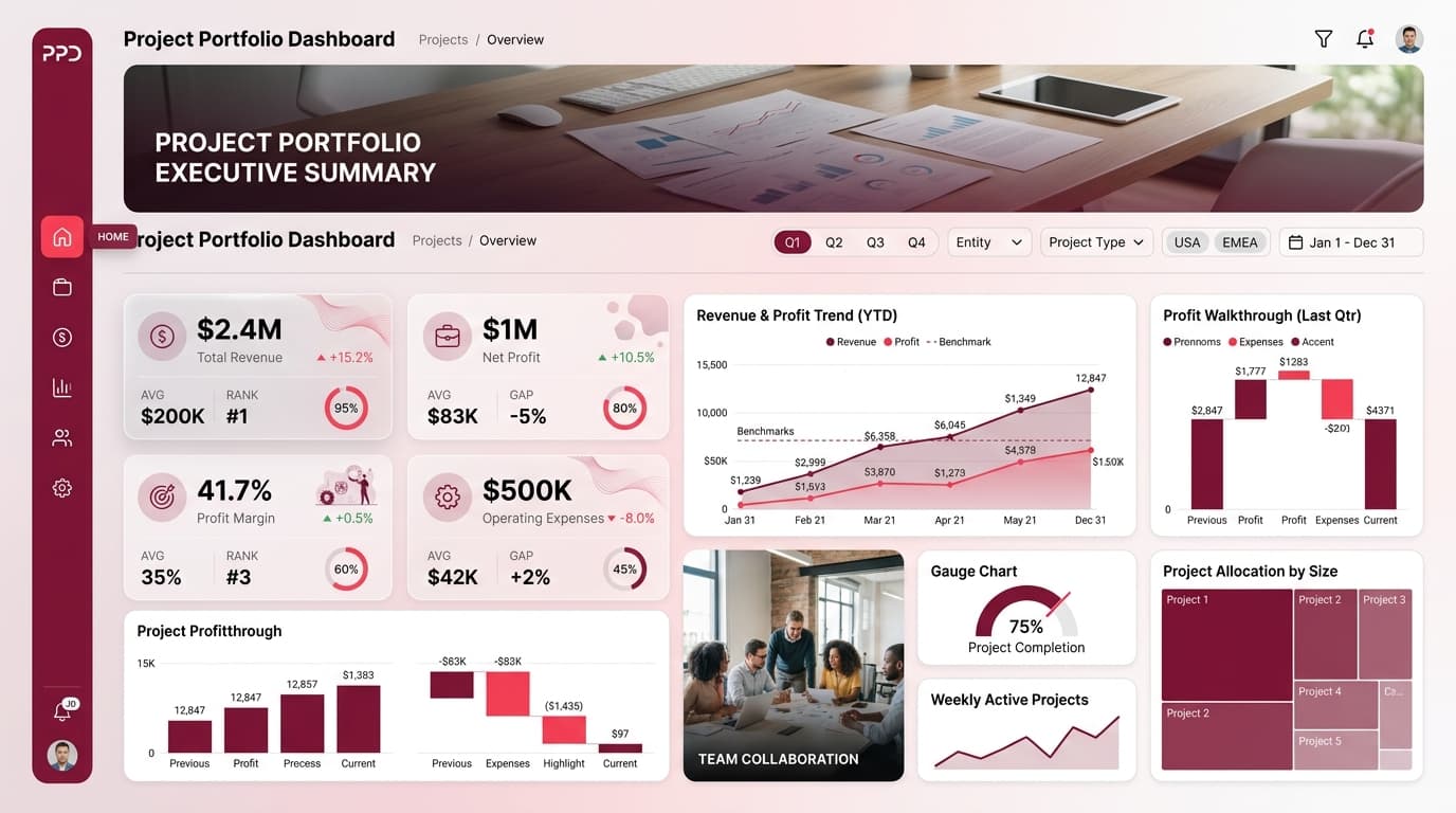
HighSelect chart types that align with the data semantics: use Multi-Line Charts for trend analysis, Progress Rings for target tracking, and Waterfall Charts for financial transitions. Limit color usage to 5-7 per chart and ensure tooltips provide context.
Visual Hierarchy & Focus
MediumEstablish a clear visual hierarchy by making the most critical metrics larger and bolder. Utilize whitespace effectively to separate sections and apply subtle shadows or borders to create depth. Highlight anomalies using conditional formatting.
Interaction & Feedback
LowIncorporate hover states for interactive elements to enhance user engagement. Use loading indicators during data refreshes and provide visual feedback on user selections to improve overall UX and navigation.