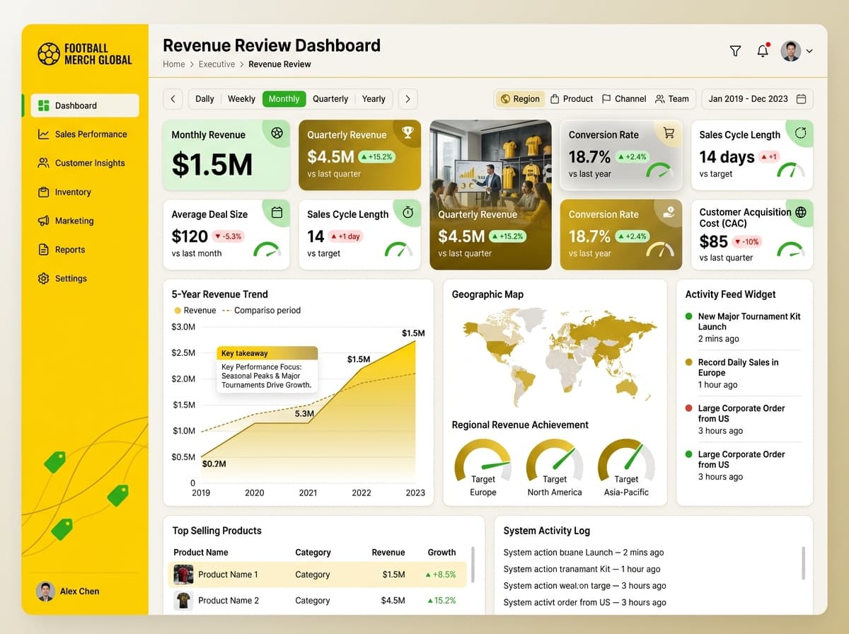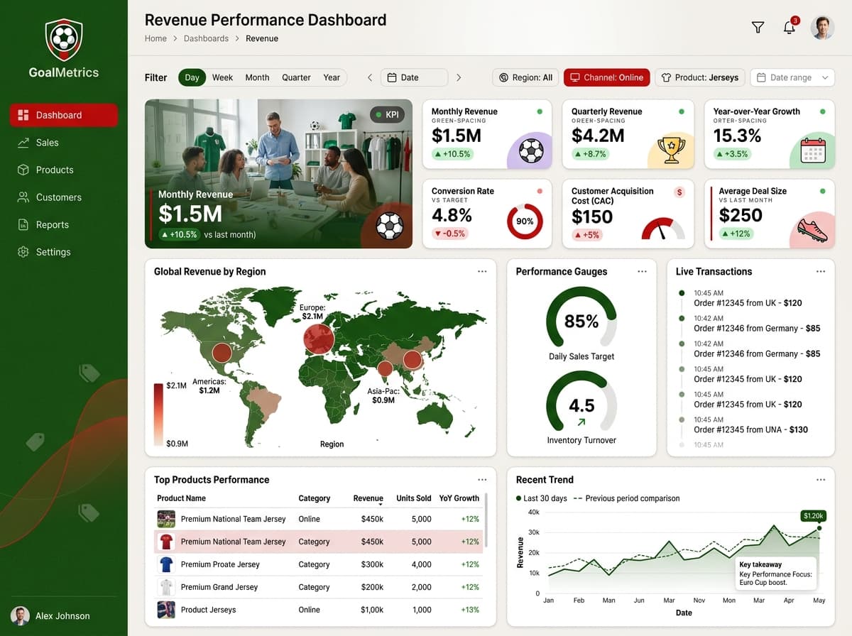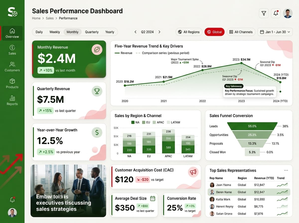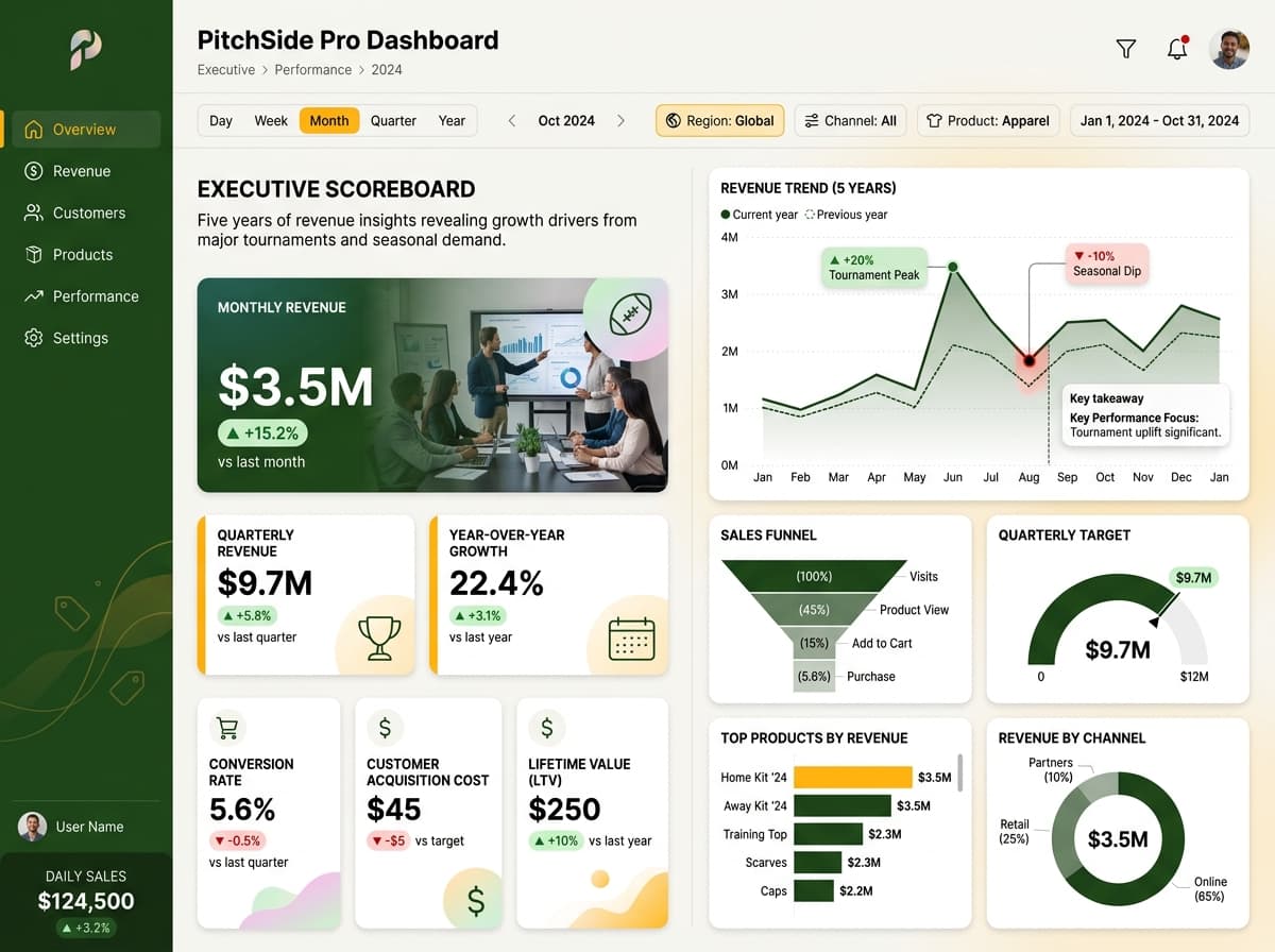

About this dashboard
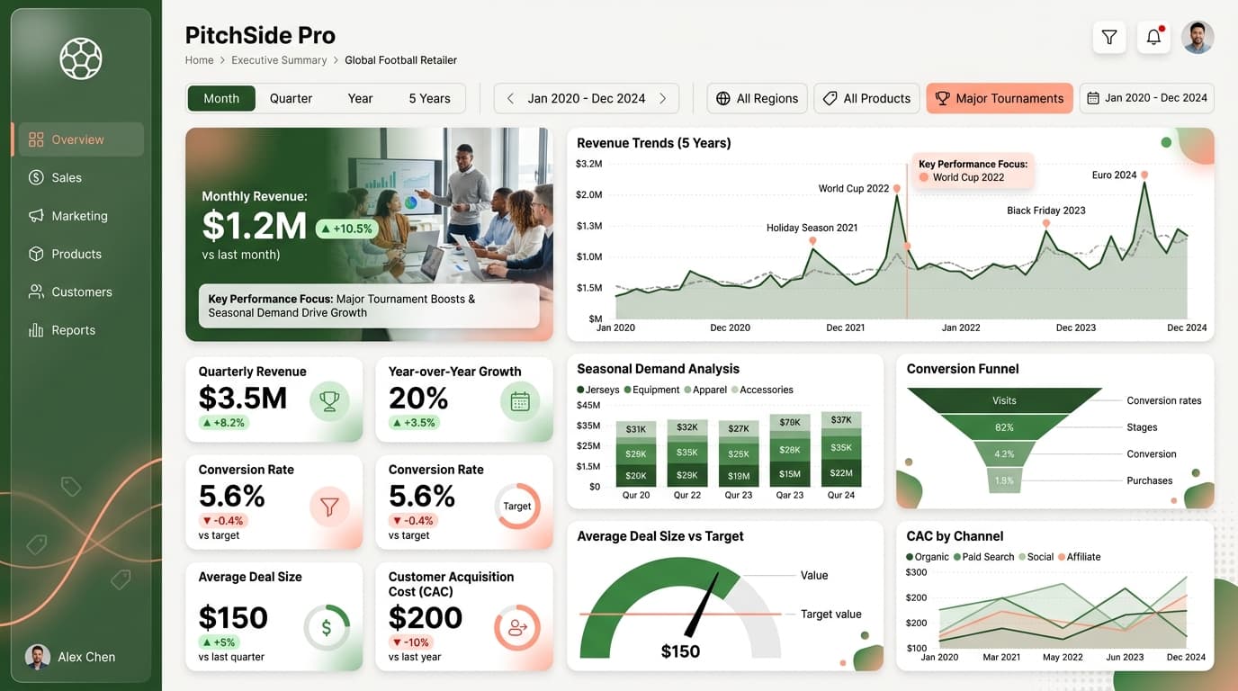
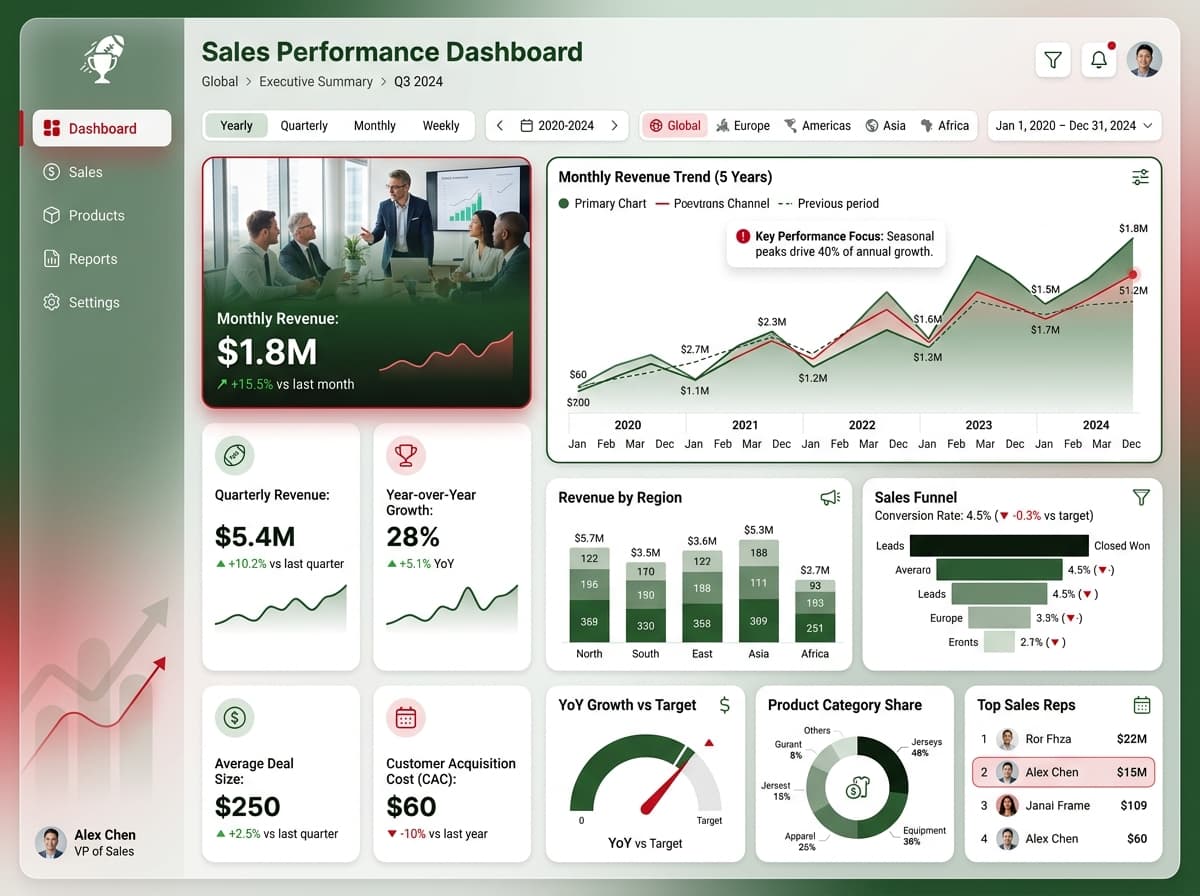
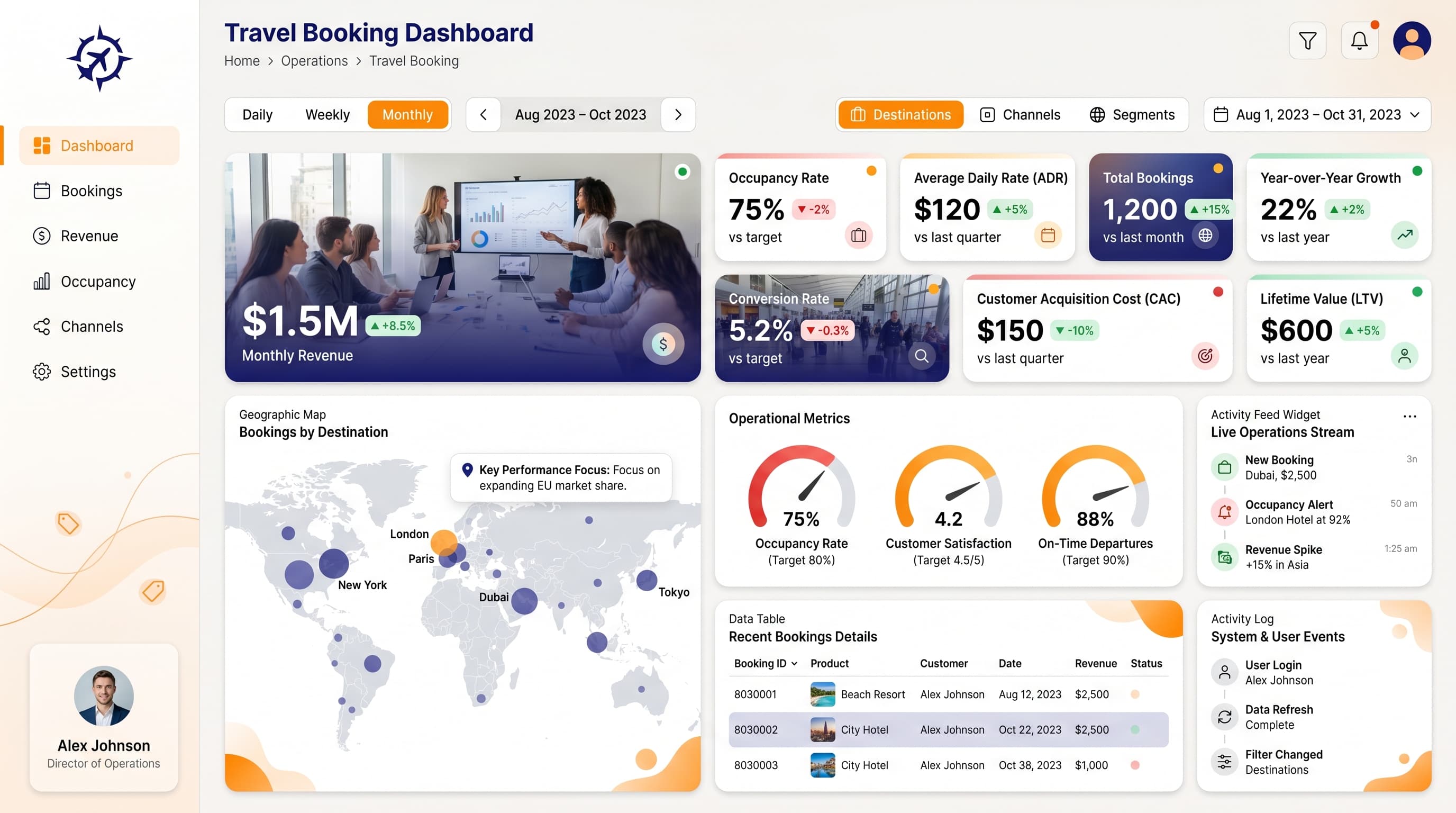
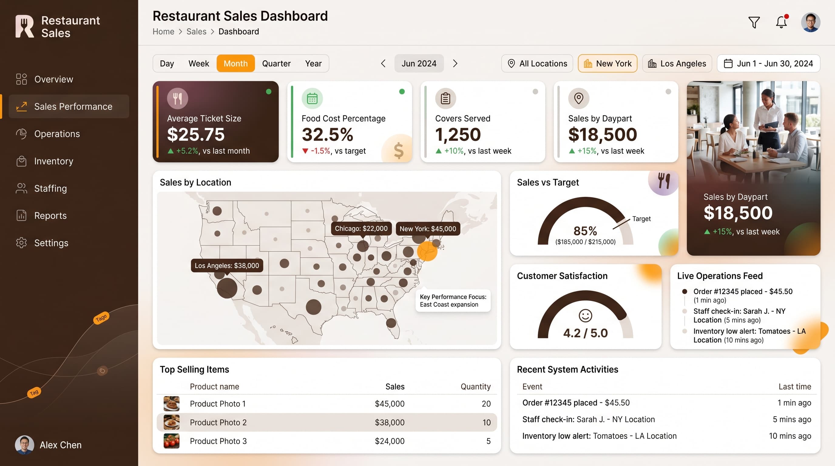
Executive view of project status, completion timelines, and potential revenue in sales.
KPIs tracked
Charts
Strategic insights
Design recommendations
Color Palette Strategy
HighUtilize a light background to ensure readability with dark-cyan elements for headers and key metrics. Maintain a contrast ratio of at least 4.5:1 for accessibility. Use dark-cyan consistently to create a recognizable visual pattern throughout the dashboard.
Layout & Grid System
HighImplement a 12-column grid system for a 16:9 ratio. Position KPI cards in the top row for immediate visibility, use the middle row for charts that analyze the data, and leave the bottom row for any interactive filters or detailed tables. Maintain 16-24px padding and 16-20px gaps between cards.
Typography Hierarchy
MediumUse a bold font size of 24-28px for the dashboard title. Section headers should be 18-20px semibold, while card titles will be 14-16px medium. Ensure body text is 12-14px regular for readability, and captions/labels should be 10-12px. Consistently apply a single font family for cohesion.
Data Visualization UX
HighChoose chart types that align with data semantics: utilize funnel charts for project stages, gauges for performance metrics, and multi-line charts for trend analysis. Limit colors per chart to 5-7 to maintain clarity, and ensure axis formatting is consistent across visualizations.
Visual Hierarchy & Focus
MediumCreate a clear visual hierarchy by making the most important KPIs the largest and boldest. Use whitespace effectively to separate sections, and consider adding subtle shadows or borders to cards for depth. Condition formatting should highlight key metrics with color changes (green for positive, red for negative).
Interaction & Feedback
LowIncorporate hover states to interactive elements, adjusting opacity or adding shadows on hover. Use loading indicators during data refresh to enhance user experience. Provide visual feedback on filter selections, and consider implementing drill-through navigation for deeper data exploration.