
About this dashboard
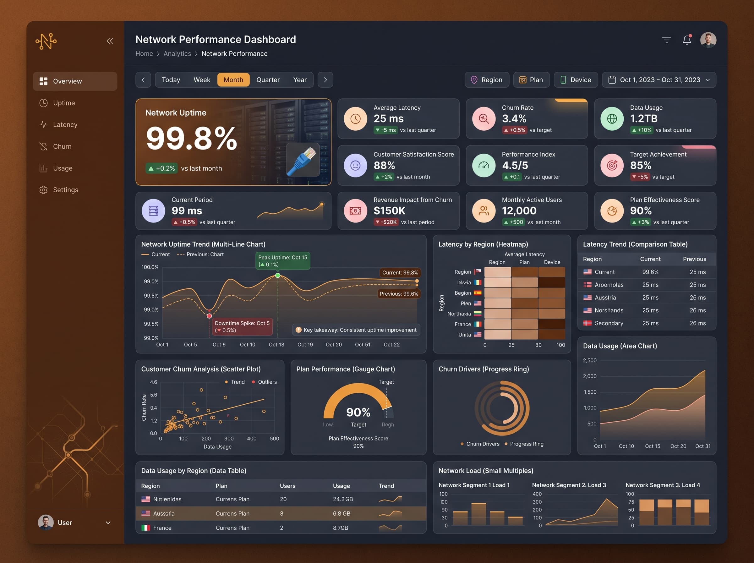
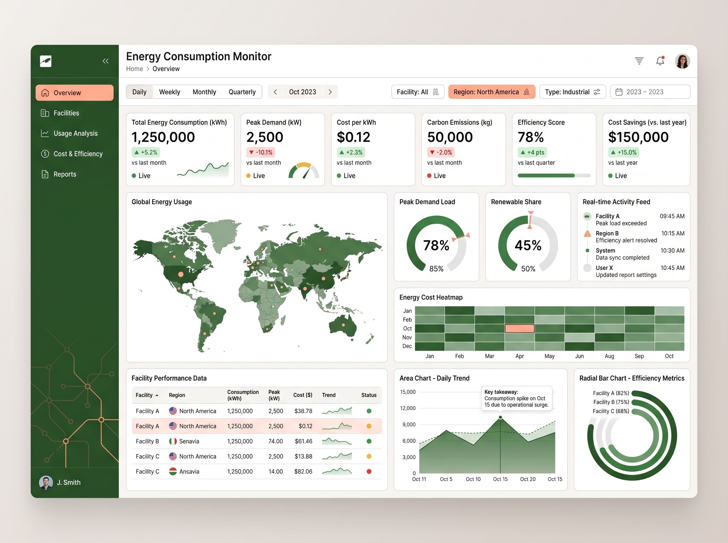
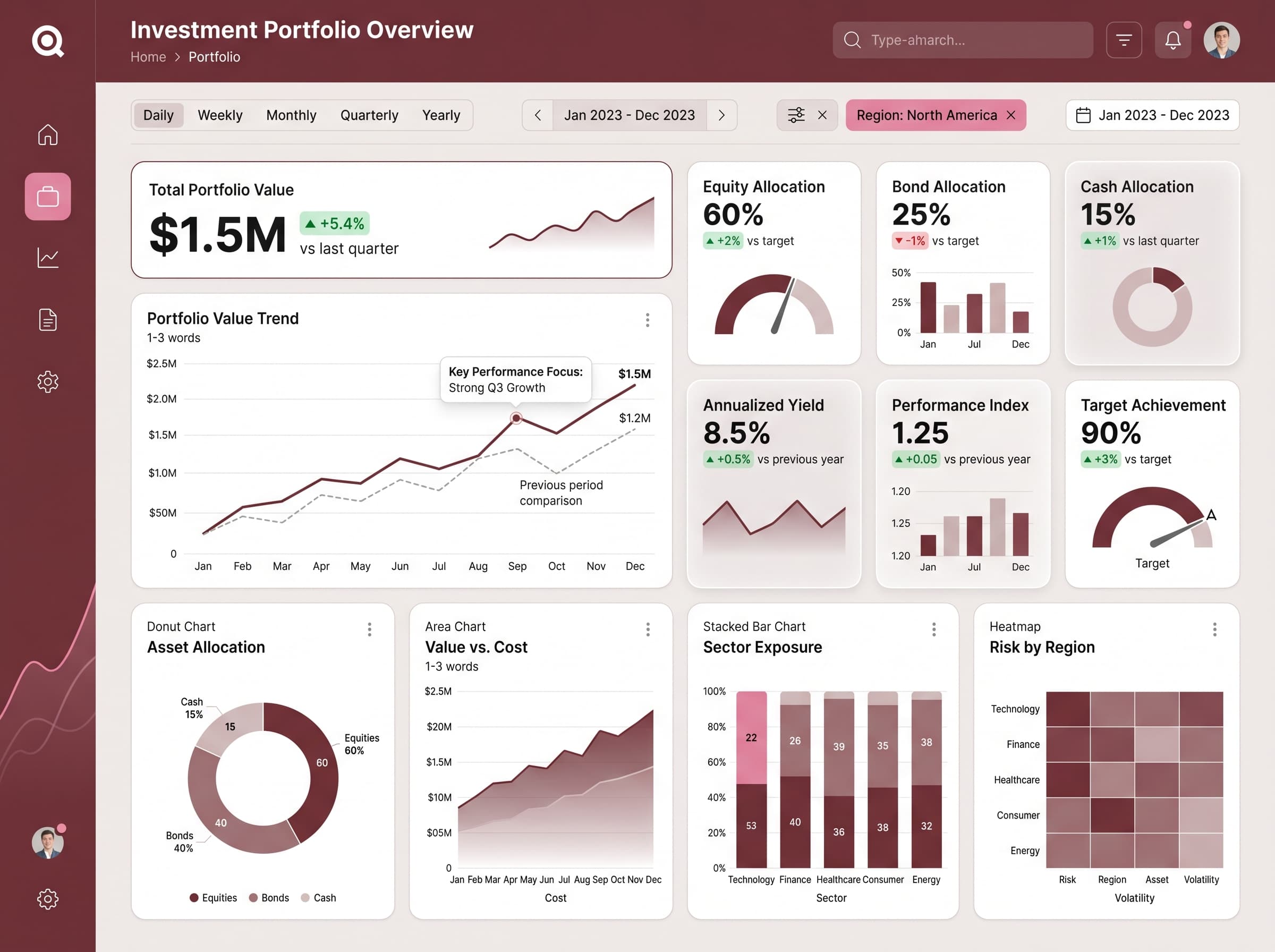
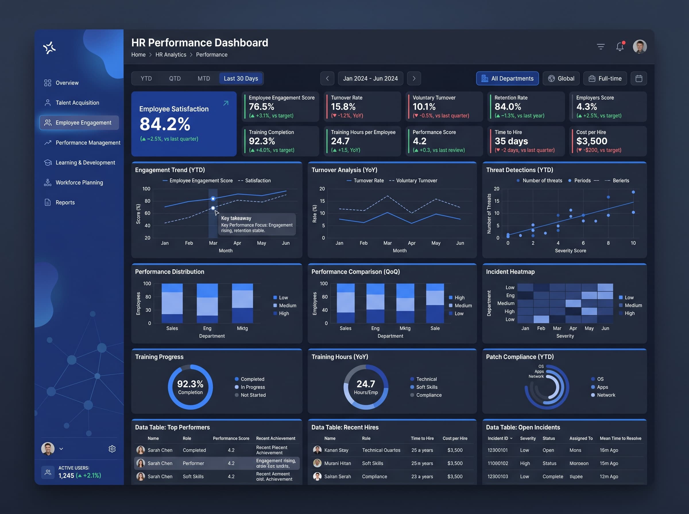
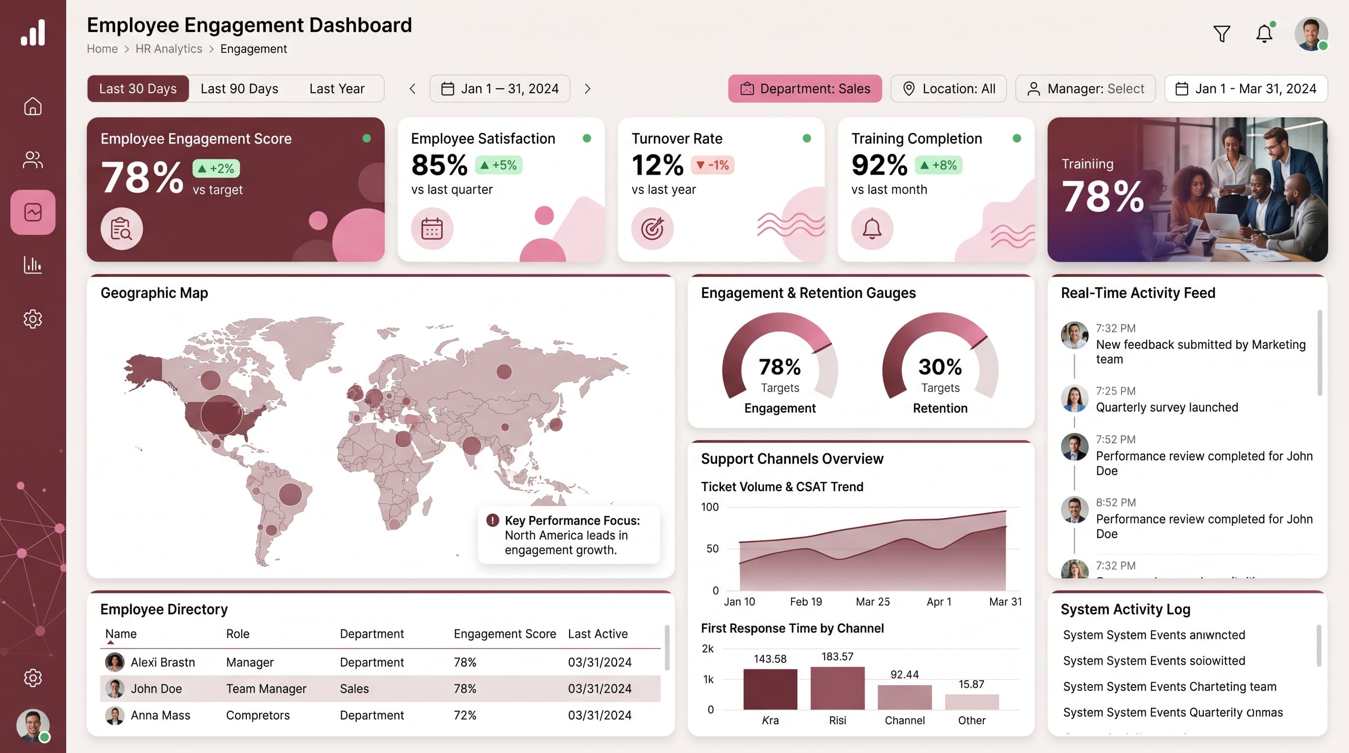
Monitor key metrics like uptime, latency, churn rate, and data usage across regions and plans.
KPIs tracked
Charts
Strategic insights
Design recommendations
Color Palette Strategy
HighUtilize a light background with espresso accents for headers and key metrics, ensuring a 4.5:1 contrast ratio for readability. Use amber for highlights to draw attention to critical data points.
Layout & Grid System
HighImplement a 12-column grid system to maintain a 4:3 aspect ratio. Position KPIs at the top for immediate visibility, with charts below for detailed analysis. Ensure 16px padding and 20px gaps between sections.
Typography Hierarchy
MediumSet the dashboard title at 28px bold, section headers at 20px semibold, and body text at 14px regular. Use a consistent font like Inter to ensure readability and consistency throughout the dashboard.
Data Visualization UX
HighSelect scatter plots for correlation insights, multi-line charts for trend analysis, and heatmaps for regional performance. Limit color usage in charts to 5 colors to avoid confusion and increase clarity.
Visual Hierarchy & Focus
MediumMaintain a clear visual hierarchy by emphasizing the most important metrics with larger font sizes and bolder colors. Use whitespace effectively to separate sections and highlight anomalies with conditional formatting.
Interaction & Feedback
LowIncorporate hover states on interactive elements for better user experience. Implement loading indicators during data refreshes and provide visual cues on filter selections for intuitive navigation.